Today’s big poll dump was from Quinnipiac, in the latest of their “Swing State Poll” series. This edition features polls from Colorado, Iowa and Virginia and is given the headline “Paul Blooms As Clinton Wilts“. That sounds pretty strong. But lets see how that headline holds up when we look at today’s updates in the context of poll averages rather than just results from one pollster, and looking beyond just the individual states with my method of classifying states.
Quinnipiac tested seven candidate combinations, but only four of those are in the “five best polled candidate combinations” by the measure I use here, so those are the ones I will talk about today. That would be Clinton vs Bush, Paul, Christie and Huckabee. (The fifth combo on the top five, Clinton vs Ryan, hasn’t been polled by anyone since February, but Cruz, Rubio and Walker, the next three by my metric, and also the others polled by Quinnipiac, still haven’t had enough polling to catch up and pass Ryan.)
So of those four, what were the actual changes in my models? There were changes for three candidate pairs. In all three cases the changes favored the Republican.
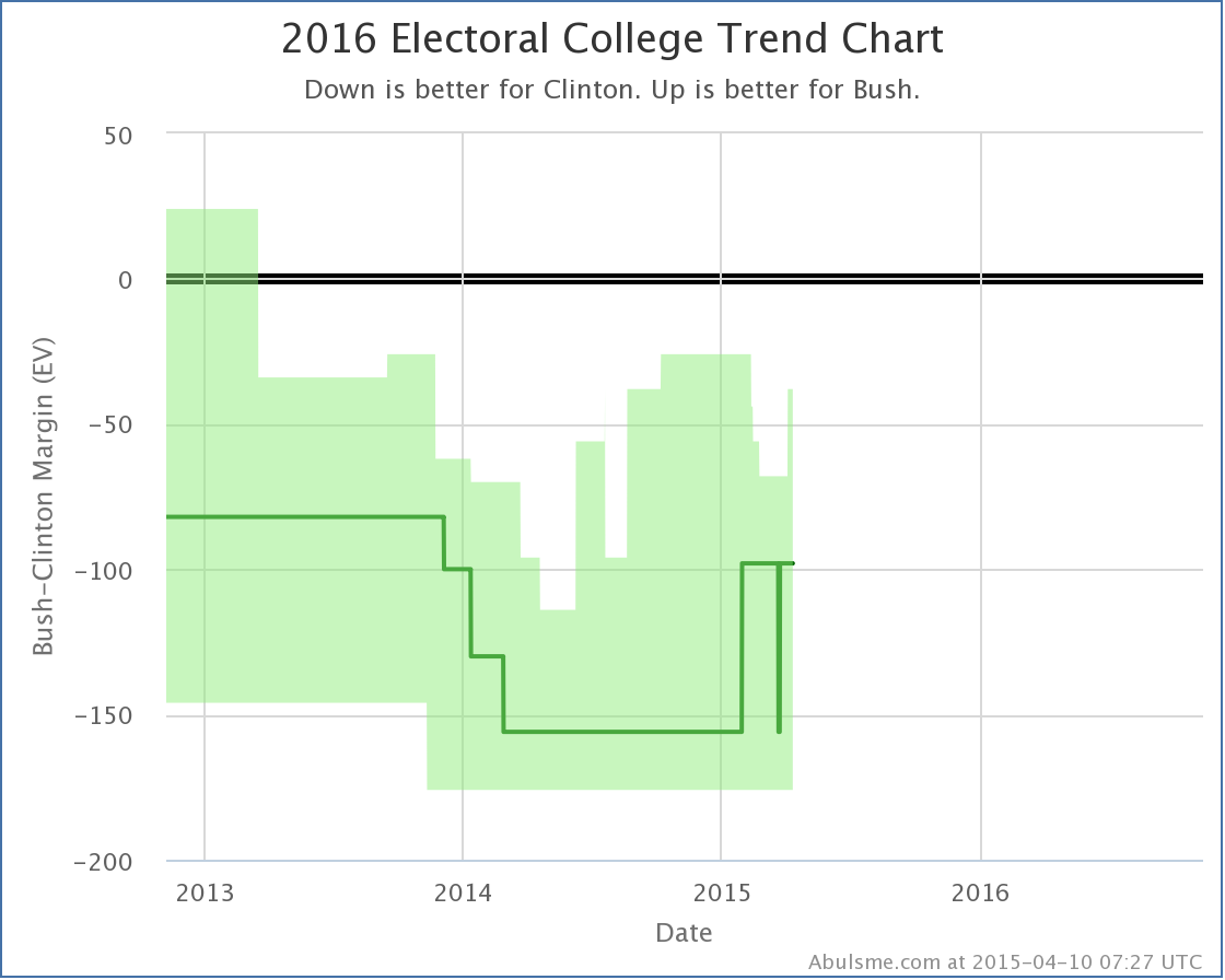
Clinton vs Bush
With today’s update, Clinton vs Bush once again becomes the “best polled” candidate combination by my metric, taking the spot from Bush vs Paul and thus becoming the default view on election2016.abulsme.com.
More importantly though, with today’s updates Clinton’s lead in the polling averages in both Colorado and Iowa dropped below 5%, putting those states back into play as “close states” that we consider possible for Bush to win. With these two back in play, Bush’s best case improves from Clinton 303 to Bush 235 before the update, to Clinton 288 to Bush 250 now, a loss by only 38 electoral votes. You can see the uptick in the top right part of the “bubble” representing the reasonable range of outcomes for Bush against Clinton given current polling:
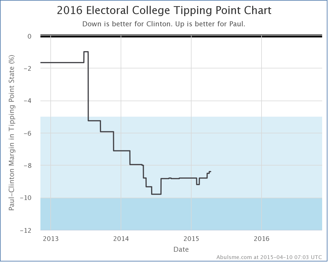
Clinton vs Paul
No states changed categories for Paul, despite the headline about Paul “blooming”. His average in Virginia however did improve from losing by 8.8% to only losing by 8.4%. This in turn moved his “tipping point margin”, a measure of how much polls need to move nationally to flip the electoral college, from being behind by 8.5% (with Wisconsin being the tipping point state) to being behind by 8.4% (with Virginia as the new tipping point state). This is the third tipping point change in a row in Paul’s direction. Almost starting to look like a trend.
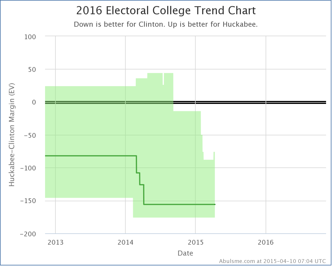
Clinton vs Huckabee
With the new results from Quinnipiac, Clinton’s lead against Huckabee in Iowa falls from 6.6% to 4.6%. That’s a rather big drop, and it makes Iowa once again a “possible” for Huckabee. So his best case moves from losing by 88 electoral votes, to only losing by 76 electoral vote. You can see this at the top right of his “bubble”:
State Comparisons
Now, while Clinton does weaken in each of the three cases above, none of this really seems to justify the “Paul Blooms as Clinton Wilts” headline on the national level. But of course these polls weren’t at the national level. The headline was really specifically about the three states polled. So lets look at how each of the candidate pairs in question are doing in these three states specifically. In each one, just look at the very last change in the lines to see how this new poll result affected the averages. (All the charts in this section also include Clinton vs Ryan, but that line can be safely ignored, since Ryan wasn’t included in these polls.)
So, in order of the number of electoral votes:
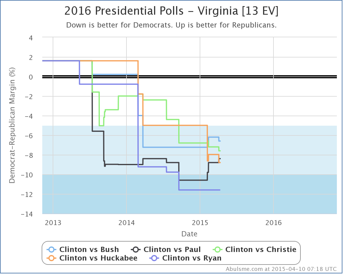
Bush, Christie and Huckabee actually fell further behind in Virginia as a result of this new polling. Paul was the only one of the four who actually improved in Virginia, reducing his deficit from 8.8% to 8.4% in my average. None of the four candidates made a move that changed the category though. Virginia is “Strong Clinton” against all four of these candidates, and this polling didn’t change that. Paul does stand out here though, by being the only one improving against Clinton.
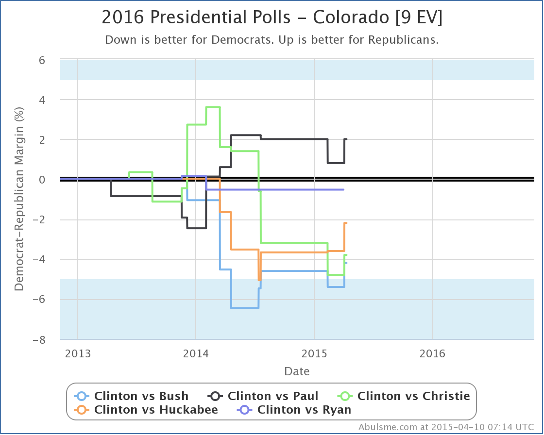
In Colorado all four of the candidates improve against Clinton as a result of the Quinnipiac poll. Bush actually moves into the white zone here, which as was mentioned earlier, means that the state is now a possible win for him. But this actually just brings Bush back in line with the rest of the pack. Colorado is a close state for all of these candidates.
Paul stands out in Colorado too, but not for the recent movement, but because he is the only one of these candidates who is showing that he could turn Colorado red again. (Colorado went blue for Obama in both 2012 and 2008, but was red in 2004, 2000 and 1996.) This is not new though. Paul has been consistently leading in the Colorado poll average against Clinton for over a year.
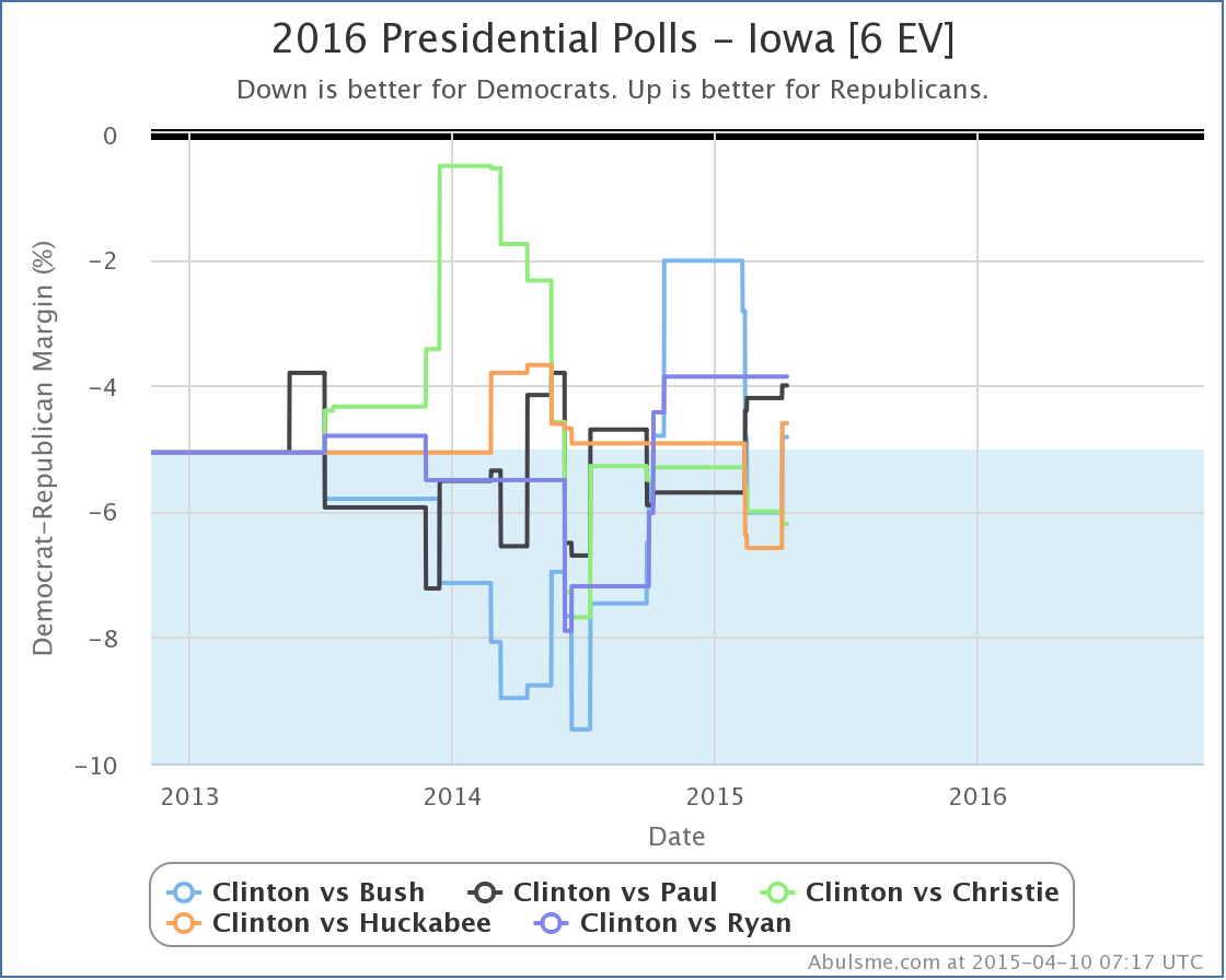
Bush, Paul and Huckabee all improved in Iowa, with Bush and Huckabee of course moving Iowa back into competitive territory, where Paul already was. Christie fell a bit further behind.
With all of the above, the moves were definitely not friendly to Clinton on the whole, but “wilting” looks like hyperbole. And while Paul does well here, so do Bush and Huckabee, arguably with moves just as significant as Paul’s if not more so.
So where does Quinnipiac get their headline?
Well, duh, they are only looking at their own polls. They are comparing their most recent results in these three states with the results of the last time they polled these three states back in February. I’m sure if you look at things with only that lens, it looks like exactly what they say it does. But you are ignoring a lot of data if you do that.
For instance, looking at only Quinnipiac data in Iowa, you see a move from Clinton having an 8.0% lead in February, to Paul being ahead by 1% now. Huge move, right? Massive momentum away from Clinton and toward Paul, right?
Lets look at the chart showing all the Clinton vs Paul polls in Iowa, not just Quinnipiac:
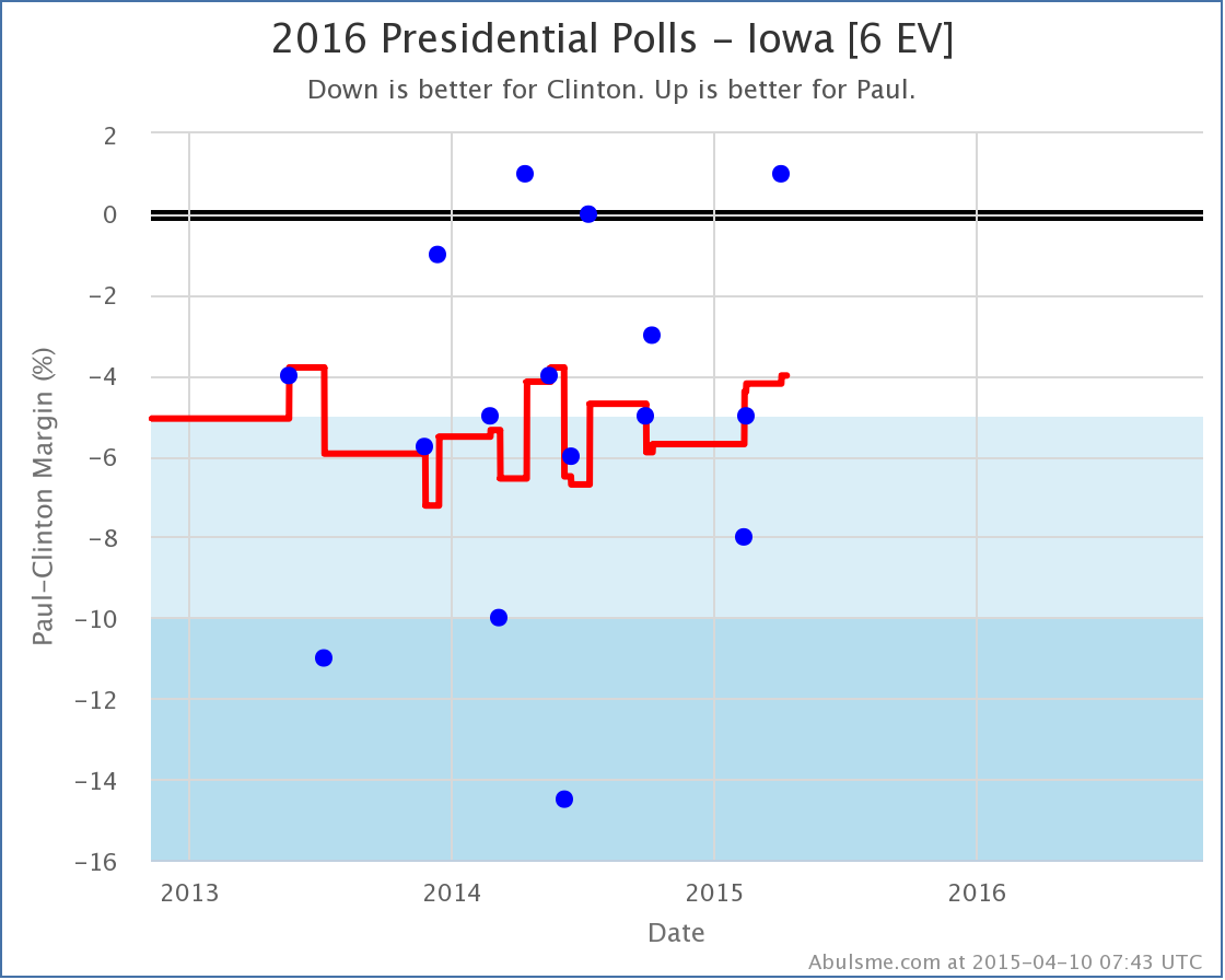
Hmmm… where did the trend go? Now, there have only been three polls so far in 2015, and it is true that each one has been better for Paul than the one before. But looking at the history of polling Clinton vs Paul in Iowa since the 2012 election, you see that the results are all over the place. There is huge scatter here. The results bounce all over the place. And so far, there has not been any sort of clear trend at all.
Yes, the new Quinnipiac poll looks great for Paul. He’s beating Clinton in Iowa! But there was a poll about a year ago that said that too. It wasn’t backed up by other polls though and wasn’t the sign of a big trend toward Paul. It was just more random variation. It wasn’t real.
Could this new poll be the first signs of a real long term movement? Maybe. Maybe not.
Kids, this is why we look at poll averages instead of individual polls.
If there is an actual big movement toward Paul, or any of the other Republican candidates, we’ll know soon enough as more and more polls start showing that movement. But no such clear trend is visible yet for any of the candidates with the most polling.
(I mentioned at the top that right now Clinton vs Cruz is the 6th best polled combo, Clinton vs Rubio is at #7, and Clinton vs Walker is at #8. You can click through on those links if you want to see what those look like at the moment. The amount of state level polling still isn’t great on those guys, so interpret the charts carefully.)
Note: This post is an update based on the data on my 2016 Electoral College Analysis Site. All of the charts and graphs seen here are from that site. Graphs, charts and raw data can be found there for the race nationally and in each state for every candidate combination that has been polled at the state level. In addition, comparisons of the best polled candidate combinations both nationally and each in each state are available. All charts above are clickable to go to the current version of the detail page the chart is from, which may contain more up to date information than the snapshots on this page, which were current as of the time of this post.
[Blog Post] “Electoral College: Bad Polling Day for Clinton” http://t.co/ZetuMoxWQN