It is just over 7 days until the doors open on the Iowa caucuses for 2016. So it is time to open the Election Graphs delegate tracker.
electiongraphs.com/2016dels
Long past time actually. At least on the Democratic side, the delegate race actually started long before Iowa. We’ll get into that a bit in a separate post later, but for now, just a quick introduction to what this delegate tracker will and won’t be.
The Election Graphs delegate tracker will be based on “soft counts”. While many delegates do get determined directly based on voting results in primaries or caucuses, many do not. There are “superdelegates” who are free agents and can change their minds at any point. There are also processes where the direct voting just elects delegates to a “second stage” who in turn later vote for “a third stage”, etc, until eventually weeks or months later, the actual convention delegates are elected. The degree to which any of this is deterministic varies by state. Here at election graphs we’ll be using a variety of sources to try to understand the preferences of known superdelegates and officially uncommitted delegates, while trying to estimate what the delegate allocation will eventually be at the end of multi-stage processes.
This all means that estimates are subject to change and revision. Things are not locked in stone when a winner is declared on a primary election night. In practice though, at least in the last couple of election cycles, tracking these “soft counts” is actually pretty stable. The estimates do adjust a bit as time goes on, but you generally have a pretty good picture of what is going on, and it gives you a better picture than looking only at a “hard count” of delegates who are completely bound to a candidate with no ability to change their vote. Looking narrowly at only that part of the delegate count leaves out a big part of the picture.
Lots of places will have delegate counts starting the evening of the Iowa caucuses though, why should you pay attention to the one at Election Graphs?
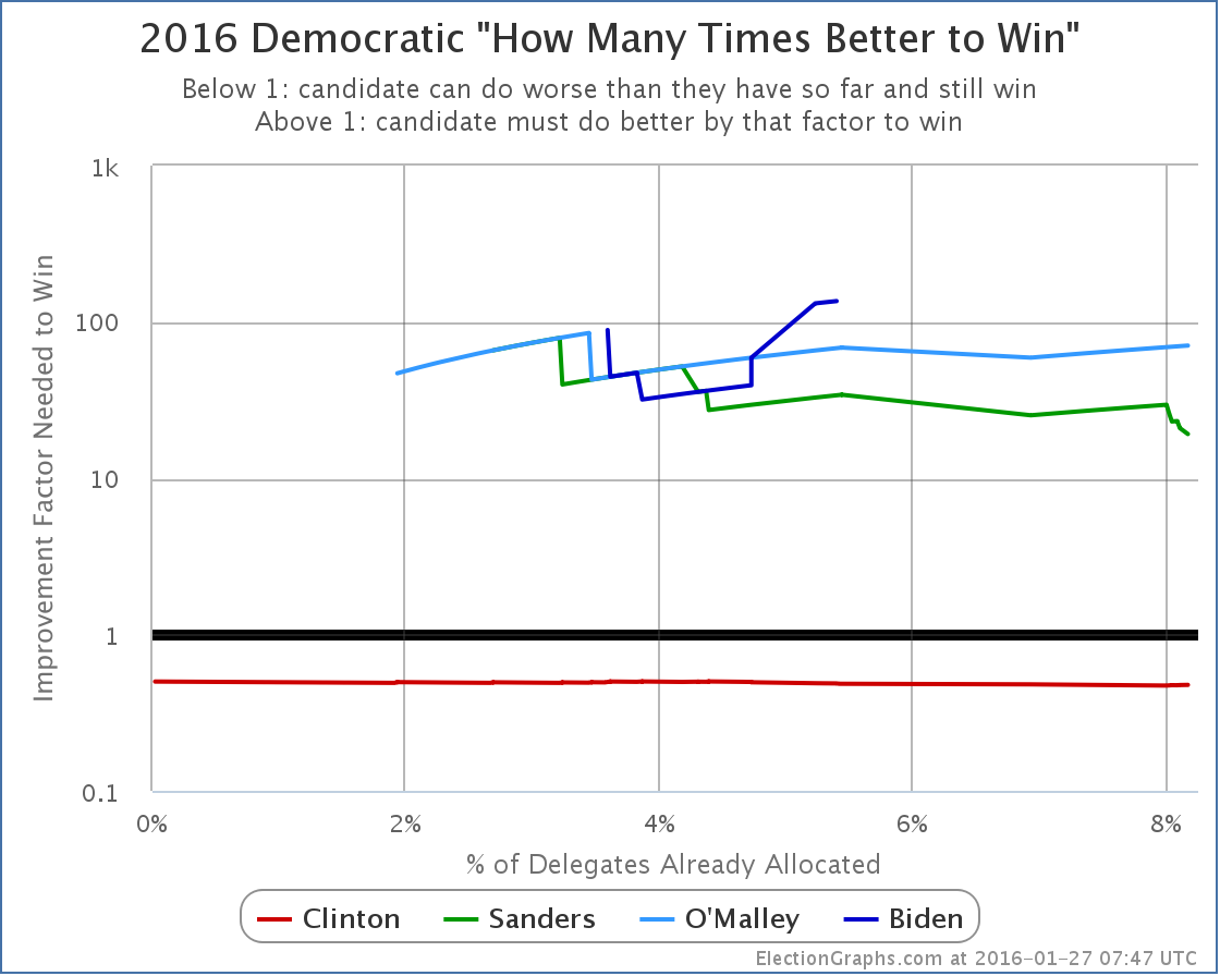
First and most importantly, I track a couple of statistics I have not seen anywhere else. Namely, the percentage of the remaining delegates each candidate needs to capture in order to win, and how much better (or worse) that is than how they have been doing so far. These tell you much more than a raw delegate count, because they also take into account the dwindling number of remaining delegates as things proceed.
So, for instance, looking at the famous 2008 Clinton vs Obama race with these metrics it was clear by early March that it was very very unlikely that Clinton would be able to catch up with Obama. Not impossible, but very unlikely, requiring Clinton to do better than she ever had before by a large margin to catch up… a margin that got bigger with every passing contest. Meanwhile the frenzy around the 2008 race continued on and on and on… long after it was clear to anyone really watching the math that it was over. So watch these numbers for an early sense of when the picture is really becoming clear.
Second, I also track all of these against the percent of delegates already allocated, not just against the date, which gives you a much better sense of how far along in the process things are, since the delegates available aren’t even remotely close to evenly distributed over time.
Third, while lots of places show current delegate counts, very few show you charts of how the delegate race proceeds over time. As they say “past performance does not guarantee future results”, but at the same time, it does give you an idea of the range of what is likely. Sure, something cataclysmic could happen to cause someone who has been routinely getting 60% of the delegates to suddenly only get 10% for the rest of the race, but it is unlikely. It would have to be a result of a massively disruptive change in the race, not the normal ups and downs of a campaign. So watch the time series charts.
There are a bunch of other little details here and there that politics and numbers geeks might like too.
And of course, it is a chance to support your local neighborhood amateur who does this for fun in their spare time. :-)
This is the first of three posts to introduce the delegate tracker, the next will be a “tour” going over all the new features on the site.
Note: This post is an update based on the data on ElectionGraphs.com. Election graphs tracks both a poll based estimate of the Electoral College and a numbers based look at the Delegate Races. All of the charts and graphs seen in this post are from that site. Additional graphs, charts and raw data can be found there. All charts above are clickable to go to the current version of the detail page the chart is from, which may contain more up to date information than the snapshots on this page, which were current as of the time of this post. Follow @ElectionGraphs on Twitter or like Election Graphs on Facebook to see announcements of updates or to join the conversation. For those interested in individual general election poll updates, follow @ElecCollPolls on Twitter for all the polls as they are added.
[Edit 2016-01-27 03:18 UTC to add final note]
[Edit 2016-01-27 08:00 UTC to update graph]
[Blog post] Delegate Race: Launching the 2016 Delegate Tracker https://t.co/rwg3ixLkAU
Carolyn Belshe liked this on Facebook.