Sanders won Indiana’s pledged delegates 44 to 39.
So he got 53.01% of the delegates. He needed 80.92% to be on a pace to catch up with Clinton.
But it is actually worse. That 80.92% was as of the results from the Northeast last week. Since then between superdelegate announcements and a revision to the Ohio results, there was a net change of Clinton +11, Sanders -1. If you add that in, you get Clinton +50, Sanders +43 since last week. So actually Sanders only got 46.24% of the recent delegates.
Which means, of course, that Clinton just continued her march to the nomination and improved her position despite Sanders’ win.
Here come the graphs:
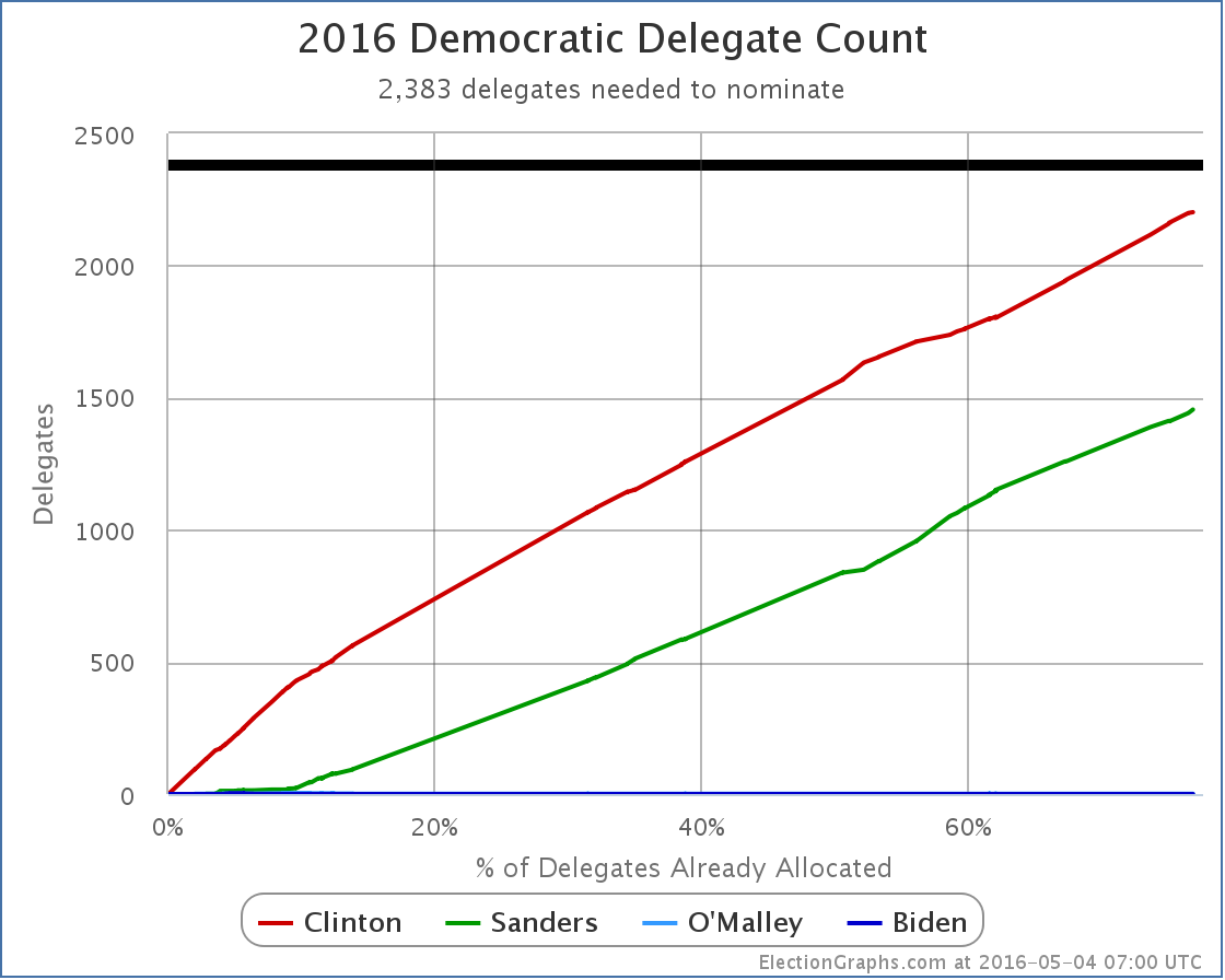
The totals are now Clinton 2202, Sanders 1455, O’Malley 1. Clinton only needs 181 of the 1107 remaining delegates to wrap this up.
Which brings us to…
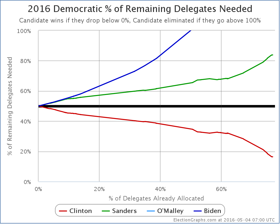
Clinton now only needs 16.35% of the remaining delegates to win. Sanders needs 83.83%.
Massive superdelegate defections could alter this, but there have never been any signs of such movement, and there are none now.
For a long time now the result has been clear absent a catastrophic change. As we have fewer and fewer delegates left, the curves above will move more quickly toward the final result, and it will be more and more difficult to get a result that would even slow it down.
ElectionGraphs.com will continue to document this process, but there is little to no drama left, it is just a matter of watching Clinton gather up the remaining delegates needed.
Update 2016-05-08 01:57 – Superdelegate update, net change Clinton +3. Update from Mississippi, net change Clinton -1, Sanders +1.
Note: This post is an update based on the data on ElectionGraphs.com. Election Graphs tracks both a poll based estimate of the Electoral College and a numbers based look at the Delegate Races. All of the charts and graphs seen in this post are from that site. Additional graphs, charts and raw data can be found there. All charts above are clickable to go to the current version of the detail page the chart is from, which may contain more up to date information than the snapshots on this page, which were current as of the time of this post. Follow @ElectionGraphs on Twitter or like Election Graphs on Facebook to see announcements of updates or to join the conversation. For those interested in individual general election poll updates, follow @ElecCollPolls on Twitter for all the polls as they are added.
Leave a Reply
You must be logged in to post a comment.