States with new poll data since the last update: Tennessee, Arizona, Florida, Pennsylvania, Michigan, New Hampshire, North Carolina, Kentucky.
It looks like Trump’s last couple of bad weeks are starting to hit the state poll averages. In this update, we have model changes caused by the movement in three states. All three changes favor Clinton.
Going through them one by one…
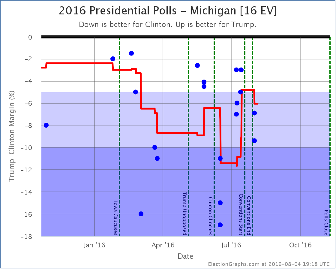
Michigan [16 EV]
First of all, I will point out a new feature on these charts. There are now vertical dotted lines marking significant campaign events. Right now that is the Iowa caucuses, when the candidates won their primaries and the conventions. When/if debates happen, they will get marked as well. This is helpful in understanding the moves vs what may be going on in the campaign.
In Michigan specifically, you can see that Trump was gaining on Clinton in the run up to the conventions. The average popped up into the “close state” zone right before the conventions started. But with the first post-convention polls, Clinton’s lead increases again. She now has a 6.1% lead in Michigan, and the state is no longer included in Trump’s “best case”.
New Hampshire [4 EV]
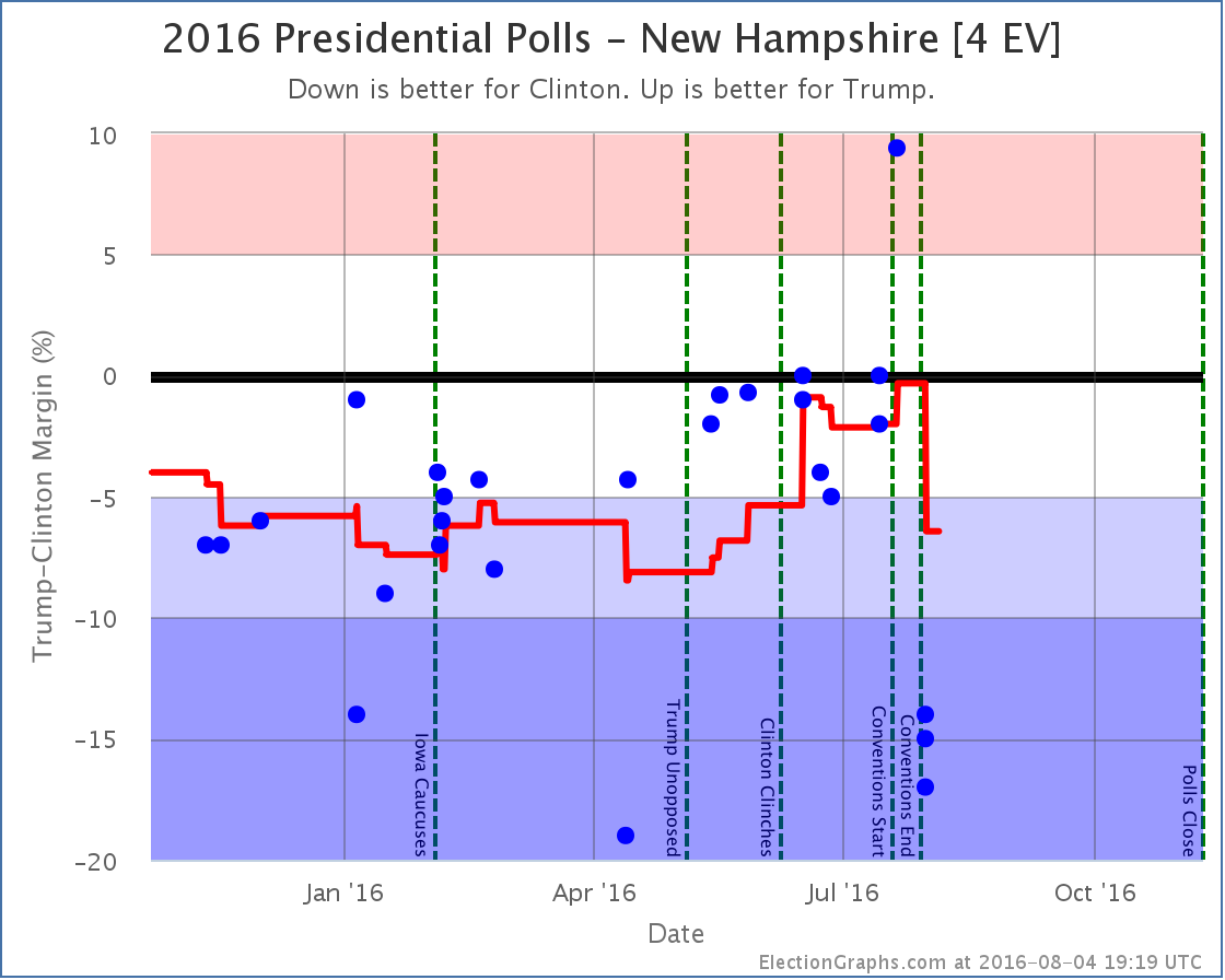
A poll taken during the Republican convention was the best result Trump has ever gotten in New Hampshire. This had moved the average to an very narrow 0.3% Clinton lead. The first results from after the Democratic convention on the other hand are some of the worst results Trump has seen in New Hampshire, and Clinton’s lead rises to 6.4%. So, like Michigan, New Hampshire is no longer looking like a possible Trump pick up. Since New Hampshire also moved past the tipping point, the tipping point also moved.
Now, both the Trump result during the Republican convention, and these new results look like outliers. Every other poll since May has been between a tie and Clinton +5%. So polls showing Trump up by 9.4%, or polls showing Clinton up by 17% should all be taken with a massive grain of salt. Given national trends some swing toward Clinton is expected, but we need to see more polls before concluding that the swing toward Clinton in New Hampshire is quite as large as the new polling indicates.* This is of course why we only look at averages rather than individual polls. The average moved quite a bit, but it doesn’t instantly snap to these new results. But it still moves enough to make a difference.
Florida [27 EV]
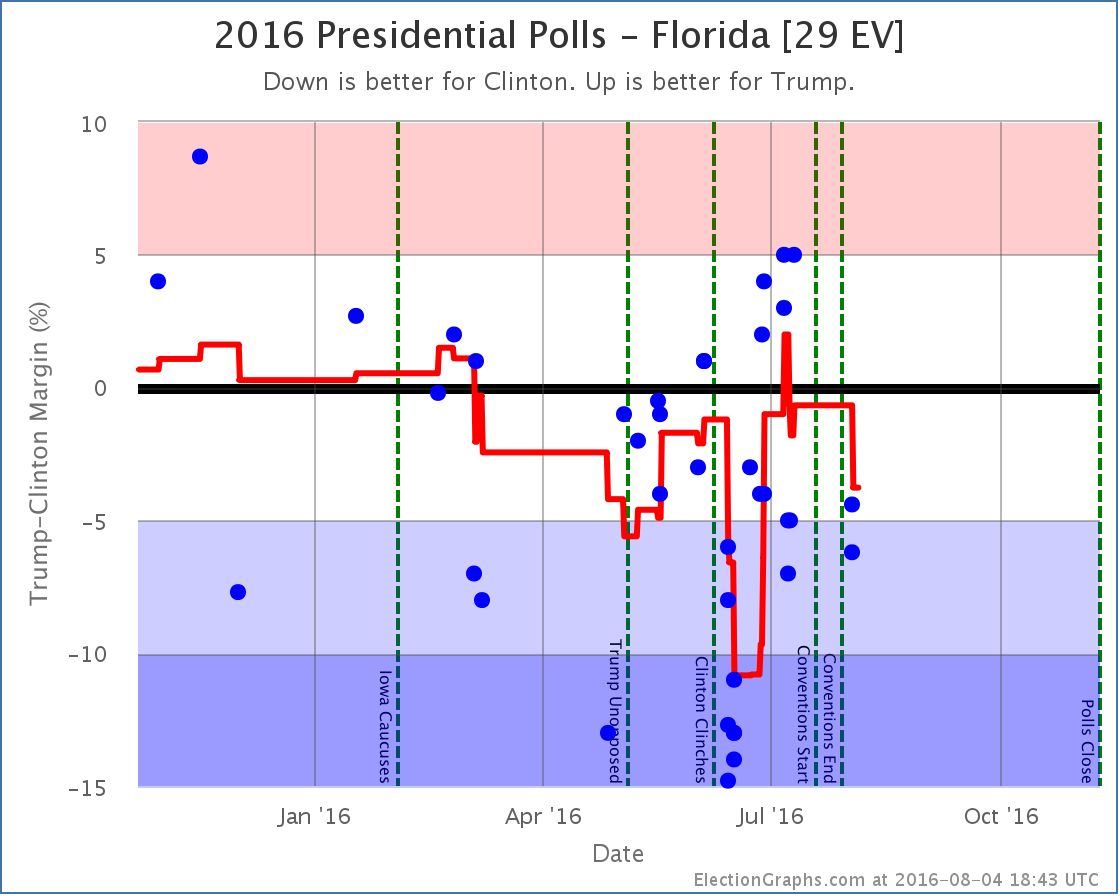
The first post-convention results in Florida move the average toward Clinton. Florida goes from a 0.7% Clinton lead to a 3.8% Clinton lead. No category change here. Florida is still weak Clinton, but since the average passes the tipping point, the tipping point gets shifted.
National View
With each of the three states that caused changes out of the way, time to look at the national picture.
First the “bubble” showing the best and expected cases over time:
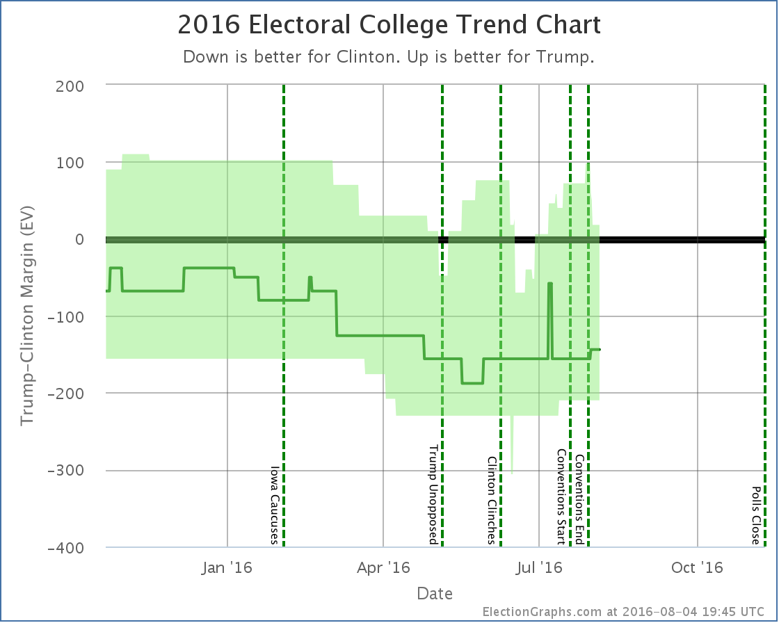
Right before the Democratic convention ended, Trump’s best case was up to winning by 98 electoral votes. Since then Pennsylvania, Michigan, and New Hampshire have slipped out of reach. His best case is now down to winning by only 18 electoral votes. He is one bad poll in Virginia, Florida, or North Carolina away from once again having his best case be a loss.
And with the movements in Florida and New Hampshire the tipping point moves dramatically as well:
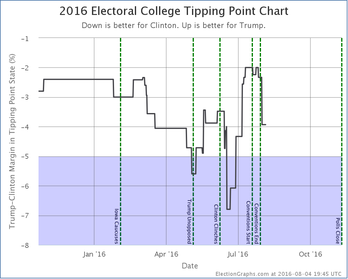
The tipping point margin… that is the margin in the state that would put the candidate “over the top” if you order the states by how strongly they support the candidates, moves from Clinton by 2.3% in North Carolina to Clinton by 3.9% in Virginia.
Before the conventions, Trump had dramatically improved his position in the tipping point. He was still losing, but by much less than before. He has now given up about 40% of the margin he gained.
A 3.9% tipping point margin… which is basically equivalent to the national popular vote margin, but adjusted for the structure of the electoral college… is still a close race. But not as close as it was before the conventions… and there are many close states that have not yet had post-convention polls.
Given where national polling is right now, once we do get more state polls, it would not be surprising to see Trump continue to drop in the short term.
95.7 days until the first polls start to close on election day.
* For the wonkiest of you out there: All three results showing Clinton up by double digits were from the same underlying WBUR poll sliced in different ways, so were not actually fully independent samples, so they don’t count as additional confirmation. This election cycle when I have a single poll that reports multiple results… just 2 candidates along side with 4 candidates, or registered voters and likely voters, or first response vs pushing leaners, I’m including ALL of the results rather than having some set of rules for picking only one. There are strong arguments for NOT doing this, specifically what I just mentioned about the results not being truly independent of each other, so you essentially end up giving more weight than you would otherwise to that pollster, simply because they reported their results in several different ways. I am simply defaulting to including everything on the theory that being more complete is better. I do understand the downsides though. I may decide to handle this a different way in 2020, but this is how it is for 2016. :-)
Note: This post is an update based on the data on ElectionGraphs.com. Election Graphs tracks both a poll based estimate of the Electoral College and a numbers based look at the Delegate Races. All of the charts and graphs seen in this post are from that site. Additional graphs, charts and raw data can be found there. Follow @ElectionGraphs on Twitter or like Election Graphs on Facebook to see announcements of updates or to join the conversation. For those interested in individual general election poll updates, follow @ElecCollPolls on Twitter for all the polls as they are added. If you find the information in these posts interesting or useful, please consider visiting the tip jar.
[Blog Post] Electoral College: Bad Polling Day for Trump https://t.co/mfG9qr53TM
RT @ElectionGraphs: [Blog Post] Electoral College: Bad Polling Day for Trump https://t.co/mfG9qr53TM
RT @abulsme: [Blog Post] Electoral College: Bad Polling Day for Trump https://t.co/4SaSc4wzFU
RT @ElectionGraphs: [Blog Post] Electoral College: Bad Polling Day for Trump https://t.co/mfG9qr53TM
RT @ElectionGraphs: [Blog Post] Electoral College: Bad Polling Day for Trump https://t.co/mfG9qr53TM
I was thinking about the point that you raised in your footnote for some time and I feel that averaging different breakdowns from the same pollster and adding it as one entry might be better.
I thought you already were averaging any poll that presented multiple results (2, 3, 4 way). Why not just keep doing that?
It’s interesting that Trump has overtaken Clinton in Nevada, even though that state has many Hispanics.
Another interesting fact is that not long ago you had Trump in a no-win situation even in his best case. But then he came back rather strongly. Now he is down but apparently not out. How to explain these fluctuations over a period of a few weeks?
Regarding recent reports of Hillary gaining 10%, I find it hard to believe there could be a sudden 10% change in a candidate’s polling results. This just does not seem credible. Are people really that unstable in their opinions?
My overall opinion is that I am very skeptical of any poll at this stage.
@DAK: That might be. It is certainly one valid approach. It is a bit harder to implement though, but something I will consider for 2020. Most poll tracking sites seem to just have some rules for choosing one of the results and discarding the rest. For instance, Likely voter used over Registered voter, 4 way used over 2 way, etc. Early on I decided to just include them all this time around. I do sometimes have second thoughts over that choice, but I’m reluctant to ever change things in mid-stream. So most likely any changes I make to methodology won’t be applied until I start tracking the 2020 race.
@Ben: The method here has always been to include each result in the average the same as if they were actually completely separate results. So, if a pollster reports both 2-way and 4-way results they are both entered, and those end up being two of the polls in the poll average. This is different from averaging the results from the pollster first, then counting that as one result. You can always see exactly what makes up the average on the state detail page. I’ve mentioned this before in the notes, but make sure to call it out specifically whenever it looks relevant to the changes that are seen. In this case specifically the new poll in New Hampshire actually reported THREE different results, so they were responsible for an even bigger portion of the average than usual. People reporting both 2-way and 4-way results seems to be pretty common at the moment, but more than that was unusual enough that I called it out.
@Dave: If you look at the Nevada details, you’ll see that the five polls that make up the average vary from Trump by 5% to Clinton by 4%… over 1.7 months. The average ends up slightly on the Trump side (0.4%), but the right conclusion is just that the state is close and could go either way. It just happens to be on one particular side at the moment, but there should be no surprise at all if it flips again with the next poll.
The rapid fluctuations in the electoral college numbers are quite simply just because of the winner take all nature of the electoral college. I include a state in the “best case” if the margin is less than 5%. But if a state is at 6%, a single poll can move the average back under that threshold. Or vice versa for a state at 4%. What happened with Trump’s surge is that there were a bunch of states where Clinton’s lead was over 5%, but not by much. A few polls showing Trump closer moved those averages under 5%, so I started including those states in his best case. Now, with things not looking as good for Trump, many of these states are once again moving above the 5% mark, so Trump’s best case reduces. But it does so in big chunks. Florida is 27 electoral votes. So it moving changes the margin by 54 electoral votes. It doesn’t take much to move these things a long way. Keep in mind though that that the “best case” for either candidate is actually somewhat unlikely. The range expressed is fairly generous. It is more likely that the result ends up closer to the “expected” case than either edge of the bubble. Sites like Sam Wang’s Princeton Election Consortium ( http://election.princeton.edu/todays-electoral-vote-histogram/ ) do Monte Carlo modeling and actually give a distribution if you want to dig into things. I intentionally have a bit simpler model here.
In terms of big swings, indeed, always be skeptical until there are a bunch of polls backing it up. Certainly don’t believe it if all there is is a big difference between two individual polls. There is a lot of variation just caused by randomness and methodology differences. Watch the averages, which should calm out such swings. For instance in the New Hampshire results above, if you just looked at individual polls it looks like there may have been a 25% swing! That is crazy. Probably both the high and low are outliers. The average still shows a swing, but only about a 6% swing, which is still relatively large, but much more plausible.
Keep in mind as well that to get a 6% swing in the margin, only 3% of people have to change their minds. Given the kind of news happening in the past few weeks, that is well within the realm of the possible.