This is the website of Abulsme Noibatno Itramne (also known as Sam Minter). Posts here are rare these days. For current stuff, follow me on Mastodon

Categories

Calendar

May 2009
S M T W T F S
 12
3456789
10111213141516
17181920212223
24252627282930
31  

Last Swine Flu Dashboard Enhancements

Well, last for tonight anyway, it is way past my bedtime.

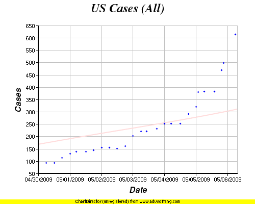
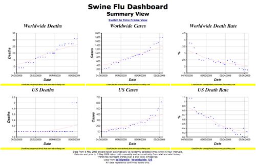
I switched things around so the main page of the Swine Flu Dashboard is a “Summary View” with only the “all data so far” graphs of the six things being tracked (deaths, cases and death rate worldwide and US only). For these I changed the trend line to be based off of a one week time period. There isn’t yet a full week of data, so that means the entire trend line may still shift. Parts of it will turn red once those parts are “fixed”.

I have then moved off onto a separate “time frame view” looks at each of those six numbers on a “previous week”, “previous month” and “previous year” basis. Obviously these will be more interesting once there is data over a longer time period. For this view I’ve made the trend lines dependent on which time frame you are looking at. They are based on 2 days for the weekly view, 2 weeks for the monthly view and 2 months for the yearly view.

Anyway… that’s it for tonight.

Swine Flu Dashboard Adjustment

After watching the updates over the past day, it became clear that the CDC was only updating once per day, while Wikipedia was updating constantly as new information came in. When there was a CDC update, that data would get reflected in Wikipedia very quickly. So overall for responsiveness, Wikipedia was a better source. So I changed the data source for the US numbers on the Swine Flu Dashboard to be Wikipedia, just as with my world numbers. (Links to the specific Wikipedia data sources on the Swine Flu Dashboard itself.)

Also, using the magic of wiki history, I went back and backfilled my data to include at least one data point per six hour interval going back to April 30th (UTC). Before that in the wiki history it seems like the standard for what was a “confirmed” case was not yet clear, and so numbers had been reported differently and were higher.

Anyway, now the four times a day update for the US numbers will actually catch changes more than once a day, and the historical numbers are just as nicely filled out as the new numbers.

Oh, and the curves are actually starting to look a bit exponential now, whereas they had previously been looking more linear.

Woo!