- 08:08:50 [Blog Post] Electoral College: Post Mortem https://t.co/bzk3bhlBD6
It took almost 20 days, but the last state, Michigan, was finally called for Trump on Monday November 28th. The final results of Election 2016 are now known: Clinton 232 Trump 306, a 74 electoral vote win for Trump. (That is absent faithless electors or something completely unexpected coming out of recounts of course.) (UPDATE 2016-12-20 19:27 UTC: The electoral college has actually voted, and there were 7 faithless electors. The final count was Trump 304, Clinton 227, Others 7. This is a 77 electoral vote margin for Trump. For details, see my post titled “The Actual Presidential Vote“.) This site’s final update predicted that the result would be somewhere between a 210 electoral vote win for Clinton and a 66 electoral vote win for Trump, with the “expected” result being an 8 electoral vote win for Clinton. Obviously I was wrong. Not just on the winner, but the result didn’t even come in within the “range of the reasonably possible” that I listed. A range which had seemed overly broad before the election. A 66 electoral vote win for Trump (or a 210 electoral vote win for Clinton) seemed like a complete fantasy. Yet Trump exceeded that margin. Having said that, the “expected result” was actually closer than almost all electoral vote trackers out there. So I actually did about as well as could have been done given the raw data that was available. So the raw output of my model on Election Graphs was pretty good. Perhaps I could have picked a bit wider window for the “swing” states than 5%, but 5% was generally reasonable. Although of course I wish I had gotten everything exactly right like I did in 2012, I am happy with how my model performed. I may make tweaks for 2020, but I will not dramatically change what I do with the model itself in 2020. I do fault myself however for some of how I interpreted that data in my analysis posts, most critically I concentrated too much on the “Expected Case” and the “Tipping Point” metrics, and not enough on the full range of variation between the best cases. Like most electoral college trackers, this led me to minimize the chances of Trump’s win because “he has never led the race and isn’t ahead now” while essentially ignoring the fact that while that was true, he spent most of the last 100 days close enough that a systematic polling error or significant movement in the last few days could erase Clinton’s lead. Both seem to have happened. My model was spitting out the “Trump Best Case” the whole time, but for the most part, I downplayed the best cases. That was a mistake. Lets dig in and look at the details. Warning in advance, the remainder of this post is likely only to be of interest to “data geek” type folks. If that isn’t you, feel free to stop now… or just skip down to the “thank you” section at the end. If you are the data geek type, dive in with me to a lengthy discussion of the details and what lessons they may provide for 2020. If you prefer listening to reading, or just want to hear about this in another way, I also discussed much of what I am now including in the post mortem in the November 11th episode of the Curmudgeon’s Corner podcast. How did I do state by state?In terms of individual states (and congressional districts), I of course did not match my 2012 record of getting 56 right out of 56. I ended up getting 5 wrong:
So there were 4 places where I erred toward Clinton and 1 where I erred toward Trump. Of these, four were in the “weak” category, with margins in my averages of 2.6% or less. They were in my too close to call categories, and while I would have liked to have gotten more right, my model did indeed say they could easily go either way. The only big surprise here was Wisconsin. The polling average had Clinton up by 7.1%, but Trump won anyway. There is nothing to say there other than the polling was way off in Wisconsin. Way off. I’m sure much will be written about why that was the case. A state that I hadn’t even classified as a swing state going the opposite direction as expected is obviously how the final result was able to end up completely outside of the expected range. Wisconsin going for Trump was simply not contemplated. All the other states that went for Trump were within the range of options this site identified as plausible. Of course, there were other states that I did not get wrong, but the margin was still off by more than expected. That is a different kind of analysis that I won’t do today. How did I do on the overall result?Looking at the over all electoral college result, lets compare with where some of the other sites had the race at the end:
First of all, I guess I am permitted to toot my own horn a bit. While I did not predict a Clinton victory, I came closer to the final result than all but one of the outlets above. That is something, right? TOOT TOOT TOOT That over with, I was still quite a ways off. I should also point out that the above is ONLY due to changes added with polls that came out on the day before election day. My very last update on election day itself had the 8 EV Clinton margin. But the update before that, on Sunday, had me at 108 electoral votes, right there with so many others. Indeed, because I had been in broad agreement with so many other outlets, and my final update caused me to deviate quite a bit, I included caveats in my last update basically saying I didn’t believe it, there were probably outliers impacting the data, and my Sunday numbers were probably better. Which brings me to the lessons of this post mortem… LessonsTrust my own method and dataNow, frankly, the swing on the last day may well have just been dumb luck. Random noise happening to go in the right direction. But it also could have been an indicator of the actual movement. Right or wrong, given I had been using a fixed methodology all election season, I should have stuck with it fully. After the election, if I was wrong, I could and should use that to learn for the next election cycle. But I started making excuses because I was not matching all the other election trackers. I should not have done this, I should have taken the results I was seeing seriously, and should have based my commentary on that. My final update had an 8 EV Clinton win with a tipping point of only 1.6% in Pennsylvania. Only that one single state needed to flip in order for Trump to win. My final update did mention that Trump had made it tight again. I summed it up like this:
Without looking at all the other forecasts and making excuses for why I was different, this should have read more like:
But I did not say that. And the reason was primarily because in that final update, I looked like an outlier, and I therefore didn’t believe what my own model said, specifically in terms of just how close it really was. Which brings us to the next lesson. Trust the UncertaintyFor the three election cycles I have done this, I have used a 5% margin as the boundary for what I call the “weak states”. States that you should consider to be too close to call and which could go either way. When justifying this, I have always said something like this:
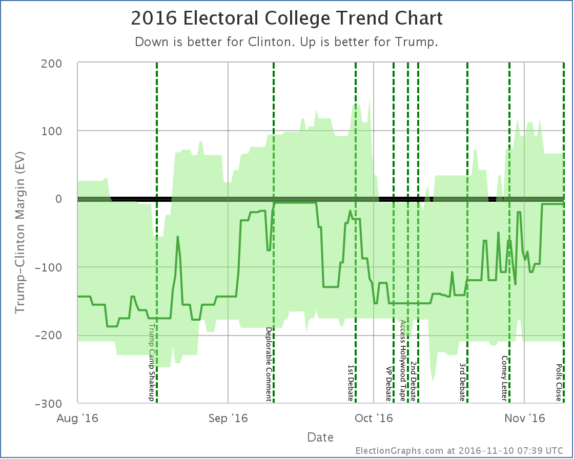
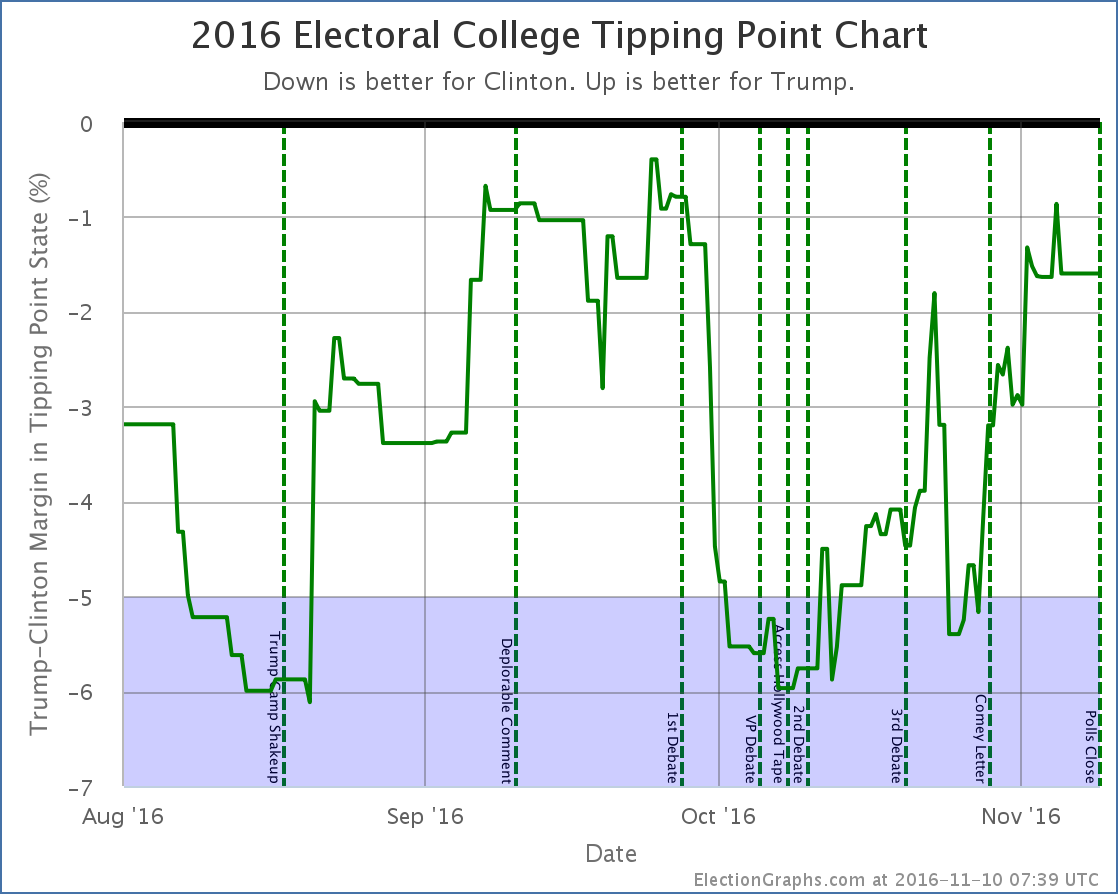
While having some sort of empirical way to define this line may be preferable, this election has shown that 5% is indeed pretty reasonable, and there are arguments that it should be even larger. (See Wisconsin again, which Trump won while my average had Clinton ahead by more than 7%.) With that in mind, lets look at the two main graphs the site provides once again:
For almost all of the last 100 days of the race, we were in the “could go either way” zone. The exceptions were short periods in August, right around the Access Hollywood tape release, and right before the Comey letter. The rest of the time we had a close race. Yes, Clinton was ahead the whole time. Yes, Trump had never actually led in my model. But we were within my own self-defined “this is close enough we can’t trust this” margin. This was a close race. And yes, there was a “ceiling” for Trump, but that ceiling was within the margin of error for this kind of model. I let myself think mostly about the center line of the model, and not as much about the “best cases”. At least toward the end of the campaign cycle. I had convinced myself based on looking at other people’s models that my best cases were probably too extreme. Perhaps useful 6 months out to reflect how much things could change over many months, but certainly too wide in the last couple of weeks or days. But even if I’d set my thresholds at 2% instead of 5%, my last couple of updates would have shown it too close to call. At 3% it would have been my last three updates. This was close by my own definition of close, and my updates minimized that. They should not have. And Trump was surging, which brings me to my next lesson: Don’t call the end of trends too soonOn the Sunday before the election my post was titled “Trump Surge Sputtering Out?“. While the next update did indicate Trump had made the race close again, that was the post full of caveats about how I didn’t really believe the data. The “looks like Trump has topped out” call was indeed premature. There was indeed mixed data. Clinton was improving on some metrics. But all within the realm that could have been noise. The overall trend was still toward Trump. There was no definitive reversal at that point, as the very next update showed, or would have if I had trusted my own data. If I had, I would have said that last update showed that the trend toward Trump had continued, and had made the race once again very close. The actual flow of the last 100 days seem really to only have a few phases:
In between those there was a bunch of movement, and I pointed out some of them as trends. Many were noise. When you are looking at a jaggy signal full of noise, it is hard to determine where to start saying something is a real trend rather than random movement. Maybe even the trends I called out above are illusions. But it is clear I should have been more conservative in calling out trends before they were dramatic enough to know with a decent amount of certainty that they were not just noise. Don’t assume trends will continue eitherNear the bottom of the trend that started with the 1st debate and ended with the Access Hollywood tape I said this on October 14th:
Now, it WAS the biggest comeback in the history of American presidential races in terms of how different the outcome was compared to polling at that time given how little time was left. And I had caveats that it wasn’t impossible. But still, that last paragraph completely dismissing the possibility of a Trump comeback was flat out wrong. It was clearly putting way too much stock in the trend at that moment, and not taking into consideration how little it would take to put Trump’s best case back into the win column. Indeed, at the time of the comment we’d just seen polls move just about 6% in Clinton’s direction in just a couple of weeks, showing that rapid movement in the polls was very possible. There was plenty of volatility. Plenty of room for movement. A 6% move in the opposite direction in the 26 remaining days should not have been dismissed out of hand. Save the “it is over” comments until it is actually over. Things can change a lot in just a small amount of time if the right things happen in the course of a campaign. And they did. Other lessonsI think those were the main lessons, but there were a few others too that will also inform my choices going forward for 2020.
ConclusionsIt would have been nice to get 56/56 again. But none of the election trackers that I follow did, and my final results were actually better than all but one of them. So on the whole, I think 2016 came off about as good as it could have given that everybody shared the same underlying data. From what I understand, even Trump’s internal polling predicted he would lose, and his win was a surprise to his own team. So I did pretty well, and I had fun. And really, I do it because it is fun for me. This site does not make me money, it costs me money. And time. Lots of time. So it is important that I have fun with it, and I did. Thank YouBut also thank you to all the people out there who have been following me. This site does not have the traffic of the “big guys” of course, but there were still a bunch of you out there. Page views for the site (including both ElectionGraphs.com proper and abulsme.com where these blog posts live) peaked at 23,097 on November 8th (UTC). Unique visitors peaked on November 9th (UTC) at 11,268. And although a few have dropped off since the election, we peaked at 2,334 likes on the Facebook page, 215 followers of the low-volume summary only @ElectionGraphs twitter account, and 405 followers of the @ElecCollPolls twitter account that tweeted out every single new poll as I added them. There were even six people who donated money to the cause through my tip jar in the time since I added it a number of months ago. A few of you have also made it over to the current events podcast Curmudgeon’s Corner podcast which I do with my cohost Ivan. If you haven’t, check it out. It is more of an opinionated discussion rather than the kind of straight “here are the facts” kind of analysis here, but we think it is fun and interesting too. These numbers are big for me, but very small compared to the professionals who do this, or even some of the other amateurs. None the less, while of course there have been trolls saying my analysis was bought and paid for by Clinton or that the numbers were made up, or whatever, there have also been quite a few people who have written in or left comments to say they really appreciate the site, or who have engaged with me in substantive discussion on the analysis or methods. I really appreciate this positive engagement. I am so glad that the site was useful and interesting to you in this election season. It makes the time and effort I spent much more rewarding than if I was simply putting this out there and nobody was looking. And of course thank you to my wife Brandy, daughter Amy, and son Alex for putting up with the many, many hours of my time that this has taken up over the last two years, and especially the last 9 months, that I probably should have been spending with them. I appreciate it so much. One last time to everybody… Thank you! There will probably be one last post in December after the electoral college meets to report on the actual official results, including faithless electors if there are any. And maybe a post looking at actual state margins vs the last polling averages in each state sometime before that. But other than those, Election Graphs will now go dormant for awhile. We’ll see you again for real once we start seeing polls for 2020! 1,436.7 days until polls close on Election day 2020. Stay tuned!
This week on the Curmudgeon’s Corner podcast Sam and Ivan start out trying to talk about things other than Trump. Thanksgiving, Puerto Rico, Apple, some books and movies… and that is well and good. But of course then they do talk about the latest week full of Trump developments as the transition continues. Then they wrap up with Jill Stein’s recount campaign, the electoral college, and other ways of messing with election results that either won’t happen or won’t change anything. Click below to listen or subscribe… then let us know your own thoughts!
Show Details: Recorded 2016-11-25
The Curmudgeon’s Corner theme music is generously provided by Ray Lynch. Our intro is “The Oh of Pleasure” (Amazon MP3 link) Our outro is “Celestial Soda Pop” (Amazon MP3 link) Both are from the album “Deep Breakfast” (iTunes link) Please buy his music and support his GoFundMe. |
||