This is the website of Abulsme Noibatno Itramne (also known as Sam Minter). Posts here are rare these days. For current stuff, follow me on Mastodon

Categories

Calendar

Electoral College: Change to handling of polls with multiple results

States with new poll data added since the last update: None, this isn’t that kind of update. Instead of new data, there is a change to how averages are calculated.

TL;DR

I changed the details on the way the poll averages are calculated to prevent pollsters who release multiple results on the same poll from having an outsized influence on the average. This changed the overall national summary as follows:

  • Trump’s best case improved from winning by 4 electoral votes to winning by 24 electoral votes, since Wisconsin now looks like a close state that Trump has a shot in.
  • The tipping point moved from Clinton by 4.0% in NH to Clinton by 4.4% in OH as the average moved a little toward Clinton in Ohio.
  • Clinton’s best case improved from winning by 226 electoral votes to winning by 248 electoral votes since Arizona once again looks like a close state that Clinton has a shot in.

The changes also modified the shape of the historical graphs a bit. Details follow for those who are interested.

The Problem

The issue is that sometimes pollsters release multiple results from a single underlying poll sample. For instance they will give results when only the two major party candidates are mentioned, but also results if respondents are also asked about third party candidates. Or they will release both “registered voter” and “likely voter” results. Or other variants.

In the interest of simplicity and a bias toward including as much data as possible, when this happened, I included all of the different results a pollster released, and just threw them into the average as if they were completely independent results.

But of course they are not.

Since the same underlying sample was used, the results are often much more similar to each other than separate polls tend to be. So I was essentially giving extra weight to pollsters who tended to release multiple results. This has the effect of making the averages more volatile than they would be otherwise, since effectively I’d be really using fewer data sources to determine the average rather than the normal minimum of five.

In some cases pollsters were even starting to release four separate results, which since I generally use five poll averages could mean that four of the five polls in the average came from the same sample. In other cases almost every poll in a state included multiple results. It was clear this was having an impact and I would probably have to change something.

The Solution

I considered a number of possible ways to address this over the last couple months. Over the last few weeks I have also been engaging with a number of Election Graphs readers about this issue and the possible solutions via the comments on this site, email, and even by phone in one case. You can see some of this discussion in the post here.

In the end I selected a solution where I weight these types of results so that if a poll includes two different variants, each of those results count as half a poll, both for the averaging itself and for determining which polls to include in the average. If the poll released three variants, each would count as a third of a poll, if they release four, each would count as a fourth, etc.

Using Iowa as an example:

Screen Shot 2016-08-31 at 19.57.17

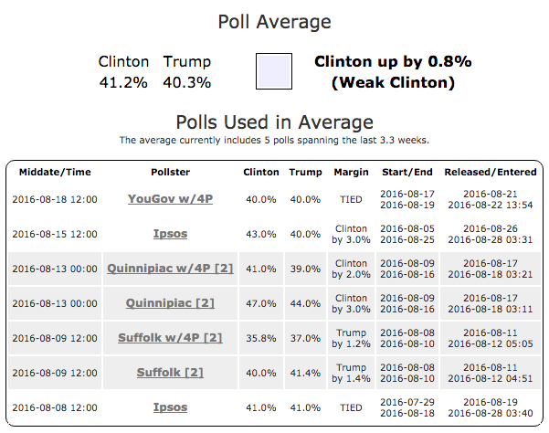
Quinnipiac and Suffolk released two results each, one with just the two major candidates, one with Johnson and Stein also added into the question. The polls in question get a grey background to highlight that they are being weighted. The more variants a poll has, the darker the grey. The number in [] indicates how many variants were in that poll. The summary still says this is an average of five polls, as each of the Quinnipiac and Suffolk variants count as half a poll in the averaging.

chart (130)

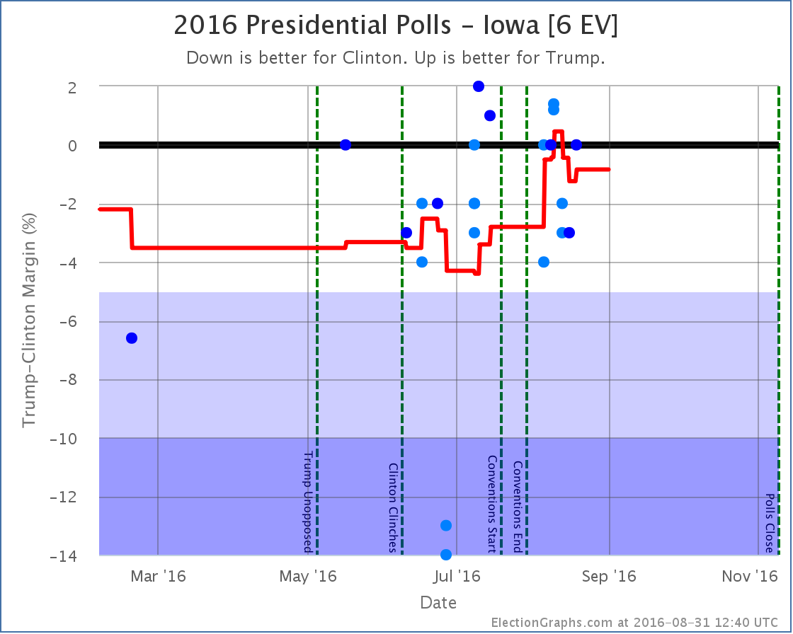
The graphs also change the color of data points that are weighted in this way. The lighter the color of blue, the less weight to the data point. This makes it as clear as possible when viewing these charts that some of the data points count more than others.

The Impact

Obviously any change to the way in which averages are constructed will cause those averages to be different. There are any number of choices made on this site that would have similar impact. As an example, the choice of five poll averages rather than using six polls or four polls. The general picture wouldn’t be expected to change much, but some details will.

In this case there were three states that changed in ways that caused an adjustment to the national summary. For each of these I’ll show an animation of the state chart before and after the change. The frame of the animation that includes lighter blue dots is the new version of the chart.

Ohio [18 EV]

OHChangeReview

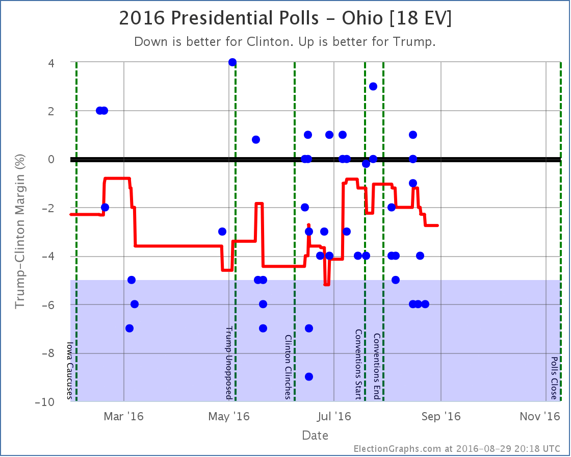
Ohio moved from a 2.8% Clinton lead to a 4.4% Clinton lead, a 1.6% move toward Clinton. Ohio is classified as “Weak Clinton” either way, but this changed the tipping point. This also eliminated a brief period earlier in the year when Ohio had been “Strong Clinton”.
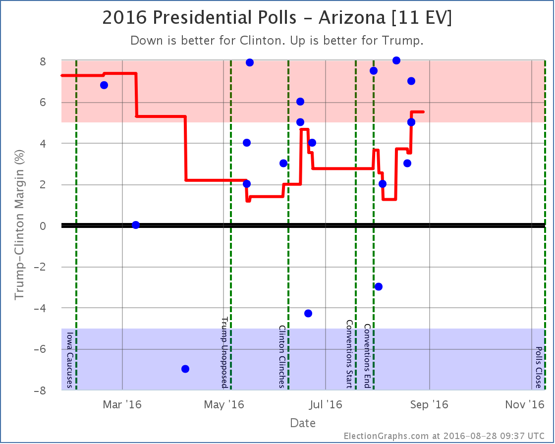
Arizona [11 EV]

AZChangeReview

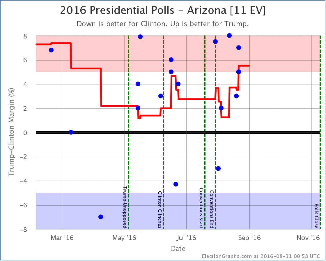
Arizona moved from a 5.5% Trump lead to a 3.1% Trump lead, a 2.4% move toward Clinton. This undid the recent Arizona move from “Weak Trump” to “Strong Trump” and improved Clinton’s best case from winning by 226 electoral votes to winning by 248 electoral votes since Arizona now once again looks like a close state that Clinton has a shot in.

Wisconsin [10 EV]

WIChangeCompare

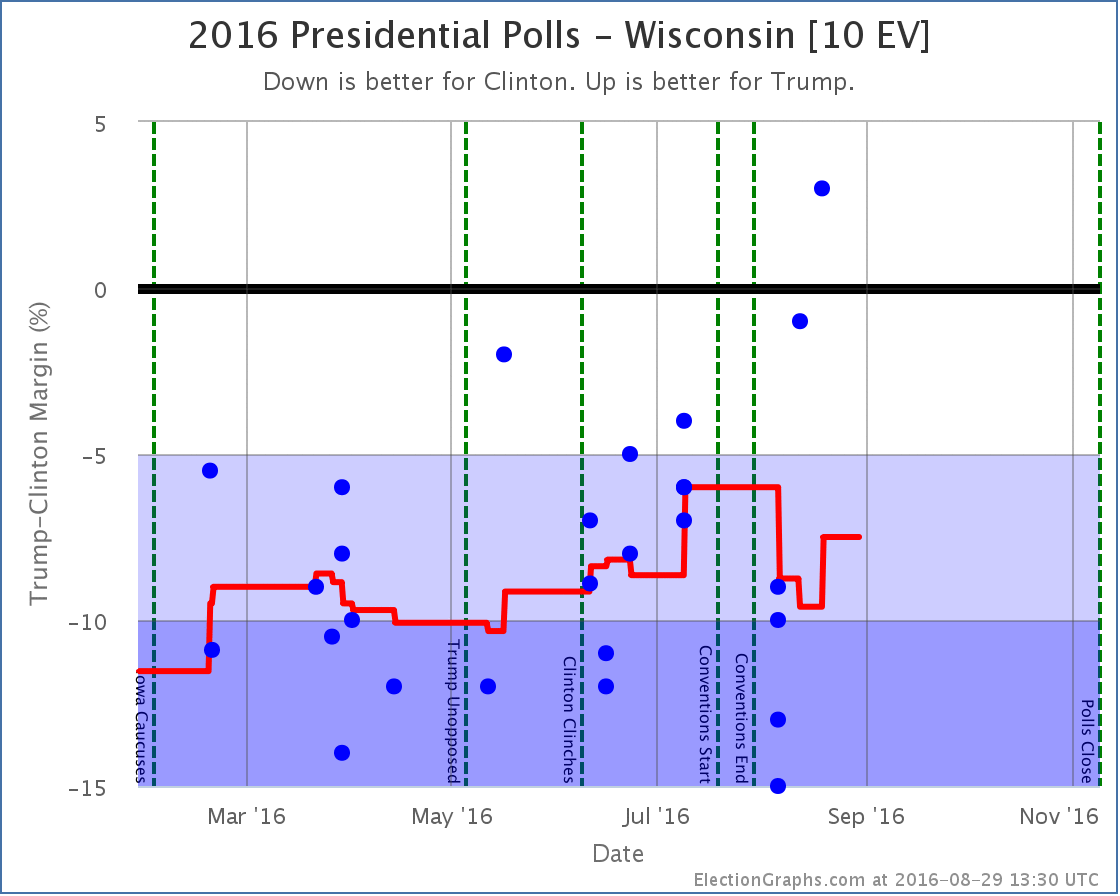
Wisconsin moves from a 7.5% Clinton lead to a 4.8% Clinton lead, a 2.7% move toward Trump. This moves Wisconsin from “Strong Clinton” to “Weak Clinton”, putting the state in play for Trump and improving his best case from winning by 4 electoral votes to winning by 24 electoral votes.

Other states

A number of other states were impacted by the change in how averages are constructed, but did not do so in ways that in turn changed the national summary. These were:

  • California [55 EV]: Clinton 28.6% -> Clinton 28.3% (0.3% toward Trump)
  • Texas [38 EV]: Trump 10.0% -> Trump 10.3% (0.3% toward Trump)
  • Florida [29 EV]: Clinton 1.3% -> Clinton 2.0% (0.7% toward Clinton)
  • New York [29 EV]: Clinton 21.7% -> Clinton 19.8% (1.9% toward Trump)
  • Pennsylvania [20 EV]: Clinton 7.3% -> Clinton 7.1% (0.2% toward Trump)
  • Georgia [16 EV]: Trump 0.8% -> Trump 0.8% (Historical graph change only)
  • Michigan [16 EV]: Clinton 5.4% -> Clinton 5.5% (0.1% toward Clinton)
  • North Carolina [15 EV]: Clinton 1.2% -> Clinton 1.8% (0.6% toward Clinton)
  • New Jersey [14 EV]: Clinton 15.0% -> Clinton 12.7% (2.3% toward Trump)
  • Virginia [13 EV]: Clinton 10.6% -> Clinton 11.2% (0.6% toward Clinton)
  • Washington [12 EV]: Clinton 16.0% -> Clinton 14.4% (1.6% toward Trump)
  • Massachusetts [11 EV]: Clinton 17.7% -> Clinton 18.8% (1.1% toward Clinton)
  • Colorado [9 EV]: Clinton 8.3% -> Clinton 8.4% (0.1% toward Clinton)
  • South Carolina [9 EV]: Trump 2.0% -> Trump 3.2% (1.2% toward Trump)
  • Connecticut [7 EV]: Clinton 7.6% -> Clinton 7.4% (0.2% toward Trump)
  • Iowa [6 EV]: Clinton 0.9% -> Clinton 0.8% (0.1% toward Trump)
  • Mississippi [6 EV]: Trump 15.2% -> Trump 13.0% (2.2% toward Clinton)
  • Nevada [6 EV]: Clinton 1.8% -> Clinton 1.8% (Historical graph change only)
  • Utah [6 EV: Trump 12.6% -> Trump 10.9% (1.7% toward Clinton)
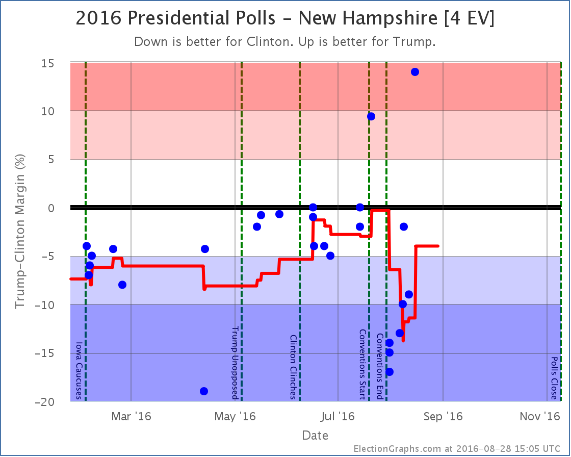
  • New Hampshire [4 EV]: Clinton 4.0% -> Clinton +4.0% (Historical graph change only)
  • Alaska [3 EV]: Trump 10.8% -> Trump 12.3% (1.5% toward Trump)
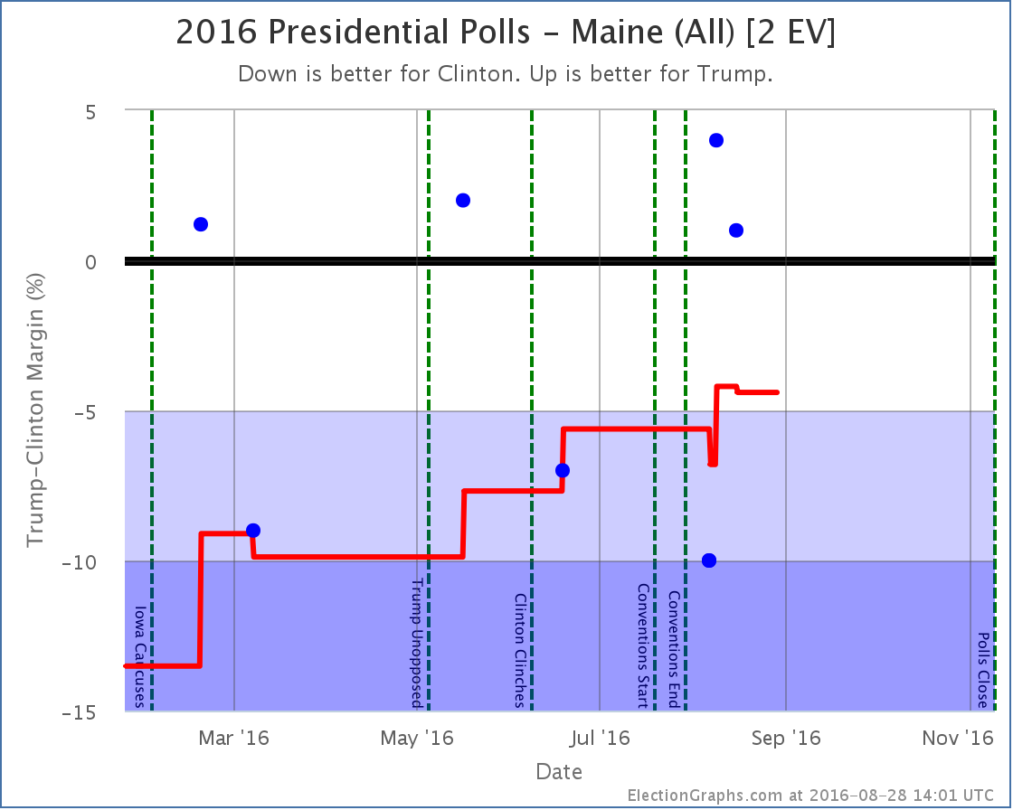
  • Maine-All [2 EV]: Clinton 4.4% -> Clinton 2.0% (2.4% toward Trump)

If anybody is interested in the before/after animations for any of these states, ask me. It would have been too much to include them all here in this post.
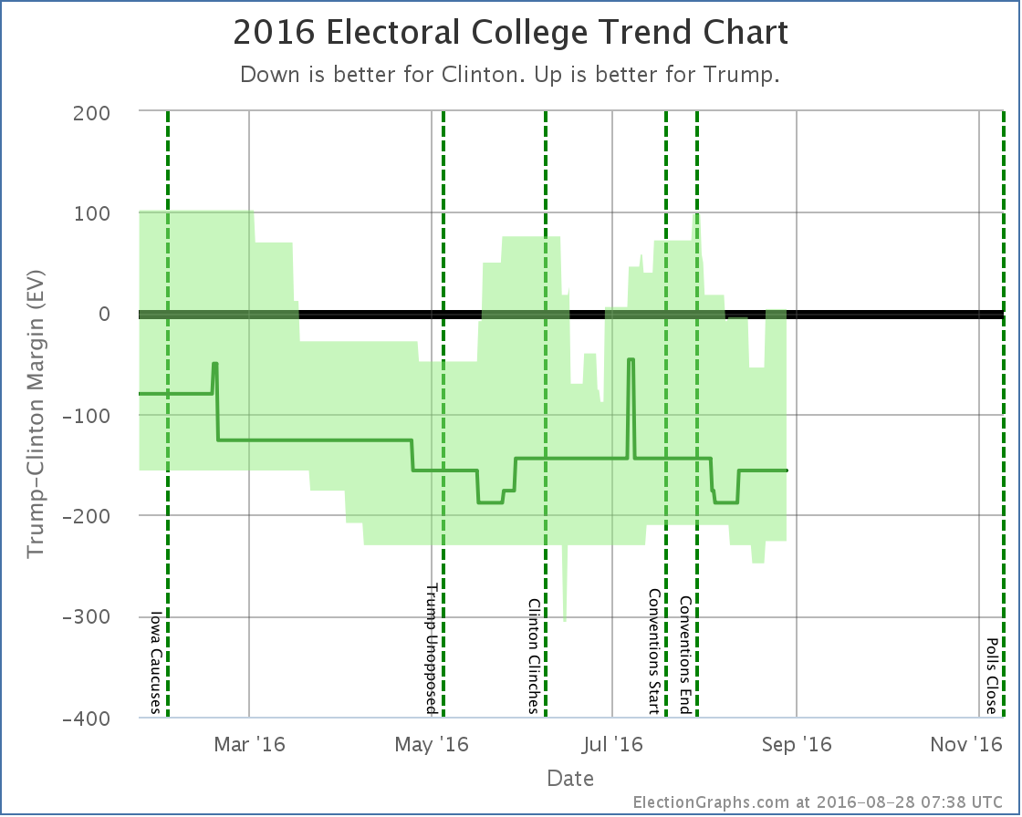
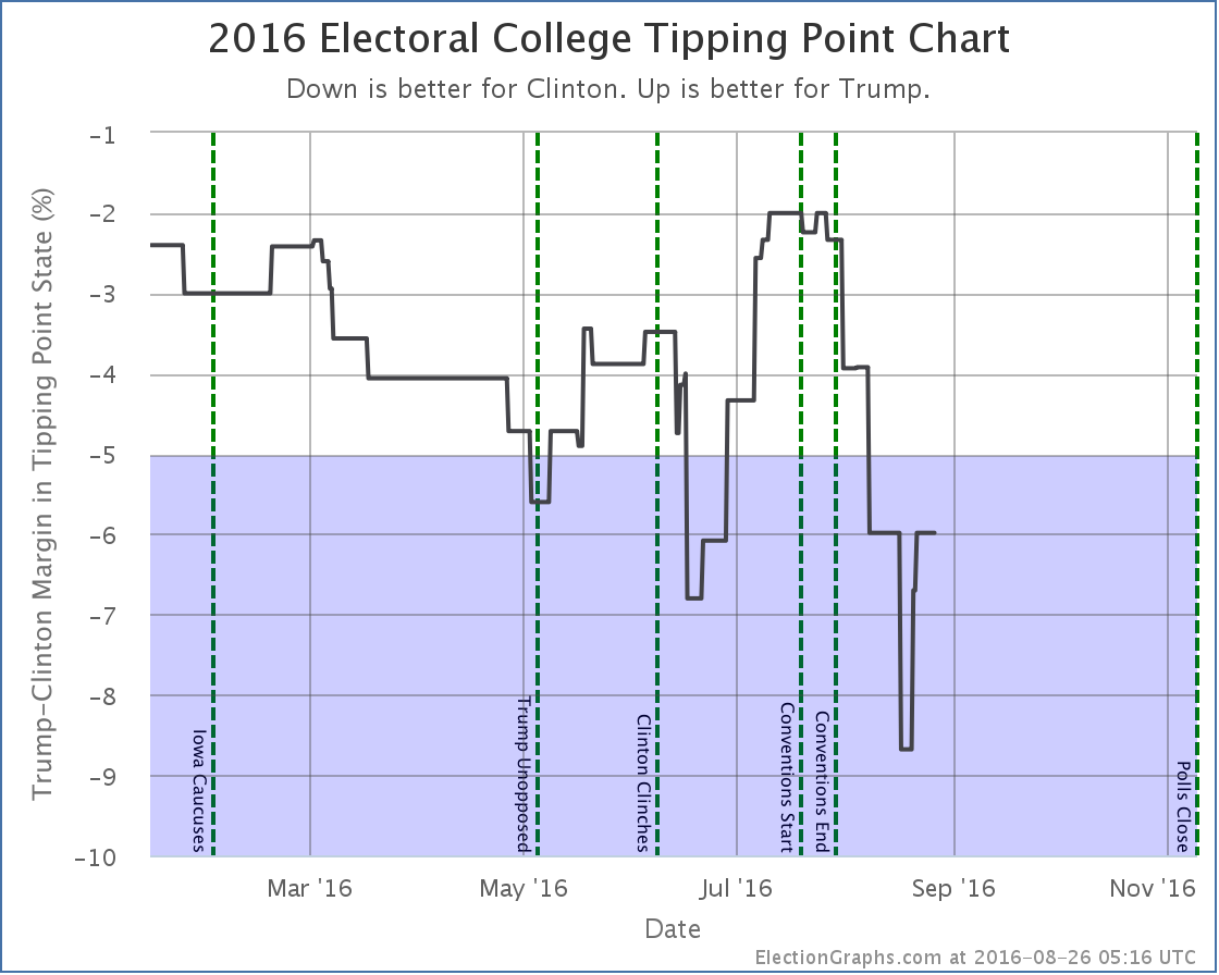
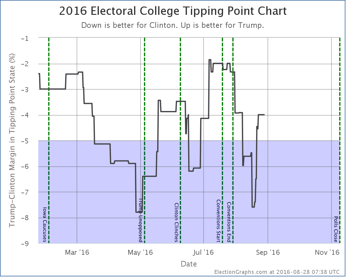
National View

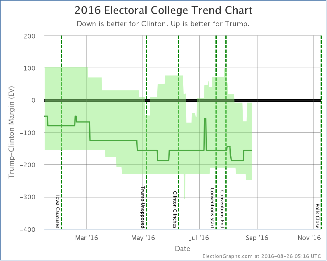
The changes in all these states of course changed the two national graphs as well. The versions with data a little further to the right are the “after” frames.

BubbleChangeFixed

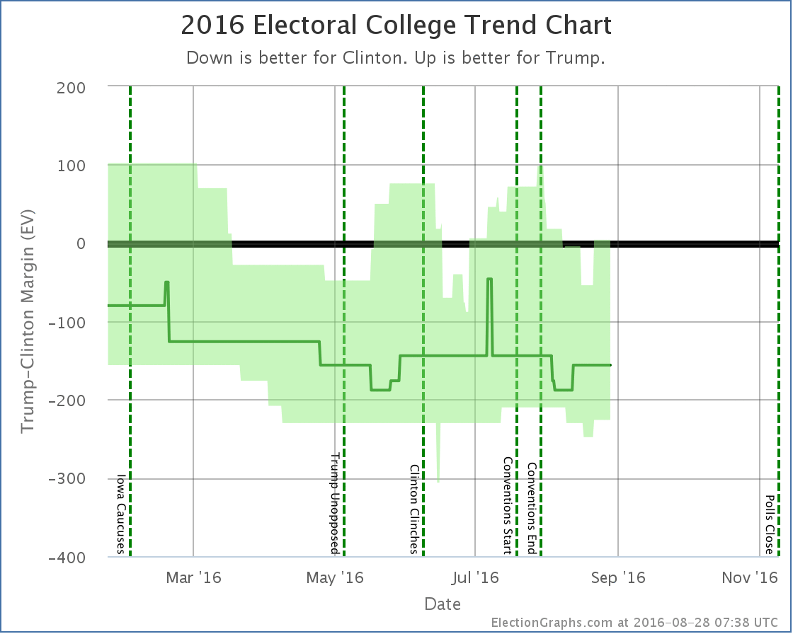
The overall shape of the electoral college trend chart is similar before and after, although Trump’s best case is now a bit better off in the time between Clinton clinching and the start of the conventions. The brief July spike toward Trump in the expected case also disappears. And of course both candidate’s best cases improve a bit at the current time.

TippingChangeFixed

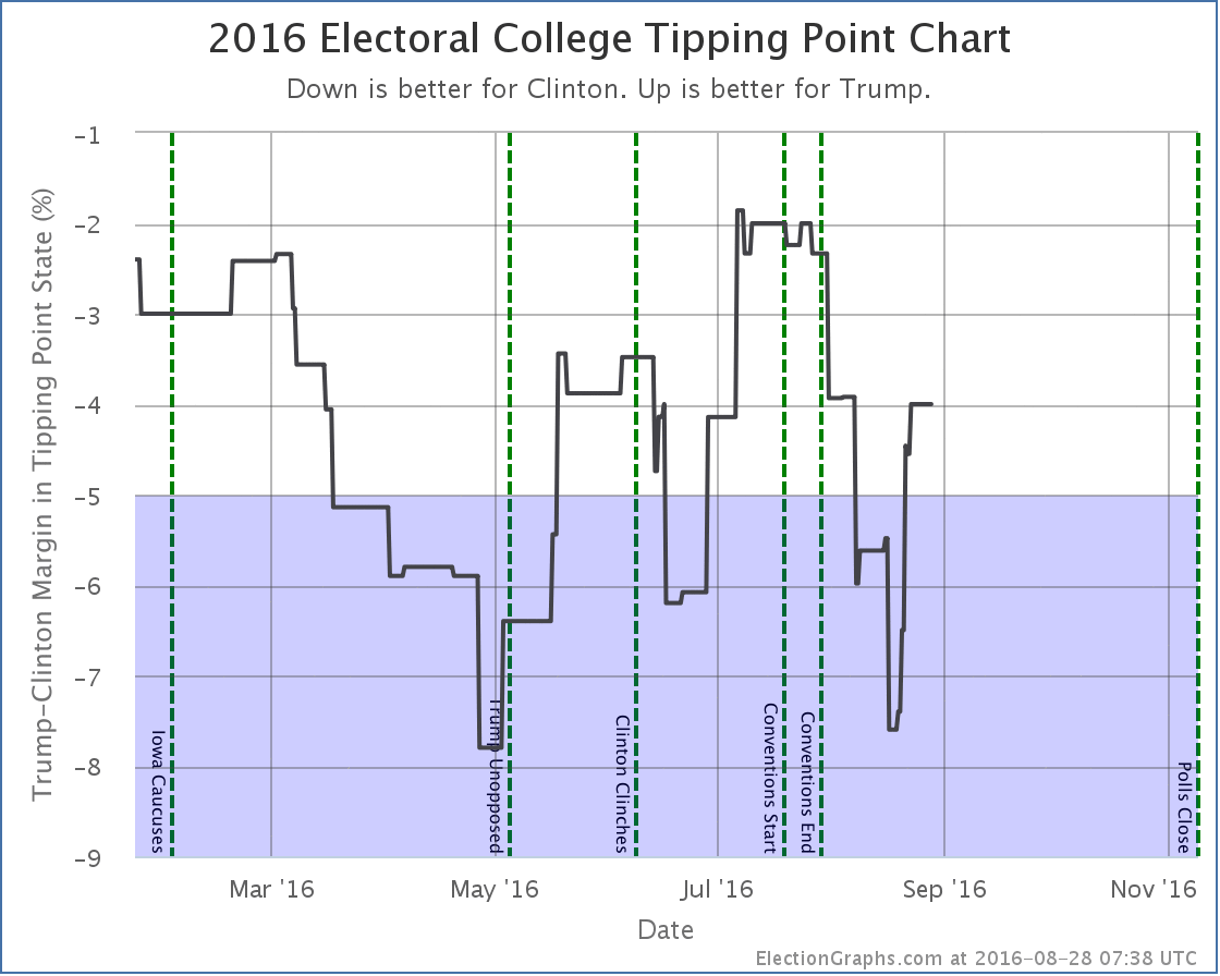
The main impact on the tipping point chart seems to have been to mute the extremes. The high in July wasn’t quite as high, the low in August wasn’t quite as low.

The map view would have changed too of course, but unfortunately I did not save off a “before” version of the map, so couldn’t produce a nice animation. The graphs above tell the story nicely though I think.

In the end, while I think this correction was important to make, it doesn’t significantly change much in the national view, or the narrative of this campaign. Trump has been behind the entire race. At times he has been able to make it a bit closer, but then seems to fall back again. Electoral college wise Clinton seems to be bouncing between winning by 144 electoral votes and winning by 188 electoral votes in the “expected case”. The range between the best cases is wider and a bit more volatile, and usually includes a narrow Trump win as a possibility, but often does not. On the tipping point, Trump’s ceiling seems to be about a 2.5% Clinton lead, and his floor seems to be about an 8% Clinton lead.

All in all, with these bookkeeping changes in place to stop giving extra weight to some pollsters, the race looks even more stable than it did before. Yes, things bounce around a bit, but fundamentally we’re in basically the same place we have been since mid-May with only minor changes.

We can and will continue to talk about the ups and downs day to day and week to week, but absent something really big happening, this race looks like it doesn’t want to budge much.

69.1 days for that to change.

Note: This post is an update based on the data on ElectionGraphs.com. Election Graphs tracks both a poll based estimate of the Electoral College and a numbers based look at the Delegate Races. All of the charts and graphs seen in this post are from that site. Additional graphs, charts and raw data can be found there. Follow @ElectionGraphs on Twitter or like Election Graphs on Facebook to see announcements of updates or to join the conversation. For those interested in individual general election poll updates, follow @ElecCollPolls on Twitter for all the polls as they are added. If you find the information in these posts interesting or useful, please consider visiting the tip jar.

@ElecCollPolls tweets from 2016-08-30 (UTC)

@abulsme tweets from 2016-08-30 (UTC)

@ElecCollPolls tweets from 2016-08-29 (UTC)

  • 01:33:55 Changing averages to re-weight polls that report multiple results going faster than I expected. See change in CA: https://t.co/gCYq0oZsfT
  • 01:37:55 The CA change is live on the CA page & summary page. Next up will be checking a state where this changes the model. https://t.co/fkUUZh06oC
  • 02:06:20 CA/NY/MA now reflect the new logic. Going from most Dem to most Rep. No category changes yet. But breaking for dinner now. :-)
  • 06:52:24 Got to the first state (VA) where the logic change adjusts the historical bubble. Current state not changed yet. https://t.co/xUzv60lSov
  • 06:53:38 VA also changed the tipping point historical chart, although again not the current value. https://t.co/sftru5nLqD
  • 08:02:13 Everything on the spectrum from DC to OR, plus CT, is now using the new logic. 38/56 still 2 go, but I gotta call it a night. More tomorrow.
  • 16:04:20 Clinton vs Trump state category change: WI has moved from Strong Clinton to Weak Clinton https://t.co/pkgMxm1hVm
  • 16:17:12 Trump best case vs Clinton has changed: Clinton 267 to Trump 271 -> Clinton 257 to Trump 281 https://t.co/7LW0cbJldN
  • 16:25:59 The move of Wisconsin to the new rules was the first to actually change the current assessment. Bubble change: https://t.co/zJqQcRMW9C
  • 16:37:33 OK, DC to CT on the spectrum, plus WI, now using the new logic. But I have to go to the day job now. More tonight. https://t.co/FfatJxjqj1

@abulsme tweets from 2016-08-29 (UTC)

@ElectionGraphs tweets from 2016-08-28 (UTC)

@ElecCollPolls tweets from 2016-08-28 (UTC)

@abulsme tweets from 2016-08-28 (UTC)

Electoral College: Trump Bouncing Back

States with new poll data since the last update: Florida, Illinois, Pennsylvania, New Hampshire, Ohio, North Carolina, Nevada, New York, Texas, California, New Jersey, Minnesota, Georgia, North Carolina, Indiana, Arizona, Missouri, Massachusetts, Virginia, Tennessee, Washington, Michigan, Wisconsin, Mississippi, Oklahoma, Idaho, Maryland, Oregon, Maine (All), Louisiana, Colorado, Iowa, Nebraska (All), South Carolina, Alabama, West Virginia, Kansas, Kentucky, Utah, Arkansas, Connecticut, Delaware, New Mexico, Montana, Alaska

Wow, that is a lot of new polls. While there were some others, the big influence today is that Reuters/Ipsos has started to do a weekly nationwide tracking poll where they provide state breakdowns for any state where they have enough data. So from now until the election we should start getting regular data on a lot of states that usually don’t get polled.

As usual, most of the updates didn’t change the status of the model, but a few did, and all of these moves this time were toward Trump. Lets take a look state by state:

Arizona [11 EV]

chart-259

Ever since April Arizona has been looking like a possible target for Clinton… Trump ahead, but with only a narrow lead that Clinton might be able to flip. With the latest updates, Trump’s lead in the average increases to 5.5%, so we take it out of that category. The notion of a blue Arizona slips away from Clinton.

New Hampshire [4 EV]

chart-260

Honestly, it looks like an outlier, but the most recent of those Reuters/Ipsos results I mentioned show Trump with a huge 14% lead in New Hampshire. The second best number in the average shows Clinton up by 2%, and that is also from Ipsos. All the other recent numbers in New Hampshire show a Clinton lead of at least 9%, and there has been no radical change in the campaign that would indicate a huge swing would be expected.

If these two Ipsos data points are really outliers, then new polls should quickly show that. For the moment though, the average moves to only a 4.0% Clinton lead due to the two Ipsos data points, so New Hampshire is once again categorized as a state Trump has a chance in.

Maine (All) [2 EV]

chart-261

Maine has been pretty sparsely polled this Election cycle, but what polls we do have show the state trending away from being a solid blue state to being close. The latest couple of results (both Ipsos) have Trump ahead, as have a few previous polls. The average is now only a 4.4% Clinton lead, so Maine is now in the “Weak Clinton” category, and it is included in Trump’s best case.

Now, Maine is one of the two states that splits electoral votes. For winning Maine at large, you only get 2 electoral votes. You then get 1 electoral vote for winning each congressional district. Now, mathematically, for Maine as a whole to have a 4.4% lead for Clinton, Trump would have to be doing even better than that in one of the two congressional districts. But right now the average in CD-1 is a 15.8% Clinton lead and in CD-2 it is a 5.3% Clinton lead. That can’t be! You would expect CD-2 to be Weak Clinton as well, or possibly even Weak Trump.

The problem is that while there has been very limited polling of Maine as a whole, there has been even less polling of Maine at a Congressional District level. There has only been ONE poll of Maine CD-2 this election cycle. It was in June and showed Trump up by 1%. The average is 5.3% Clinton because in order to fill out the average when there are less than five polls, I use previous election results.

New polling in Maine CD-2 is currently what I classify as the “Most Needed Poll” (followed be NE-2, NE-1, ME-1 and SD). Right now we don’t have enough polling evidence to show that CD-2 is actually Weak Clinton or Weak Trump rather than Strong Clinton, but given where Maine as a whole is, the ME-2 electoral vote has to be a possible pick up for Trump too, but it won’t be categorized that way here until there are enough polls backing that up directly.

National View

Before showing the new national trend chart and tipping point charts, a quick note. In addition to the new polls added in the most recent batch, I found a handful of older polls that I had somehow missed earlier in the year. These don’t change the current picture, but they change the past. Specifically, Trump’s position in the spring was significantly weaker than it looked at the time, mainly because Florida would have slipped out of his reach significantly earlier.

To be transparent on this change, rather than just show the new charts, I’ll show the before and after due to today’s update. First the trend chart as it appeared on Election Graphs as of the August 26th update post:

chart-245

And here it is now:

chart-262

Note that in addition to the bumps upward in Clinton and Trump’s current best cases, Trump’s best case in the spring is significantly depressed, enough so that his best case moved from a narrow win in most of April to a narrow loss. There are some other subtle differences between these two caused by the addition of these old polls I had missed at the time, but that is the big one, caused essentially by one March poll in Florida that I did not see until August. Apologies for that.

The difference in the tipping point graph is even more dramatic, with Florida worse for Trump than it previously looked, there was a lot more room for the tipping point to wiggle, and it was a lot worse during the spring than it looked.

Here is the before picture of the tipping point graph from the August 26th update post:

chart-246

And here is the tipping point graph now:

chart-263

Again the main impact is that the “missing polls” that I added make it clear that Trump was significantly worse off in the spring than I had shown at the time. In fact, it means that at the end of April he was actually below his recent bottom in mid-August.

There were only a handful of polls missed, but this goes to show that even with poll averaging, individual polls in critical states can make a big difference in the overall picture. (Especially when they appear to be outliers, such as the one Florida poll I missed that made the biggest difference. Oops.)

OK, enough hand wringing about things that may have been missed in the spring.

The big current news on the tipping point is that with changes in the averages in Michigan, New Hampshire, and Ohio, the tipping point comes roaring back in Trump’s direction. In this update it moves from a 6.0% Clinton lead in Connecticut to a 4.0% Clinton lead in New Hampshire, but this is a full 3.6% swing toward Trump since his low of 7.6% about 10 days ago.

Now, everything above still shows a Trump loss, but it is looking a lot closer than it did a couple weeks ago. The first part of August was disastrous for Trump, but he has been bouncing back since then. He is still very far behind, but maybe his latest reworking of his campaign is working. His best case is once again to win, although by a very narrow 4 electoral vote margin.

Will the recent trend continue and make this race look even closer? 72.2 days left for him to do it.

Notice on Methodology: In my August 13th update I solicited opinions on possibly changing how this site deals with the case when a pollster releases multiple results from a single poll. See the discussion in that comment thread for more details. Immediately after this post goes live I will be working to change the site logic so that if two results are released from a poll, each counts as only half a poll for purposes of the averages here. Similar logic will apply to tracking polls where samples overlap, but not completely, with polls weighted to reflect the fraction of the new result that is actually from a fresh sample.

As examples of the impact this could have, the three states mentioned in this post would change as follows: Arizona is a 5.5% Trump lead (Strong Trump) with the current logic, it would be a 3.9% Trump lead (Weak Trump) with the new logic. New Hampshire would move from a 4.0% Clinton lead (Weak Clinton) to a 8.4% Clinton lead (Strong Clinton). Maine (All) would move from a 4.4% Clinton lead (Weak Clinton) to a 3.7% Clinton lead (Weak Clinton). With these three examples, two of the changes favor Clinton, and one favors Trump.

At this point I will not be adding new polls to the averages until the math changes are complete and I have reported on the results with a blog post. (Unless my revisions fail and I’m forced to reschedule for another weekend.)

[Note added 21:39 UTC – Actually, as I’m starting in, I realize that tracking polls have a bunch of extra complications that multiple results in a single poll don’t have, so I’ll leave them alone and treat them as if they were completely independent for now. Without weighting tracking polls, the changes above would now be: AZ Trump +5.5% -> Trump +3.1%, NH Clinton +4.0% -> Clinton +4.0% (No change), ME-All Clinton +4.4% -> Clinton +2.0%.]

Note: This post is an update based on the data on ElectionGraphs.com. Election Graphs tracks both a poll based estimate of the Electoral College and a numbers based look at the Delegate Races. All of the charts and graphs seen in this post are from that site. Additional graphs, charts and raw data can be found there. Follow @ElectionGraphs on Twitter or like Election Graphs on Facebook to see announcements of updates or to join the conversation. For those interested in individual general election poll updates, follow @ElecCollPolls on Twitter for all the polls as they are added. If you find the information in these posts interesting or useful, please consider visiting the tip jar.

@ElectionGraphs tweets from 2016-08-27 (UTC)