[tube]xn6ZqHPu-Mg[/tube]
[tube]xn6ZqHPu-Mg[/tube]
|
[tube]xn6ZqHPu-Mg[/tube] 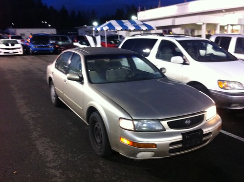 We had to take one last drive in the Maxima since to get the trade in it had to drive into the dealer’s lot. This is a picture right as Brandy was handing over the keys. Seconds earlier it had been billowing thick clouds of white smoke. But it made it! 
Done. She will be driving it home momentarily. Looks like Brandy’s 1995 Nissan Maxima with 246k miles on it now needs an expensive repair that may or may not actually completely fix the problem. If it doesn’t fix it then actually fixing it would most likely cost significantly more than the car is worth. So we are car shopping. Right now Brandy is looking at a 2007 Volkswagen Passat 2.0T Wagon and is really excited about it. Test drive coming after we eat lunch. If she likes it we may end up with it. We shall see.
 Well, not that happy a turkey, since we’re about to eat it. Oh well!
So, back to a physical book again. This one was part of the spoils from going to Tufte’s Lecture back in June. All the attendees got his four major books, of which this, The Visual Display of Quantitative Information is the first. Since I went to the lecture for work, this is on my work non-fiction list. Of course, I’d seen this book around and heard about it for many many years. I remember talking to colleagues about this book way back when I first started doing web and internet related stuff in the 90’s. That would have been the first edition of course. What I read now is the second edition, but I gather the changes were more in terms of corrections and improvements to images and such, rather than fundamental changes to the content. Tufte’s books been, and especially this one, have been held up essentially as bibles for good visual information design. Having now seen his lecture and read the first of his books, my initial impression is that while he certainly makes a number of good points, especially when it comes to things that are routinely done badly and which should be avoided, he falls down a bit in terms of his positive suggestions for new sorts of presentations. It seems that perhaps he is a little overhyped. Of course, there is also the possibility that it only seems that way because many of his recommendations have become so widely regarded over the years that when you hear them now you think “Well, duh! How could anyone think otherwise?” whereas when he first articulated his ideas they were a brand new perspective. I think this is quite likely. Of course, his major complaint is with information graphics that are full of what he calls “chart junk” or misrepresentations. Basically decorative elements that add no information and often detract from understanding the data, or choices of graphical treatment that leave a casual viewer with an incorrect impression of the data. He gives many examples of these sorts of bad usages. The core message is to strip away the extraneous elements and concentrate on the data itself, and then be extremely careful to show that data in a way that highlights the important aspects of the data honestly. This is excellent core advice. He does get a little too sparse in some cases though, or recommends presentations that he himself says may stray into “puzzle” territory, where the person looking at the chart has to figure out what some of the new conventions mean. I suppose some of this just has to do with being used to the standard conventions. But in some cases I think it is just a case of taking good general principles a bit too far. For instance, remove the frame and gridlines around many plots. Now, certainly gridlines should be light enough to not interfere with looking at the data, but I like having them damn it, and the frame separates out the data from whatever is surrounding it. Yes, I get they may not be completely necessary, but I actually think they help in many cases. Oh, and of course Tufte introduced sparklines. These can be useful in certain contexts, but I generally don’t like them. There. I got my curmudgeonly bit out. In any case, this is a classic on these topics, and well worth reading. Even if you don’t buy into every last bit of what Tufte is saying, the general principles are right on the money and worth considering whenever you are trying to present any quantitative data graphically. [tube]3-mpkK8XfIg[/tube] |
||||