New polls since last update: Florida, Iowa, Michigan, North Carolina, Ohio, Pennsylvania, Virginia.
This is the fourth day in a row where there have been changes to the Election Graphs model based on new polling. That is quite a bit! The pace of polling is accelerating as we approach the conventions.
The new additions today that caused changes were all from a series of swing state polls released by Ballotpedia. The Ballotpedia results look very bad for Trump. In terms of the Election Graph model, Pennsylvania, North Carolina and Virginia all jumped into categories more favorable to Clinton, and the movements in Ohio and Pennsylvania contributed to a move in the tipping point toward Clinton.
All in all, the net result is that once again even if Trump were to win all the states he is ahead in, plus all the states where he is less than 5% behind, he would still lose. As recently as yesterday I said that Trump was up or flat from one and two months ago on all four metrics tracked here. Today’s results flip that overnight. Trump is now DOWN or flat on all four metrics when compared to either one or two months ago. Perhaps these polls will turn out to be outliers, but for the moment, Trump’s position looks much weaker than it did… and it was pretty weak to start with.
Lets go over each of states that shifted the model. Although just released, these polls covered June 10 to June 22, so the changes show up on the charts on the midpoint, June 16th. So the shape of the charts over the last couple weeks is modified, not just the very end of the charts.
Pennsylvania
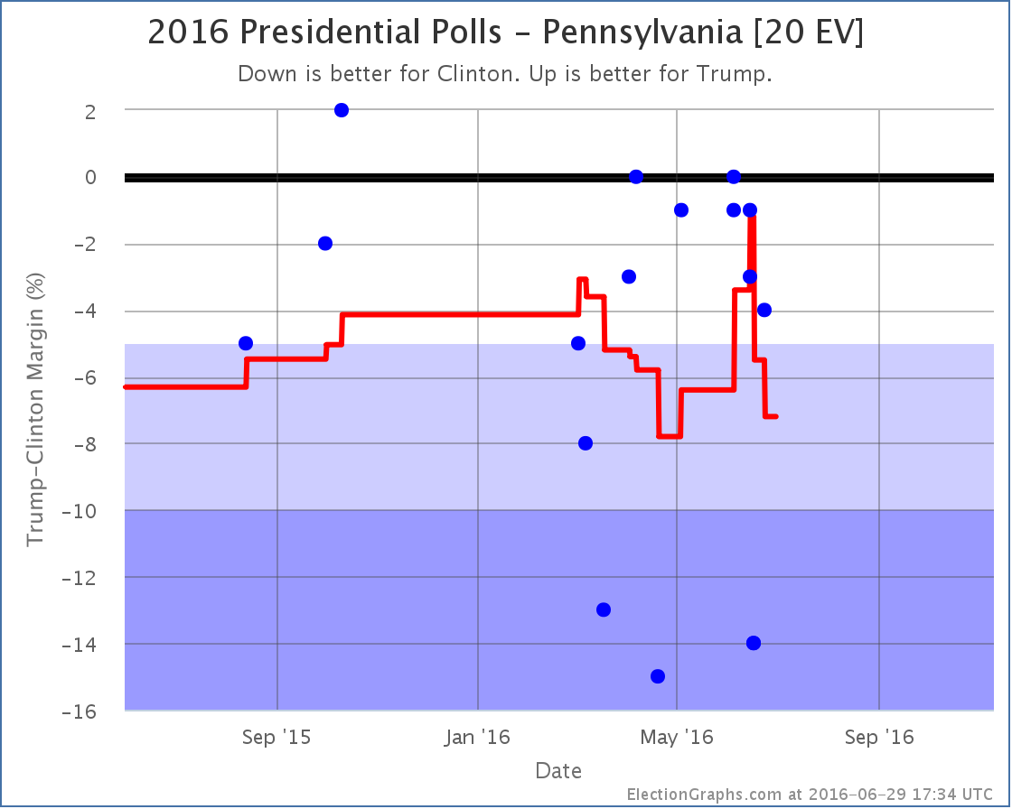
A series of relatively good polls for Trump that showed Pennsylvania close had resulted in a nice spike toward Trump. But with the new polls from Ballotpedia (one including Johnson, one with just Clinton and Trump, both showing a 14% Clinton lead) the average again moves dramatically toward Clinton, now showing a 7.2% Clinton lead.
Now, it is clear that the new polls are dramatically different than the other recent polls, so the possibility that they are not really representative can’t be thrown out. On the other hand, they are still within the very wide range we have seen polls over the past few months. Election Graphs includes all polls in the average and lets the average wash it out. If Ballotpedia is not representative of the “real” trend, new polls should show that before very long.
For the moment though, Pennsylvania moves to “Strong Clinton” and is no longer included in Trump’s best case.
North Carolina
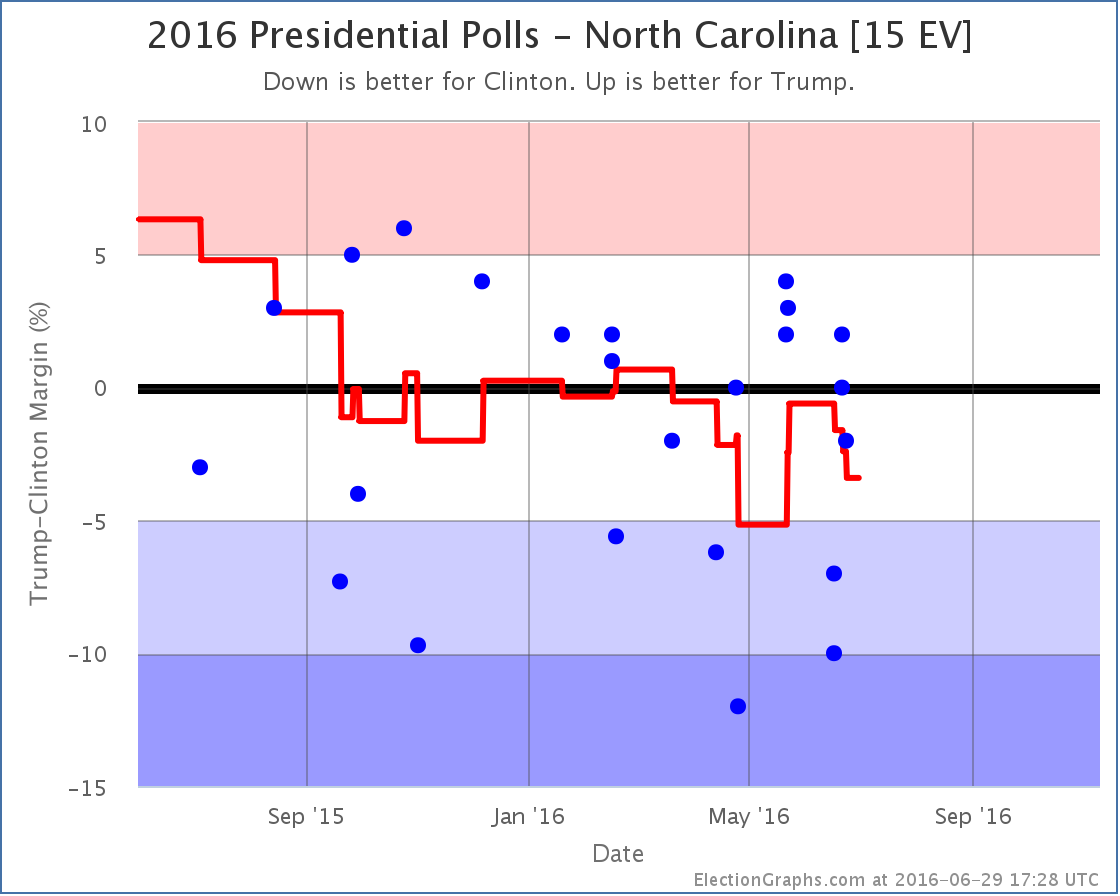
In North Carolina the two Ballotpedia polls (Clinton leading by 7% and 10%) not only pull North Carolina from Weak Trump to Weak Clinton, but because these polls covered a time period before the recent upward movement by Trump it actually completely erases that brief period in the red zone for North Carolina. Clinton now leads by 3.4% and North Carolina is back on the blue side of the ledger.
Virginia
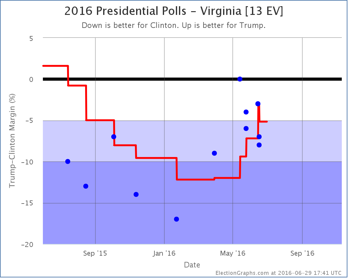
Virginia is also a state where Trump had made the state close, but the new polls wipe that out. Here the new Ballotpedia polls show Clinton ahead by 7% and 8%, and the new average is Clinton by 5.2%. This takes Virginia back out of Trump’s list of potential pickups and further damages his “best case”.
Ohio
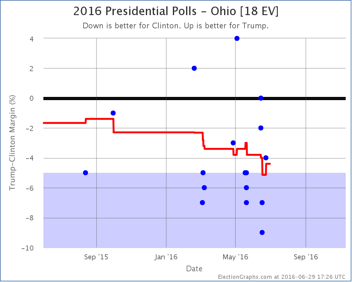
The new Ballotpedia polls (Clinton by 7% and 9%) actually briefly moved Ohio into the “Strong Clinton” category, but since there was already a later PPP poll (Clinton by 4%) there is no net category change in today’s update. The movement in Ohio, along with the movement in Pennsylvania, both contributed to the change in the tipping point though.
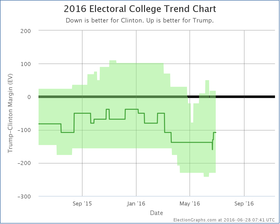
National Picture
So where do all these changes put the national picture?
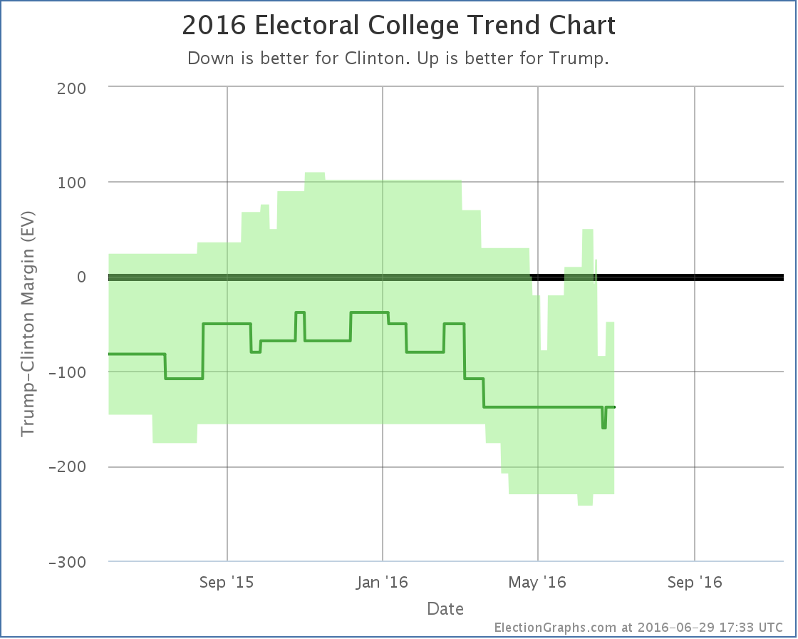
The most recent move on this chart is actually an upward movement toward Trump. This is Ohio moving back to “Weak Clinton” after the brief period as “Strong Clinton” described in the Ohio section. But the major move in todays updates is overall movement away from Trump.
Trump’s “expected case” moved from a 108 electoral vote loss (which is now wiped from the chart) to a 138 electoral vote loss, which is where the expected case has now been all but a few days since March.
Meanwhile Trump’s “best case” moved from an 18 electoral vote win, to a 48 electoral vote loss.
And the tipping point also moves:
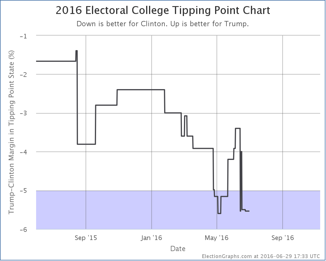
The tipping point moved from a 4.0% Clinton lead in Ohio, to a 5.5% Clinton lead in Minnesota.
The center of the spectrum of the states now looks like this:
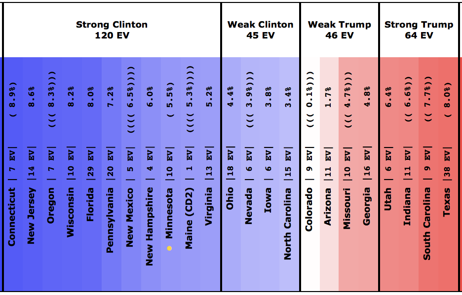
To be clear: Ohio, Nevada, Iowa and North Carolina currently look like “close states” that Trump could possibly pick up. Clinton doesn’t need any of them. She could give all four of them to Trump on a silver platter and he would still lose. She could throw in Virginia as well, and even give him the 2nd district of Maine… and she would still win.
Now, if these Ballotpedia results turn out to just be bad polling, the averages will pop back a bit more toward Trump once we get a few more polls in these states. But for the moment, Trump’s averages just took a serious dive. He isn’t in the worst shape against Clinton ever… that happened at the beginning of May… but he is close.
132.0 days until the polls start to close. Much more fun to come…
Note: This post is an update based on the data on ElectionGraphs.com. Election Graphs tracks both a poll based estimate of the Electoral College and a numbers based look at the Delegate Races. All of the charts and graphs seen in this post are from that site. Additional graphs, charts and raw data can be found there. Follow @ElectionGraphs on Twitter or like Election Graphs on Facebook to see announcements of updates or to join the conversation. For those interested in individual general election poll updates, follow @ElecCollPolls on Twitter for all the polls as they are added. If you find the information in these posts interesting or useful, please consider visiting the tip jar.