This is the website of Abulsme Noibatno Itramne (also known as Sam Minter). Posts here are rare these days. For current stuff, follow me on Mastodon

Categories

Calendar

April 2024
S M T W T F S
 123456
78910111213
14151617181920
21222324252627
282930  

100 Days of Wiki of the Day

After a bit of testing, on May 4th the first episode of popular Wiki of the Day launched, followed by random Wiki of the Day on the 5th, and featured Wiki of the Day on the 6th. Then I posted about it. It has now been 3 months since that first episode launched. Stretching it back to 100 days to include some of my testing, here is a look at how these fully automated podcasts I created have been doing. If you haven’t yet by the way, please subscribe!

I’ve been looking at it in terms of unique downloaders in the trailing 7 days. (Defining unique based on IP address plus user agent, excluding obvious robots… which has some flaws of course, but it will do…)

Anyway, lets look at the three podcasts…

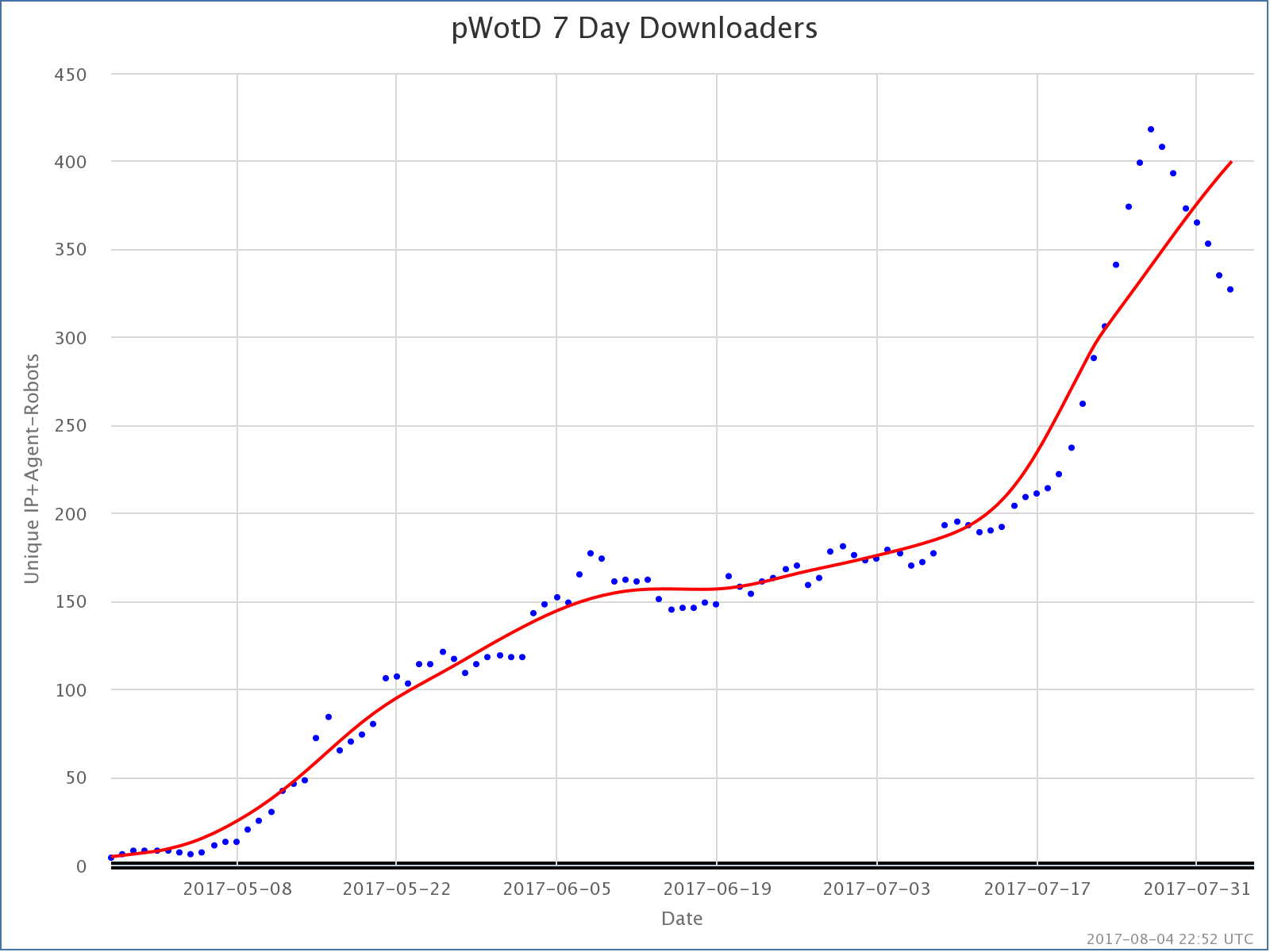
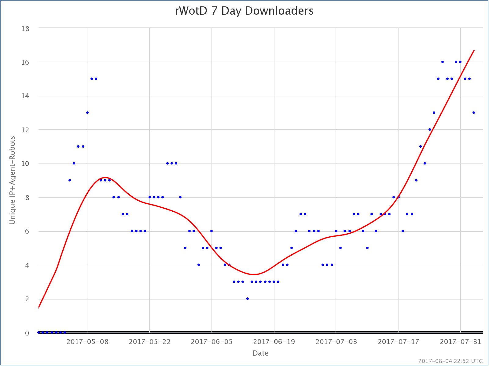
popular Wiki of the Day is by FAR the most, well, popular. It has been trending upward in terms of number of listeners pretty much from the moment it launched. There have been spikes when particularly popular episodes were released. For instance, that really obvious spike in July is due to the release of the episodes on Chester Bennington and Linkin Park. That peak isn’t over, so we’ll see if we end up back on the growth trend from before those episodes, or if the growth trend stops.

With my other podcast, Curmudgeon’s Corner, the pattern is that at any given time, most people are downloading the most recent episode, and only a few people are downloading older episodes. Just recently, in the last week or two, that has started to be the case on most days for pWotD, but for most of the last 100 days, generally speaking the latest episode would NOT be getting the downloads. Instead, a handful of episodes with nice popular search terms would be getting the most downloads.

I don’t have stats running the whole last 100 days easily available, but I regularly generate stats on downloads over the past 30 days. In the 30 days ending August 2nd, the most downloaded episodes for this podcast were:

  1. Justin Bieber from May 12th with 285 downloads
  2. Linkin Park from July 22nd with 190 downloads
  3. Ariana Grande from May 24th with 125 downloads
  4. Chester Bennington from July 21st with 102 downloads
  5. Ed Sheeran from June 26th with 60 downloads

There does seem to be a theme in the current top 5. They are all music related. The episodes are on all sorts of different topics, but for whatever reason those are the most popular.

In any case, the number of downloads for the podcast is growing, and we do seem to have transitioned to the current episodes being the most downloaded episodes in the day or two after they are released, so it looks like the downloads are starting to be dominated by people who are actually subscribed rather than people finding individual episodes through searches. And that is without any ongoing effort from me, or any money for advertising or anything.

So that is good.

The “popular” variant really is the only one of these getting significant numbers. It is almost 24 times as popular as the next most popular of the three podcasts, which is the “random” variant, random Wiki of the Day. After the initial spike of people I know checking out the podcast, it was basically just me listening to this one. Because I listen on multiple devices while on several different networks, my metric often detects me as 3-5 different “people” over the course of a week. But in the last few weeks, random Wiki of the Day has been trending upward as well. It is still tiny, but there are a few people other than me listening.

The top 5 episodes downloaded in the last 30 days for this one are:

  1. Rebecca Soni from July 24th with 5 downloads
  2. Friar Alessandro from August 2nd with 4 downloads
  3. Charles Allen, Baron Allen of Kensington from July 27th with 4 downloads
  4. Cho U from July 26th with 4 downloads
  5. BГ©atrice de Planisoles from July 21st with 4 downloads

Notice all of these are very recent, no really old episodes showing up on the Top 5 list.

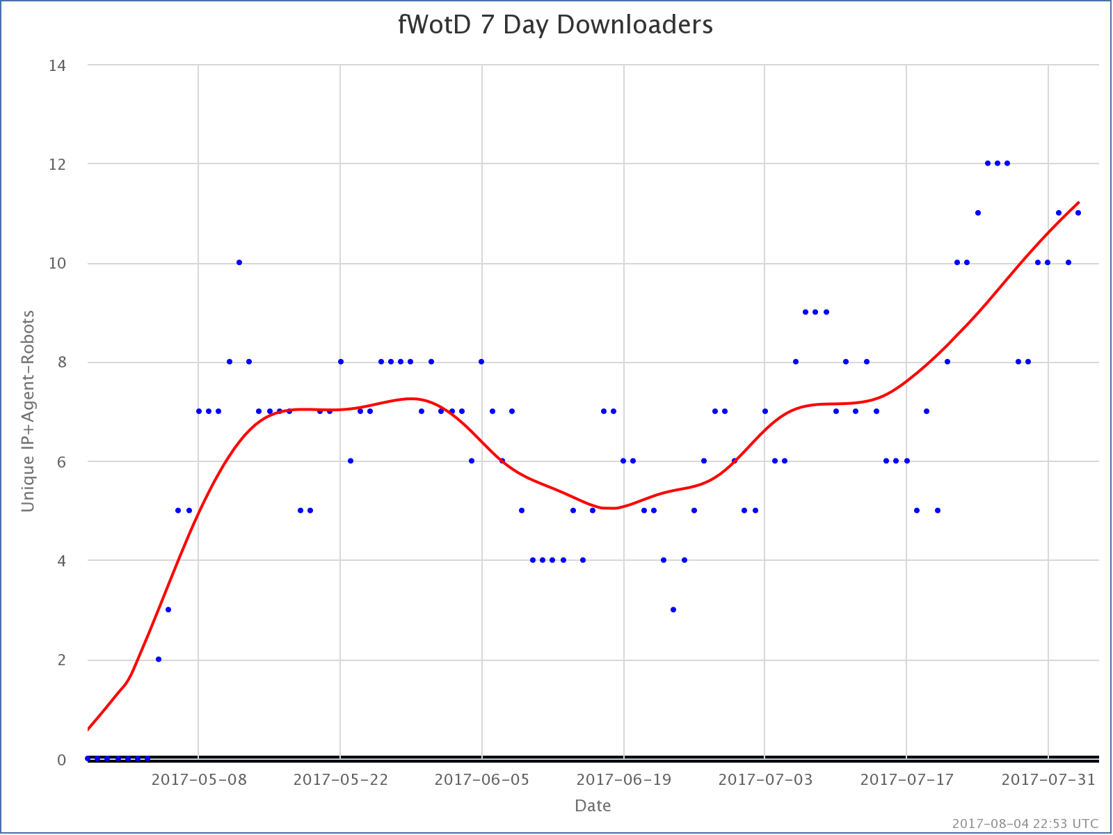
Finally, the least popular of the three, featured Wiki of the day. Least popular, but also growing slowly. A handful of people other than me are actually listening to it!

The most downloaded episodes over the last 30 days:

  1. The Beatles from July 7th with 4 downloads
  2. Murder of Dwayne Jones from July 21st with 3 downloads
  3. Columbia River from July 18th with 3 downloads
  4. Dire Wolf from July 17th with 3 downloads
  5. Blade Runner from July 12th with 3 downloads

And that is that. Also growing. Slowly.

Oh, and just for comparison I guess… over the same time period:

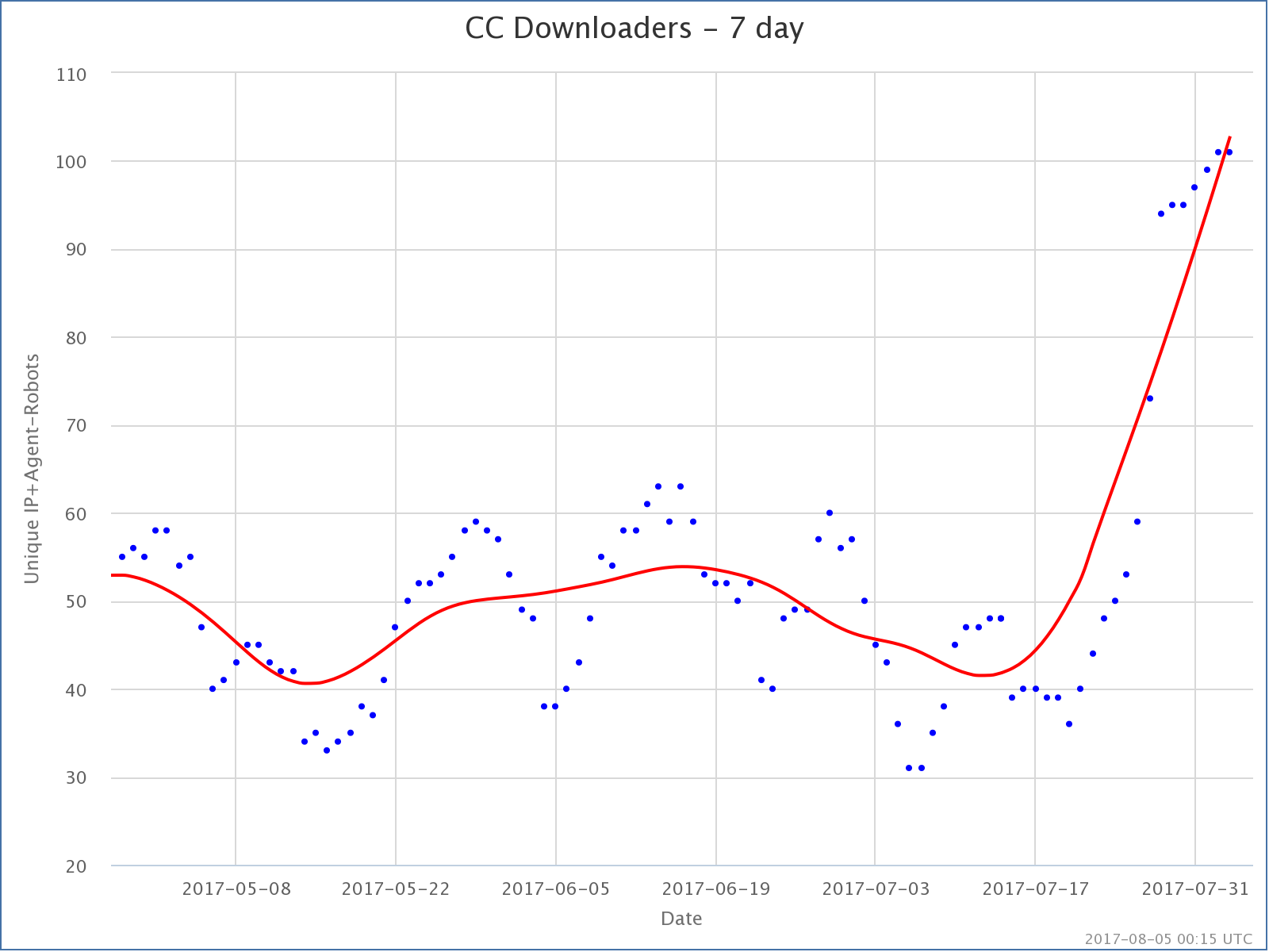
Curmudgeon’s Corner, the podcast I actually put about 5 or 6 hours a week of work into, is at about 100 downloads per week right now. That’s after a big spike we are seeing after we switched some stuff around on how we promote the podcast a couple of weeks ago. (We switched from Facebook and Google ads to an ad in Overcast, a popular podcast player.) We’re getting a bunch of new people checking us out at the moment. Don’t know if they will stick around if we turn off the ads, but for the moment the trend looks good.

Of course that is a bought and paid for trend line. And even with that popular Wiki of the day has 4 times the downloads Curmudgeon’s Corner does. Guess people just like their Wikipedia content!

I don’t actually mind this… it was actually what I hoped would happen… the automated podcasts… which each contain a promo for Curmudgeon’s Corner… slowly growing listenership via people finding them via searches and such, but with no additional promotion and no additional weekly effort on my part… and maybe pointing a few people back to Curmudgeon’s Corner. They key is now that it is set up, it is very little continuing effort on my part. I basically just check the stats periodically, and listen to the new episodes to make sure nothing breaks.

And there ya go.

Anyway. Fun stuff.

Is Curmudgeon’s Corner getting longer?

In addition to swearing on Curmudgeon’s Corner, IvГЎn and I apparently just like to run our mouths. In her comments on our March 12th show my mother also asked “Why are you doing shows near 2 hours in length now?”. Well, to quickly answer the question in the title, yes, our shows have been getting longer. Here are some graphs.

First, since we just completed our 400th show, here is a breakdown of the length distribution of the show, split up 100 shows at a time, grouped into 10 minute wide intervals:

Screen Shot 2015-03-21 at 07.20.46746

There is a lot of interesting stuff here if you look into it.

Our first 100 episodes were a bimodal distribution. We did a bunch of “short” shows, between 10 and 50 minutes, and then we did a bunch over an hour, mostly just over an hour long. Basically, when we first started, we targeted shorter shows, perhaps averaging 30 minutes, then we decided to make the jump to an hour. Between the two modes, we averaged 51 minutes per show (rounding to the nearest minute).

The second and third 100 shows were a more typical near “normal” distribution. The second hundred we averaged 53 minutes per show. The third hundred we averaged 63 minutes per show.

In the fourth hundred, shows under an hour became extremely rare (only 4% of shows). Our distribution was moving toward longer shows, and thus we had a longer tail to the right, including two shows that were actually over two hours long. Our average jumped to 80 minutes. A full 25% of our shows were over 90 minutes long.

You can also see the trend toward longer shows in a chart showing show lengths vs episode number, along with a 10 episode moving average:

Screen Shot 2015-03-21 at 07.21.10911

You can sort of see that although there has been tons of variability for our whole run, we started out averaging around 30 minutes per show, then we decided we could go longer, jumped up to averaging a bit more than an hour through episode 100 or so. We then started cutting back, getting down to just over 40 minutes per show on average right before episode 150. Then ever since we’ve slowly been getting longer and longer. We just stopped bothering to shut up, and just keep talking until we don’t have much left to say.

As we’ve thought about it, IvГЎn and I agree that while under an hour sometimes seems a bit cramped now, over 90 minutes is really getting too long, unless perhaps there is a LOT of very interesting news that week… which there usually isn’t… and maybe not even then.

So we are going to be working on tightening things back up again. Maybe not all the way back to averaging 60 minute shows, but probably cutting back quite a bit on the number of shows that end up stretching over 90 minutes.

Of course, this is all subject to feedback from our listeners. What length would you prefer? 30 minutes? 60? 90? Or are you one of those folks who really like 2 or 3 hour podcasts? There are many of those out there of course. I don’t think IvГЎn and I will make podcasts of that length a habit though. :-)

Context on Sandy Hook

Like many people, after I heard the news about the school shootings in Connecticut, I spent time watching the news come in, I spent time reading about it, and I was very emotionally effected by the whole thing. I admit I cried. Each time I thought about it, I couldn’t help thinking about the families, and imagining the incredible pain if something like that were ever to happen to my own family. It was an incredibly sad day.

At the same time though, I hear the repeated “we must do something!” calls, and while I emotionally empathize with them, I also get very frustrated. Because as tragic as this all is, there are a few things to remember, and if you are going to look rationally at these kinds of things, especially if you are going to start talking about laws and political solutions, then you need to step back a bit.

So lets start:

28 people killed at one time is NOT worse than 28 people killed separately. It is more visible. It is more shocking. I have heard it said that when multiple people are killed together it has the same emotional impact as if that number of people SQUARED had been killed separately. So 28 people killed together has the emotional impact of 784 people killed separately. Perhaps so, but in the end, 28 people are still dead either way.

Yes, it was horrible that 28 people were killed yesterday, and it was horrible that most of them were children. But every year there are over FIFTEEN THOUSAND people killed violently in the United States. And over SEVEN HUNDRED of them are children under 14. (Source: DOJ)

As dramatic and disturbing as the deaths of those 28 people are, it is a drop in the bucket compared to the overall rate at which people are getting murdered in the United States. (And according to the DOJ only about 1 in 2000 homicide incidents involve 5 or more victims and 95% of all homicides have only a single victim.)

If you are going to set policy to try to reduce violent death, if you try to craft a policy that is specifically structured to address statistically rare mass killings, then even if you succeed in reducing the frequency of THESE events, you will not actually be optimizing for reducing TOTAL violence and therefore you would NOT be doing the best you could for the public.

So what does the violent death rate look like? Using numbers from violentdeathproject.com:

Screen Shot 2012-12-15 at 17.24.13

Dramatic improvements were made throughout the 1990’s. Since then, with the exception of the peak from 9/11 in 2001, the violent death rate has been essentially flat. (The most recent data here is 2008, as these things have a bit of lag. There is evidence for a further DROP since then, although that second source includes fewer deaths in their numbers than VDP since VDP includes manslaughter as well as homicide.)

So while there is still TONS of room for improvement… The US rate of 6.1 per 100k is horrible compared to most of the rest of the developed world… 1.9 per 100k for Germany, France and Canada; 1.3 per 100k for the UK; 0.8 per 100k for Japan… things HAVE generally been moving in thew right direction in the last couple of decades. You are less likely to be killed violently now in the US than any time in almost 50 years. You have to go back to the mid-1960’s to be better off than today.

That does NOT mean that we should not try to do better… that we should not be looking at ways we might be able to reduce the US violent death rates to the levels in the UK or Japan… or better. We absolutely should. We should not by any means accept the idea that the US is just more violent and that is OK.

But it does mean when you hear breathless comments about how out of control things are, and how desperate the need is for “immediate action”, you should take a deep breath and look at things in the larger context.

Now, the next thing to look at is type of weapon used. The conversation has immediately turned to gun control, but should it?

Lets look at two relevant charts, this time the source of the data is the Bureau of Justice Statistics at the DOJ. Unlike the VDP data, these only include homicides (not manslaughter), and exclude 9/11.

Screen Shot 2012-12-15 at 19.00.35


Screen Shot 2012-12-15 at 19.01.31

These two charts show the same data, but one with absolute numbers, and the other as a percentage of total homicides.

It stands out immediately that about 2/3 of US Homicide deaths are indeed committed with guns. That is an extraordinarily high number. The only real change here seems to be an reduction in the number of murders committed with knives over the time frame shown, both in absolute and percentage terms. (Anybody know why that happened? Why are knives less popular than they were?)

This seems to indicate that if you want to reduce the overall homicide rate, targeting gun violence is actually a pretty good place to start.

There is of course the argument that if guns were not available, or at not as easily available, that many of those murders would still happen, people would just use different weapons. And of course even with restrictions, anybody who really wanted a gun could still get one.

Both of these points are true. But because the percentage of violent deaths by gun is so high, even if a small percentage of the homicides did not happen because the perpetrator couldn’t get easy access to their weapon of choice, it would make a significant difference to the overall rate.

Of course, that doesn’t say what actual policies might or might not help. It is quite easy to construct policies that are very restrictive, but have no actual effect on public safety, or which may actually reduce safety when you take everything into account. (See, for instance, TSA policy at airports and how people driving more after 9/11 caused an increase in highway deaths.)

So even if you do engage in gun regulation, you need to be careful about what you do in order to ensure that you actually are effective at changing anything regarding the violent death rate. And perhaps more importantly, that you don’t also introduce significant and unacceptable restrictions in personal freedom that have other negative side effects.

But a perhaps even more salient point, the most effective way to reduce the overall rate of violence may have NOTHING to do with restricting weapons of any sort. Rather, I have seen some arguments that massively increasing availability and access to mental health support would have an even bigger effect. Easily available inpatient care to those who need it of course, but even more than that, just options and support for those who are in stressful situations that could escalate, or to those with conditions that make them more likely to react violently to provocations.

So even though additional gun control MAY be an effective part of a plan to help improve the violent death rate, any discussion about this sort of issue should not be exclusively about gun control, or about reacting to “mass killings”. Anything that is done needs to take a broader perspective, looking at the overall violent death rate and long term trends. Any knee jerk reaction that is highly focused on a specific incident, or even types of incidents, is very likely to be ineffective or even counter productive at solving the larger problem.

[Edit 2012 Dec 12 20:36 to correct a place where I accidentally said “drug” instead of “gun”. That’s a whole different can of worms, although of course drug policy also has an effect on the death rate.]

SLU Commute Review

From February 20th to August 2nd, I tracked my inbound commute time from my house in Snohomish County to work in South Lake Union in Seattle.* We changed buildings last week, and the commute will be different, so time to review my results. The most critical chart is the one above, showing the parking space to parking space time, given different times I left home. As you can see, this is highly variable, from a minimum of 30 minutes a couple of times, to a maximum of 106 minutes. (That was a pretty awful commute day!)

As can be expected, the worst time to leave is during the morning rush. Duh. But specifically the 10 minute bucket from 14:10 to 14:20 UTC is the worst possible time to leave for work, with the 95% confidence interval for the trip being 47 to 85 minutes and the average trip time being 66 minutes.

So how often did I hit that worst case?

Too much. My most frequent time to leave home was between 14:00 and 14:10 UTC, where the 95% confidence interval was 43 to 65 minutes, with an average of 54 minutes. But the second most frequent bucket was indeed at the worst possible time. Ouch. Unfortunately, if I was leaving at that time of day, it most likely meant I had a meeting at 15:00 UTC, and leaving between 14:00 and 14:10 I had a 63% chance of getting to work by 15 UTC. Leaving between 14:10 and 14:20 UTC those odds dropped to 17%. By comparison, if I actually managed to leave between 13:50 and 14:00 UTC, I had a 100% chance of getting to work by 15 UTC, because the confidence interval for the trip at that time was 37 to 65 minutes with an average of 46 minutes. It just proved really difficult for me to get myself regularly up and out of bed in time to leave quite that early. I was often running 10-15 minutes late for that goal, which was enough to make the commute dramatically worse, and cause me to be a few minutes late for those 15 UTC meetings. Oops.

You can also see a bimodal distribution starting to be evident in my departure times. I’d either leave between 13:30 UTC and 15:00 UTC, or I wouldn’t leave until after 16:00 UTC. It was pretty rare for me to leave home between 15 and 16 UTC. This distribution is closely related to when my first meetings of the day happen to be. If I don’t have the early meeting, when I leave for work is significantly later, and shows a much more spread out distribution. This shows I probably could use a lot more discipline about getting up and out and to work at a consistent time on days I don’t have a meeting driving the arrival time.

Oh, and the best time to leave, at least of times I have tried enough to have data for, is between 17:00 and 17:10 UTC with a 95% confidence interval from 31 to 33 minutes, with a 32 minute average. I only have two data points at that time though, so probably not a really reliable estimate, but certainly much nicer than leaving between 14:10 and 14:20 UTC.

Anyway. Fun data to look at. We’re at a new building now, so I have to start collecting data from scratch to reflect the new commute. So far I only have 3 data points inbound and 2 data points outbound, so not enough to draw any conclusions yet. My gut feel is that on average the commute will be a bit longer, the raw distance is slightly greater and it seems like it takes longer to get to a parking spot in the new garage too, but it will take awhile to confirm that with data.

* There isn’t data for every day I went to work, because this only includes direct trips with no stops or detours. So if I needed to stop for gas, or to drop off Alex at daycare, or otherwise did anything other than a direct trip from home to work, I would not take a data point. I also tried to do the same exercise for the commute home, but as it turned out I very rarely went straight home from work with no stops, and when I did I often forgot to note the times, so I didn’t have enough data to draw a meaningful chart.

Edit 2012 Aug 11 16:52 to add the bit about the best time to leave.

Edit 2012 Aug 11 18:41 to add axis labels to the second graph.