This is the website of Abulsme Noibatno Itramne (also known as Sam Minter).
Posts here are rare these days. For current stuff, follow me on Mastodon
|
OK, now that all of that “launching the analysis site” stuff is over, time for the first actual look at the 2016 Presidential race. Let me start with this map:
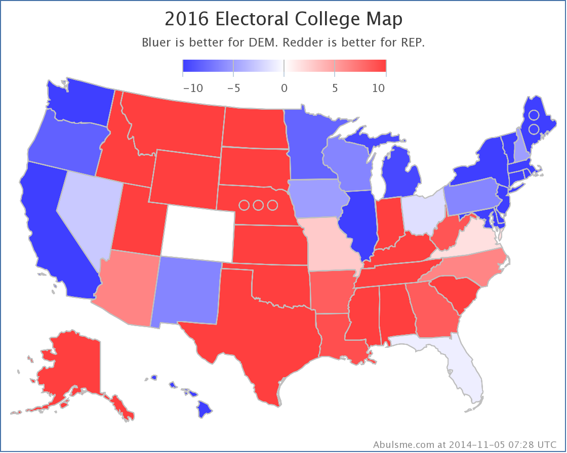
This has NO 2016 data. This represents the average margin in each state over the past 5 presidential elections. Thats 1996 to 2012. That is a long time. A lot has changed since 1996. In those 5 elections, the Democrat won 3 times, and the Republican won 2 times. When you crunch the numbers, you end up with only SIX states where the average margin in these five elections has been less than 5%. That would be Nevada (Dem+2.8%), Ohio (Dem+1.7%), Florida (Dem+0.9%), Colorado (Rep+0.0%), Virginia (Rep+1.6%) and Missouri (Rep+2.8%). Every other state is basically solidly on one side or another when you average these five elections. Those six states add up to 85 electoral votes. If you let these six states swing from one side to another, your range is from the Democrats winning by 146 electoral votes, to the Republicans winning by 24. If all the states just went the way of their averages, the Democrats would win by 82 electoral votes.
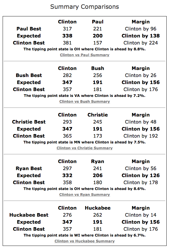
That essentially was the state of play immediately after the 2012 election. But we’ve had a lot of polling since then. There have been 745 polls added to my database so far. That covers eight potential Democratic candidates, and 24 potential Republican candidates. There have only been a few combinations with a significant amount of polling though. On the Democratic side, only Clinton has substantial polling. (Biden is next, but he is way behind.) When looking at how much polling there has been in close states, the “best polled” combinations at the moment are Clinton vs Paul, Bush, Christie, Ryan and Huckabee. Next would be Cruz and Rubio, but lets concentrate on the Top 5. These are not necessarily “front runners”. We’re measuring how interested the pollsters are in these candidates, not their chances of winning the nomination. But presumably the pollsters are polling about the folks who are looking like possibilities, so it is a good enough place to start.
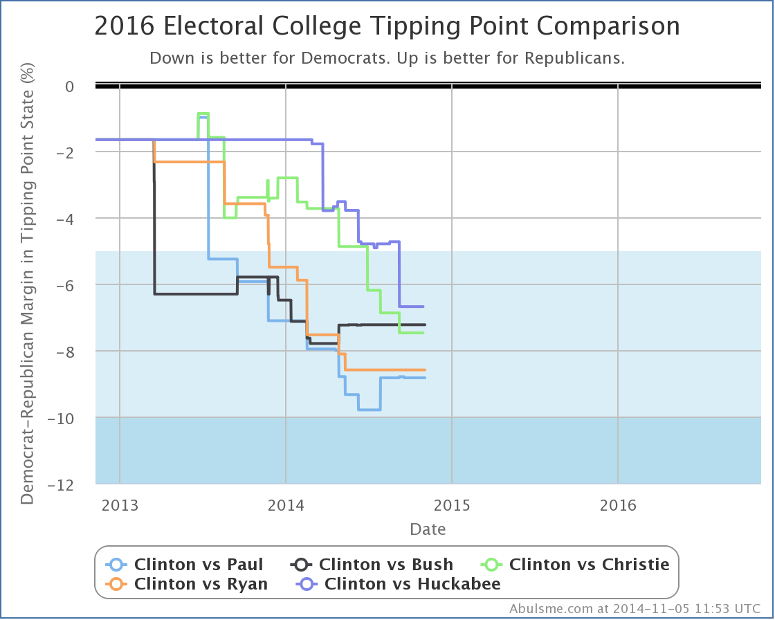
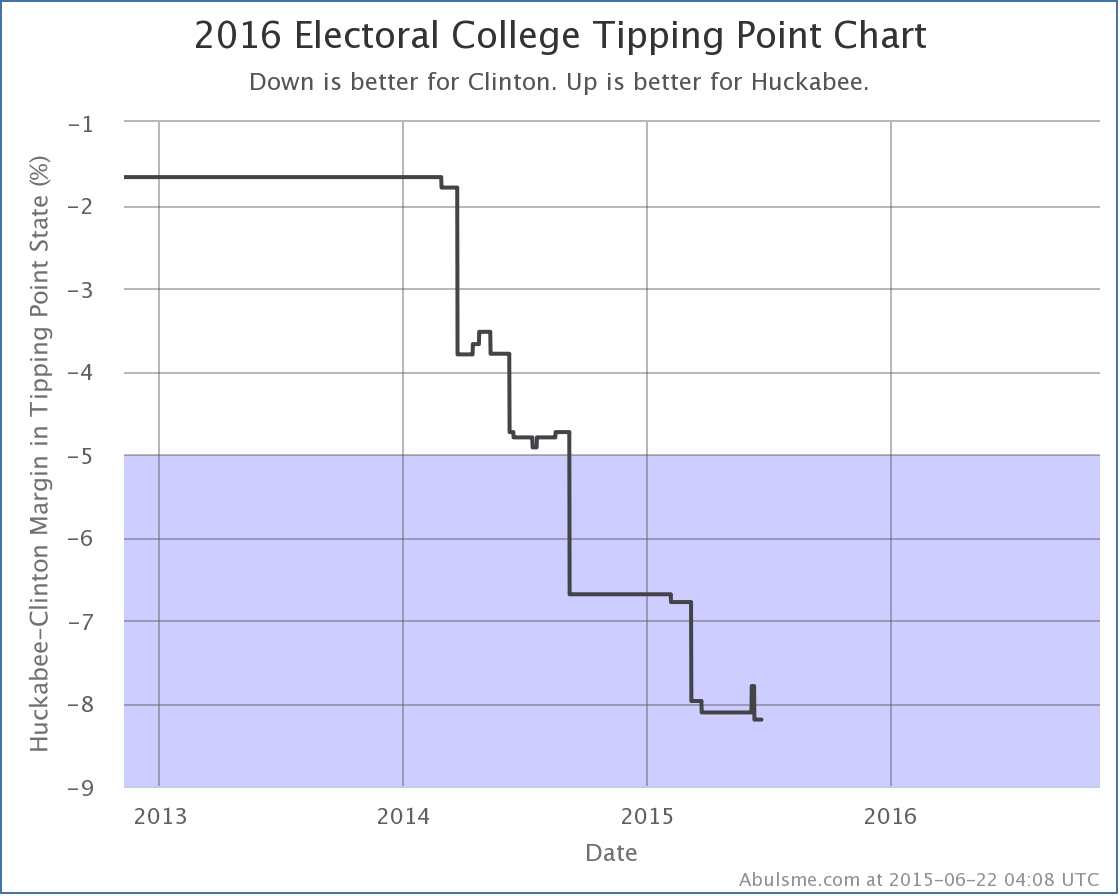
Although I generally prefer looking directly at Electoral College margins, for now the best visual of the difference between the generic “last five elections” position versus where we are now is actually looking at the “Tipping Point Margin”. The tipping point margin is the margin in the state that would push the winner “over the edge” if you ordered the states by candidate support. It can also be thought of as how much you would have to shift the popular vote nationally to flip the result of the election (assuming that shift was distributed uniformly across all states). In other words, it is a pretty good indicator of who is ahead and by how much.
Here is what that looks like for the top five candidate combinations from the 2012 election through to today:
Click the image to go to the full comparison page with all sorts of other detail.
The key here though is that as we get more and more polls, we’ve seen a significant shift toward Clinton over the “starting point” defined by the last five presidential elections. This seems to be true whichever of the five opponents you look at.
Now, at this stage you have to interpret these graphs carefully. Most of what you see in this chart is NOT movement or changes in support. Rather, it is just the process of getting enough polls in enough states to get an actual picture of how these two specific candidates fare against each other, rather than just a generic Republican vs a generic Democrat based on 18 years of history. We are only now at the point where we might be starting to see things representing actual movement in charts like this. But what we can see is that at a starting point, Clinton has a big advantage here.
If you look at the actual electoral college expectations, you see this:
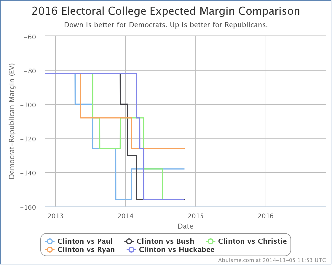
Between these five candidates, the expected case (where everybody wins all the states they are ahead in) ranges from Clinton winning by 156 electoral votes (against Bush or Huckabee) to Clinton winning by 126 electoral votes (against Ryan). Those are not insubstantial margins.
Even if you give the Republicans all the close states, you end up with results ranging from Clinton winning by 96 electoral votes (against Paul) to Clinton winning by 14 electoral votes (against Huckabee). In no cases are ANY of these five Republicans registering a lead against Clinton at the moment. Even if you give them ALL the close states.
This is somewhat to be expected of course. Clinton has the name recognition. She had high recognition and approval ratings coming out of being Secretary of State. Meanwhile, while those of us who follow these things closely know a lot about each of the five Republicans here, your average guy on the street probably goes “Who?” when hearing many of these names, or even if they have heard of them don’t know much beyond that. Like her or not, everybody knows who Clinton is.
So it is not surprising to see Clinton with a big lead at this stage. That does not mean it will stay that way.
Are the 2014 election results (major Republican wins nationwide) an indication of things to come in these Presidential numbers? Maybe. Maybe not. The Presidential landscape is very different than the landscape for Congress. The structure and fundamentals are just very different. If 2014 is an indication of a wider trend to the Republicans, that will surely show up on these sorts of charts soon. But even without that, there are tons of reasons that things may move toward the Republicans.
Everything is still very theoretical at this point. The real campaign against Clinton hasn’t ramped up yet. Lots of mud will be thrown. And the Republican candidates will get more and more visibility. Although anything is possible in either direction, it is quite possible that what we are seeing right now will be Clinton’s high water mark. The race is likely to get closer as we move through 2015 and people get more engaged.
I mentioned that on the two charts above we may still be seeing “settling in” to the real positions between these candidates vs the generic positions we started with and that therefore it might be hard to distinguish actual movement yet. But is there anything else we can look at?
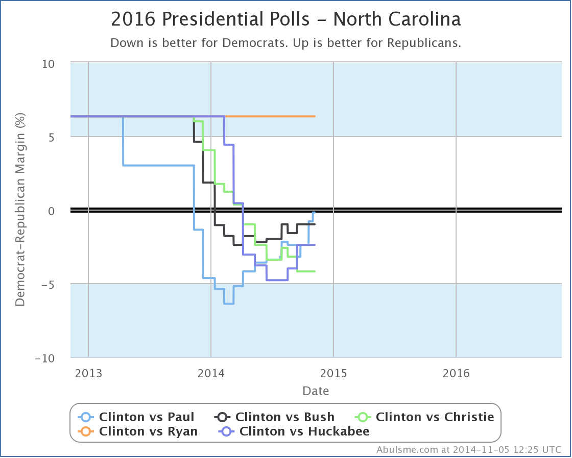
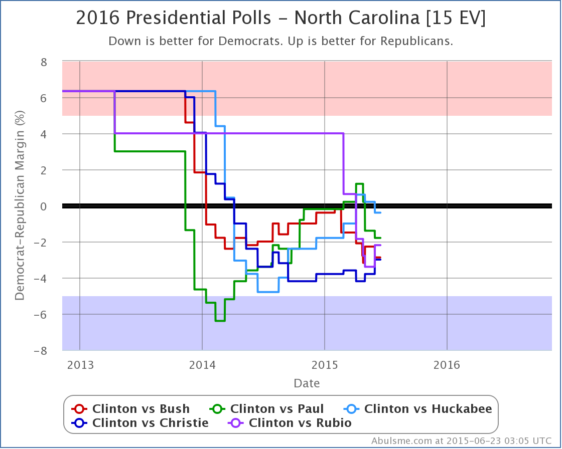
Yes. We can look specifically at how the polls are going in some of the more heavily polled states, where we have frequent enough polls that we long ago washed out the previous election results and can see trends based on the candidates themselves. There are only a handful of these highly polled states, but one of them may be indicative. North Carolina:
As before, click through on the graph for more details.
There is a clear pattern here. All of the Republicans except Christie (who is still sinking) and Ryan (who has not been polled at all in North Carolina) seem to have bottomed out earlier in 2014, and since then have been improving their positions against Clinton. For the last six months we haven’t seen any category changes here. This movement is within the “Weak Clinton” category. So no changes yet to the electoral vote summaries. And North Carolina is pretty far from the tipping point at the moment, so no changes there either. But we CAN see definite movement toward the Republicans here.
North Carolina is the only state with such a clear pattern at the moment. But it is also one of the most highly polled close states. So is it an indicator of things to come?
We’ll find out over the next few months.
The race is on!
This is a FAQ for the Electoral College portion of electiongraphs.com. The FAQ for the Delegate Race portion can be found here.
Why are you doing this?
Well, mainly because I have fun doing it. I don’t have any illusions about being the next Nate Silver or anything. But I think my little version of this adds yet another perspective to look at the presidential race, and more is better, right? But mainly, I’m a news junkie, and presidential elections are an every four year frenzy for that sort of thing. And I enjoy crunching numbers, doing analysis, and making graphs. So this is a natural fit. Mainly though, I enjoy it.
Seriously, we already have 538, PEC, The NYT, The Washington Post, and all kinds of other folks doing this. What do you add?
Well, all those places are great. I eagerly consume everything they do and respect all of those efforts quite a bit. I’ve added to and enhanced what I do here based on things I’ve learned from them. (Specifically, the “tipping point” stuff is inspired by PEC’s meta-margin.) All those models can get quite complex though. They factor in many things, and they do much more robust mathematics than I do. One of my “points” in doing this the way I have since 2008 is that even with a very simple model, just a plain old average, nothing fancy, you can do very well.
Also, while a few of the other do this too, I concentrate a bit more on monitoring the ebb and flow of the race and looking at the trends over time rather than just what the prediction was today for November.
And of course, my views and analysis are always purely electoral college based. When I started in 2008, it was because I had been frustrated in 2004 that it was hard to get views of the race based exclusively on the electoral college, instead everybody kept talking about the national polls. But that isn’t how we elect presidents!
Is this a prediction?
No. Not at all. At least not yet. Everything here is essentially an “if the election was held today” snapshot. But the election is not today as I’m launching the site in 2014. It is a long way away. Things will change. Events will happen. The two parties will actually select their candidates. Maybe as we get into the Fall of 2016 the data here can start to be reasonably interpreted as a prediction. Before then, it is not. It is simply a description of what things look like today, which can still tell you quite a lot.
Why a five poll average? Why not six? Or ten?
This is actually fairly arbitrary. It was chosen to be high enough that you could get a reasonable average out of it, but low enough so that the time frames covered by the average are short enough to be responsive to changes in the campaign… at least closer to the election in the close states… when we are far from the election… or for uncompetitive states right up through the election… the average can cover so much time it won’t respond much to change. But what happens is that as the election approaches, close states are polled more and more often, so by the time of the election, the five poll averages in the close states generally only cover a few days.
But why a number of polls? Why not an amount of time?
Well, once you include the backfill from old elections, you can always fill out the average. With any timeframe, you will often hit the situation where you have no polls at all in your chosen timeframe. Then what do you do? There are obviously answers to that question, but you have to start having special cases. Having an “X poll average” is just simpler and more straightforward.
How about some fancy curve fitting or smoothing instead of an average?
Oooh! That is fancy! Initially I didn’t consider this because I was calculating everything with a simple Excel spreadsheet and it was a little daunting to think about. Now that I’ve automated all sorts of things, it wouldn’t be that hard to plug in whatever logic I wanted for computing the “average”. It has occasionally tempted me, but then I remember that one of my points in doing this is to show how very simple logic can do just as well as the complicated models, so I decide not to add complexity if I don’t need to.
OK, but how about a median instead of a mean? Wouldn’t that be better?
Maybe. Sam Wang at PEC uses medians. They are more resiliant to outliers. They definitely have some advantages. I have thought about it, although there are probably downsides too. In the end though, I’ve used means for the last two election cycles and it has worked pretty well, and I’d like to be able to compare results between election results to some degree, so I’ll stick with the mean.
Fine. So what about these categories? Aren’t they completely arbitrary?
Yes. Yes they are. I consider any state where the margin is less than 5% to be “weak” and thus subject to the possibility of going either way. This could be some other number. 5% just seemed like a reasonable amount that you could imagine either polls being wrong, or for a last minute movement in the race that could happen too fast for polls to catch. After the last couple of elections, I considered narrowing this a bit, but ended up sticking with 5%.
Do you do any sort of simulation that gives odds of winning?
No. At the moment I just provide the “possible” band and the tipping point margin. The band between the best cases roughly means that anything inside that band is within the realm of the possible, and anything outside of it is not. It of course isn’t that simple. It is far less likely that every single close state goes to one candidate than the states are roughly split in the way indicated by who is ahead in each state.
I have considered modeling this and doing a Monte Carlo simulation and generating “Win Percentages” and such. But to do so, I have to basically toss out the core methodology of just categorizing the states into broad bands, and instead have to start looking at modeling uncertainty based on the available polls and other factors.
This is of course a valid thing to do, but it is a fundamentally different way of structuring things than the basic premise of my breakdown. If I did this, I’d probably want to reassess almost everything else about how the site’s analysis is done. So for the moment I have decided not to pursue this direction. If you want that, there are plenty of other sites doing exactly that. (Or there will be by election time anyway.)
How do you decide what polls to include?
I basically am not picky. I include just about everything I find. I’d have to have a really good reason to exclude something. I don’t try to evaluate pollsters by their methodology, previous accuracy, or anything like that. I just throw everything into the mix and see what comes out.
Doesn’t this take a lot of work?
Yes. Hopefully it will not be quite as much of a slog in the run up to the election now that I’ve automated a large part of the grunt work. But just scanning the web for polls, entering them, and writing commentary when things change will still suck a significant number of hours. But referring back to the first question, it is fun for me, so that isn’t that bad.
Aren’t you starting this a bit early?
Well, again, it isn’t a prediction. Predictions this far out probably are fairly useless. But the first 2016 polls actually appeared BEFORE the 2012 election. And there have been new polls dribbling out pretty much constantly since then. They may still be pretty sparse, and it is still a very long time from the election as I officially launch this site in November 2014, but in terms of trying to understand how things are shaping up, it is NOT too soon to be paying attention. The folks that do groundwork and manage and fund campaigns have been paying attention and making decisions based on what they see in the wind… including polls… for more than two years already. No reason why the rest of us shouldn’t be looking too.
Who are you anyway? Are you even qualified to be looking at any of this?
A long time ago I was a Physics major. Then somehow I got into the world of the web, and eventually ended up doing product management at a tech company in Seattle. This election stuff is purely a hobby. I do it for fun. I do not have professional credentials in this area. I can’t claim to be an expert. I’m just an amateur putting this together in his spare time. I think the results have been pretty good so far, and I’m looking forward to the 2016 version. If you ARE an expert and have constructive criticism for me, I’d love to hear it and learn from you. Just don’t be mean. :-)
Shouldn’t you maybe get a life? Maybe go outside or something?
Nah, I’m good.
What do I do if I have questions or comments on all this?
Well, just add a comment to one of the blog posts about the election on Abulsme.com. Or email me at abulsme@abulsme.com. Or tweet at me via @abulsme or the dedicated twitter account for these election updates, @ElecCollPolls.
How do I follow along with what is changing with this analysis?
For up to the minute updates when polls are added, when states change categories, when tipping points change, or information of that sort, follow @ElecCollPolls on Twitter. When changes worth noting more widely occur, I will be making blog posts on Abulsme.com. To see just Election 2016 related posts, look for the tag. My cohost Ivan and I will undoubtedly also be speaking more and more frequently about the election on our podcast as we get closer to November 2016.
Edit 2014-11-06 05:43 UTC – Fixed typo
Edit 2014-11-07 21:50 UTC – Fixed incorrect word
Edit 2016-05-14 19:55 UTC – Changed first sentence to refer to election graphs.com instead of the older election2016.abulsme.com, added link to Delegate Race FAQ.
This post gives an overview of my 2016 Electoral College website, highlighting the major features of the site and explaining how to interpret the data on the site. Or you can just go to the site to explore and skip this entirely. This is more for those who want a written reference to how the site works and what is on it.
Basic Premise
All of the information on the site is generated based on these fundamentals:
- Simple Poll Averages: How each candidate is doing in each state is determined by a simple average of recent polls in that state. Generally the most recent five polls are used, but more will be used if there is a tie for the 5th most recent, or if more are needed to place the average definitively into one of the “categories” described below. If there are not five actual polls between the two candidates, previous general election results are used to fill out the average.
- Classifying States: All states are classified based on how much of a margin the leading candidate has in a state. Between 0% and 5% is “Weak”, between 5% and 10% is “Strong”, and more than 10% is “Solid”. Older polls are pulled in as needed to avoid any state ever being exactly on a boundary. The range of possibilities the site describes are based on the assumption that only “Weak” states are really in play and could go either way.
- The Tipping Point is interesting too: The tipping point represents the state that would put a candidate “over the top” if the states were sorted by candidate support. The margin in the tipping point state represents how much of a uniform shift in national polls would be needed to change the overall election result, so is a measure of how close the race is that gives greater granularity than the electoral college totals.
Common Navigational Elements
Each of the four pages has a header that lets you navigate through the site, and which lets you know what you are currently looking at and the recency of the data:
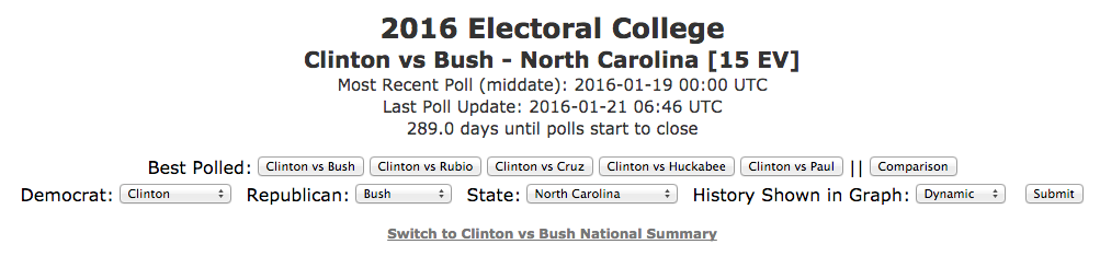
[Screenshot above updated 2015-06-23 03:12 UTC]
[Screenshot above updated again 2016-01-24 23:24 UTC]
The items here are:
- Best Polled Candidate Combinations: The five candidate pairs with the most polling (weighted to count close states more) are shown here for quick access. These links will take you to a national level page if you are on a national level page, or will keep you on a state level page if you you were on a state level page. Note that being the best polled does not necessarily mean these are the frontrunners! Once there are delegate leaders in both parties, a separate “Leaders” button will appear for that combination.
- Comparison: This takes you to a page where you can see the top five pairings compared to each other, once again remaining on a state or national level as appropriate.
- Selection Bar: This line lets you choose which candidate pair you are interested in looking at, the amount of history you want to show on the graphs, and if you are at the state level, which state/jurisdiction you want to look at. As of the launch of the site, there had been polls involving 8 Democrats and 24 Republicans. Any combinations beyond the top five combinations are however generally very sparsely polled, so results should be viewed with appropriate skepticism.
- Page Identification: Which candidate combination you are currently looking at, and what information about that combination you are currently viewing.
- Most Recent Poll: The date and time of the most recent poll (by middate of the days the poll was in the field) used in the page you are currently viewing.
- Last Poll Update: The date and time data on the page you are looking at was most recently updated.
- Time until polls start to close: How much time is left until actual election results start coming in making poll based analyses like this moot.
- Link to national summary: If you are viewing a state level page, a link will be available to navigate to the corresponding national page.
Also of note, all maps and graphs have a hamburger menu in the upper right which allows you to save off a copy of the image if desired.
This page gives a national overview of the state of the race for a particular pair of candidates. The page defaults to whatever candidate pair is currently the “best polled”, but of course any other candidate pair can be chosen.
The following elements are shown on this page:
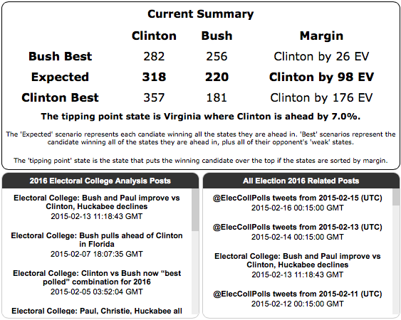
[Screenshot above updated 2015-02-17 13:14 UTC]
The summary block gives a round up of the overall situation between the two chosen candidates.
The expected line gives results if all states are won by the candidate currently ahead in the poll average in the state. The two best lines show the range of possibilities if all of the close states end up going with one candidate or the other. The current tipping point is also described.
The bottom half of the block contains links to recent Election 2016 related posts on Abulsme.com. These may be summaries of poll updates digested from twitter, blog posts with analysis or commentary, or podcast episodes that include discussion of the election.
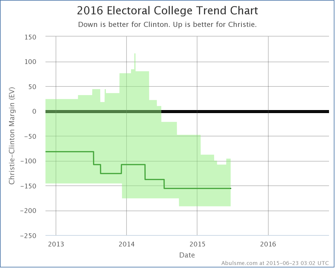
[Screenshot above updated 2015-06-23 03:02 UTC]
The Electoral College Trend Chart shows the ranges described in the summary as they have evolved over time. Mousing over the chart allows you to see the margin ranges as they were on various dates in the past.
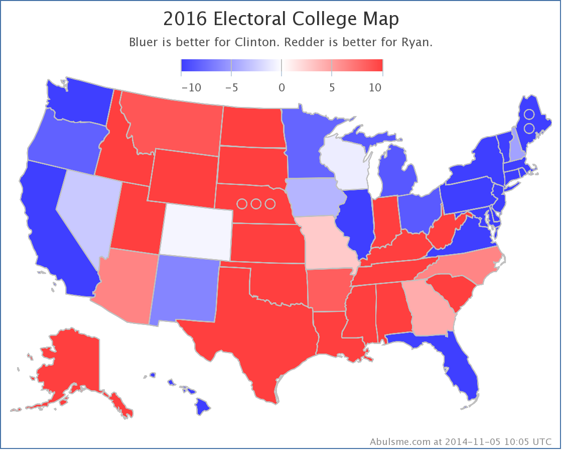
The Electoral College Map is just the traditional red/blue map of the states. Blue for Democrats, Red for Republicans. Any margin over 10% is solid red or blue. The closer a state is, the closer the color gets to white. On the site, if you mouse over the map you can get details on particular states. Clicking on a state takes you to the full detail page for the state.
[Screenshot above updated 2015-06-22 04:08 UTC]
The Tipping Point Chart shows the Tipping point margin over time. Mousing over the graph will show the numerical margins along with the state which was the tipping point state at particular dates in the past. Shading is used to represent the “Weak”, “Strong”, and “Solid” categories.
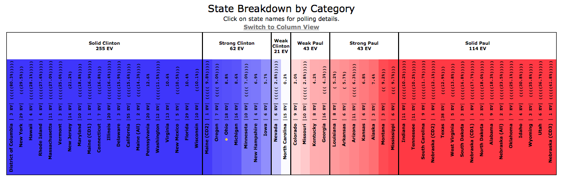
The State Breakdown gives an ordered list of the states as they fit into the six categories. The yellow dot indicates the tipping point state. If it is in a blue state, the Democrats are winning. If it is in a red state, the Republicans are winning.
If the poll average in a state needed to use previous general election results to fill out the average because not enough actual polls of the candidate pair were available yet, parentheses are added around the average, one per general election result used. A state with five sets of parentheses indicates that there have not yet been any polls of that candidate pair in the state and the average is based only on the five previous general elections. A state with no parentheses on the other hand indicates that there is enough polling that the average is based fully on actual polls for the candidate pair.
Clicking on any state’s name will take you to the detail page for that state and these candidates.
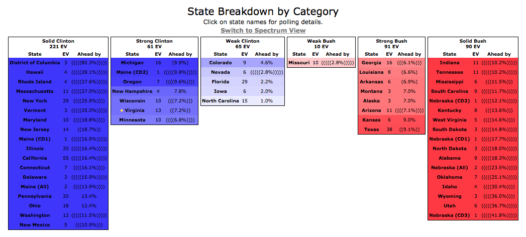
The Category Breakdown can be toggled from Spectrum View (the default) which shows all the states in one continuum with vertical text to Column View, which keeps the text horizontal with separate columns for each category. The information presented is identical, only the way it is presented changes.

Finally, for anyone wishing to remix or reuse the poll data on this site, links are available at the bottom of this page to access the underlying poll results.
The left of the page is simply a compilation of the national summary blocks for each of the top five best polled candidate pairs.
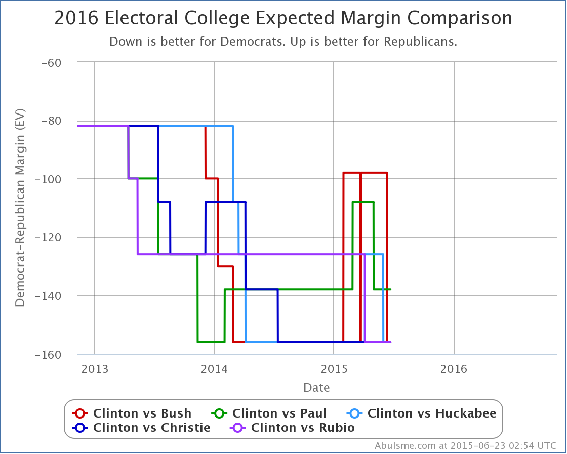
[Screenshot above updated 2015-06-23 02:54 UTC]
The Margin Comparison chart simply shows the “Expected” case from each of the top five best polled candidate pairs. Unlike the candidate specific national summaries, this only shows the expected lines, not the full range of possibilities between the two best cases. With five mostly overlapping area ranges, the chart would simply have been unreadable. As with other charts, if you mouse over the lines, you will see the specific numbers for the candidates on the days you are mousing over.
[Added 2015-01-23 10:28 UTC – As of today, the Republican and Democratic “Best Case” charts are also shown on at the bottom of the National Comparison page in a manner parallel to the “Expected” chart.]
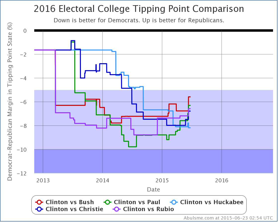
[Screenshot above updated 2015-06-23 02:54 UTC]
The Tipping Point Comparison chart shows the same type of comparison, but for the tipping point margin. Shading is used to represent the “Weak”, “Strong”, and “Solid” categories.
[Added 2015-02-17 13:20 UTC]
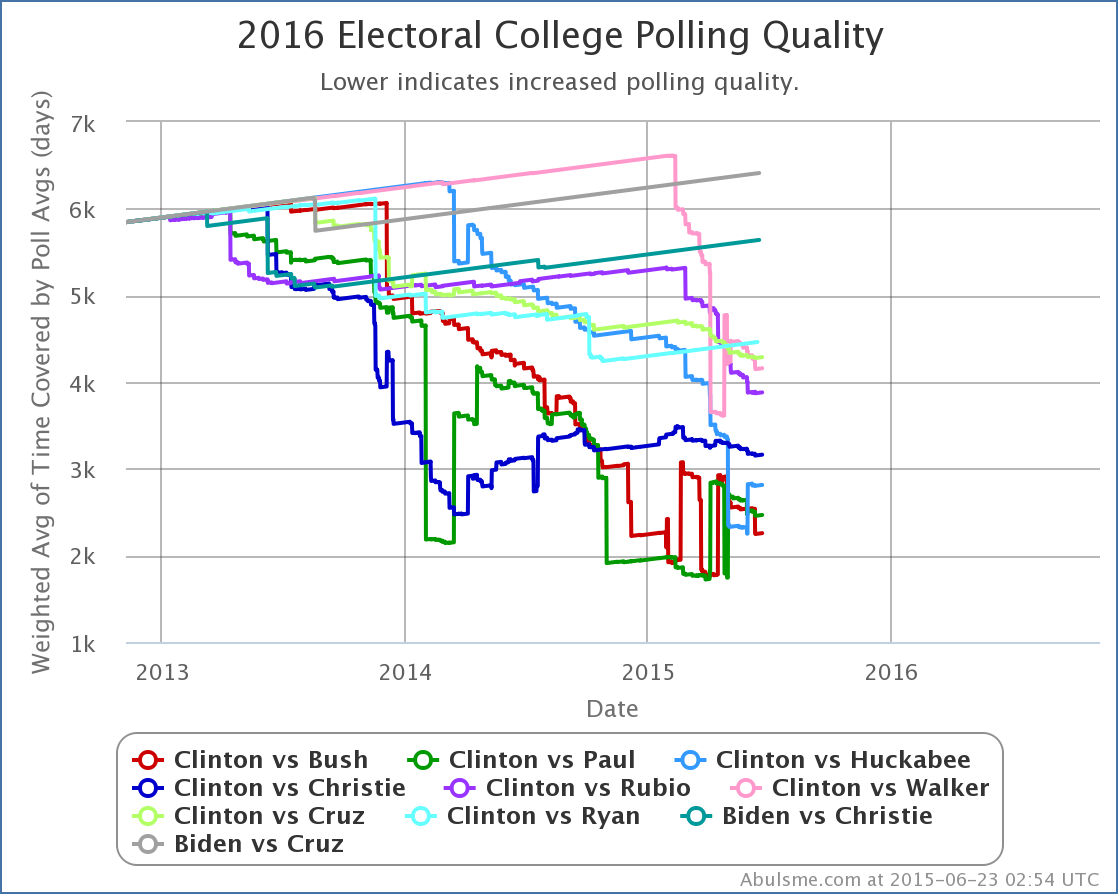
[Screenshot above updated 2015-06-23 02:54 UTC]
At the very bottom of the comparison page is a chart comparing the “polling quality” of various candidate combinations. For purposes of this site, polling quality for each candidate combination is measured by an average of the time since the oldest poll included in the polling average in each of the 56 jurisdictions. In order to account for the fact that closer states “matter more” than ones where the result is essentially a foregone conclusion, rather than being a flat mean, we weight the average by the inverse of the margin in each jurisdiction, thus giving a much higher weight to closer states. Rather than just showing the top five candidate pairs like the other charts, this chart shows the top ten in order to illustrate the position of the “next closest” candidate combinations relative to the five generally shown throughout this site.
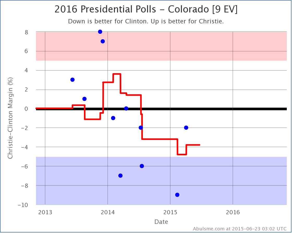
[Screenshot above updated 2015-06-23 03:02 UTC]
The chart on this page shows both the poll average (the red line) as it changes over time, and the actual individual polls. Mousing over the red line will give you the value of the average at each time in the past. Mousing over the blue dots will give you details of each individual poll.
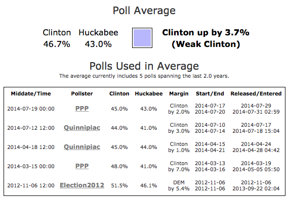
The right side of the page shows the actual averages for each candidate, as well as the margin and classification of the state. The color swatch represents the color of the state on the national summary.
Below this is a listing of each of the specific polls used in the average, along with a variety of details on each one. Clicking on the name of the pollster will link to the source for the poll information. Most often, this is the pollster’s website directly, but in some cases it may be a news article about the poll.
A separate table of all available older polls not used in the average, including general election results back to 1980, is also shown.
[Screenshot above updated 2015-06-23 03:05 UTC]
The chart here compares the poll averages in this state for each of the top five best polled candidates nationally. As usual, you can mouse over the lines to see the margins for each of the candidate pairs on specific dates in the past.
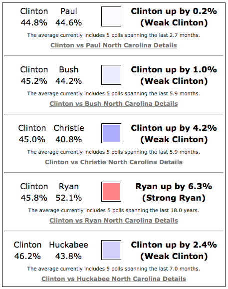
The right side of the page is simply a compilation of the summaries from the state detail pages for each of the five candidate combinations.
Edit 2015-02-06 19:10 UTC to fix minor formatting issues.
Edit 2015-06-23 04:17 UTC to update screenshots affected by updates to the color schemes on certain charts.
Edit 2016-01-24 23:27 UTC to update a screenshot and note the appearance of a button for delegate leaders in the navigation.
The blood is barely dry from the 2014 midterm elections, but that means everybody’s eyes will be turning rapidly toward 2016, and therefore as I did in 2008 and 2012 I am spinning up my own election analysis site:
What you will see there is NOT a prediction. Everything represents “if the election was held today”. Until we get to Fall 2016, things will probably be very different by the time we get to the election. We don’t even know who the candidates will be yet! But it doesn’t have to be a prediction to be useful or interesting. Where things stand NOW still gives insight into how much work each candidate has to do, and where that effort needs to be spent. You will be able to see the ups and downs of the race as it develops. It isn’t only the end that matters, watching how we get there is fascinating too.
Those of you who follow me on Twitter know that I’ve been working on this since early 2013. Why? The 2012 elections left me physically and mentally exhausted. At the time everything was done via lots of manual effort in Excel, image editing programs, and on my wiki pages. It became close to a full time job in the last month. I decided that while I had a blast, if I was going to do it again, I needed to automate most of the more tedious tasks.
So, for the last couple years, with a few hours here and there as time allowed, plus some vacation days burned recently to concentrate on it, I’ve put together a site that does all of what I did manually in 2012, and more. I just update a single data file with the raw poll data, and everything else is generated automatically… even automated tweets at @ElecCollPolls when new polls are added, or for notable status changes. I’ll still have to write blog posts by hand though. :-)
In addition, since I’m jumping in early, and it didn’t exist anywhere else yet, this site seems to be the single most authoritative source on the Internet for state level 2016 presidential polls. For the moment. I’m sure that won’t last as the “big boys” jump in over the next two years, but right now, if you want this info, my site is the best source.
And don’t worry, once we get to 2016, I will be adding analysis of the delegate races. But there won’t be data for that until the Iowa caucuses, so that will wait another year or so. Believe it or not though, there are already TONS of 2016 polls. As of today, I have 745 separate poll results in my database… and we hadn’t even gotten to the midterms yet!
This is the first of four introductory posts I have scheduled for today. The others will be a “tour” of the features on the site, FAQs for those interested in details, and a post looking at where things stand today, at the “starting line” for 2016.
So… here we go!
[Edit 2015-08-23 10:45 UTC to reflect new domain.]
[Edit 2016-01-24 23:02 UTC to point to electoral college stuff specifically since delegate tracker now launched as well.]
|
|