This post gives an overview of my 2016 Electoral College website, highlighting the major features of the site and explaining how to interpret the data on the site. Or you can just go to the site to explore and skip this entirely. This is more for those who want a written reference to how the site works and what is on it.
Basic Premise
All of the information on the site is generated based on these fundamentals:
- Simple Poll Averages: How each candidate is doing in each state is determined by a simple average of recent polls in that state. Generally the most recent five polls are used, but more will be used if there is a tie for the 5th most recent, or if more are needed to place the average definitively into one of the “categories” described below. If there are not five actual polls between the two candidates, previous general election results are used to fill out the average.
- Classifying States: All states are classified based on how much of a margin the leading candidate has in a state. Between 0% and 5% is “Weak”, between 5% and 10% is “Strong”, and more than 10% is “Solid”. Older polls are pulled in as needed to avoid any state ever being exactly on a boundary. The range of possibilities the site describes are based on the assumption that only “Weak” states are really in play and could go either way.
- The Tipping Point is interesting too: The tipping point represents the state that would put a candidate “over the top” if the states were sorted by candidate support. The margin in the tipping point state represents how much of a uniform shift in national polls would be needed to change the overall election result, so is a measure of how close the race is that gives greater granularity than the electoral college totals.
Common Navigational Elements
Each of the four pages has a header that lets you navigate through the site, and which lets you know what you are currently looking at and the recency of the data:
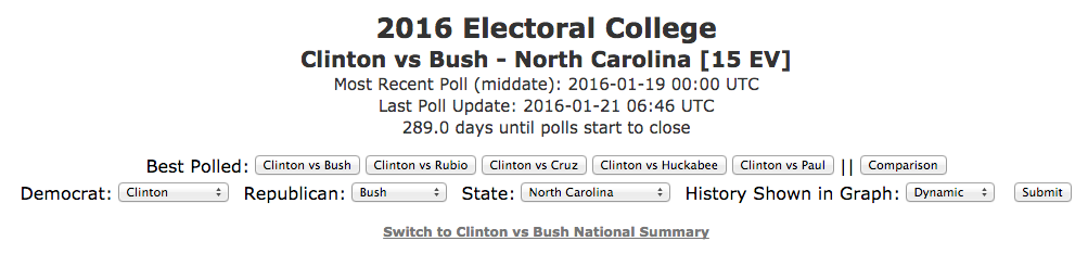
[Screenshot above updated 2015-06-23 03:12 UTC]
[Screenshot above updated again 2016-01-24 23:24 UTC]
The items here are:
- Best Polled Candidate Combinations: The five candidate pairs with the most polling (weighted to count close states more) are shown here for quick access. These links will take you to a national level page if you are on a national level page, or will keep you on a state level page if you you were on a state level page. Note that being the best polled does not necessarily mean these are the frontrunners! Once there are delegate leaders in both parties, a separate “Leaders” button will appear for that combination.
- Comparison: This takes you to a page where you can see the top five pairings compared to each other, once again remaining on a state or national level as appropriate.
- Selection Bar: This line lets you choose which candidate pair you are interested in looking at, the amount of history you want to show on the graphs, and if you are at the state level, which state/jurisdiction you want to look at. As of the launch of the site, there had been polls involving 8 Democrats and 24 Republicans. Any combinations beyond the top five combinations are however generally very sparsely polled, so results should be viewed with appropriate skepticism.
- Page Identification: Which candidate combination you are currently looking at, and what information about that combination you are currently viewing.
- Most Recent Poll: The date and time of the most recent poll (by middate of the days the poll was in the field) used in the page you are currently viewing.
- Last Poll Update: The date and time data on the page you are looking at was most recently updated.
- Time until polls start to close: How much time is left until actual election results start coming in making poll based analyses like this moot.
- Link to national summary: If you are viewing a state level page, a link will be available to navigate to the corresponding national page.
Also of note, all maps and graphs have a hamburger menu in the upper right which allows you to save off a copy of the image if desired.
National Summary Pages
This page gives a national overview of the state of the race for a particular pair of candidates. The page defaults to whatever candidate pair is currently the “best polled”, but of course any other candidate pair can be chosen.
The following elements are shown on this page:
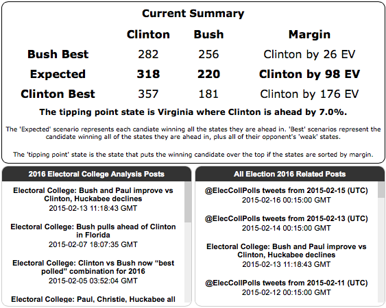
[Screenshot above updated 2015-02-17 13:14 UTC]
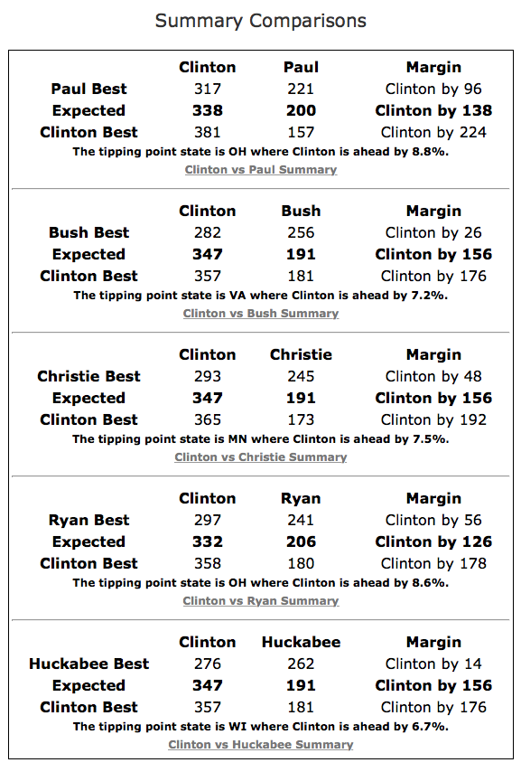
The summary block gives a round up of the overall situation between the two chosen candidates.
The expected line gives results if all states are won by the candidate currently ahead in the poll average in the state. The two best lines show the range of possibilities if all of the close states end up going with one candidate or the other. The current tipping point is also described.
The bottom half of the block contains links to recent Election 2016 related posts on Abulsme.com. These may be summaries of poll updates digested from twitter, blog posts with analysis or commentary, or podcast episodes that include discussion of the election.
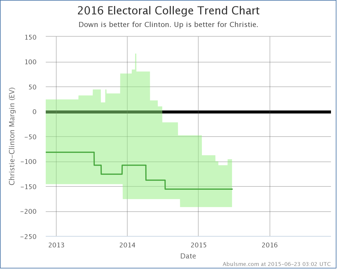
[Screenshot above updated 2015-06-23 03:02 UTC]
The Electoral College Trend Chart shows the ranges described in the summary as they have evolved over time. Mousing over the chart allows you to see the margin ranges as they were on various dates in the past.
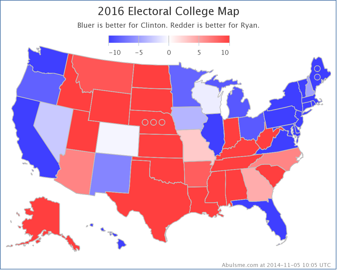
The Electoral College Map is just the traditional red/blue map of the states. Blue for Democrats, Red for Republicans. Any margin over 10% is solid red or blue. The closer a state is, the closer the color gets to white. On the site, if you mouse over the map you can get details on particular states. Clicking on a state takes you to the full detail page for the state.
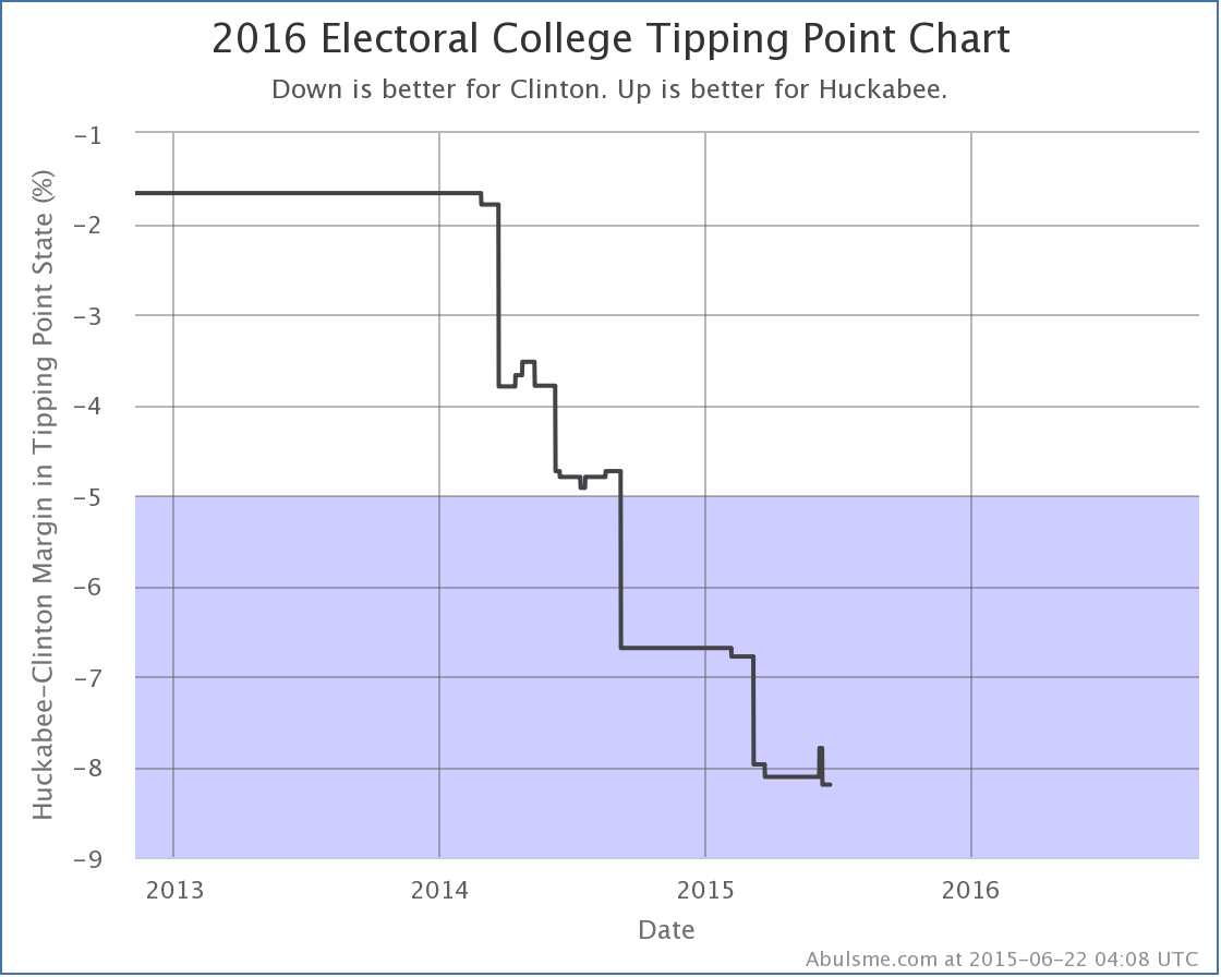
[Screenshot above updated 2015-06-22 04:08 UTC]
The Tipping Point Chart shows the Tipping point margin over time. Mousing over the graph will show the numerical margins along with the state which was the tipping point state at particular dates in the past. Shading is used to represent the “Weak”, “Strong”, and “Solid” categories.
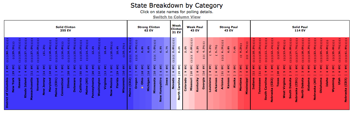
The State Breakdown gives an ordered list of the states as they fit into the six categories. The yellow dot indicates the tipping point state. If it is in a blue state, the Democrats are winning. If it is in a red state, the Republicans are winning.
If the poll average in a state needed to use previous general election results to fill out the average because not enough actual polls of the candidate pair were available yet, parentheses are added around the average, one per general election result used. A state with five sets of parentheses indicates that there have not yet been any polls of that candidate pair in the state and the average is based only on the five previous general elections. A state with no parentheses on the other hand indicates that there is enough polling that the average is based fully on actual polls for the candidate pair.
Clicking on any state’s name will take you to the detail page for that state and these candidates.
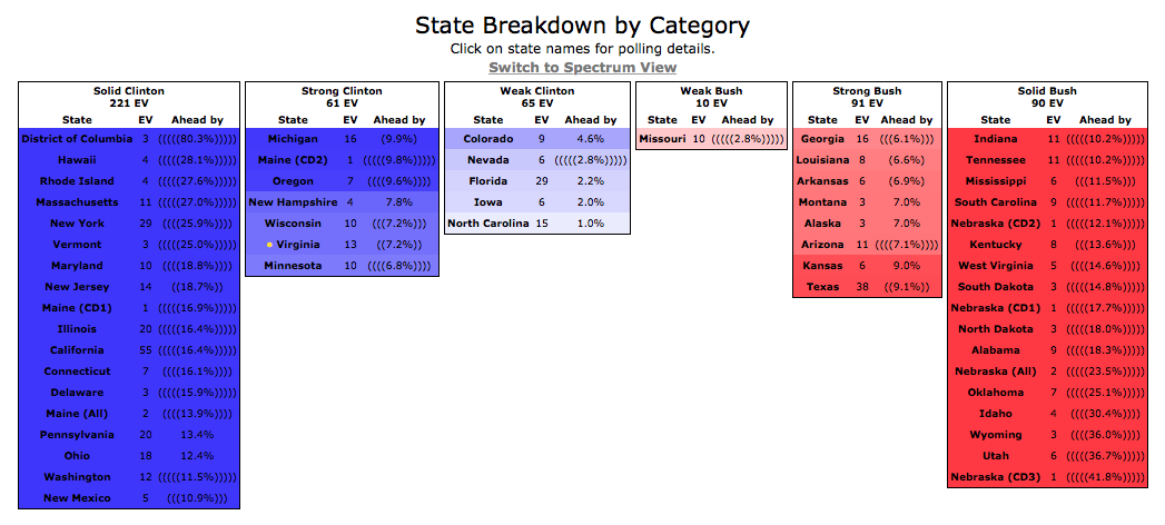
The Category Breakdown can be toggled from Spectrum View (the default) which shows all the states in one continuum with vertical text to Column View, which keeps the text horizontal with separate columns for each category. The information presented is identical, only the way it is presented changes.

Finally, for anyone wishing to remix or reuse the poll data on this site, links are available at the bottom of this page to access the underlying poll results.
National Comparison Page
The left of the page is simply a compilation of the national summary blocks for each of the top five best polled candidate pairs.
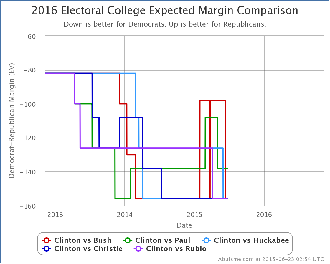
[Screenshot above updated 2015-06-23 02:54 UTC]
The Margin Comparison chart simply shows the “Expected” case from each of the top five best polled candidate pairs. Unlike the candidate specific national summaries, this only shows the expected lines, not the full range of possibilities between the two best cases. With five mostly overlapping area ranges, the chart would simply have been unreadable. As with other charts, if you mouse over the lines, you will see the specific numbers for the candidates on the days you are mousing over.
[Added 2015-01-23 10:28 UTC – As of today, the Republican and Democratic “Best Case” charts are also shown on at the bottom of the National Comparison page in a manner parallel to the “Expected” chart.]
[Screenshot above updated 2015-06-23 02:54 UTC]
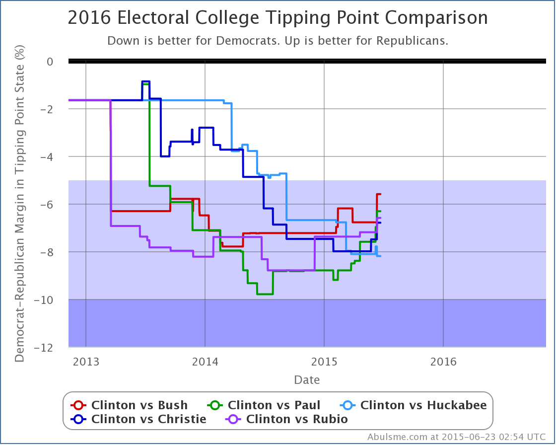
The Tipping Point Comparison chart shows the same type of comparison, but for the tipping point margin. Shading is used to represent the “Weak”, “Strong”, and “Solid” categories.
[Added 2015-02-17 13:20 UTC]
[Screenshot above updated 2015-06-23 02:54 UTC]
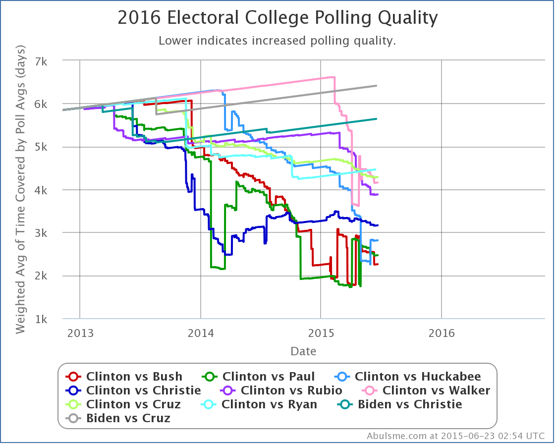
At the very bottom of the comparison page is a chart comparing the “polling quality” of various candidate combinations. For purposes of this site, polling quality for each candidate combination is measured by an average of the time since the oldest poll included in the polling average in each of the 56 jurisdictions. In order to account for the fact that closer states “matter more” than ones where the result is essentially a foregone conclusion, rather than being a flat mean, we weight the average by the inverse of the margin in each jurisdiction, thus giving a much higher weight to closer states. Rather than just showing the top five candidate pairs like the other charts, this chart shows the top ten in order to illustrate the position of the “next closest” candidate combinations relative to the five generally shown throughout this site.
State Detail Page
[Screenshot above updated 2015-06-23 03:02 UTC]
The chart on this page shows both the poll average (the red line) as it changes over time, and the actual individual polls. Mousing over the red line will give you the value of the average at each time in the past. Mousing over the blue dots will give you details of each individual poll.
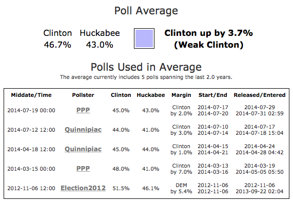
The right side of the page shows the actual averages for each candidate, as well as the margin and classification of the state. The color swatch represents the color of the state on the national summary.
Below this is a listing of each of the specific polls used in the average, along with a variety of details on each one. Clicking on the name of the pollster will link to the source for the poll information. Most often, this is the pollster’s website directly, but in some cases it may be a news article about the poll.
A separate table of all available older polls not used in the average, including general election results back to 1980, is also shown.
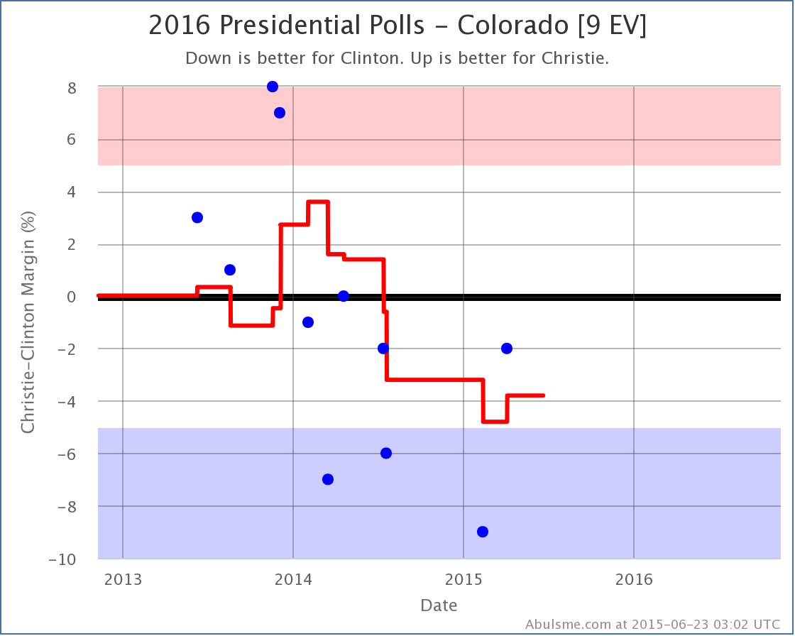
State Comparison
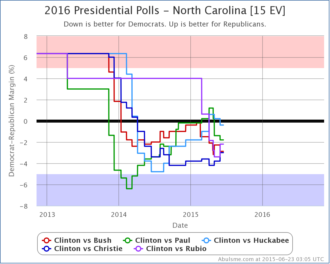
[Screenshot above updated 2015-06-23 03:05 UTC]
The chart here compares the poll averages in this state for each of the top five best polled candidates nationally. As usual, you can mouse over the lines to see the margins for each of the candidate pairs on specific dates in the past.
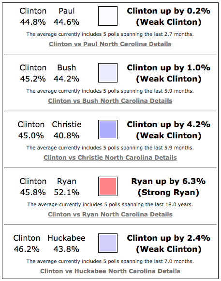
The right side of the page is simply a compilation of the summaries from the state detail pages for each of the five candidate combinations.
Edit 2015-02-06 19:10 UTC to fix minor formatting issues.
Edit 2015-06-23 04:17 UTC to update screenshots affected by updates to the color schemes on certain charts.
Edit 2016-01-24 23:27 UTC to update a screenshot and note the appearance of a button for delegate leaders in the navigation.
[Blog Post] “Electoral College: A Tour of the 2016 Site” http://t.co/zMFAvyTRPf
The site tour post has been updated to reflect the updated colors on some of the charts. http://t.co/T2P9AMKgSd