This is the website of Abulsme Noibatno Itramne (also known as Sam Minter).
Posts here are rare these days. For current stuff, follow me on Mastodon
|
As is true of most people, every few months I completely change the method I use to keep track of and manage the various things I need to get done.
Right? Most people do this, right?
No? OK, well, whatever. This is something I experiment with. The general pattern is that at some point I realize that whatever method I am using isn’t working for me. Then I scrap the whole thing and come up with a new mechanism/algorithm to try and see how it goes. Typically, it will do better at making sure some of the things I was feeling got neglected get done, but at the expense of something else that had been getting more attention, but now doesn’t. (Because fundamentally, there is never time to do everything I want to do, so no matter what system I choose, SOMETHING gets shafted, the question is which things, and am I happy with the result.)
Anyway, in the last couple weeks, I’ve started a new one of these cycles, so I figured I’d talk about it a little bit.
Requirements
In this iteration, the problem I was having was that a handful of high priority items that I do regularly were getting all my attention, and some lower priority items (that never the less I would like to get to SOMETIMES) were just never happening. So I wanted some method that would encourage me to mix it up a bit.
I wanted something that would take into account that I want to do certain tasks repeatedly, while others were one offs. It also needed to take into account the fact that some items do indeed have higher priority than others. Also, and most importantly, it should take into account how close the deadline is for each item. (Or realistically, since this is me, how late it is.) This last factor makes the prioritization dynamic. If it has been 5 days since the last time I did something that is supposed to happen once a day, that’s one thing. If it has been 20 days since I did that thing, the priority should be much higher.
I also didn’t want a todo list that just showed me a list, or what the current “most important” thing was. If the most important thing is a big time consuming thing, it doesn’t mean I want to spend 100% of my time on it until it gets done. (Not usually anyway.) So I wanted something probabilistic, where each item had a dynamically calculated “current priority” which would translate into a probability. Each time I want to sit down to work on something, I want to roll the metaphorical dice, and have one of the items come up based on those probabilities. So the “most important” item has a higher chance of coming up than everything else, but not a 100% chance. Meanwhile, low priority items may have a low chance of coming up, but not a 0% chance. And as time goes by without those low priority items being picked, their priority slowly rises. If ignored long enough, even the lowest priority item will become high priority.
So, looking at specifics:
Recurring Items
To start with, I figured I would have a “default priority” for these that started at 0 when the item had just been done, and rises linearly to some constant value (I picked 1.00) at the moment the thing is due to happen again. Then because some things are more important than others, I allow a multiplier.
So we end up with (multiplier)*(1-(((time due next)-(now))/(recurrence)).
Notice this keeps going up after something is due, at a rate that depends on the recurrence. So a weekly item that has gone two weeks ends up with the same priority as a daily item that has gone two days (if they have the same multiplier).
One off Items
I wanted these to basically work the same way and be included in the same system as the recurring items, so I mapped them into the same pattern. I did this by also tracking a “start date”. A one off item just gets treated the same as a recurring item with the recurrence being the amount of time between the start date and the due date.
Putting it Together
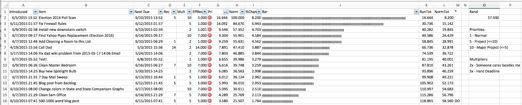
Although eventually I’d like to set all this up in a web app for me to be able to easily access my list from anywhere, I started by modeling it in Excel. You list all the times, you calculate the dynamic priorities, from that you sum things up and calculate the probabilities. I added some additional stuff for Excel to show a bar graph of the probabilities, to have a macro to refresh all the probabilities, resort the list, and then pick an item based on the probabilities, etc.
Although I may flip on this later, I also decided on a minimum recurrence of 24 hours for practical purposes. (Theoretically, having much shorter time frames is fine, but for my use case it didn’t make sense…)
Results
Too soon to tell. I’ve been using this for maybe two weeks so far. I am indeed seeing a mix that has the higher priority items come up slightly less often, but still a decent amount, while lower priority items are getting attention they haven’t gotten in a long time. I’m happy about that. But of course the question is if the higher priority items will get ENOUGH attention, or if this ends up being a solution where they don’t get what they need, and being high priority, that causes problems. Of course, if that happens, I can always increase the multiplier on those items. But I’m not sure yet if that would just set up an arms race on multipliers, or if things would come to a stable equilibrium that is acceptable.
I’ll report back after a few months. :-)
Oh, and if anybody wants to also try this, let me know and I’d be happy to send you a copy of a skeleton spreadsheet with this logic.
Today’s poll update consisted entirely of a new release of North Carolina data from PPP. They polled 11 different candidate combinations for 2016. Only one of these caused a category change for one of the top five “best polled” candidate pairs. That would be Clinton vs Paul:
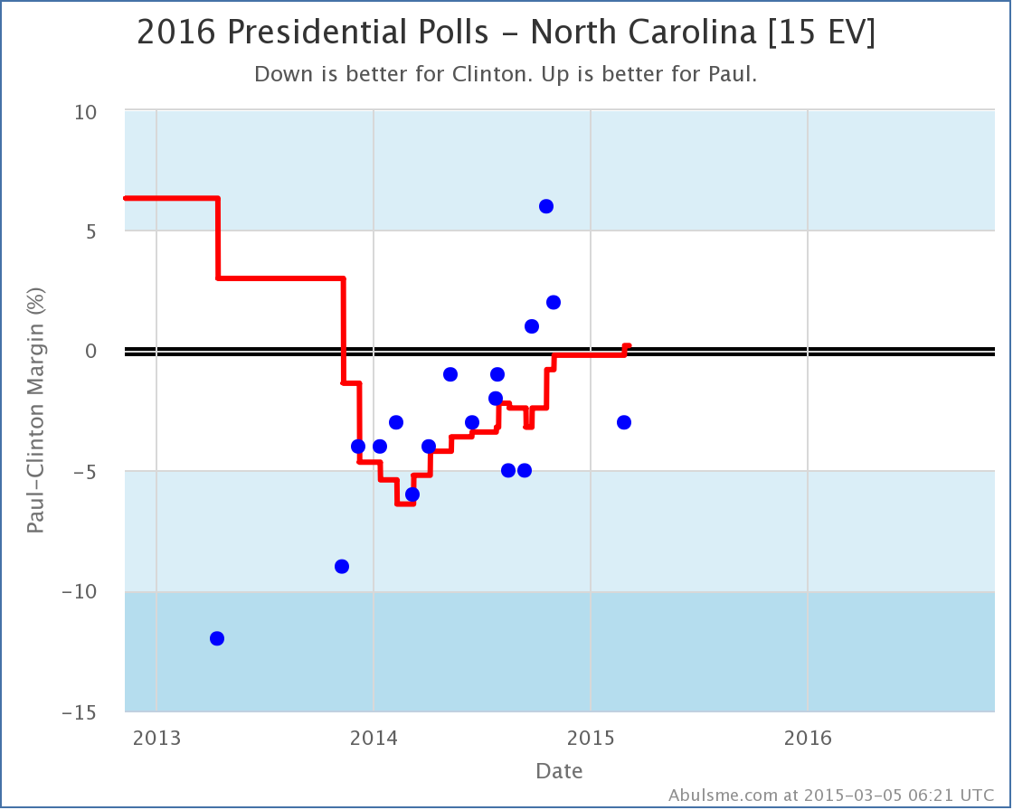
Although the most recent poll has Paul behind by 3%, the poll it replaces in the average had Paul behind by 5%, so the average moves from an 0.2% Clinton lead to an 0.2% Paul lead.
Now, to be clear, just barely on one side of the line vs just barely on the other side of the line, either way this is about as close to a tie as you can get. (Especially since the way I calculate polling averages actually doesn’t allow ties, since it will pull in older polls to break any ties that might otherwise come up.)
The spread of the last five polls is from Clinton by 5% to Paul by 6%, so there is a lot of uncertainty here too. Basically, North Carolina is a toss up. But that’s what being “Weak” means in my model anyway. We allow the state to swing from side to side in calculating the range of possible outcomes.
But for now, this does push the “Expected Margin” in Paul’s direction:

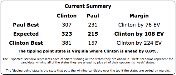
Still way behind to be sure, but every change in the Clinton vs Paul margin range numbers in the last few months has been in Paul’s direction.
Bush, Christie and Huckabee were also in this latest batch of North Carolina polls, so lets look quickly at the comparison chart as well:
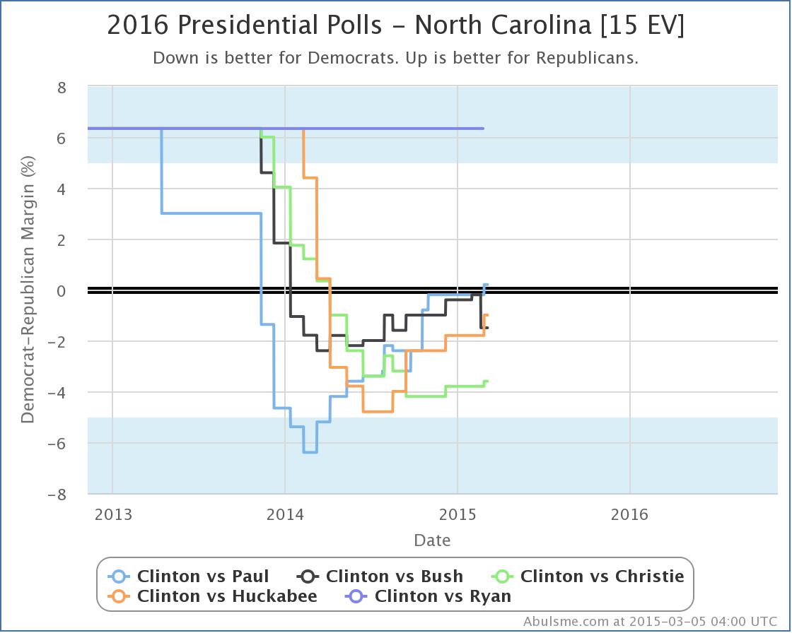
Ignore Clinton vs Ryan, which has never been polled in North Carolina.
All of the candidates have been improving against Clinton in the last few months. Paul is just the first to flip the state. Bush was very close, but the last two polls including him didn’t go his way, so he pulled back a bit. But even Christie looks like he may have bottomed out and is now improving again. In North Carolina at least, the trend seems to be away from Clinton and toward the various Republican contenders.
As usual though, the usual caveats apply on how sparse polling still is, just how far away from the election we still are, and how the very next poll may change the trend.
Final thing to mention, with today’s new data Clinton vs Huckabee passed Clinton vs Ryan to take the #4 spot in my “Top 5 best polled” list. Given that Ryan has said he is not going to run, it probably won’t be that long until he drops off the top 5. Cruz, Rubio and Walker (all vs Clinton) have all gotten recent polling attention that is improving their polling situation. Given all the recent attention, my bet would be on Walker, even though of this bunch he is currently furthest behind in my polling quality metric, but we shall see…
Note: This post is an update based on the data on my 2016 Electoral College Analysis Site. All of the charts and graphs seen here are from that site. Graphs, charts and raw data can be found there for the race nationally and in each state for every candidate combination that has been polled at the state level. In addition, comparisons of the best polled candidate combinations both nationally and each in each state are available. All charts above are clickable to go to the current version of the detail page the chart is from, which may contain more up to date information than the snapshots on this page, which were current as of the time of this post.
If changes keep coming in at this rate, I may need to move to a once a week update format, at least until we get a bit closer to the election. In any case, with today’s batch of new polls, we get a couple of status changes in Iowa, which in turn shift the national picture a bit.
Click on any of the charts to see more detail.
Clinton vs Paul
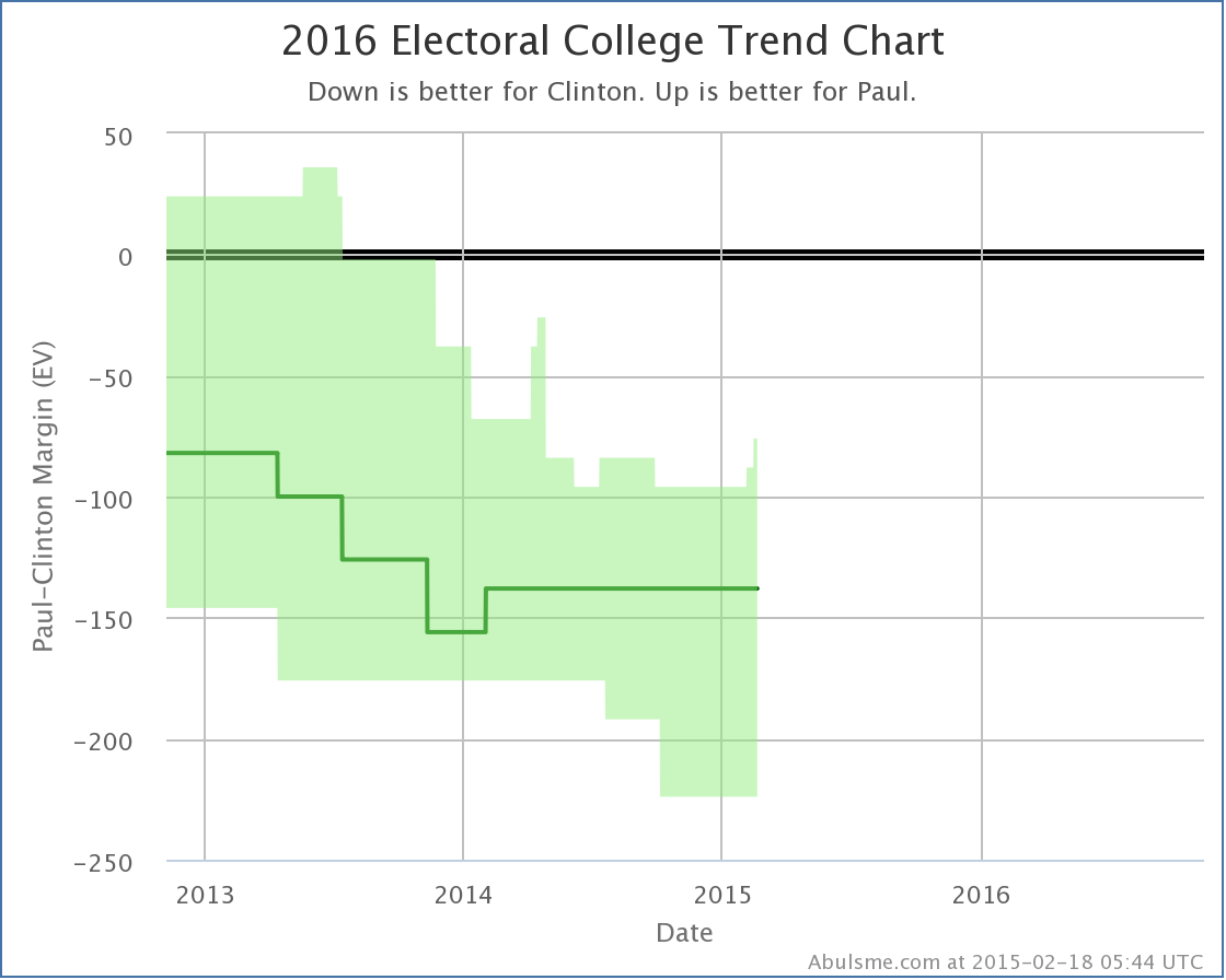
With today’s update, Iowa moves into the “Weak Clinton” zone, meaning that I consider it to be close enough to allow for the possibility of Paul winning. This improves Paul’s best case against Clinton to losing by 76 electoral votes. A couple of weeks ago, Paul’s best case was to lose by 96 electoral votes. So there does seem to be some movement here.
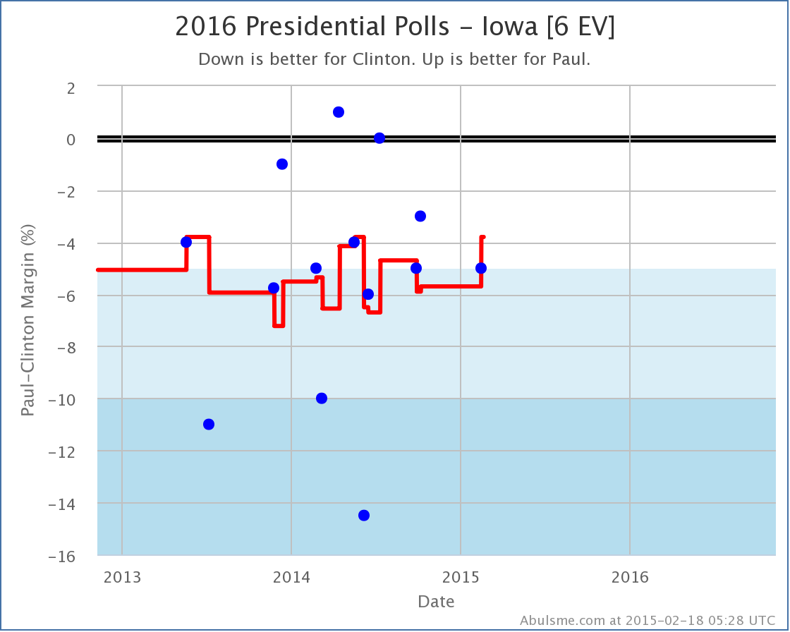
Looking at the actual polls in Iowa though, this trend is a little less clear. Iowa seems to have been bouncing back and forth over the 5% Clinton lead line for the last two years, spending more time with Clinton further ahead than 5%, but with occasional temporary movement toward Paul. Can we say that this time is a real “trend” rather than just another short term bump? Nope. Or maybe the average being further in Clinton’s direction is really just the result of a handful of outlier polls and really this “should” have been closer all along. Maybe. We’ll have to wait for more polls to see.
For now though, my charts show movement toward Paul.
Clinton vs Huckabee
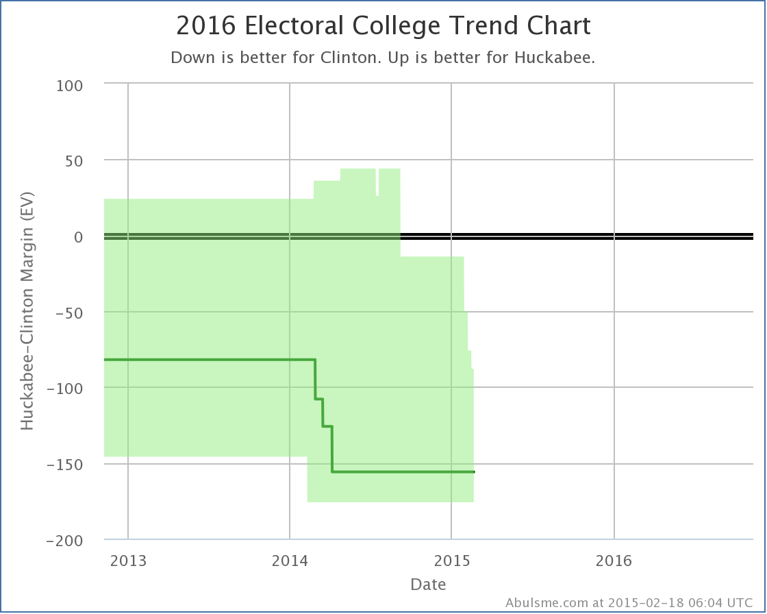
While Paul’s picture is improving, Huckabee’s continues to decline. In the latest update, Iowa slips out of Huckabee’s best case. Huckabee’s best case is now to lose to Clinton by 88 electoral votes. A month ago, his best case was losing by only 14 electoral votes, but states keep slipping away. Now, there has been a lot less Clinton vs Huckabee polling than there has been Clinton vs Paul polling, so there is a good chance a lot of this has simply been getting enough polling to get a good picture, rather than actual movement.
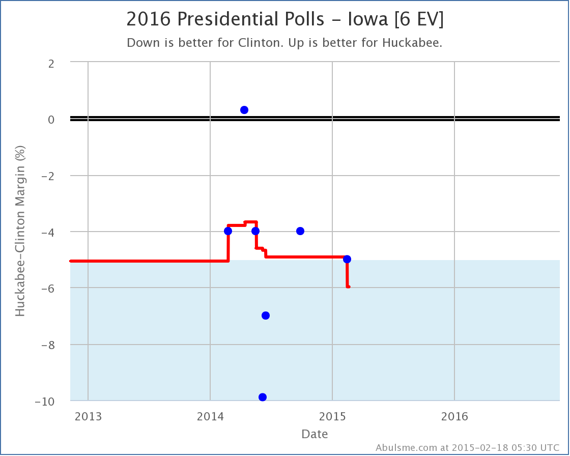
Specifically looking at the individual Iowa polls, you can see that we already did have five polls in Iowa, so the picture wasn’t dependent on previous election results, but there have only been 7 polls compared to the 14 for Clinton vs Paul. And there is quite a scatter between those polls (as there also was with Clinton vs Paul). The “movement” here is basically one extreme poll (the one showing Huckabee actually ahead in Iowa) falling out of the average, while another extreme point (the one showing Clinton ahead by 10%) remains in the average.
As with the Paul situation, it is far from clear that this is a real trend as opposed to just a temporary bump in this direction, and the next polls could change the picture again. It is well within the realm of possibility that the “real situation” for both of these candidates is that Clinton is just about 5% ahead of them, and they will just bounce back and forth between my categories as new polls come in.
Comparison
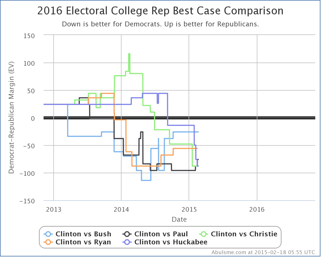
Since in both cases today, what has changed is the Republican best case, lets look at the trends there with the five best polled candidate combinations. Looking just since the 2014 elections, the movement on this specific metric has been Paul improving, Bush and Ryan flat, Christie and Huckabee declining. Other metrics show slightly different trends, but when all of the Republicans here are losing even when you give them all the close states, the first step is just to start making states close, and this chart measures that process.
But wait, Ryan has said he isn’t running, and what about this Walker guy? A bunch of people have been talking about him lately. Well, I recently introduced this new chart on where the candidate combinations stand in my “polling quality” metric:
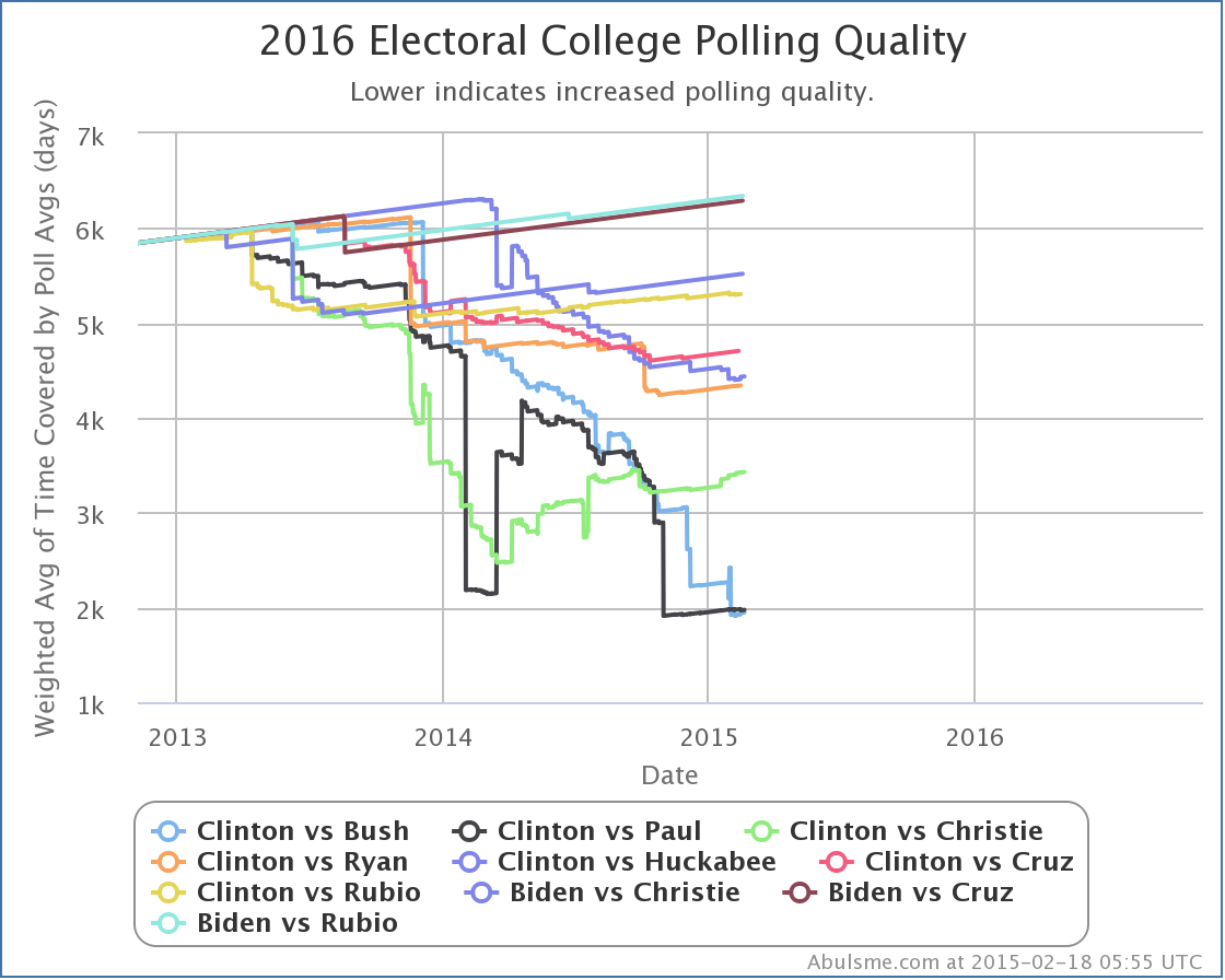
This shows the best TEN polled candidate combinations, not just the top five, so we can see if new candidate pairs are heading toward the top five.
On this chart the lower the line, the better the polling quality. Poling quality is measured by the average amount of time used in the polling averages across the 56 jurisdictions that have electoral votes, weighted such that close states count a lot more than states where one candidates lead is large. A new poll may or may not improve polling quality, since if new poll makes a state less competitive than it was, the weight of that state also decreases in this metric. If there are no new polls for a candidate pair, the polling quality slowly gets worse as each day passes.
Anyway, what do we see here? Well, if trends continue, looks like Clinton vs Huckabee may soon pass Clinton vs Ryan, and Clinton vs Bush and Paul are very close to each other so easily could flip back and forth, but Clinton vs Cruz hasn’t shown any signs lately of much life. Nor any of the others in the 6-10 zone. So we may not get any new combinations in the top five for a little while yet.
How about Clinton vs Walker? Oh, yeah. that combination is still way out at #18 on this ranking. He stands at about 6616 on this metric, compared to 6340 for the worst of the top ten shown in the chart above and 4437 for the worst of the top five. We need a lot more state level polls of that combination before we have enough polls to meaningfully compare that scenario to the five we’re showing in the analysis here.
We are 634.6 days from the first polls closing as I write this message. But yet here I am with the fourth of these updates in a two week period. I honestly didn’t expect the polling to be picking up quite this fast. But it seems to be. So be it.
Please keep in mind that everything here describes where things are now, and how things are trending NOW. We are far enough from the 2016 election that nothing here represents a prediction for what will happen in 2016. But knowing how things look now and observing the trends still provides interesting insight.
Today I added new polls from CNU in Virgina and from Bloomberg / Saint Anselm / Purple in New Hampshire. These resulted in changes worth noting* for three candidate pairs. I’ll review them quickly in order of the magnitude of the change.
Click on any of the charts to go to the election2016.abulsme.com site for more detail.
Clinton vs Huckabee
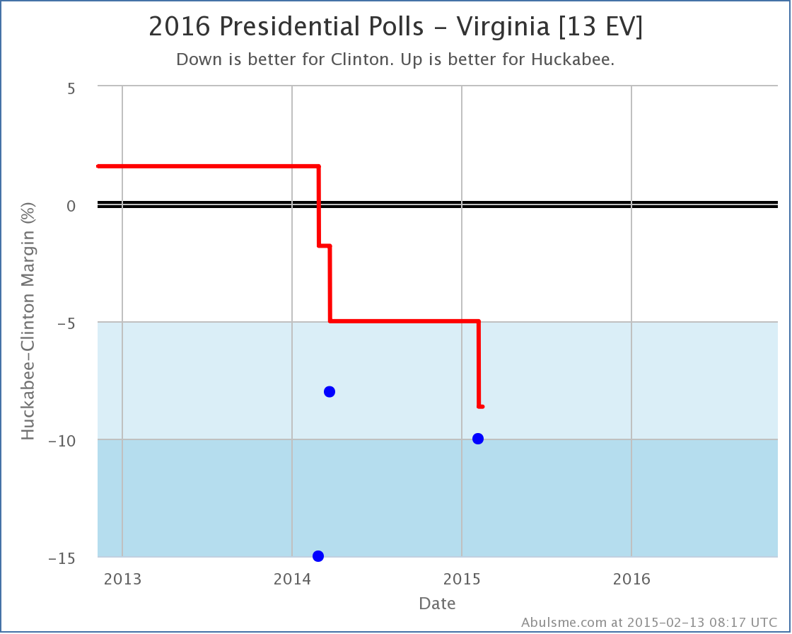
Huckabee had only been hanging on to the “Weak Clinton” category in Virginia by virtue of the fact that I pad my poll average with previous general election results if there are not yet five actual polls between the candidates in question. With the third poll directly pitting Clinton vs Huckabee in Virginia, Huckabee falls much further behind, and Virginia now seems to slip out of reach. Huckabee’s best case vs Clinton therefore gets worse.
Without Virginia in the mix, Huckabee’s “best case” (where he wins all the states he is ahead in, plus all of the states where Clinton is ahead by less than 5%) is now to lose to Clinton by 76 electoral votes.
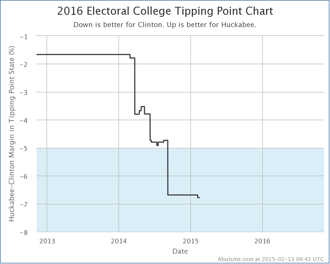
This change also drops the “tipping point” (which represents how much of a uniform shift in polling across all states would be needed to flip the election) further in Clinton’s direction. The tipping point state for Clinton vs Huckabee is now Minnesota, where Clinton is ahead by 6.8%.
Clinton vs Paul
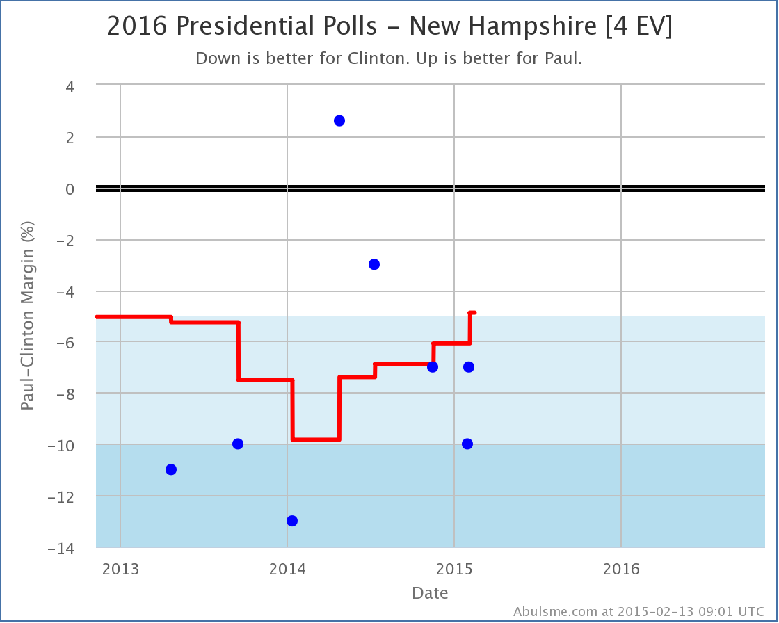
This chart of Clinton vs Paul polls in New Hampshire is interesting, and actually shows one of the disadvantages of using an average of the most recent polls, rather than some more sophisticated sort of trend smoothing. Paul’s average vs Clinton has been steadily improving for the last year. But if you look at the individual polls, you see that this is because some really bad polls for Paul from 2013 and early 2014 were “aging off” the average, being replaced by some relatively good polls for him from the last year, including one where he was actually ahead!
But if you actually look at the trend of the individual polls since then, the trend has been back toward Clinton. With a straight up poll average, this trend in the last five polls is invisible. We just know that the average of the newest five is higher than that of the five most recent polls not counting the brand new one. Basically, a poll where Paul was behind by 13% was replaced by a poll where Paul was only behind by 7%, so the average moved toward Paul… even though there may be a different trend if you look within the five polls actually used in the average.
If the trend in the last five polls is real (it may or may not be) then it would not be surprising to see New Hampshire fall back into “Strong Clinton” territory with the next poll.
For now though, we grant Paul the possibility of winning New Hampshire in his “best case” which is now to lose to Clinton by only 88 electoral votes.
Clinton vs Bush
No changes in best, worst or expected case for Bush against Clinton, but since the tipping point in this case was Virginia, and we had polling in Virginia, it is not unsurprising that the tipping point here moved, if only a little.
The tipping point here remains Virginia, but Bush moves from being behind 7.2% there, to only being behind by 7.0%.
And that is it for today’s update. Please explore election2016.abulsme.com to find more detail and interesting bits and pieces.
* For now, “Changes worth noting” are when the best, worst, or expected cases for one of the five best polled candidate pairs changes, when the tipping point changes by at least 0.1% for one of those candidate pairs, or if a new candidate pair becomes “best polled” or replaces one of the current five pairs on the list.
|
|