
|
There are several effects of all this, but the MOST noticeable is what is responsible for the name of this episode. This episode is entitled: “Darth Sam Breathes on Ivan”. This week Sam and Ivan discuss:
Anyway… thoughts… it was a Harry Potter movie. One must see them all out of completeness. It was OK. It seemed a little disjointed at times though. I’m thinking it is just a matter of exactly what was cut from the book and what was left in not being quite as smooth as one would have liked. Overall the usual for a Harry Potter film. Special effects, magic. The final fight scene reminded me more of a Star Wars film what with all the force lightning and such. The actors are all aging very quickly. You can tell they haven’t kept up with the one movie per year. Hmmm… I guess I don’t have all that much to say about Harry Potter. And I’m in a bit of a hurry, so I’ll leave it at that I guess.
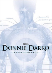
Anyway, she picked Donnie Darko. Years ago I had seen it at a midnight showing in a theater with Rebecca and company in DC. A few years later it was given to me on DVD for Christmas or my birthday or some such, and I watched it fairly soon thereafter. I remember assuring Brandy that it was a family safe movie, but then five minutes in two of the main characters start using some highly amusing, yet not 8 or 9 year old safe language and Amy started hiding her eyes and covering her ears. Oops. A little later they released a Director’s Cut version. I bought it as soon as it was available, but then it sat on shelves and in boxes for two and a half years until we watched it today. First lets start with I liked the original quite a bit. The Director’s cut adds a LOT. The Donnie Darko page on Wikipedia has a listing of the differences. When we finished the movie I was saying that they must have added “about half an hour”. I was close. Turns out it was about 20 minutes of new scenes. For the most part I like the additions. There is an argument that can be made that some of the appeal of the original version was just how confusing it was, whereas some of the things added are attempts to clarify what is going on… especially the places where the text from the time travel book is shown… and that this takes away from the “WTF just happened?” feelings that leave you talking and wanting more when you are done. Like too much explanation spoils it. Having said that, it isn’t like they end up spelling it out cleanly. You still get some of that effect. And for the most part I liked the additions. But I think I am glad I saw the original version first. Cynthia saw it for the first time in extended form. I’m thinking it was still odd and disturbing, but perhaps not quite so odd and disturbing as if she’d seen the original version. Oh yeah, right as the dramatic tension was building near the end, Roscoe started baking uncontrollably from the back yard. He had treed some sort of animal that hissed back from above. We couldn’t see it because it was dark, but we had to pause for about ten minutes to get him back inside and stuff. Threw things off a bit. But not too badly. Then the sound got messed up (by my needs to be replaced A/V system) right at the end when Mad World was playing. Hated that. HAd to keep getting up to kick the system to fix the sound. Grrr…
About 13.5 hours ago Cynthia arrived. Now we have to figure out what we will do for the next week or so. I’ve noticed a trend lately that seems to be most prominent about “blogs” that get big. What would that be? Really crappy redesigns that add more crap to the page, and detract from the primary content. I could list a bunch of them, but instead I’ll just tick off some of the features that really annoy me. Now, many of these may just be me, and other folks may love it, but… #1) “Click to read more”. Yeah yeah, you get another click and more page views, and you can fit more on your front page. But these really piss me off. I want to go to your front page, scan down for new things, and read any postings I am interested in. I shouldn’t have to go anywhere other than your front page unless I want to dig into your archives and find something old… or perhaps if I want to read the comments and discussion. But not to read the primary content. That just annoys me. But more and more places are using it more and more often. Too many to list. But I hate it everywhere. This is a big deterrent to me, but if the content is good it hasn’t yet stopped me from going to a site. But it is close. I don’t care if you right something long and I need to scroll a bit to read it… or to see the stuff below it. If I am coming to your site, it is because I like your content and want to read it. Don’t make it harder for me. #2) More and more columns. People. No more than three columns. Come on. I’ve seen sites recently with four or more. You need one big one for your main comment. You need one for secondary navigation. (Primary should probably be up top.) And I can even buy a third one for an ad bar or some additional interesting feeds or something if there is a compelling reason. I’ve considered adding a right hand bar to this site for a few things I want to put there. But no matter what your main content column should be prominent and none of the other columns should distract from it. One of the big advantages to a blog is the clear and central chronological organization. There are several sites I go to that appear to be going for an old fashioned newspaper layout with several columns, all of which get new content through the day. Sometimes not always with the newest at the top. It makes my eyes hurt and confuses me. Stop. Talking Points Memo just did this. I think they are imitating Huffington Post. With HuffPost I just can’t stand going there the layout is so annoying, doesn’t matter if they have good content or not. TPM was one of my regular daily stops. It may not be any more. The main content column is now less than half the width. No. Just to give both sides of the political spectrum some time, Michelle Malkin did this recently too. Only three columns, but two of them are content columns. Lead story on the left, other stuff on the right. WTF? JUst give me one column with the new stuff on top please. #3) Little side blocks with summary information about the post. Gawker just did this with all their sites. Instead of putting the little “Posted by bob at 5:15” thing at the bottom of each post, they are putting it at the side, thus creating huge blocks of wasted white space. This won’t stop me from going to engadget or lifehacker, but it is just stupid and annoying. It takes up more space this way. It wastes space. It makes the main content column narrower than it needs to be. Again, please put it back how it was. #4) Too many links to yourself. There are places that in a post make some words links. For instance they mention President Bush or the Whitehouse or the iPhone or something. When I see links like that, I expect to be sent to the actual website of the thing being mentioned. Or perhaps a wikipedia entry or some such. If you link these words to a listing of your own posts that you tagged with that word it pisses me off. If such a thing is really useful to the post, have a feature with a list of tags that people can click on that is clearly marked as such. Don’t use inline links for this. #5) Inline Ads: Yeah, yeah, I know, you want to make money and these are more effective that ads in the sidebar or whatever. But they are annoying as hell. Keep your content bar where your content bar goes. Keep the ads somewhere else. OK, I could probably pick more things to rant about, but I need to finish up a few things and then get to work. So I’m done.
So this week Sam and Greg discuss:
|
||

 OK, this is the 7th Curmudgeon’s Corner of the year. Fair warning though… it sucks. It sucks pretty badly. We had a lot of technical difficulties this time, with parts or all of the recording getting zapped a total of three times. The last time, we were actually recording it simultaneously in two different ways, and when one crashed we still had the other. But the other was extremely low quality, with my voice way too loud, and Ivan’s way too soft, and recorded all on one track so I couldn’t just correct both volumes once and be done with it. Instead I had to boost the volume when Ivan was talking, and pull it way down when I was talking. This is somewhat sloppy. I did my best, but it still sucks and is pretty hard to listen to.

 The sixth CC of the year, released late yesterday, is entitled “Law, Law and the Law”. Ivan had technical difficulties this week, so this week