After my post about landslides, Reader Ben asked in the comments about the relationship between the popular vote and electoral vote margins. Since I had all the data handy, here is a chart of that relationship…
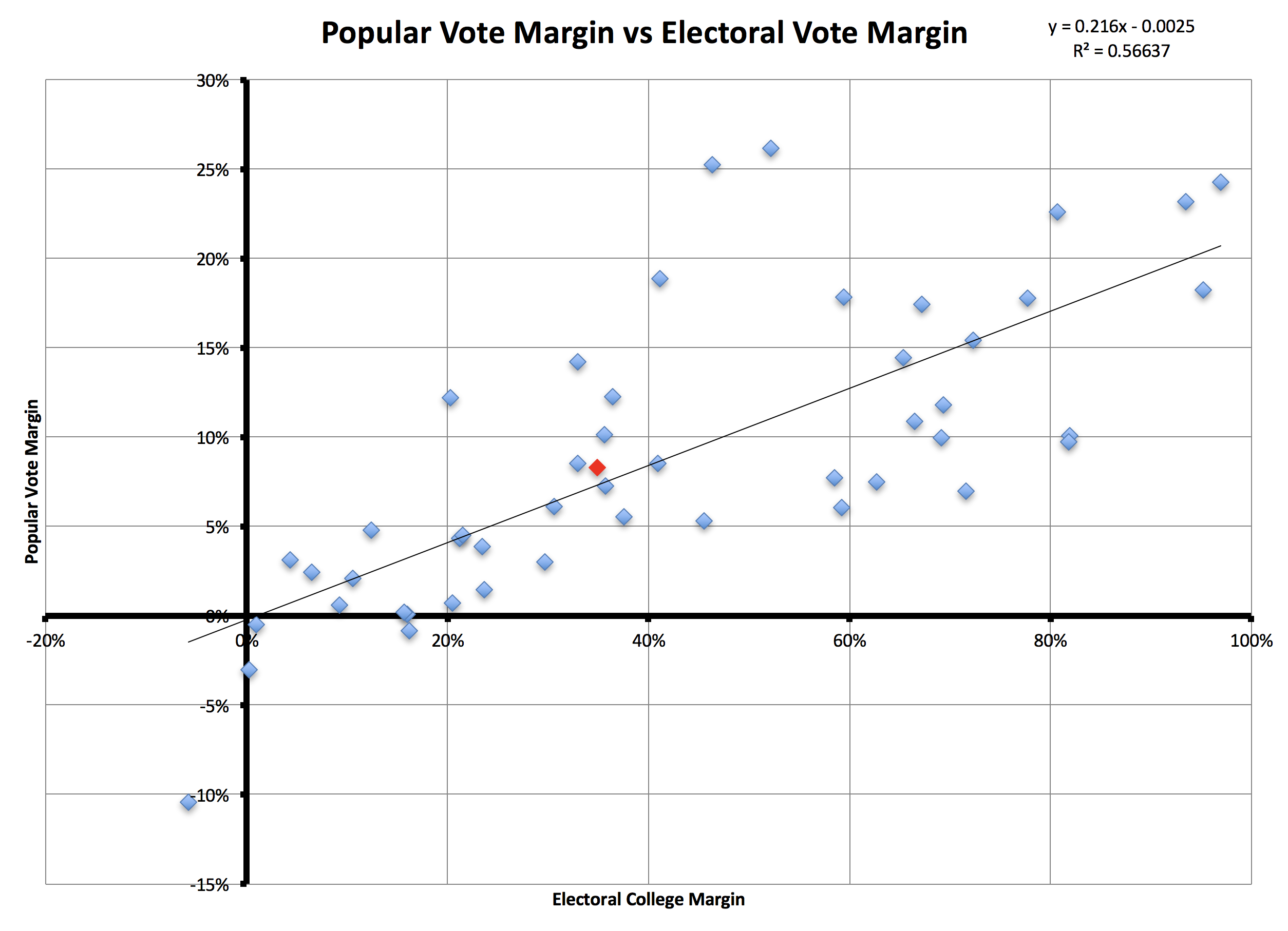
Each blue point represents one election between 1824 and 2012 with the popular vote margin on the Y axis and the electoral vote margin on the X axis. Interesting to note are the election where the person with the most electoral votes did not win (1824) and the four elections where the popular vote winner did not win (1824, 1876, 1888, 2000).
In general, you can see that there is a correlation between these two ways of measuring the election, but it is actually fairly loose. There is a lot of variance depending on the geographic distribution of support.
More relevant for this year though, the red data point represents the current polls for the 2016 election (as of August 16th), with the popular vote margin represented by the pollster.com average of an 8.3% Clinton lead and the current Election Graphs “expected case” of a 188 electoral vote win (188/538=34.9%) for Clinton.
As I discussed in my previous post, you can see that this election is in the middle of the pack, not an extraordinary “landslide” type win. At least not at the moment. We do still have several months left and things will of course change.
Leave a Reply
You must be logged in to post a comment.