- RT @fivethirtyeight: Newt has surged negative 6 points in the Florida polls since the Fred Thompson endorsement. #
- MT @fivethirtyeight: Romney back ahead in our FL forecast and gaining quickly. Newt needs a big debate tomorrow. http://t.co/f9oyZPZj #
- MT @abaumania: This chart from @fivethirtyeight shows worrisome trend for Newt. Debate tomorrow is huge. http://t.co/DMSrmPIW #
- Reading – Polls Suggest Gingrich's Support May Have Peaked (Nate Silver) http://t.co/j7i0gaWg #
- Reading – Poll analysis: Four new polls…Obama still ahead (HorsesAss) http://t.co/Ch1FA6i9 #
- RT @AmazonSES: Happy birthday to us! Many thanks to our wonderful customers who made our first year so awesome! http://t.co/K0hKiq2R #
|
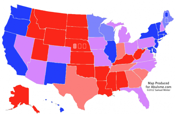
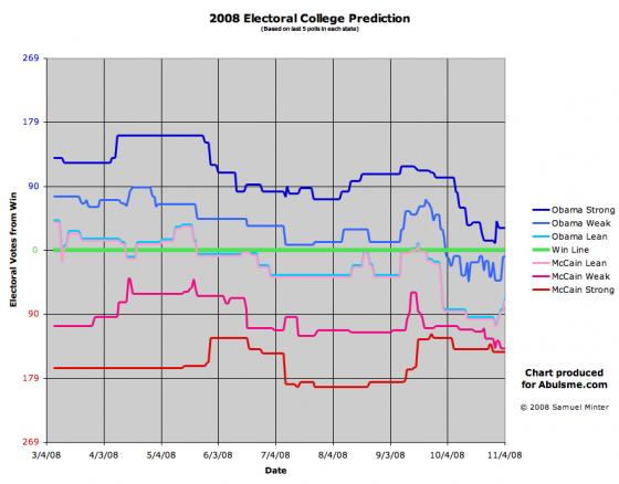
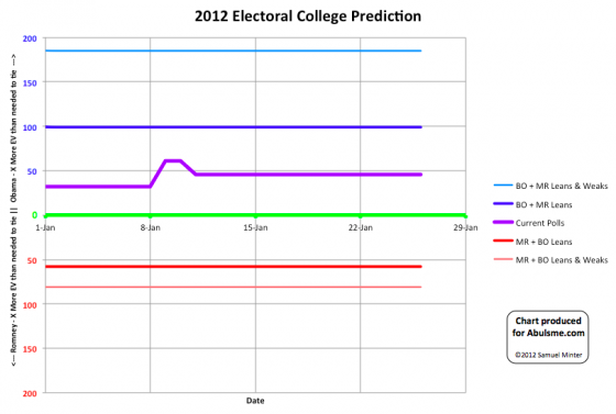
Map from the Abulsme.com 2012 Electoral College Prediction page. Well, the time has come. I have put together my initial general election forecast. Now, since so far Romney has been the only one in the lead in my Republican Delegate Count Tracking this initial analysis is based on the assumption that this will be an Obama vs Romney race. If someone else, say, I don’t know, Gingrich, would take a lead in my delegate count at some point in the future, I’ll produce a new analysis based on that pairing. For now though, we assume a Romney nomination. Bottom line at the moment… Obama is in a better position than Romney. If everybody won the states where my polling average indicates they are even slightly ahead, Obama wins by 315 to 223. But there are 12 states that at the moment should be considered too close to call. If Romney were to win all 12 of those states, he would win 327 to 211. If Obama were to win all 12 of those states, he would win 368 to 170. (For reference, 2008’s final result was Obama 365, McCain 173, so at the moment Obama’s best case is just slightly better than his 2008 result.) For details on the methodology I am using, please see the full 2012 Electoral College Prediction page. It isn’t the most sophisticated analysis method out there, others such as HorsesAss.org are doing more complex things such as Monte Carlo simulations based on current polling, etc. As we get closer to November, there will be dozens of sites doing different sorts of modeling and predicting possible results in different ways. I hope mine provides a slightly different view which is useful or interesting to at least a few people. The main item that is different with what I show than what I’ve seen other places is my method of showing the evolving race over time. In 2008, that chart ended up looking like this: (More on the 2008 analysis can be found at the 2008 Electoral College Prediction page.) In the 2008 chart above, the lower the lines were, the better off Obama was doing, the higher the lines, the better off McCain was. The nice thing here though is you can see the ebb and flow of the race over the course of the year. So you can tell McCain was doing well in the Spring, then sometime in May he was no longer the favorite to win, and with the exception of a few days right around the Republican convention, he was never ahead again. Then soon after the conventions were all over, McCain just collapsed and by the time we got to October, it was clear that it would take something remarkable happening for him to pull off a win. Anyway, for 2012 I’ve redone some of the details of how this chart is constructed, hopefully improving readability and intuitiveness. We don’t have all that much data or action yet so far, things are just beginning after all, but here it is: Chart from the Abulsme.com 2012 Electoral College Prediction page. This time up is better for Obama, down is better for Romney. The two wobbles on the center line so far are Florida flipping from Leaning Romney to Leaning Obama on January 9th, and North Carolina flipping from Leaning Obama to Leaning Romney on January 12th. Since this is the first post of the year for this model, I’ll include here the full explanation of how to interpret this chart:
Edit 2012 May 30 15:53 UTC – Since this was posted, I was made aware of more older polls that should have resulted in New Hampshire starting off as a “Weak Romney” state instead of a “Lean Romney” state. The time series charts are corrected as of May 30. Further details of the New Hampshire correction are also located in that post.
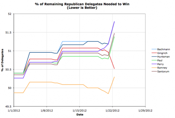
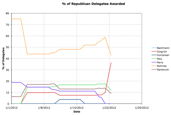
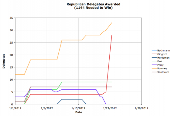
Chart from the Abulsme.com 2012 Republican Delegate Count Graphs page. Pulling ahead in just the last few days before the South Carolina Primary, Gingrich won a commanding victory in South Carolina. Although the congressional district level results won’t be final for awhile now, it looks like Gingrich will end up with 23 of South Carolina’s 25 delegates. Romney gets the remaining 2 delegates, plus he picked up another superdelegate since our last update. Fundamentally, looking at our “% of Remaining Delegates needed to win” chart gives the same story that is the big narrative tonight. This was a very bad day for Romney. Romney is still in the best position to win. He is still ahead in delegates. (33 Romney delegates to Gingrich’s 28 by our count which uses data from both The Green Papers and Democratic Convention Watch.) But now instead of being way off on his own, with a much better position than all of his competitors, who were getting worse off by the day, he is now joined by Gingrich, who has broken out of the pack of “not-Romneys” and is now nipping at Romney’s heels. Meanwhile, Paul and Santorum fall even further behind since they got no delegates at all out of South Carolina. The next big contest is Florida of course, with 50 delegates at stake. Florida is a winner take all state. If Romney wins Florida, he pulls WAY ahead again, and pushes Gingrich back into the background. If Gingrich wins, then he suddenly will take a fairly significant lead himself, and we will need to start taking a much closer look at the rest of the calendar… Since this was a big day, two other views as well… first the race as % of delegates captured so far… Romney had been over 50% for a little while. No longer. And finally, the plain old “Total Delegates” chart… Gingrich’s good night is particularly striking in this last one, but I think it actually makes it look like a better night than it really was. I think the first of these three charts is the most indicative of where the race really stands, but the other two are interesting views as well. But looking at % needed to win really gives you a sense of how close we are (or not) to wrapping things up. Numbers close to 50 as we have today still indicate a lot is possible. As we get candidates starting to head rapidly toward 100 (where they are mathematically eliminated) or starting to dive down toward zero (where they cinch the nomination) we will see very clearly the state of the race. Brendan Loy is right, it is time to watch and read this again. The good part starts 2:30 into the video. Lithgow does Newt (on Colbert) from wally danger on Vimeo.
Not so funny now, huh? Oh wait, yeah, it still is.
|
||
