States with new poll data since the last update: Utah, Georgia, Missouri, Kentucky, Illinois, Pennsylvania, North Carolina, Ohio, Iowa, Florida, Kansas, Wisconsin, New Hampshire, Texas, South Carolina, Maine (All), New York, North Carolina, Virginia, Colorado
There have been tons of polls lately, but most of them didn’t cause any change to the analysis here. The exception this time was Virginia:
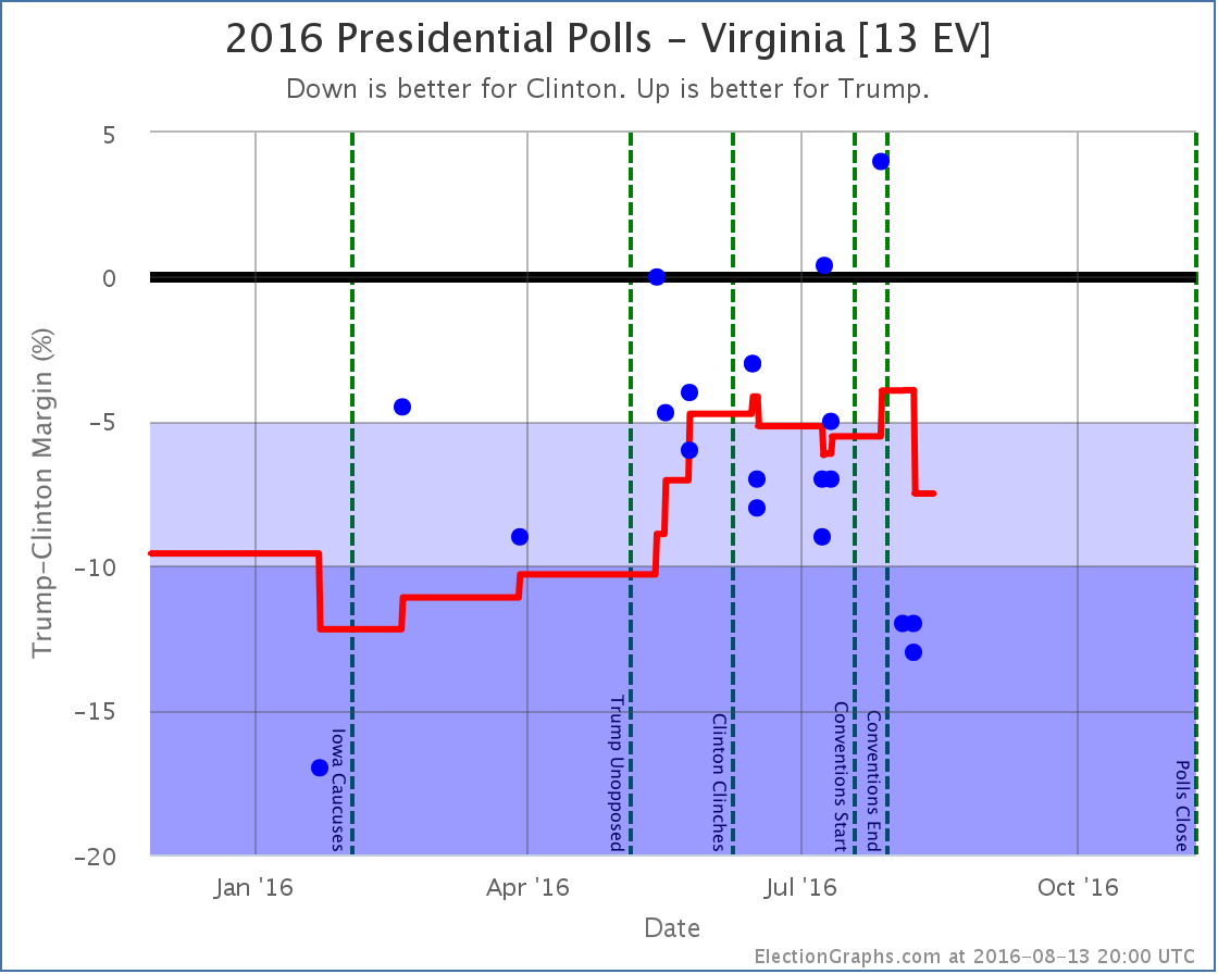
Virginia had been hovering at just about the 5% Clinton lead line since May. A poll taken during the convention weeks gave Trump his biggest lead ever in Virginia. This put Virginia on the close state list. Post convention though, both Marist and YouGov polls have shown Clinton with double digit leads. This moves the average from a 3.9% Clinton lead to a 7.5% Clinton lead.
And so Virginia disappears from Trump’s “best case” where we assume he wins not only the states he leads, but also steals all the states where Clinton’s lead is under 5%.
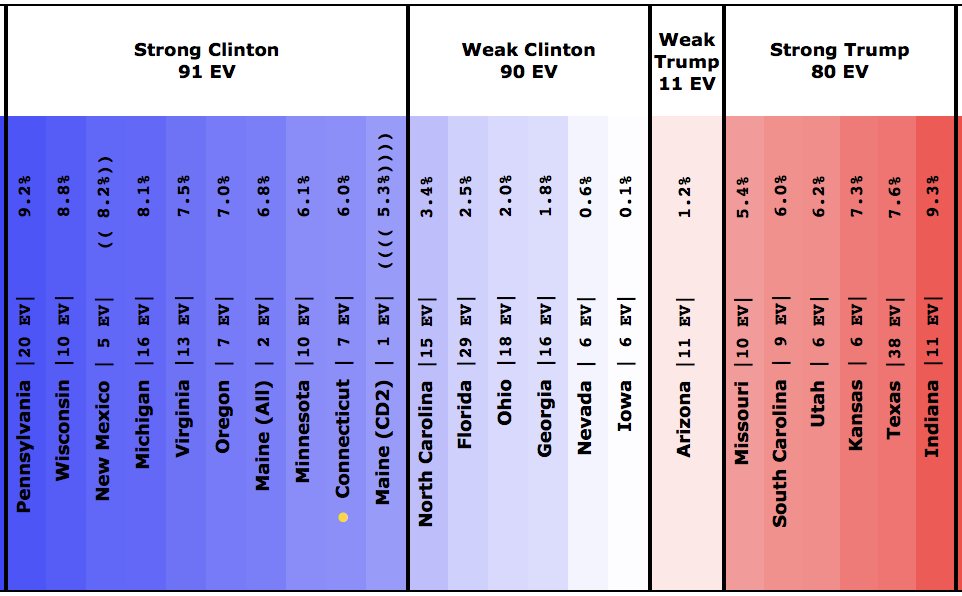
Trump’s “best case” is now to lose to Clinton by 8 electoral votes. A narrow loss, but a loss none the less. To win, Trump not only has to pull all the close states to his side, he has to start winning in some states where Clinton has a substantial lead at the moment.
This is even more striking on the chart of the tipping point. Virginia was the tipping point, and when Clinton’s lead there moved, the tipping point also moved dramatically.
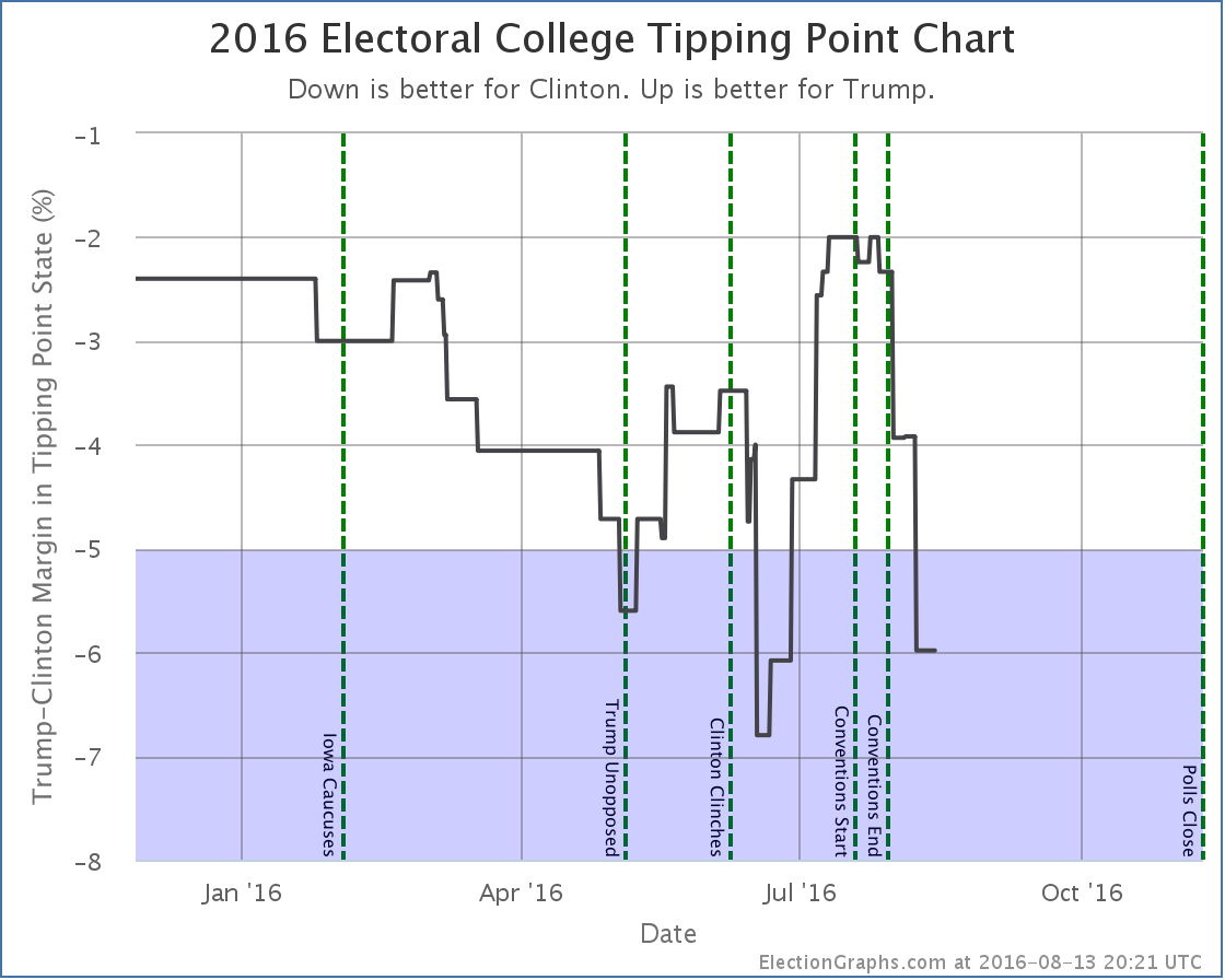
The tipping point moves from Clinton +3.9% in Virginia to Clinton +6.0% in Connecticut. Connecticut! We have a situation where it might be CONNECTICUT that puts Clinton over the edge. Not Ohio, not Florida, not any other traditional swing state… but Connecticut. Clinton’s tipping point lead still isn’t as good as it was back in mid-June, but it is getting close.
The center of the spectrum of states now looks like this:
And the national summary like this:
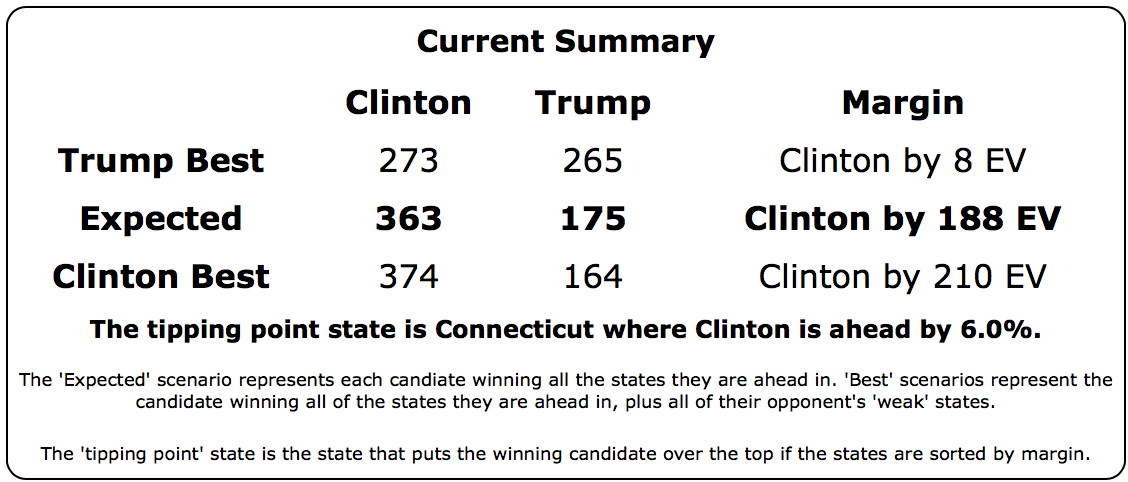
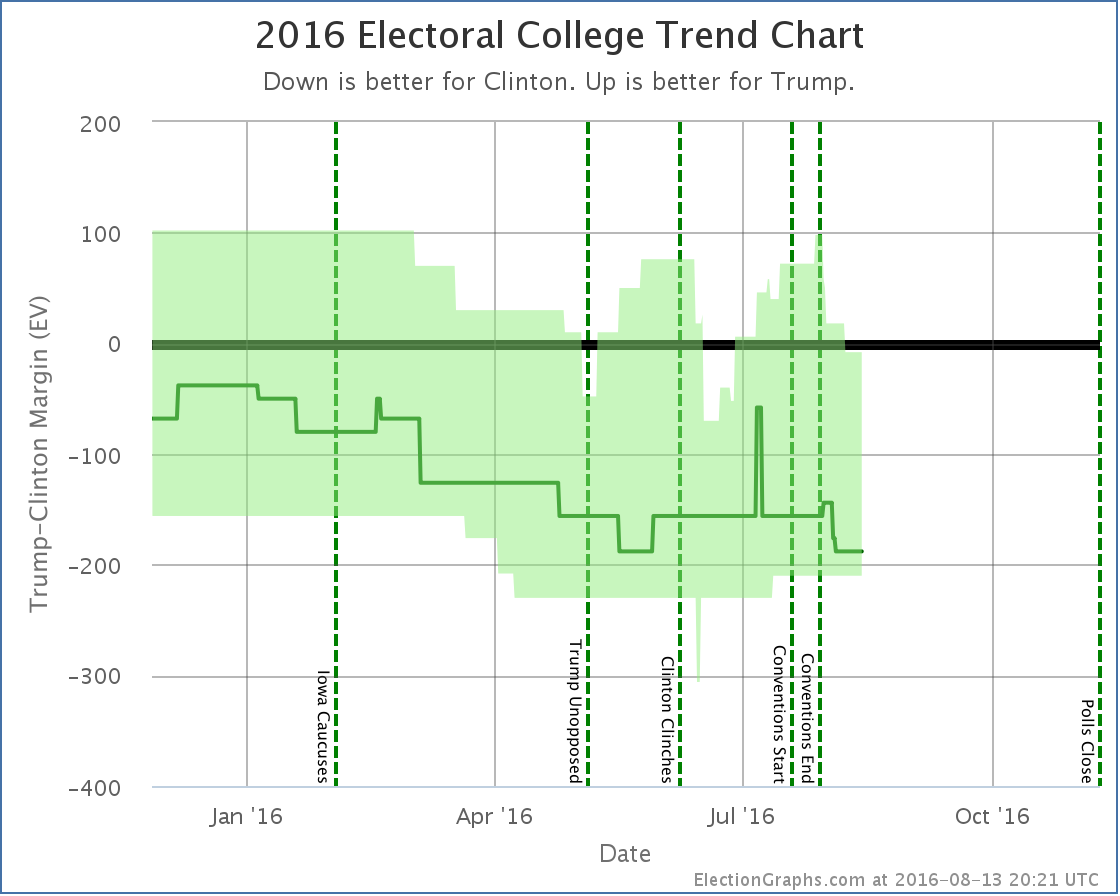
This isn’t a Clinton landslide, but it is looking like a very solid Clinton win. Trump needs to reverse his slide to get back in the game. Let alone to win. So far Election Graphs has NEVER shown a Trump win as the expected result, and right now isn’t even showing Trump in serious contention.
But the graphs above do show that things can swing quickly based on what is happening in the campaign and in the world. So we of course all have to keep watching. 87.1 days until polls start to close.
Opinions Wanted! For the data geeks out there, I’ve been having discussions with a few readers about how I handle it when a single pollster releases multiple results. For instance, in the case above, Marist took one poll, but asked about both Clinton vs Trump (Clinton leads by 13%), and Clinton vs Trump vs Johnson vs Stein (Clinton leads by 12%). Currently, in the interest of keeping things as simple as possible, and also of including everything, I just include both of these data points as if they were completely separate. Of course they are not. The same people were asked both questions. They are not independent results, and are usually closely grouped. So I’m in effect double weighting Marist compared to YouGov, who only released one result (Clinton vs Trump vs Johnson in this case). This also makes my normal “five poll average” often include less than five separate pollsters and cover a smaller time period than it would otherwise. Most other sites in these cases pick ONE of the reported results and ignore the others completely. There are other possible ways to handle this as well. I’m considering if I should make changes to how polls are counted on Election Graphs to address this concern, and if so which changes. If you have an opinion, please let me know in the comments or email me directly at abulsme@abulsme.com. Thanks!
Note: This post is an update based on the data on ElectionGraphs.com. Election Graphs tracks both a poll based estimate of the Electoral College and a numbers based look at the Delegate Races. All of the charts and graphs seen in this post are from that site. Additional graphs, charts and raw data can be found there. Follow @ElectionGraphs on Twitter or like Election Graphs on Facebook to see announcements of updates or to join the conversation. For those interested in individual general election poll updates, follow @ElecCollPolls on Twitter for all the polls as they are added. If you find the information in these posts interesting or useful, please consider visiting the tip jar.
[Blog Post] Electoral College: Virginia no longer close, Trump’s position grim https://t.co/GX8KdSZPOs
RT @ElectionGraphs: [Blog Post] Electoral College: Virginia no longer close, Trump’s position grim https://t.co/GX8KdSZPOs
Buyers remorse, no?
Pretty sure there is at least some of that. :-)
Ivan Bou liked this on Facebook.
Robert May liked this on Facebook.
Good question about dealing with single polls with multiple results.
One of the things I love about ElectionGraphs.com is how the calculation is incredibly simple. It shows how much can be gleaned without resorting to complicated (and sometimes questionable) data manipulations. Any change to the way ElectionGraphs works would hopefully retain the current elegant simplicity.
I can think of a few options.
A. Perhaps the cleanest way to handle this is to use the result in any poll with the fewest candidates. (In this case, we’d ignore the results from Marist that included Johnson and Stein).
Correct me if I’m wrong, but it seems that one of the unstated presumptions of ElectionGraph’s electoral graphs is that it will be a two-way contest. I’m not sure how you’d even add a third party. Go 3-D? And four parties? I’m sure a solution is possible, but I am not so sure it can be done in a clean, elegant way. Since a two-party race is an assumption of the graph, it makes sense to use data that is also based on that assumption.
B. Another option would be to average results. It only adds a little complexity to say, “We will look a the last five *polls*, but if a single poll releases multiple *results*, they will be averaged together.” This makes so much sense, I had assumed it was already the policy here. However, it is doing extra manipulations to the data and gets us a result that was not actually the one published.
C. Include each result as a separate data point, as is being done now, but increase the window size so only one old poll gets bumped off the other end. (So, Marist’s two results would essentially count as only one poll in the limit of 5). While this makes some sense, it adds complexity while still allowing multiple results from a single poll to have greater influence.
Using an average would probably be the most realistic: The ‘full slate’ question does most accurately reflect who people want to vote for given an uninhibited choice. However, there will be some fraction of would-be third party voters who are going to accept that the one they want is going to be eating autocannibalistic rump roast come November and will actually vote Big-2.
The proper weighting for the average is something I’ll leave to those who want to go digging through past election’s poll data.
RT @abulsme: [Blog Post] Electoral College: Virginia no longer close, Trump’s position grim https://t.co/IZDZFmMS3M
I completely disagree with anyone suggesting to ignore third parties. While the majority may not make a difference, Johnson could act as a spoiler in some states.
I’d suggest you go one of two ways…
Either make two versions of the graphs, one for C v T, one for C v T v J (v Other too maybe).
More work, but may show some interesting differences and show where Johnson/Other are acting as spoilers (take Utah as an example, does he draw enough to give the state to Clinton given its one of his most friendly states).
No, he’s not going to win, not even win an EV (barring an unimaginable change in the mood of the US), but imagine Johnson pulling 10 or 15% support (not outside the possible) in a couple of states. If 2/3 of that is from Trump, then it opens a number of states for Clinton to win.
The alternative is to add either a ‘Other’ or ‘Johnson’ category to your normal average and if a pollster releases multiple versions then use the one with more candidates named and disregard the rest.
I think both of these formats have merit, the former probably being more interesting but containing much less data points than the latter.
For reference, look at Huffpost and 538, both have versions including third party candidates in their polling.
FWIW, the CT result is heavily influenced by a single outlier by Harper (R), which is not an actual poll, but only a news article about unpublished data. Not sure whether this should be included in the first place, and none of the other poll trackers have it.
While Richard Booker is correct that third and fourth party candidates can affect an election (consider Nader in 2000) and also correct that larger outfits like Huffpost and 538 take them into account, I think he is mistaken that this site should follow suit.
What makes electiongraphs special is that its methodology is elegant and understandable. Yes, focusing on only two parties is a big assumption, but it’s also a big assumption to believe we know how to correctly model multiple candidates. The folks at 538 are very clever and they have devised many fixes to correct polls and mash the math into a hairy, and hopefully more accurate, mass. But is it better? No. I think there’s a need for a site like electiongraphs that presents the more fundamental picture by explicitly ignoring cruft and fluff.
P.s. Bernd’s contribution about the CT poll is a perfect example of how, because the methodology here is clear and understandable, people can actually see and account for underlying flaws. More complex models are more opaque.
I think myself and Ben will have to agree to differ on our views. I’m all for simplicity, but I believe that you shouldn’t sacrifice accuracy for it.
Fundamentally the problem is that some pollsters will be overweighted due to release of multiple versions of the same poll. On that, I think, we agree.
I don’t think that presents a simplified picture, rather it presents a biased one. A pollster could release multiple versions of what is essentially the same poll (say CvT, CvTvJ, CvTvJvS, CvTvJvO and the RV and LV versions of the poll) and wipe every other poll off the average. Unlikely? Maybe 8 is too many, but 3 or 4 is happening now.
If you’re going to keep it simple then at least limit pollsters to one version in the average. Which version? Use a simple order of preference, 4 beats 3 beats 2 candidates (or vice versa) and LV beats RV). No averages or altered results, just the numbers from the ‘higher priority’ poll.
Alternatively, as I suggested before, keep 2 versions. One of just 2 party polls and one of 3+. The downside being that it’s more work, the upside being you can immediately see if and where a third party is having a noticeable effect. It is not much different to the multi-candidates GE polls being kept during the primaries.
I don’t know about anyone else, but I’m especially curious to know if Johnson and the other minor parties are going to start swinging Utah, Georgia, Arizona and others
As a small addition and example, looking at the RCP averages (which do split 2, 3 and 4 way polls into separate categories). Georgia and Iowa both change from small Clinton wins to small Trump wins when only 3/4 way polls are used instead of only 2 way. Ironically averaging the averages puts both states as exact ties..
I’m not going to pretend to know which is the more accurate, better or reader friendly way to present that kind of information. I just know that it feels right to show that there is a difference between the versions.
Richard and I agree more than we disagree. I see the value of both sides in balancing accuracy versus simplicity. I am going to be happy with whatever method Election Graphs uses going forward.
By the way, Richard’s suggestion of limiting pollsters to only one result per poll by picking in order of preference rather than averaging makes sense to me. I’d guess that 2 beats 3 beats 4 candidates would be best for graphs that will ultimately show only two candidates. But, that’s just a hunch.
I’d agree with Ben there, the higher preferred result should be the one that follows what the graphs are going to show.
2-3-4 for 2 way graphs
3-4-2 for 3 way
4-3-2 for 4 way or more
Add in LV over RV variants and you’re set to play election poker :)
(Or is it bridge? What with “No Trump” being popular)
First of all, thank you everybody for all of your comments on this question. It is much appreciated. I’ve been watching the conversation unfold over the last few days and you all bring up some good points. I’ve also been discussing this by email with a couple of additional people, and with one person I know personally by phone as well.
Some thoughts from me…
First of all, while the basic structure of Election Graphs does indeed assume that only two candidates will be strong enough to receive electoral votes, I do want to make sure to include evidence of the impact third parties have on the two party margin where it is available, thus the inclusion of 3 and 4 way polls at all. So I probably don’t want a solution that ignores those results when 2 way results from the same pollster are available. So if I did decide to use only some of the results, I’d probably keep the ones with the most candidates included, not the fewest.
(Note that if a third party was strong enough to actually be within reach of getting electoral votes, I’d basically have to redo most of the site to give a way of reflecting that possibility… I have a mental plan for what I would do in that situation, but won’t be pulling the trigger unless it actually looks like that is a realistic possibility because it would be a LOT of work.)
The option was also suggested of having one version of everything that only included 2P results, one that only included 3P, one for 4P, etc. While that might actually be the most “correct” as it doesn’t mix results from different sorts of questions, it would be a lot of additional complexity that would result in confusion for the casual viewer. Which result is the “right” one? Why am I showing so many options. I at this point also don’t let the user change the “5 polls” number to 6 or 7 or 8 for the same sorts of reasons. It wouldn’t be THAT hard for me to add it. (Although a little harder than I initially thought when I considered adding that functionality a month or two ago.) But it would add lots of possibility for confusion I think. Also, in this case, it would solve 2P vs 3P vs 4P, but unless you want to go even further down that line, you’d still have to worry about RV vs LV and other polling variants. At some point you just have to stop and throw them together. Also, the 3P and 4P versions of the charts would have a lot less data in most states at the moment. People polled the 2P variants going back a very long time, 3P and 4P didn’t start getting polled regularly until the last couple of months.
An option of not weighting, but just using more polls to compensate for the fact there was some non-independence was brought up, but that doesn’t really solve the fact you are effectively giving more weight to some pollsters.
Although I’d thought about some others as well, I’ve basically boiled down my realistic options to three:
1) Keep it just how it is, perhaps with a little additional explanatory text in the small print beyond what I have today. One of the people I’ve corresponded to about this basically takes the position that while indeed I overweight certain pollsters using this method, that in general while the notion of combining multiple results to reduce variance and get a more accurate result is supported, there is not much to support any specific method of doing so being better or worse than any other, and minor adjustments to the details of how I do the average are unlikely to make a substantive difference. It would jiggle some states around, but be very unlikely to change the overall picture. Other things I do like using the mean rather than the median, using more than 5 polls under certain circumstances, my choice of 5 polls rather than some other number, are all likely to make just as much difference or more.
2) Set preference rules and choose one of the results when there are multiples, but still SHOW the rest, just greyed out or something. This lets me fix the overweighting problem, while not actually tossing the other data completely. I wouldn’t use it for the averages, but I’d still display it for those who are interested in exploring the differences shown by the different methodologies. But it does end up forcing me to choose a hierarchy of polls rather than remaining agnostic, and while I still would display everything, a lot would not be used. I would probably pick 4P over 3P and 2P, LV over RV, pushed undecideds over non-pushed.
3) Weight the polls so that if a pollster releases 3 results, I include all of them, but give them 1/3 weight in the average, and count them each as only 1/3 in counting my “5 polls”, and include some sort of visual indicator that those polls are weighted in that way. This lets me fix the weighting problem and still use all the available data. This does make it less clear to the casual observer exactly what I am doing… most people understand an average, a far smaller group understand a weighted average. But for the most part, “casual” observers aren’t second guessing the details anyway, and the data geeks who would care would understand the weighted average easily. This is the same mathematically as averaging the results from a pollster and then using that result as the data point, but I would still show all the results individually for clarity. I would just go for even weighting, not something where I tried to decide which variants should be worth more or less in the average.
At this point I am leaning toward option #3, but I’m still open to persuasion if I hear strong arguments against that option. So if you have more thoughts, let me know. This discussion has been very valuable.
Either of the last two options will probably take at least a weekend of work for me to setup and debug followed by adjusting all the data files to know which polls are the ones that need to be treated specially. I’m traveling with my family this weekend, so the earliest any changes would happen is the weekend after that. Although if other things come up and/or this proves to be more complex than I currently expect, things could be delayed further, or I might be pushed to Option #1 by default.
Another thing that this may also solve but I haven’t fully thought through yet are tracking polls… there was one in New Hampshire in the run up to that primary, but there will undoubtedly be more before much longer. Basically, they do something like release results daily based on the previous three days of polling, and each day one day of the sample drops off and one new day gets added. So today’s result is not independent of yesterday’s result. They share 2/3 of the underlying data. So how should this be treated? In the New Hampshire case back in January, I just included each day as if they were completely independent. Of course that pollster ended up dominating the average. If I remember 2012 correctly, the way some aggregators handled this was to only include every 4th day from the tracking poll, so each point was independent. I don’t really like that though. Maybe weight them each 1/3 and include them all instead? Thoughts on this are welcome too, although it isn’t an active issue right yet…
Thanks one more time to all of you! I really do appreciate this feedback.
(On a completely different note, the poll in CT which was just a news report of a private poll, without access to the full poll details, was mentioned and there was a question if it should be included. There are actually a number of additional polls like this scattered through my data. In general, my axiom is to include everything I find in the mix. So sometimes I do include polls where all that is available is a news report that the poll existed, and sometimes all the details are not available. For instance in the update I did last night, there was a Michigan poll where the one and only news report I have indicated it was a new poll, but didn’t give the field dates or any other details. So I had to put in something semi-reasonable, and if I find more information later I will adjust. I obviously like it better when I have access to the full details, but if i have a report from a reputable seeming source, I will include it unless there is a really strong reason not to.)
My opinion is that either option 2 or 3 are good but with a couple of ideas and/or caveats!
First, while I know you’ve said adding a third party is a lot of work, is it possible to add a data line that’s essentially ‘Other’ and covers third parties but not undecided?
If that line is just a visual aid, and not related to calculations, it can be helpful in gauging third party effects and only affected by 3P or 4P results.
I may not be explaining that well but I know what I mean :)
Second, weighting by number of polls seems fair, but why not go one step further and do the same for tracking polls? Multiple results lower the weighting but all are included to a maximum of however many days the polls are over (3, 5 or occasionally 7 seem to be popular).
The big problem with the third parties is that they don’t have a blanket impact. Which is probably why they aren’t being polled so highly in some places. I still think it’s useful to be able to see where they are influencing the result in a state.
Now if one of them a debate invite, you might need that third party trigger!
atop the lying trump took virginia in the promries nd leading clinto inow by over double digits!!!!1
I like option three, weighed averages, as it can be explained to the lay person as “The graph shows the average of the last five polls. If a single poll presents multiple results (e.g. third party questions), those results will be averaged first so there is a single result per poll.”
P.s., Confidential to “American”: the wonderful thing about this site is that if you think it is “lies”, you can check for yourself. The methodology is simple to follow and easy to verify. (By the way, in terms of impact on your readers, exclamation points may not work the way you think they do.)
I am definitely going with option three as long as I can pull it off without breaking the site. I had planned to start work after doing my Friday evening round of poll updates, but there were a huge number of updates, so I didn’t finish until almost 1 AM Sunday morning… So I’ll get started Sunday. Hopefully it won’t take as long as I thought, or I may have to take off work on Monday to finish. :-)
I am voting Trump in NC and I am not looking back. I think Hillary is a proven Lier and Traitor to our country. Trump is unknown , but he’s not Hillary I like what he says if keeps even half of his promises I will be happy.
Brad, I think you may be confused. This site doesn’t do any opinion polling, it merely aggregates polls and presents them in understandable ways. While your opinion is, I’m sure, quite valuable to pollsters, this is not how to reach them.