States with new poll data added since the last update: All 50 states, and DC. Notable changes in the tipping point plus New Mexico, Maine (at large), Kansas, and Missouri.
National Summary
With the latest batch of updates, there was a lot of churn that caused some big movements if you look at the charts. For a while as I entered polls it looked like Trump’s peak was definite and a clear downward trend was in place, even before the debate. But then as I continued to enter polls, most of those Clinton gains were reversed.
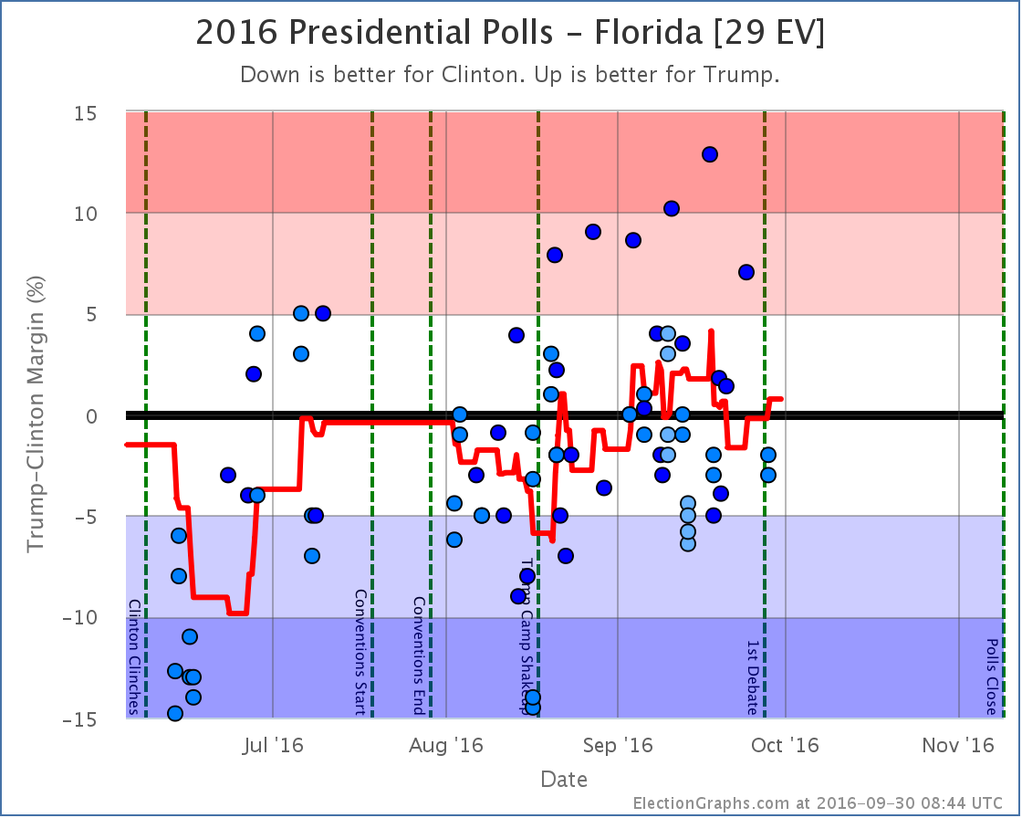
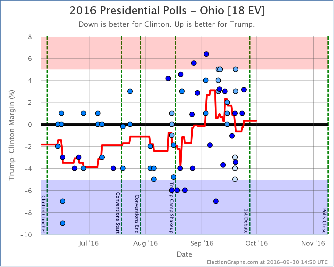
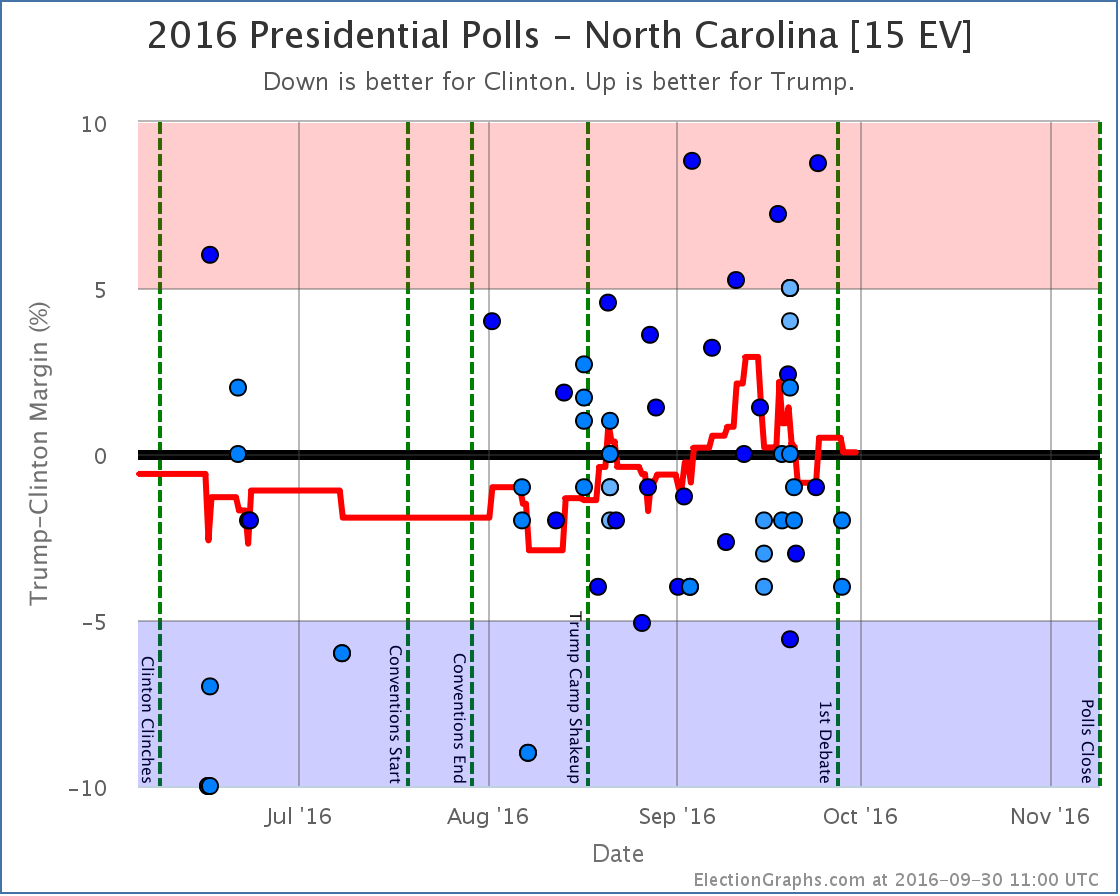
The primary reason for this? Florida [29 EV], Ohio [18 EV], and North Carolina [15 EV] are all currently very close in my averages. Close enough that single polls can move them back and forth across the center line. As I worked through this round of poll updates, all three of these states moved from Weak Trump to Weak Clinton and back again. Now, the actual changes in the averages in these three states were not much. They just happened to pass the zero line, and have large numbers of electoral votes.
So if you look at the “Expected Case” chart for the electoral college, you see a big move toward Clinton, then a big reversal a few days later. Because of the nature of the electoral college, you should expect (and be careful interpreting) large electoral college moves like this so long as there are big states that are close. In these cases looking at the tipping point provides a different view with a bit less volatility.
In any case, looking only at the final net change from this round of polls, we see these changes in the national picture:
- The expected case moves from Clinton by 8 EV to Clinton by 6 EV
- Clinton’s best case improves from Clinton by 188 EV to Clinton by 208 EV
- Trump’s best case declines from Trump by 106 EV to Trump by 92 EV
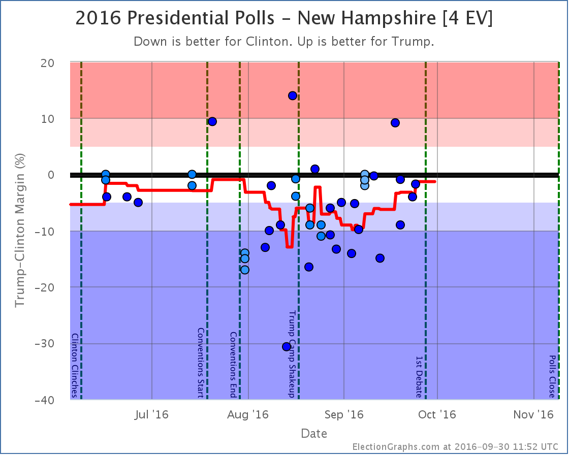
- The tipping point moves from Clinton by 0.1% in KS to Clinton by 1.3% in NH
Now, this round includes a handful of post-debate polls, but almost all of the movement discussed here comes from before the debate. (The exception is Florida returning to Weak Trump after the debate.)
Looking at the charts…
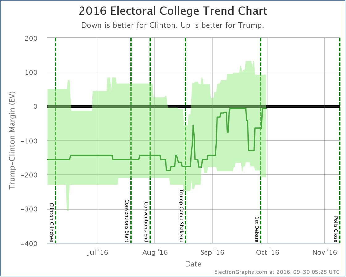
Notice the clear dip from about September 19th to September 28th when Florida, Ohio, and North Carolina went slightly blue, then moved slightly red again. In the end, the “expected case” remained flat. The movement Clinton saw from winning by 6 electoral votes to 8 electoral votes in the last update was erased by New Mexico and Kansas both returning to their “normal” colors.
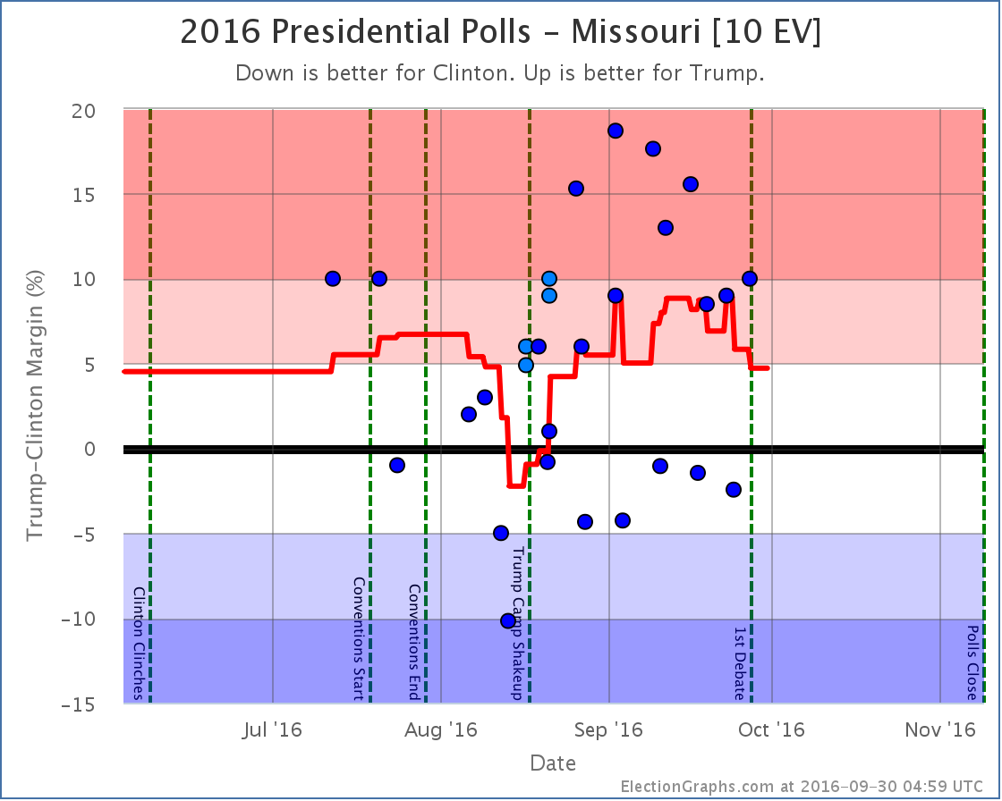
Both “best cases” moved toward Clinton though, with New Mexico and Maine at large both moving out of Trump’s reach, while Missouri moved into Clinton’s reach.
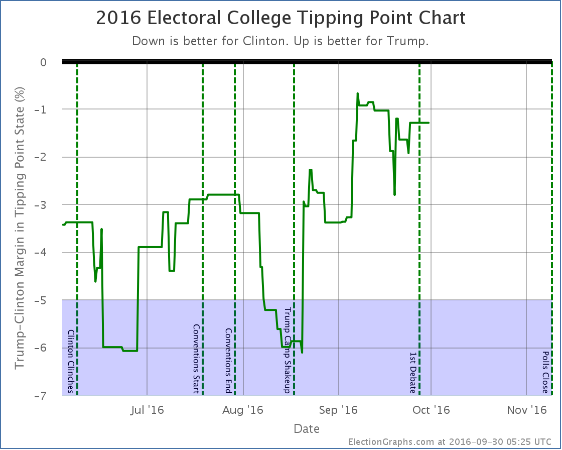
The tipping point chart doesn’t end up with huge moves when big states cross the center line, so it might be a better chart to look at right now to see how the race is moving. What we see is that after big gains starting with Trump’s campaign shakeup on August 17th, Trump seems to have peaked around September 7th… way up from where he had been, but never actually taking the lead… and he has been on a slow decline ever since… but we haven’t yet seen a BIG move back toward Clinton.
By most reports, Trump did badly in the debate, and has been doing things counter-productive to his campaign since the debate. But this does not mean large numbers of people have changed sides. Maybe this will happen, maybe it won’t, but the small number of post-debate polls already included here don’t yet show it. (In fact, as I mentioned, the single state category change post-debate so far is a move toward Trump.)
Additional post-debate polls are coming in quickly now, but I had to cut off the round poll updates somewhere to get this blog post out. There will be another update soon enough, and we’ll start to see a bit better what (if any) lasting change comes out of the first debate. Of course just about as soon as there has been enough time to see that in the polls, it will be time for the next debates…
39.4 days left until polls start to close.
State Details
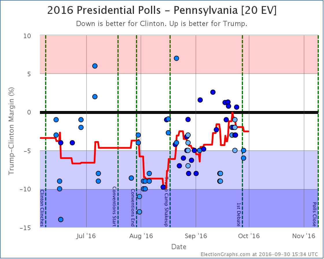
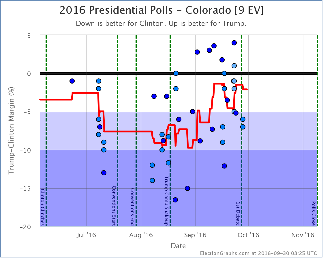
For those digging into the details, here are the charts for all the states influencing the analysis above:
The big close states:
Weak Clinton to Weak Trump
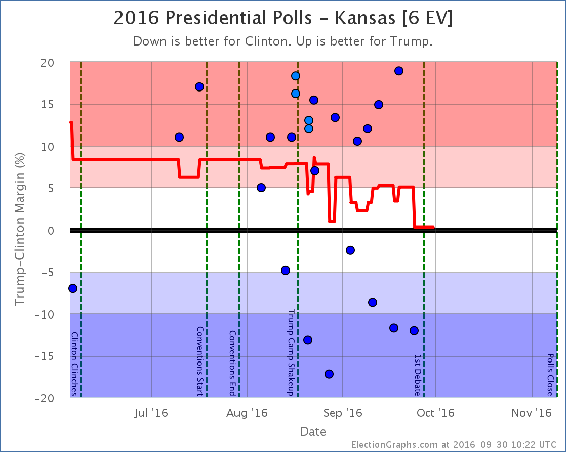
Strong Trump numbers from Ipsos and CVoter balance out the strong Clinton numbers from Google and leave us with an essentially tied Kansas and erase the short blue period for the state I noted last time. (The Ipsos and CVoter results came out later, but covered an earlier time period, so they moved the lines in the past, not just the current number.)
As I stated last time I am incredulous about the Google numbers, and wish there was more additional polling in Kansas to clear up what is really going on there.
Weak Trump to Strong Clinton
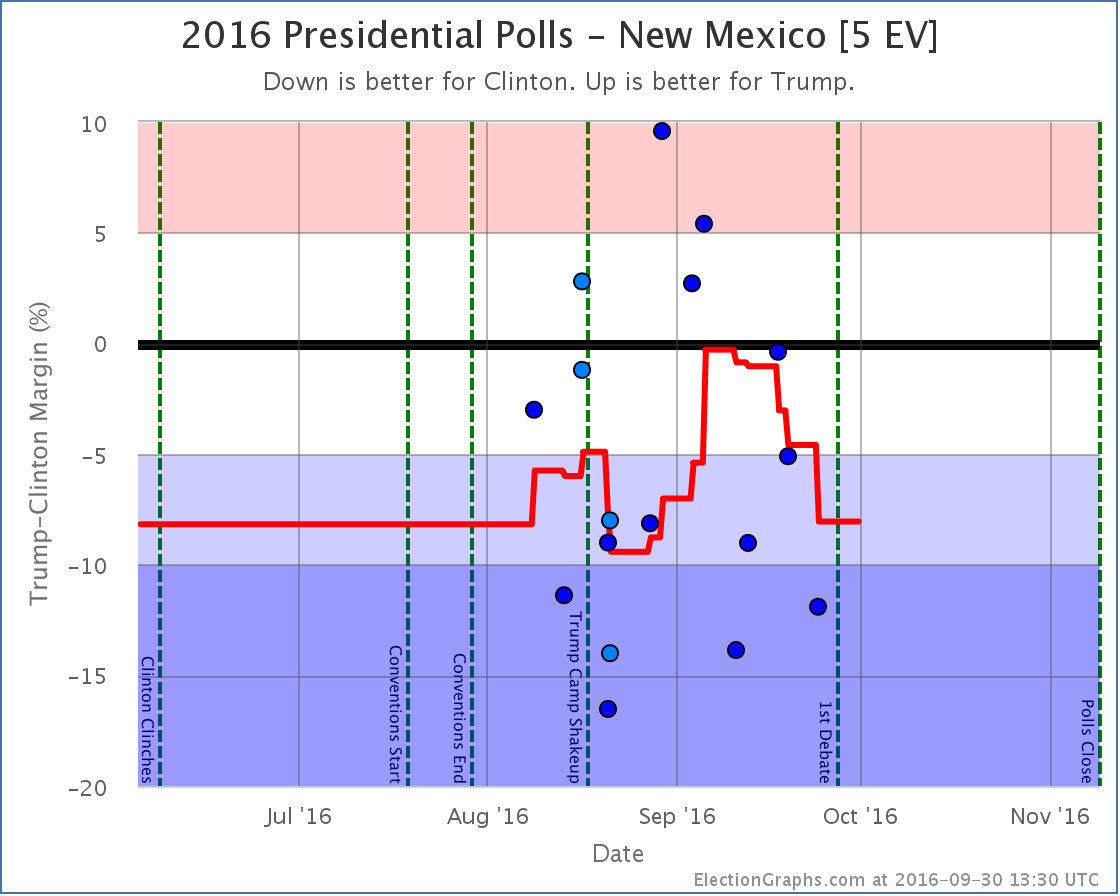
New polls in New Mexico erased the short foray into red territory for New Mexico. As with Kansas, since some of the “new” polls covered older date ranges, the shape of the curve in the past changed as well as the current number.
Strong Trump to Weak Trump
Weak Clinton to Strong Clinton
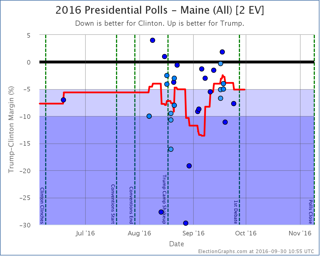
Other states that influenced the Tipping Point
Note on placing polls on the timeline
I somehow forgot to mention this in my recent interview about this site, but it seems relevant to the discussion above… Many other election tracking sites place polls based on the END of the poll’s time in the field. I place polls on the timeline based on the mid-date of their time in the field. I think this does a better job at trying to identify when directional changes happen, because if an event and a mid-date are aligned, you know that the poll was half before and half after the event. When you place polls by the end of their field time, you can’t make any sort of statements like that about how the poll results match up with the event without referring to the specific start and end dates.
For more information…
This post is an update based on the data on ElectionGraphs.com. Election Graphs tracks both a poll based estimate of the Electoral College and a numbers based look at the Delegate Races. All of the charts and graphs seen in this post are from that site. Additional graphs, charts and raw data can be found there. Follow @ElectionGraphs on Twitter or like Election Graphs on Facebook to see announcements of updates or to join the conversation. For those interested in individual general election poll updates, follow @ElecCollPolls on Twitter for all the polls as they are added. If you find the information in these posts interesting or useful, please consider visiting the tip jar.
Edit 2016-10-01 00:34 UTC to correct the one state that moved after the debates. I had said it was North Carolina moving back from Weak Clinton to Weak Trump, it was actually Florida.
[Blog Post] Electoral College: Poll Churn (mostly pre-debate) https://t.co/ry1Rgk5s2v
RT @ElectionGraphs: [Blog Post] Electoral College: Poll Churn (mostly pre-debate) https://t.co/ry1Rgk5s2v
Interesting that most charts would put the poll at the end date. I would have assumed midpoint was the most obvious, reasonable thing to do. Any idea why they choose that?
Also, are most polls about the same duration? If not, it might be interesting to see their dots smeared out over time, making blurry data points literally blurry.
Or does the fact (by which I mean, my presumption) that longer polls have larger sampling sizes make them carry more weight? I suppose the opacity of a blurred “point” ought to be proportional to sample size divided by duration.
So, what is the variation in poll duration and sample size? Is it significant? Not that I think these charts should show those factors by default. Just curious.
Ben,
Can you explain why midpoint is obvious? I don’t see the idea there.
For me end is logical because that’s the overall result, I don’t understand how you can break it down into before and after an event unless you have individual daily/whatever results which would have a large margin of error by definition (due to small sample sizes).
I can see an argument for using a midpoint in a daily tracking poll, when you can see the difference day by day, but not in one off polls.
I also do mean end date, as in last date of polling, not release date. Occasionally there can be quite a difference between end and release.
I don’t know if anyone else knows why a particular method is chosen, but to me it’s purely down to that’s the cut off date and the results run from date x to date y overall.
Polls can be any length you want. From exit polls on Election Day itself which are a few hours to some which are over a month.
I think sample size, e.g. Number of responders, can be decided beforehand. I think some pollsters stop polling when they reach a certain number while others are determined by set days. Tracking polls are certainly more likely the latter.
It all depends on a lot of factors like.. which company is polling, which company is paying, how is the survey conducted (there are laws about using robopolling and mobiles I believe), the type and number of questions etc
Usually differences to make note of are things like…
If the poll is internal or external (e.g. For a candidate, party or interest group)
If the pollster has a ‘house effect’ (consistently shows bias in favour of one party)
Type of poll (internet polls can’t reach people with no internet, robopolls cant reach people with no landline etc These things change the demographics of who is included in the sample)
I may be wrong on some points there, or have gone into more detail than needed, if that’s the case then I apologise. I hope it has helped though.
Richard, I guess “obvious” in this case means, my own, unsupported & biased gut instinct. I can try to rationalize it though.
If you have a cluster of points (samples) you want to represent on a graph as a single point, the typical thing to do is average each dimension. (Surely, you agree with that.) Since we don’t know the actual time of each sample, we cannot determine the mean. However, taking the midpoint gives us the median, which (correct me if I’m wrong) will reduce the RMS (root mean squared) error as opposed to selecting one of the extremes.
Or to put it more intuitively, these samples are asking people about their opinion at that specific moment. But that opinion is time dependent, so we’d like to graph the results as closely to when the sample was taken as possible. Imagine the most time dependent poll question possible: “what time is it?”. Here are the poll results (y-axis):
Poll 1 (8am to 4pm): noon.
Poll 2 (noon to 4pm): 2pm.
Poll 3 (3:59 to 4pm): 4pm.
Now, at what time on the x-axis should we place each of these points? If we select the end time, you’d have three polls seemingly simultaneous with widely different results. (4pm, noon); (4pm, 2pm); (4pm, 4pm).
If you select the midpoint, the polls would show an accurate progression of opinion over time. (Noon, noon); (2pm, 2pm); (4pm, 4pm).
Seems reasonable, no?
Ben,
I see what you mean, and I agree that in like for like that makes sense. So tracking polls, polls from the same pollster and so on, I can see what you mean
But I can’t see that it’s going to be useful to do that for unlike polls. Take the current Google and Ipsos.. or Rasmussens generally accepted Republican house effect. There’s enough built in errors in the various methodologies and types that you can’t claim it’s an accurate representation, no matter which way you present the data.
Didn’t the primaries, for example, have some misses (mostly within the margin of error)? I think one was a huge miss too. There’s been similar in Europe recently too, with pollster misses.
This maybe because I can’t understand the idea properly because of my Asperger’s, I fully understand that to be possible. It would be easier if I had something I could see, but because each site does things differently even that isn’t possible.
RT @ElectionGraphs: [Blog Post] Electoral College: Poll Churn (mostly pre-debate) https://t.co/ry1Rgk5s2v
So, the results of putting “the point” at various places relative to the field dates in terms of understanding how the data points compare to an event that happens on a specific date (like a debate for instance).
At the beginning: You can be sure that any dot after the date represents a poll that was taken completely after that date. But many data points before the date will also include SOME data from after the event. How much before would be unclear, since polls very greatly in length. So you can’t tell which polls have SOME info after the event and which do not.
At the end: You can be sure that any dot before the date does not include ANY data reflecting the event. Points afterwards will have some data from after the event, but given the varying length of polls, it would not be possible to tell when the polls got to the point where they were 100% after the event.
At the midpoint: A dot on the date indicates that (roughly, since we don’t know the exact distribution of the interviews) the poll was done half before and half after the event. You still can’t tell which polls are 100% before, or 100% after the event, but even with the varying lengths of the polls, you know that any point after was more than 50% influenced by the event, any point before was less than 50% influenced by the event. (At least roughly.)
I figured the last one was the best option, but that is of course arguable.
Of course, even nicer would be to actually take into account and show the start and end point directly, visualize that, and maybe even make your average take that into account as well. (Mine does not.)
There is one person (@williamjordann on twitter) doing this on the national polls, and it is actually quite nice. Here is his most recent tweet with one of these:
https://twitter.com/williamjordann/status/783263093942001668
I could see doing something like that on the state level polls, and figuring out how to construct an average that was not just “last five polls” but specifically took into account which polls were in the field at a given time. Something like the average on a given date is the average of all polls in the field on that date, but if there are less than five in the field fill in with the ones that left the field most recently. Or something.
It would be an interesting and different approach, but probably a good one. Not sure it will be me that does it, but it would be cool if someone does!