This is the website of Abulsme Noibatno Itramne (also known as Sam Minter).
Posts here are rare these days. For current stuff, follow me on Mastodon
|
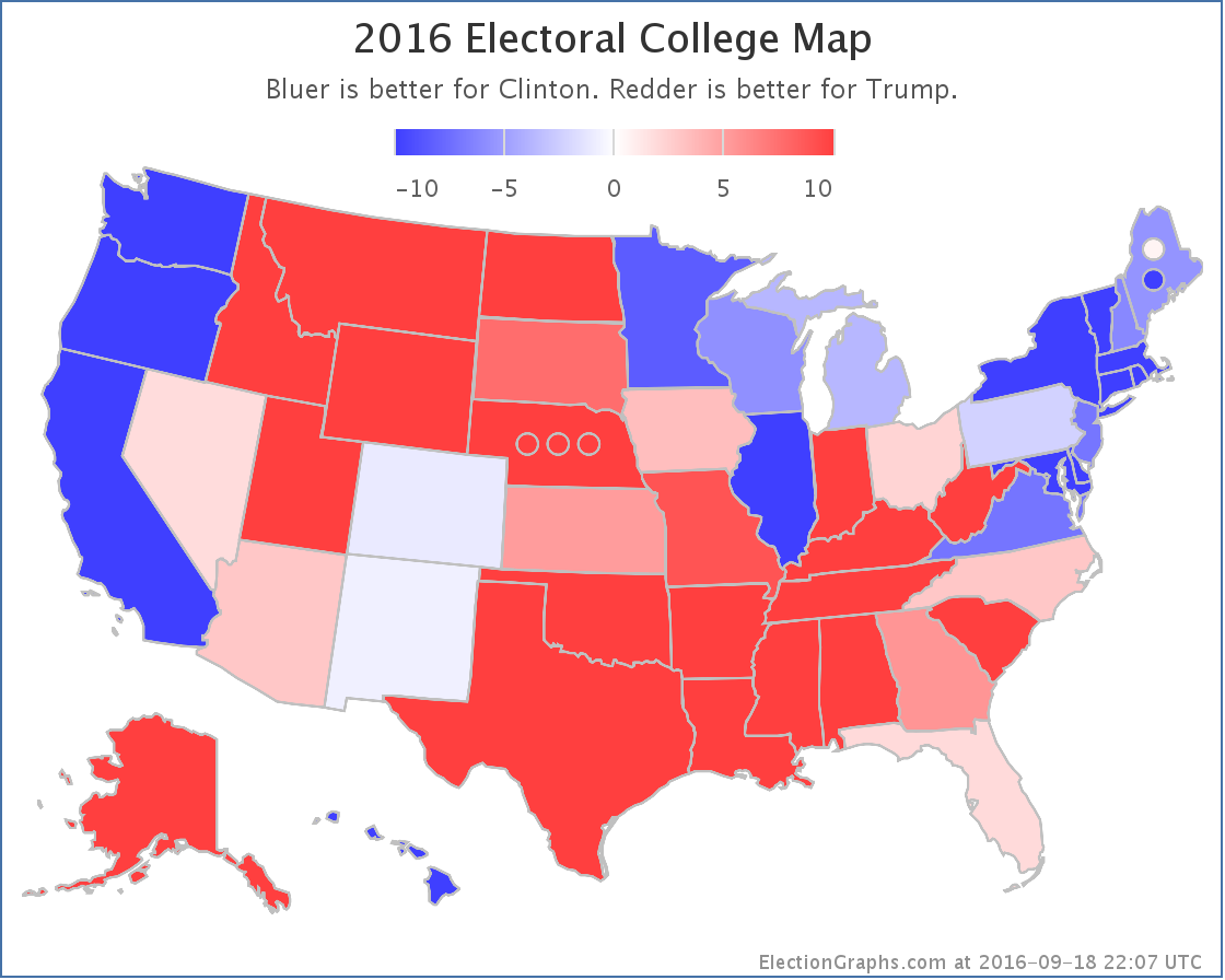
States with new poll data added since the last update: All 50 states, DC, and the Maine congressional districts.
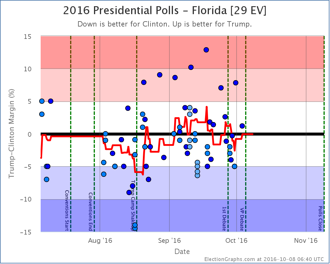
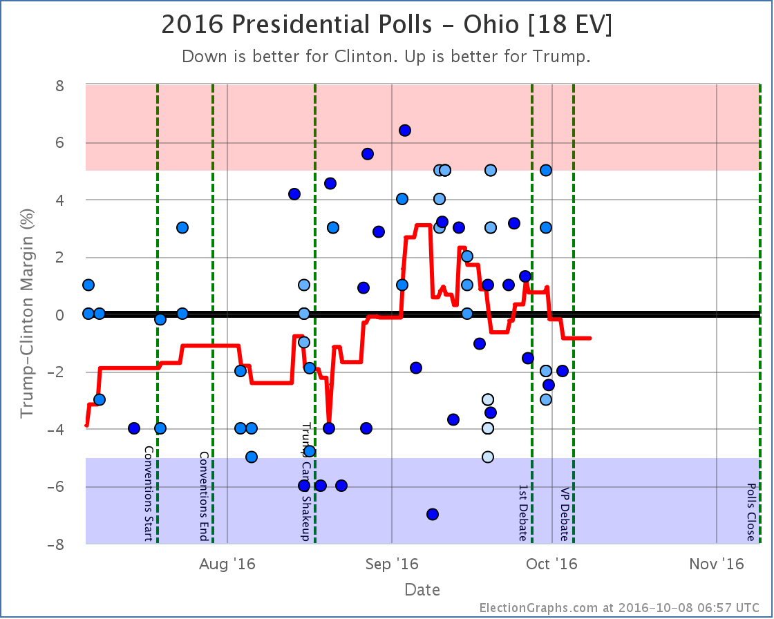
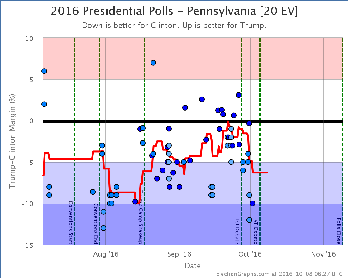
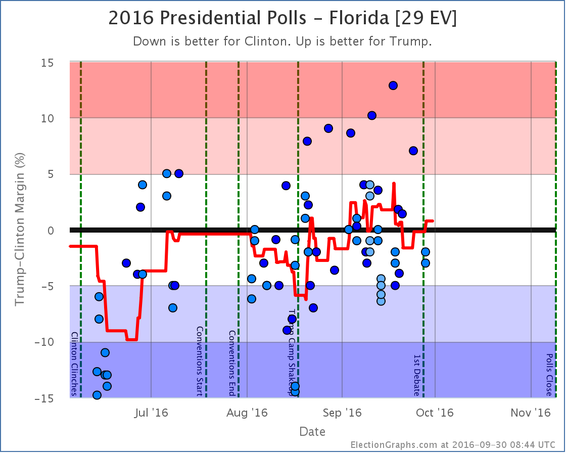
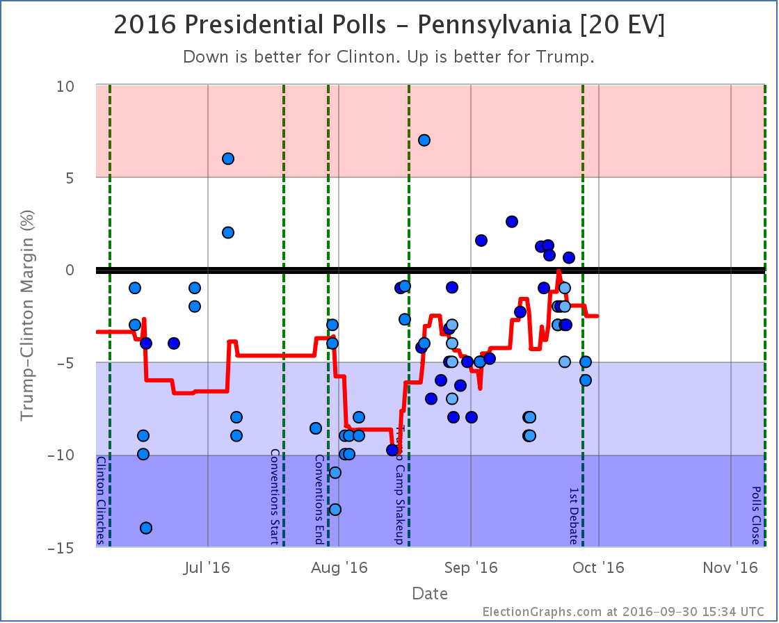
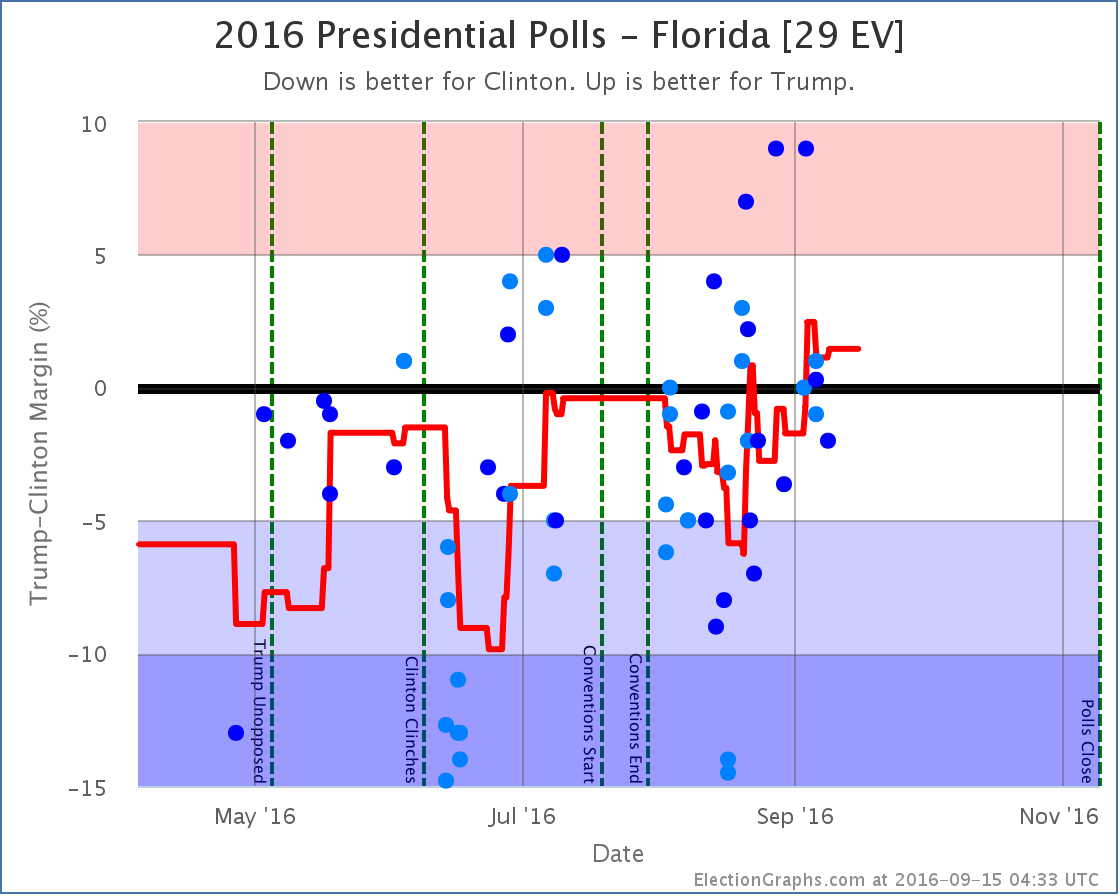
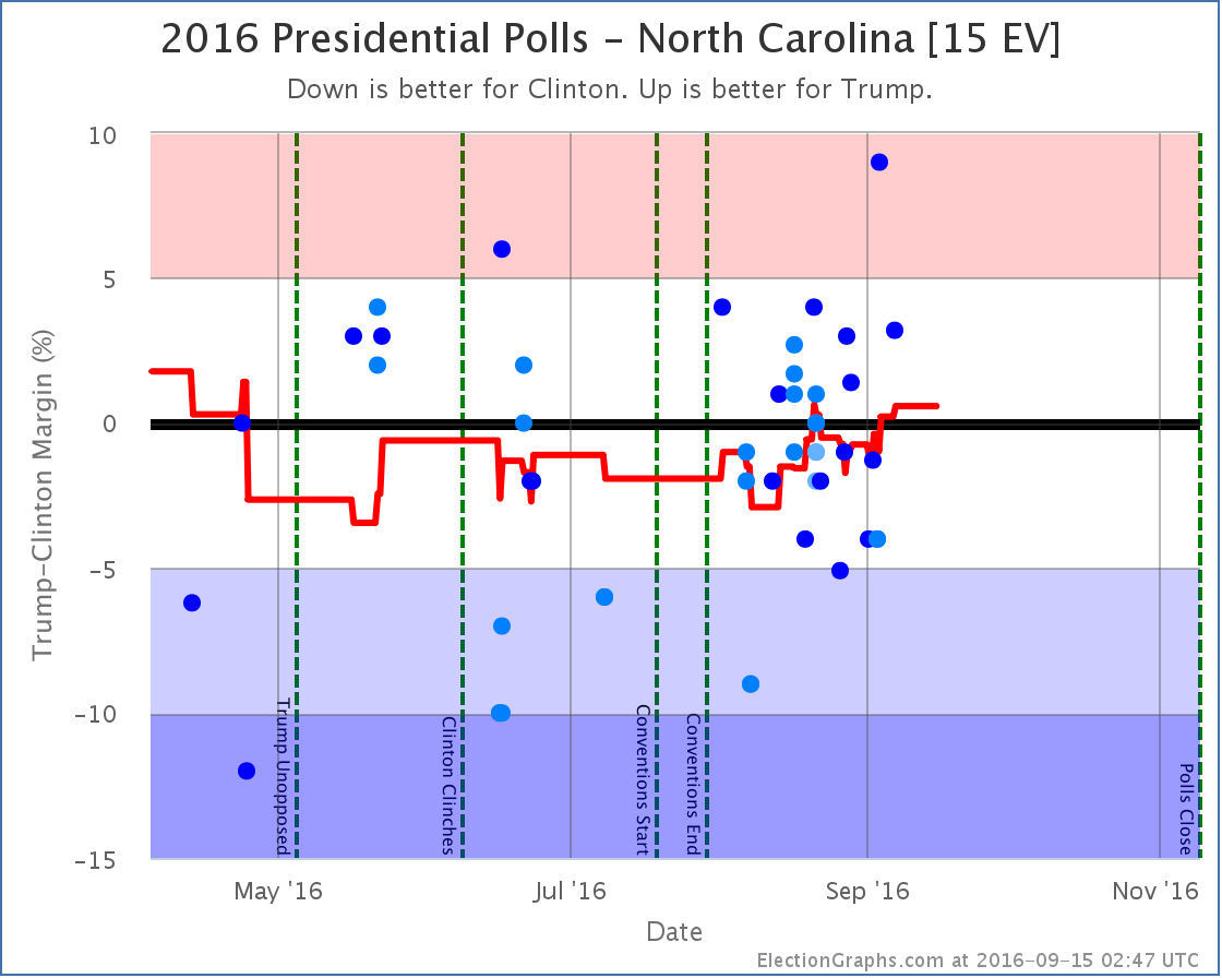
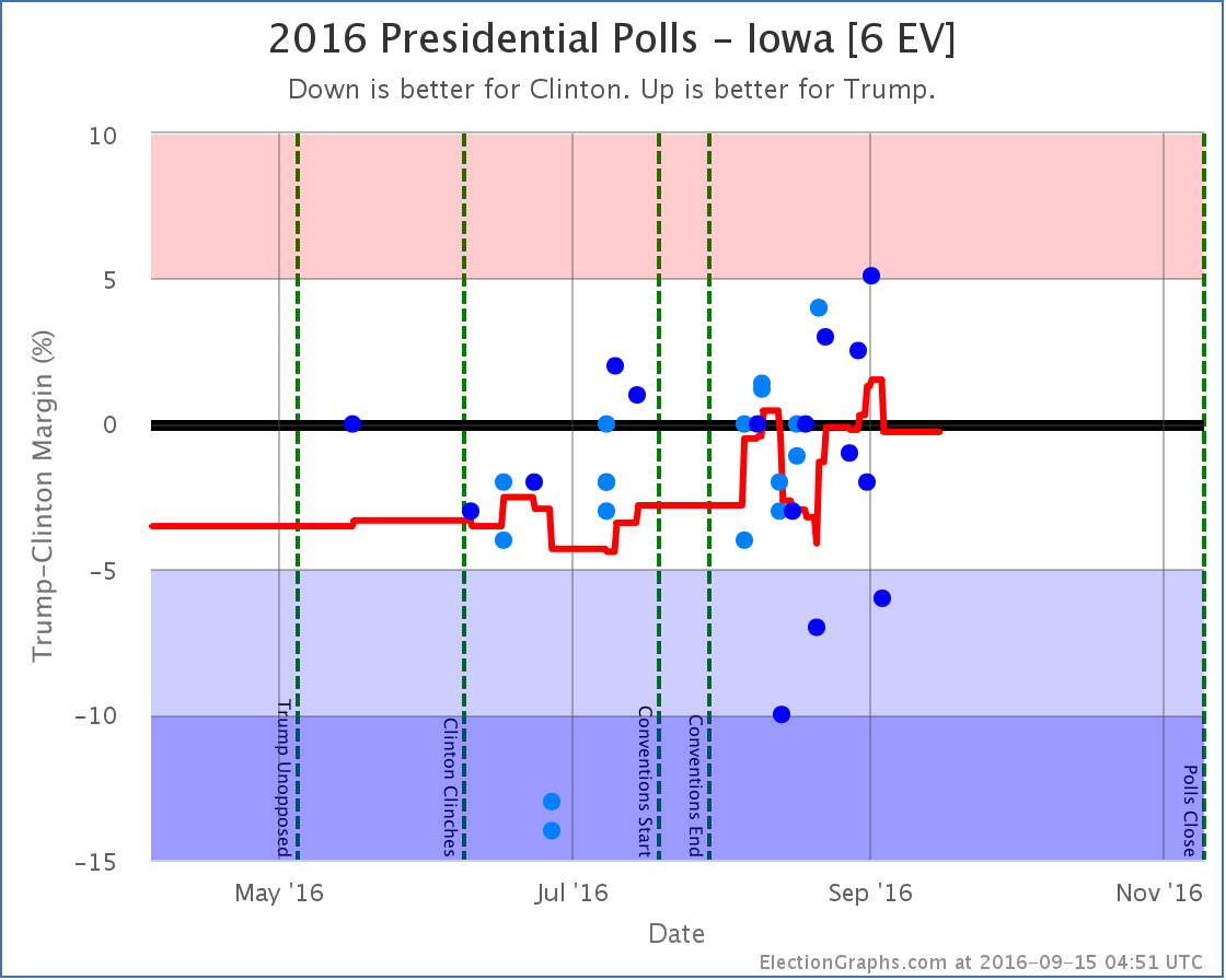
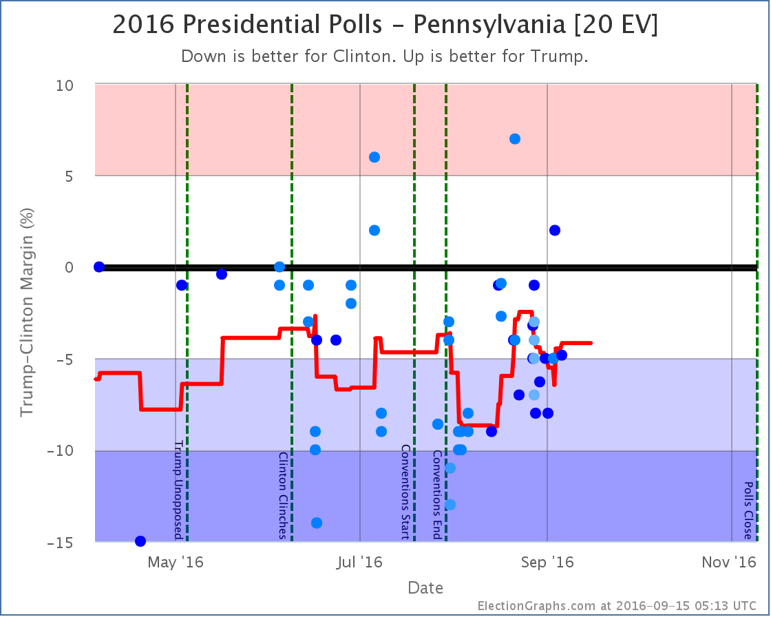
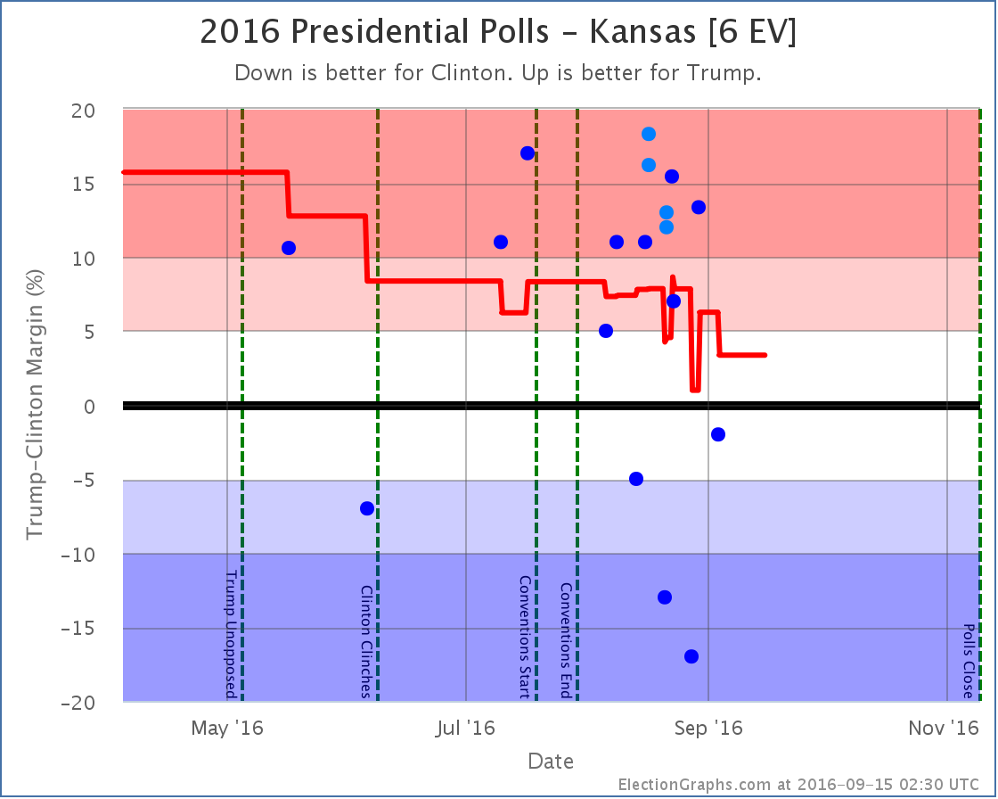
Notable changes in: Florida (29), Pennsylvania (20), Arizona (11), Iowa (6), Kansas (6), Utah (6), Alaska (3), and the tipping point.
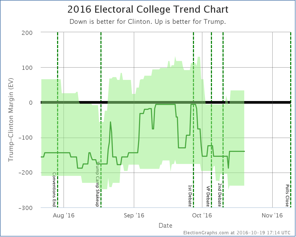
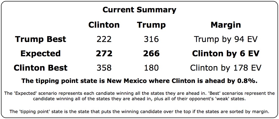
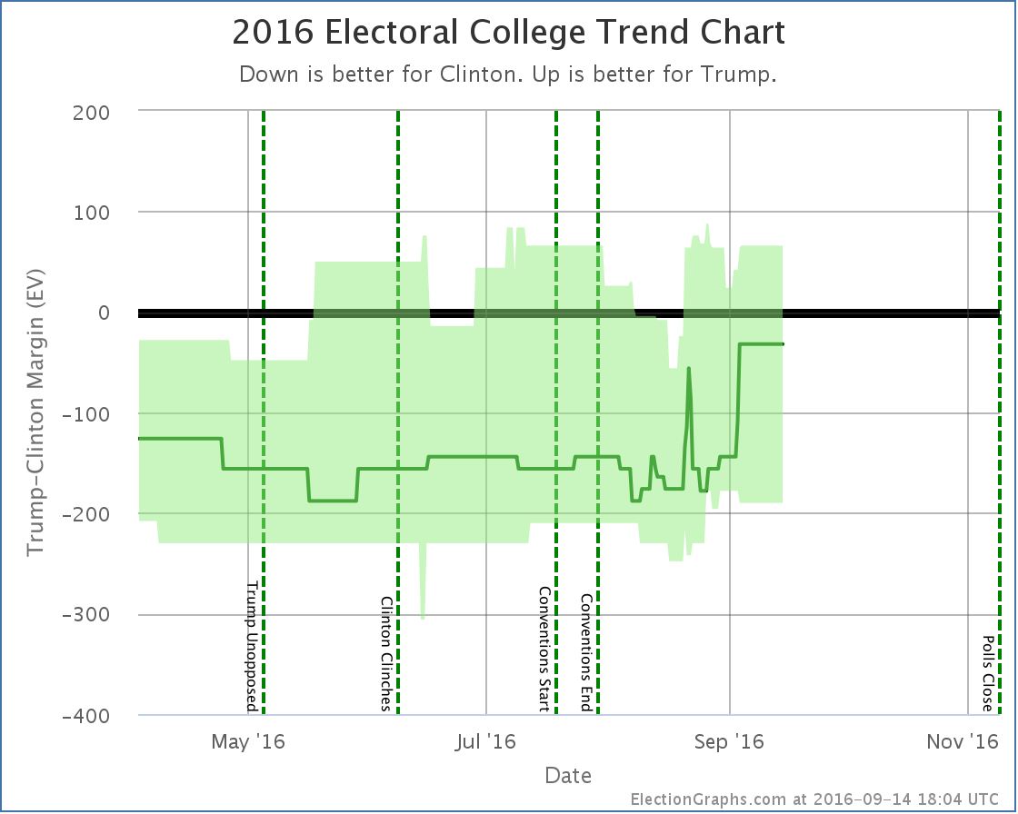
National Summary
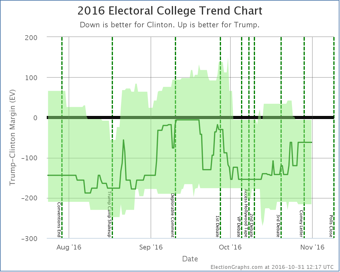
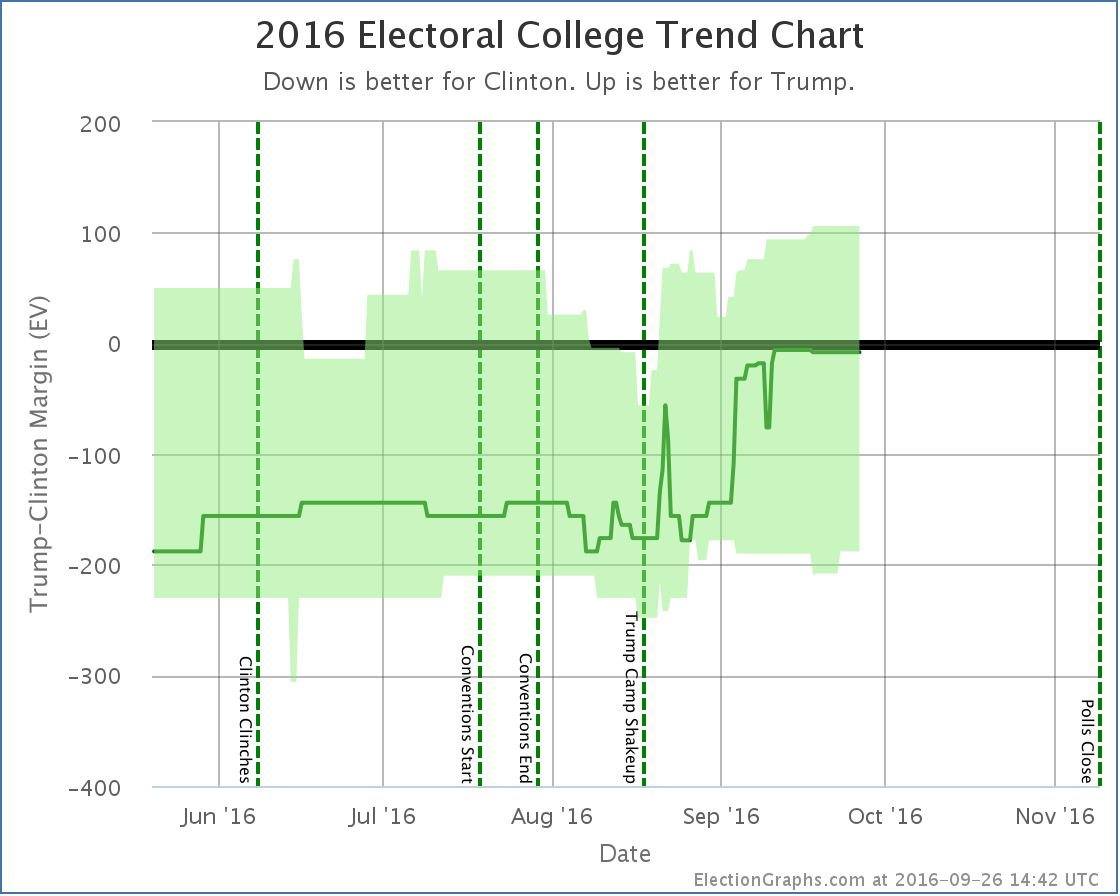
It has been about five days since the last update. Since then the movement has been decidedly mixed.
Note that as of this update, no polls have been included that contain interviews done after the release of the “Comey Letter”.
Good for Trump:
- The expected result has moved from a 130 EV Clinton win to only a 62 EV Clinton win
- Clinton’s best case has declined from a 234 EV win to only a 216 EV win
Good for Clinton:
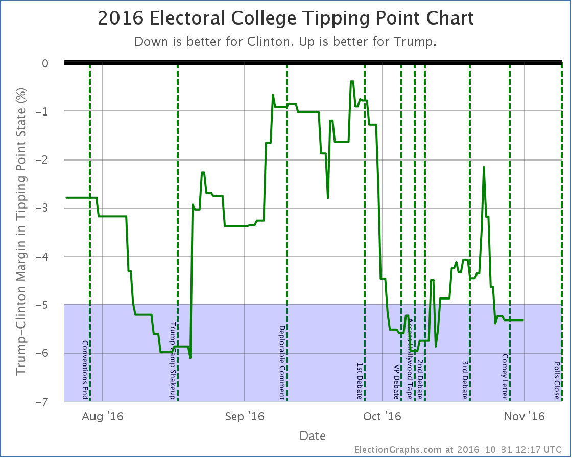
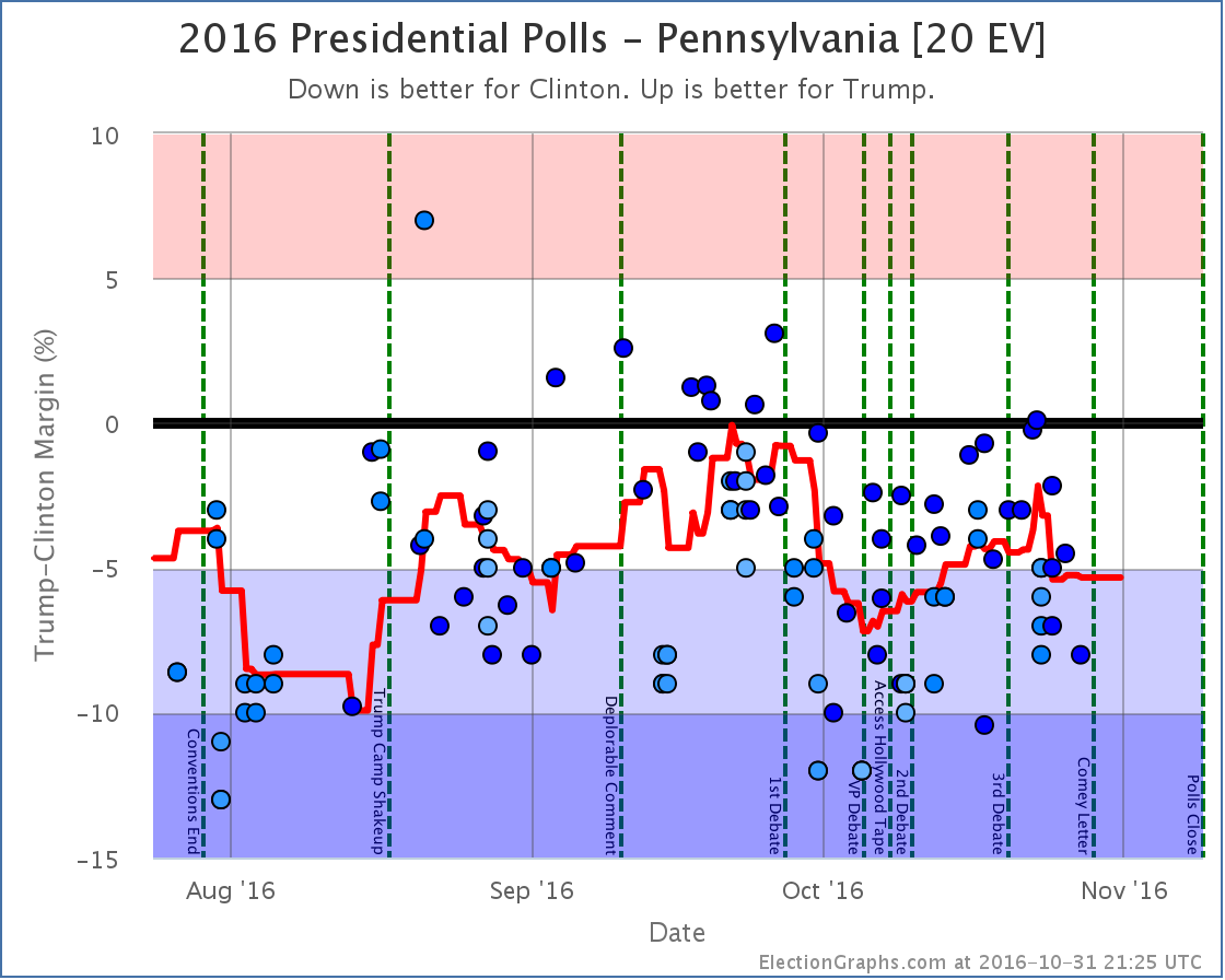
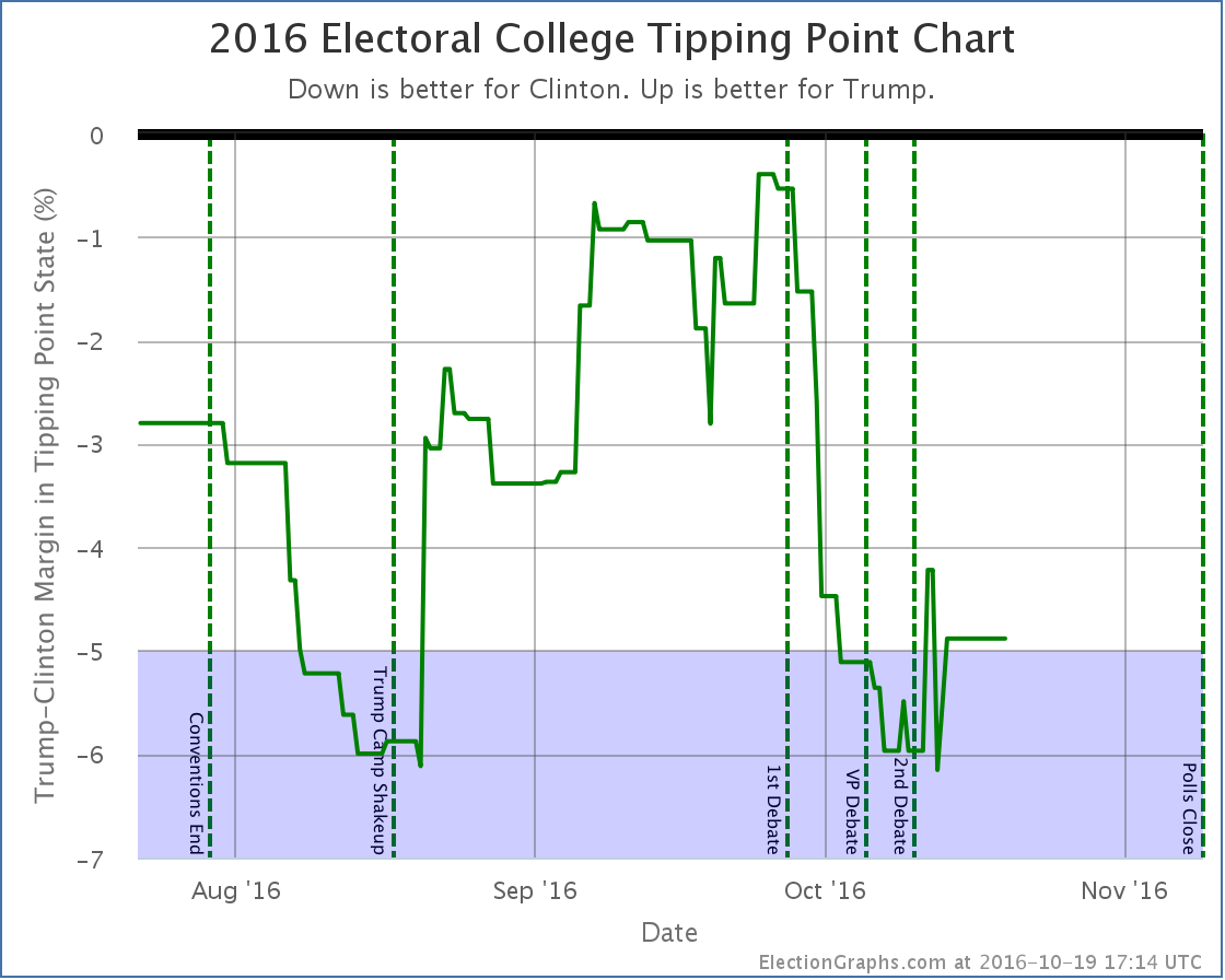
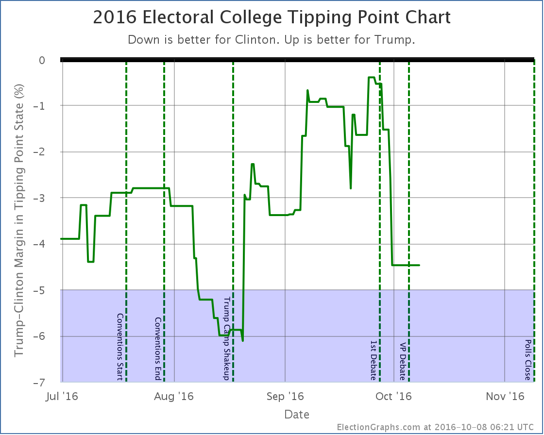
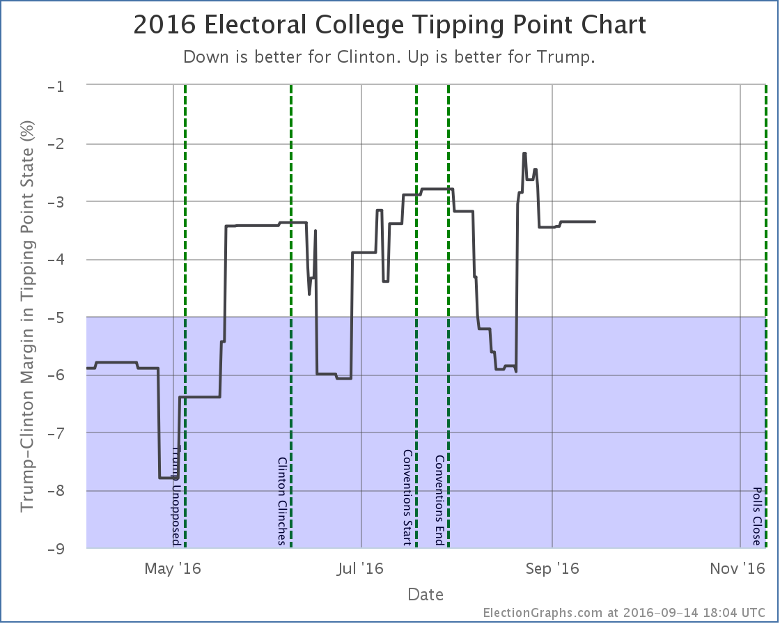
- The tipping point moves from Clinton by 4.1% in PA to Clinton by 5.3% in PA
- Trump’s best case declines from a 34 EV win to a 6 EV loss
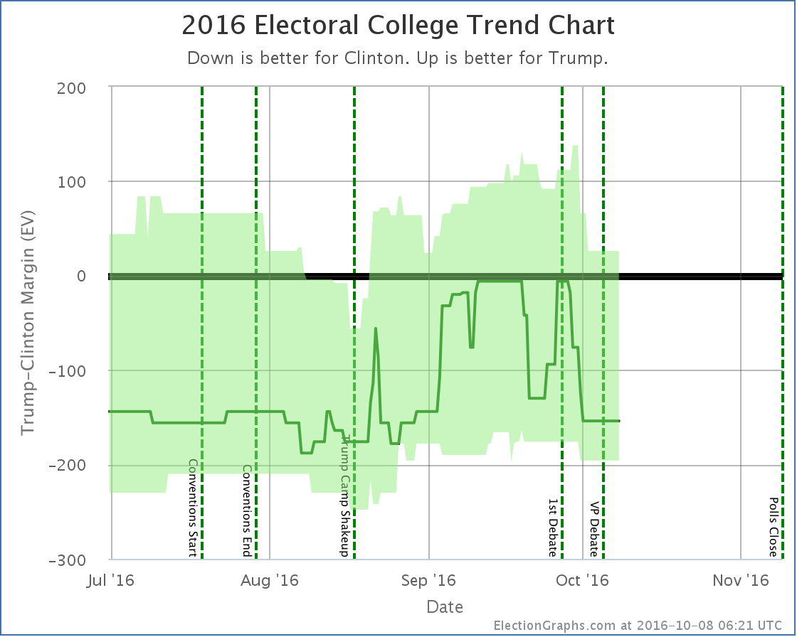
Charts
Discussion
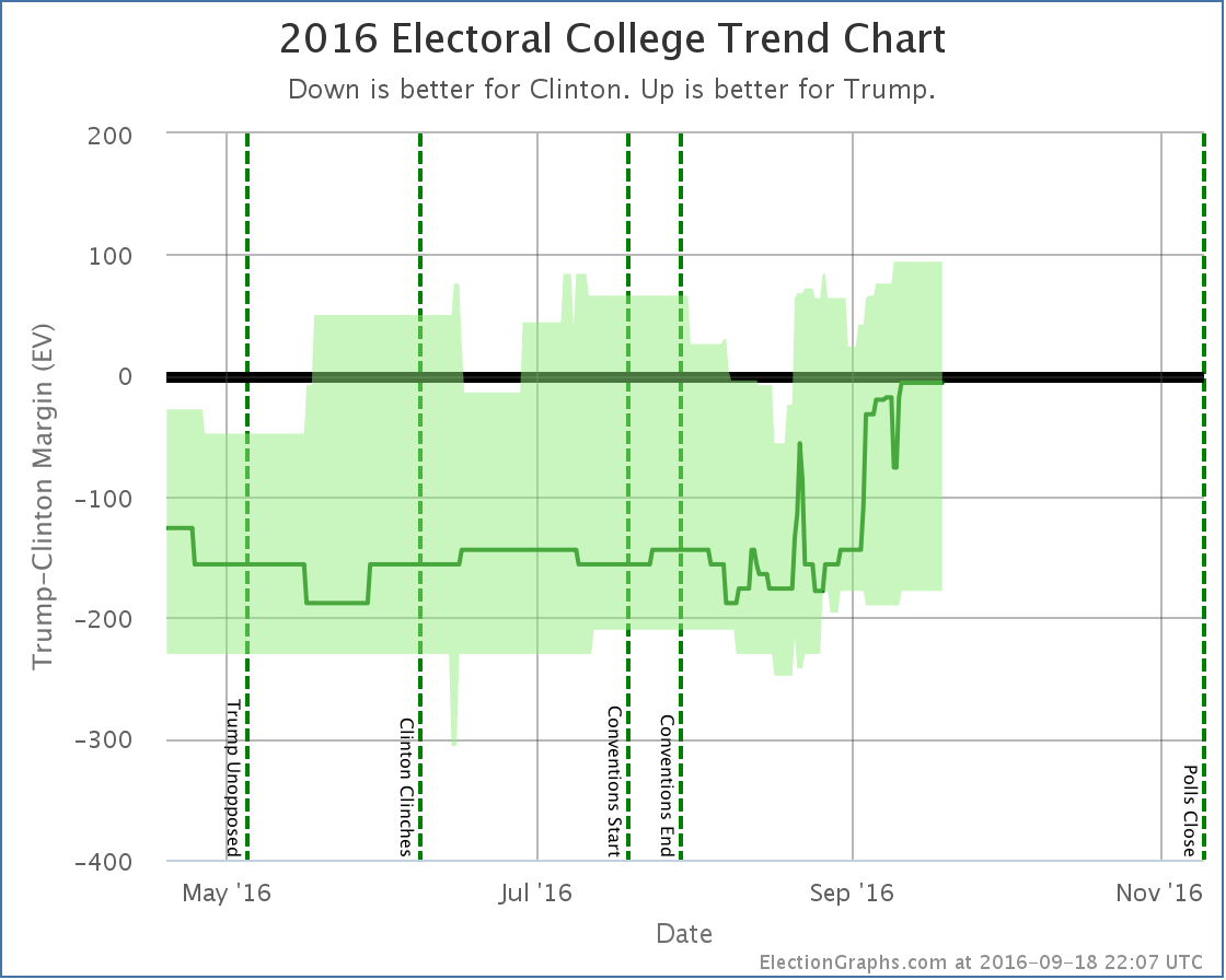
While some metrics have moved in Trump’s direction and others in Clinton’s, in the end this picture is bad news for Trump. Why is that? Fundamentally, doesn’t the fact that the “expected case” moved toward Trump mean that he is doing better?
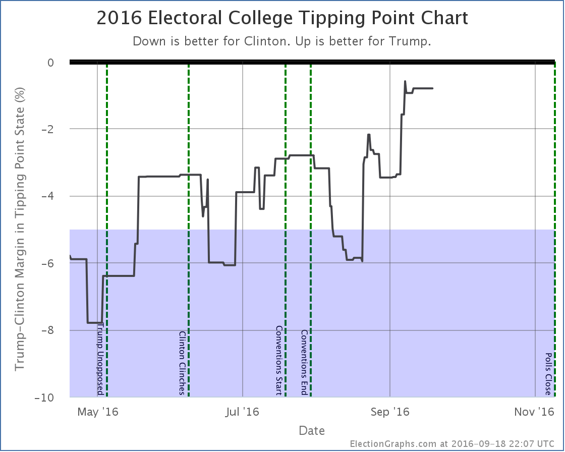
Well, it means the margin he will lose by is getting smaller, yes. However, if you are trying to look for scenarios where Trump would actually catch up and win, the tipping point is what you want to be looking at. To win he has to move the tipping point state (or states he is even further behind in) over to his side of the line. And the tipping point is moving further away at the moment.
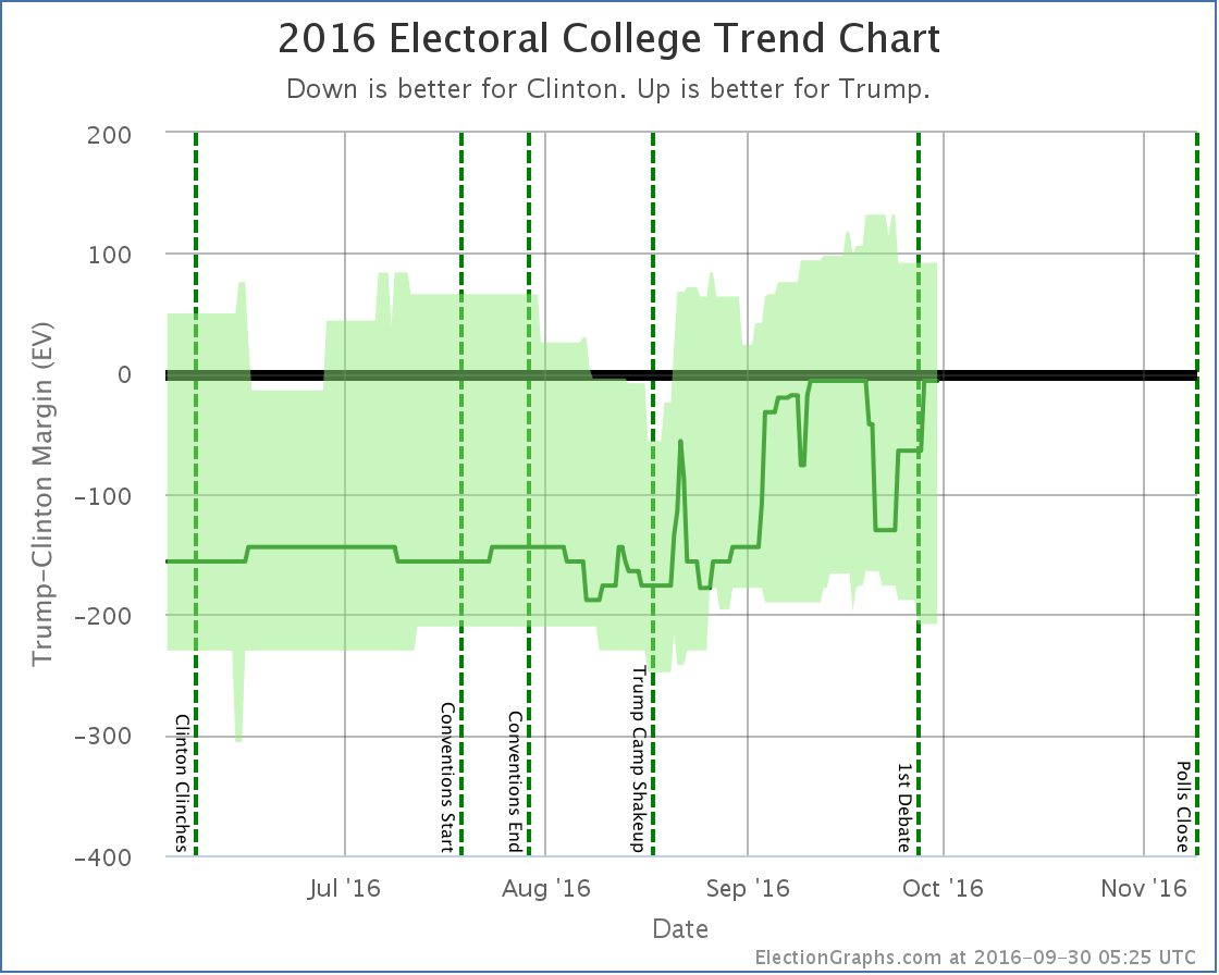
If you look at the tipping point chart you can see that Trump had indeed been making progress on the tipping point starting about when the Access Hollywood tape dropped. But that started to reverse around the 23rd. At the same time that his expected electoral college result was still improving.
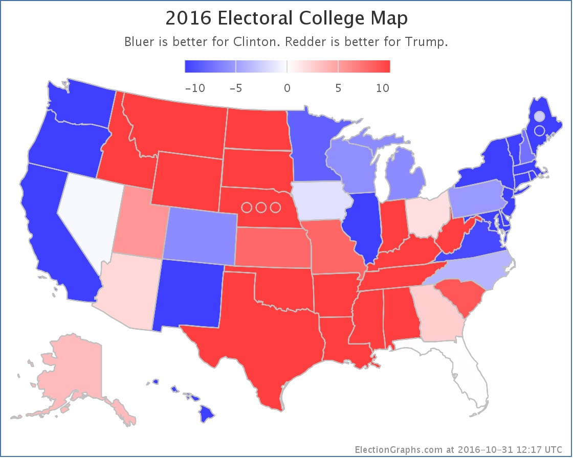
This is still confusing. What is happening? Well, all the states aren’t moving in lock step in reaction to events. A number of close states have moved toward Trump, like Florida for instance. But key states like Pennsylvania have been moving away from him. Because of this divergence, we can have Trump improving his electoral college “score” while simultaneously the path to 270 electoral votes gets harder.
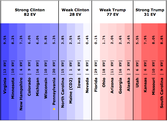
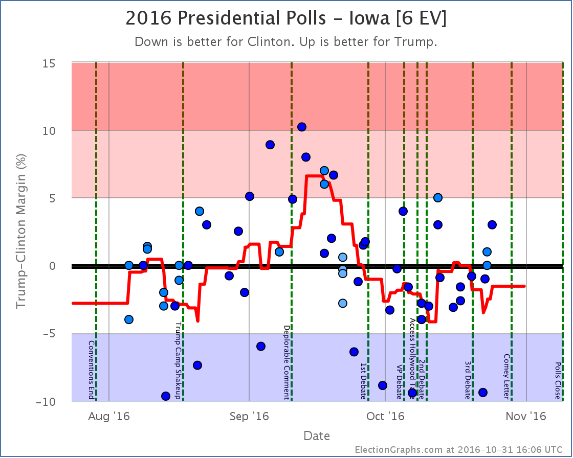
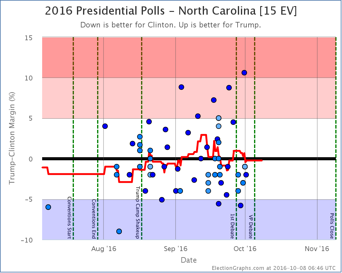
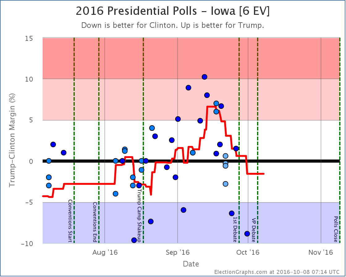
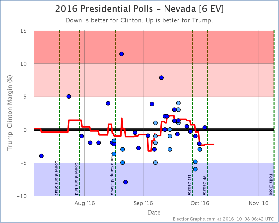
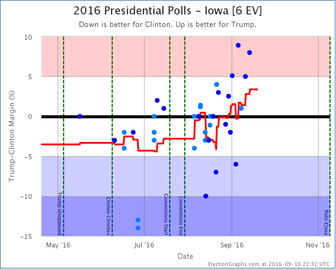
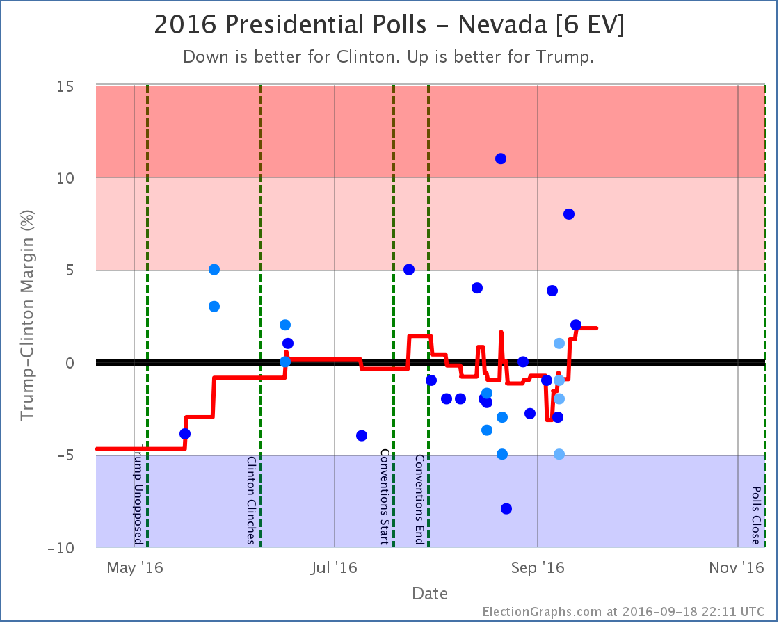
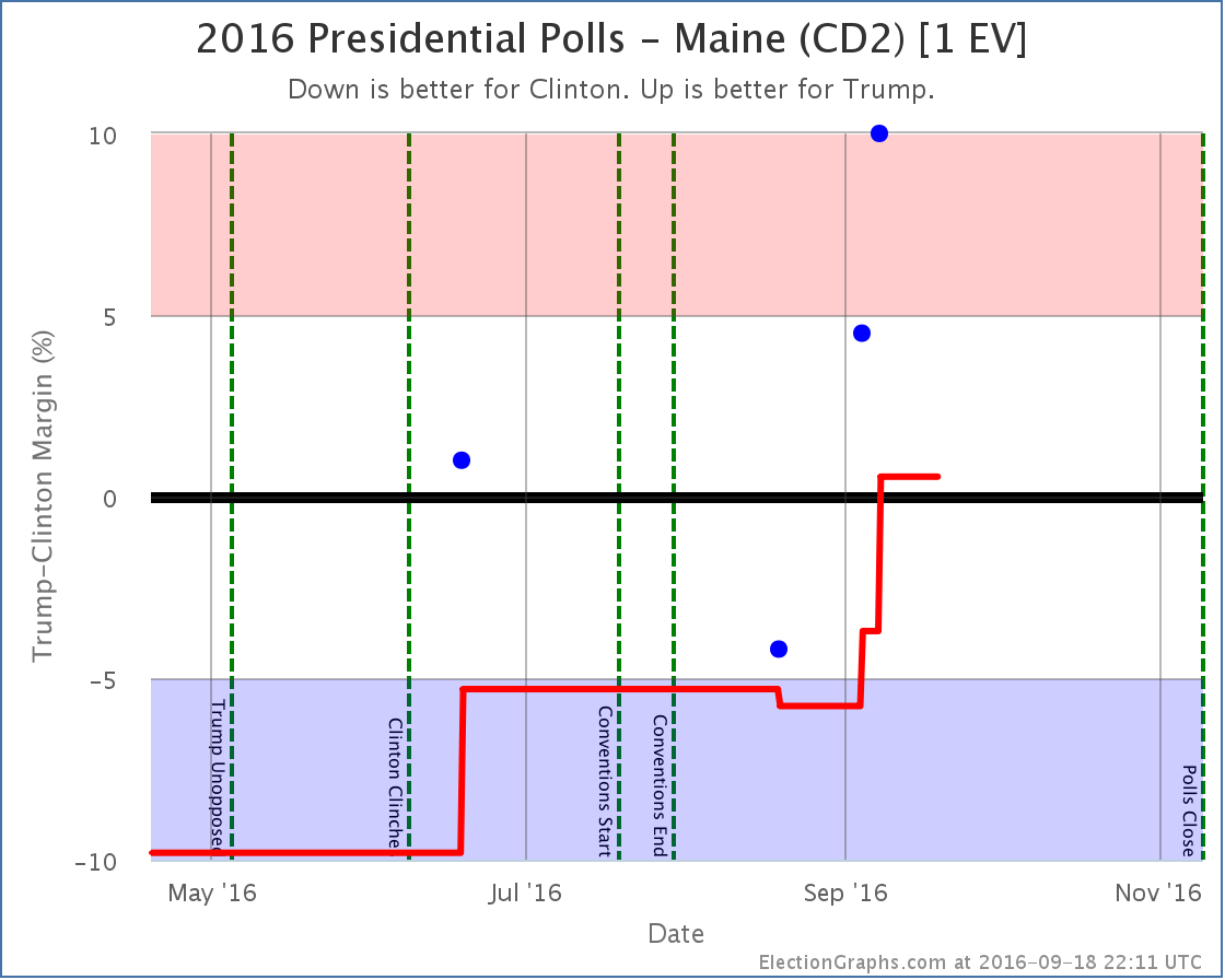
And in fact, at the moment, 270 looks out of reach for Trump. Look at the spectrum of the close states above. Right now Trump could win every state he is ahead in, then also pull over the states where he is close… Nevada (0.4% Clinton lead), Iowa (1.5% Clinton lead), Maine CD2 (2.5% Clinton lead), and North Carolina (3.8% Clinton lead)… and Trump would still lose by 6 electoral votes.
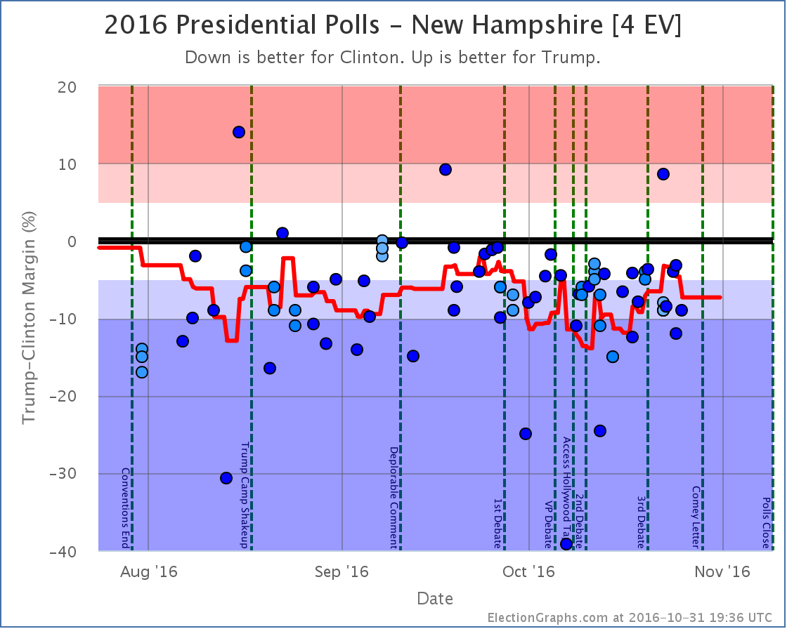
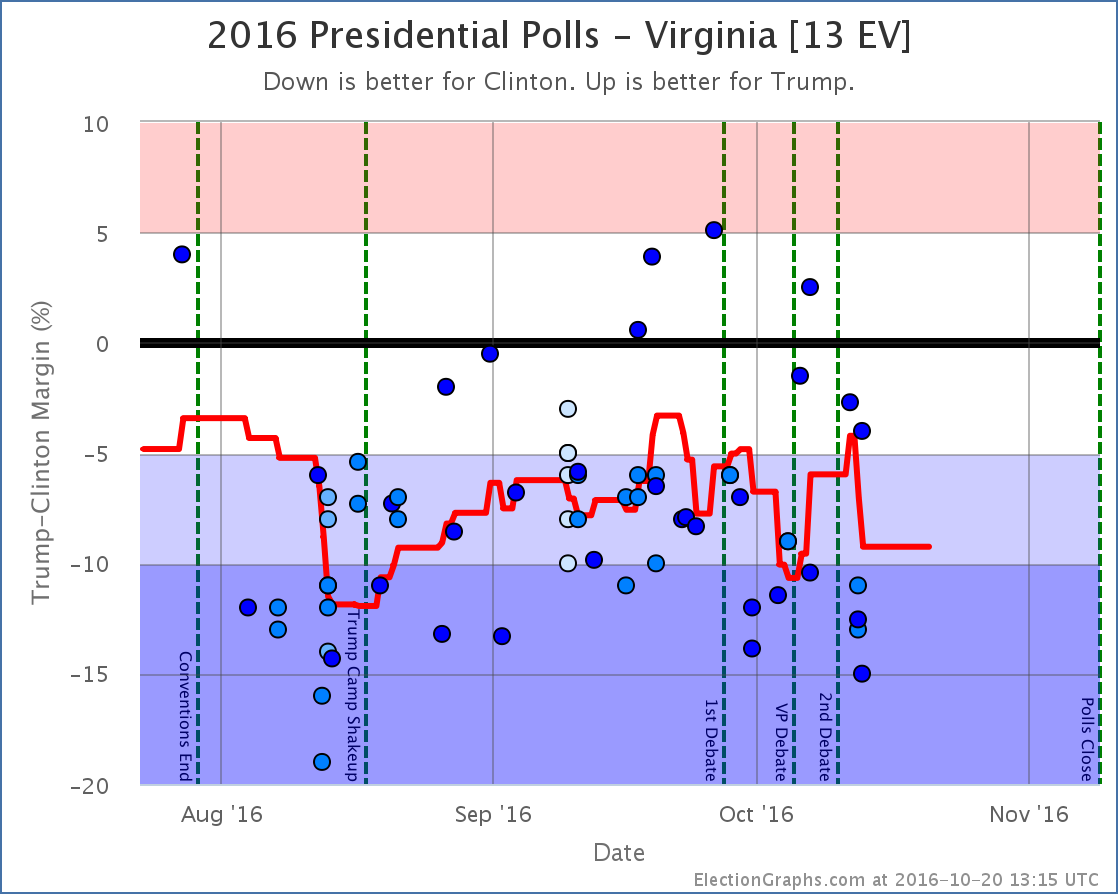
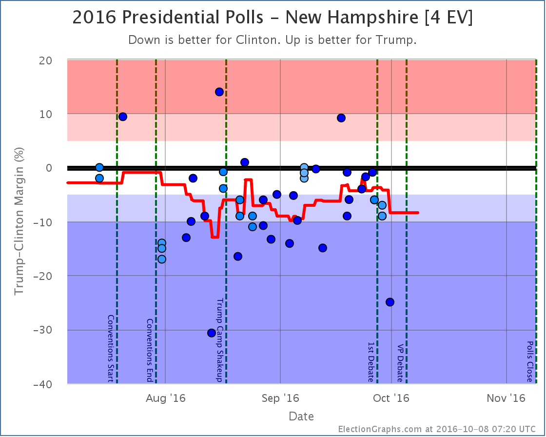
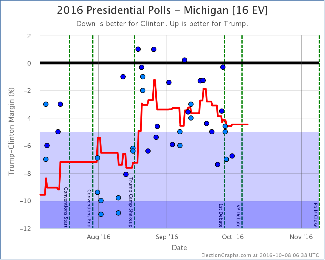
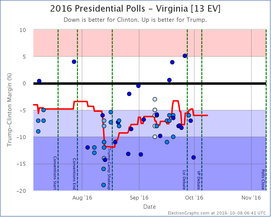
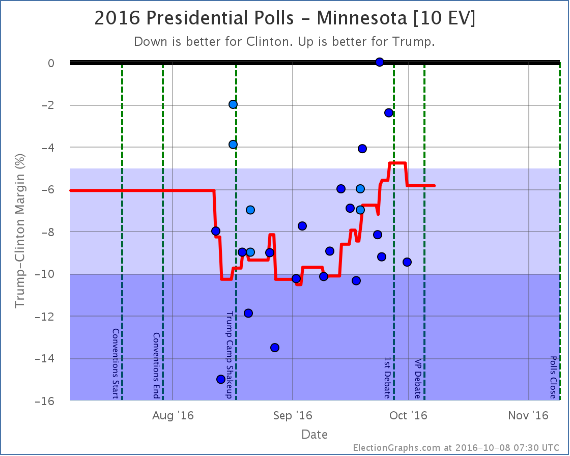
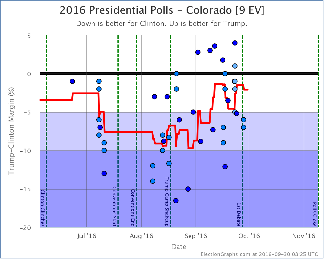
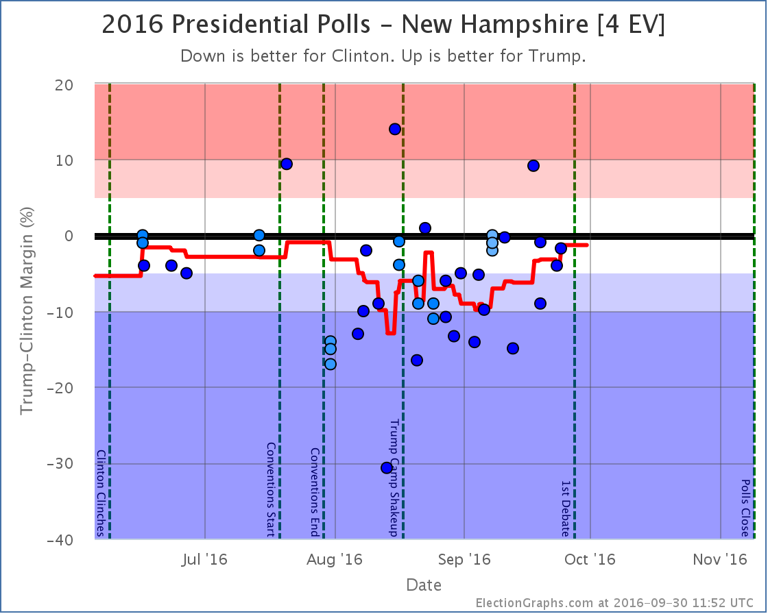
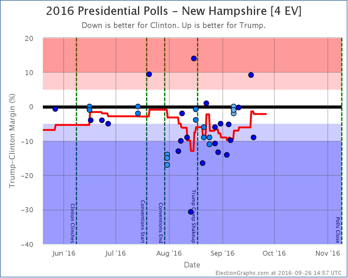
To win, Trump has to win all of the close states, plus Pennsylvania, where Clinton has a 5.3% lead at the moment… or one of the other larger “Strong Clinton” states… Wisconsin, Michigan, Colorado, Minnesota, or Virginia… all of which Clinton currently leads by even bigger margins. (New Hampshire isn’t enough to push Trump over the edge with only 4 EV.)
This is a really big pull with so little time left. The Trump side seems to be hanging their hopes on the fallout from the Comey Letter. This may cause some movement, but early indications are that almost all voters made up their minds on the Clinton email issue and if it mattered to them long long ago, and this is unlikely to change many minds.
We’ll start to see if there is any movement due to the letter within a few days. But there just are not that many days left. Sites that give odds for Trump winning range from less than 0.01% on the low side to 24.4% on the high side. The median odds seem to be around 5%. That isn’t impossible. But those odds are low enough that a Trump win would be a very big surprise.
There is another goal that Trump has a much better shot at though. If the election ends up exactly how things look today, Trump will lose by only 62 electoral votes. That would mean that Trump would do better than both McCain (lost by 192 EV) and Romney (lost by 126 EV). It may not be an actual win, but Trump improving on the performance of both previous Republican candidates may give the message to Republicans that a Trump like candidate in 2020 might be the way to go rather than returning to Romney or McCain style Republicanism.
We shall see.
8.1 days left until we start getting actual election results.
We are almost there.
State Details
The following are the detailed charts for all the states that influenced the national changes outlined above.
Moving from Clinton to Trump

Moving from Trump to Clinton
Now a possible Clinton pickup
Now out of Trump’s reach
Now out of Clinton’s reach
Also influencing the tipping point
A note about McMullin
Election Graphs is designed around showing the Republican – Democrat margin, and there is not enough time before the election to revamp the site to properly account for 3rd parties that are strong enough to have a shot at winning electoral votes.
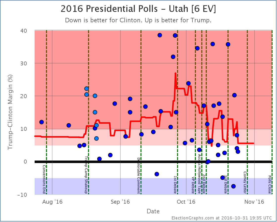
Right now the Real Clear Politics average in Utah has McMullin 6.0% behind the lead. The 538 average in Utah has him 7.3% behind the lead. If/when McMullin is within 5% according to either of these averages, I will add notes to both the Utah and National pages about the possibility of McMullin winning Utah’s 6 electoral votes.
For more information…
This post is an update based on the data on ElectionGraphs.com. Election Graphs tracks a state poll based estimate of the Electoral College. All of the charts and graphs seen in this post are from that site. Additional graphs, charts and raw data can be found there. Follow @ElectionGraphs on Twitter or like Election Graphs on Facebook to see announcements of updates or to join the conversation. For those interested in individual general election poll updates, follow @ElecCollPolls on Twitter for all the polls as they are added. If you find the information in these posts interesting or useful, please consider visiting the tip jar.
States with new poll data added since the last update: All 50 states and DC.
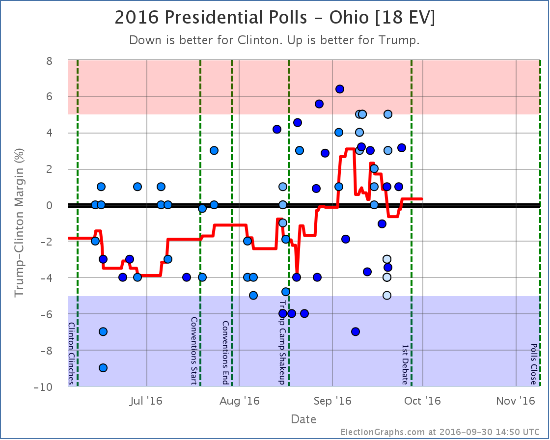
Notable changes in: Ohio, Arizona, Indiana, Kansas, Pennsylvania, and the tipping point
National Summary
Despite the widespread view that the time between the Vice Presidential debate and the present has essentially been non-stop bad news for Trump that could only cause his number to fall, and the fact that the national popular vote numbers do show this kind of trend, the electoral college view has just plain not shown that. In fact, looking at the various electoral college numbers we track here, things have mostly been moving in Trump’s direction since the 2nd debate. In the latest update, we have these changes:
Good for Trump:
- Expected case moves from a 154 EV win for Clinton to a 140 EV win for Clinton
- Tipping point moves from Clinton by 5.4% in VA to Clinton by 4.9% in PA
- Trump best case improves from a 6 EV loss to a 34 EV win
Good for Clinton:
- Clinton best case improves from a 204 EV win to a 238 EV win
While Clinton’s best case does improve a bit (although this may be due to outliers, see state details below), for the most part the movement here is toward Trump. It is not a huge movement, but it also doesn’t look like Trump continuing to crash.
Here are the charts:
While we do have Indiana and Kansas moving into the “Weak Trump” category, and thus expanding Clinton’s best case, the net changes for the expected case and tipping point are both in Trump’s direction, and Trump improves his best case as well, with Clinton’s lead in Pennsylvania down from where it was at the VP debate.
Looking at both charts, while Trump may have improved a bit from his lows, what this really looks like is that we have reached a plateau and things have basically been flat since the VP debate, minus some jiggles around the edges by states that are right near my category boundaries.
There are still events that aren’t factored in here, including some of the later sexual assault allegations, and of course the third debate. So things may start moving again in the next few updates. But for now… basically flat.
The “best case”, if Trump wins all his states, plus all the states where he is within 5%, now once again registers a narrow Trump win. But that would still require either a fairly large systematic polling error, or a last minute Trump surge. The “bubble” shows the extreme range of “conceivable possibilities”, but the edges of the bubble are still very unlikely. We’re far more likely to get results closer to the “expected” line.
Looking at the expected result, we are once again we are in the zone where Trump does better than McCain, but worse than Romney. That is a solid Clinton win, but not any sort of unprecedented loss for Trump. Just a normal sort of electoral loss. At least in terms of the electoral college.
We’ll see if anything causes that to change.
19.3 days left until we start getting real vote counts instead of polls…
State Details
Weak Clinton to Weak Trump
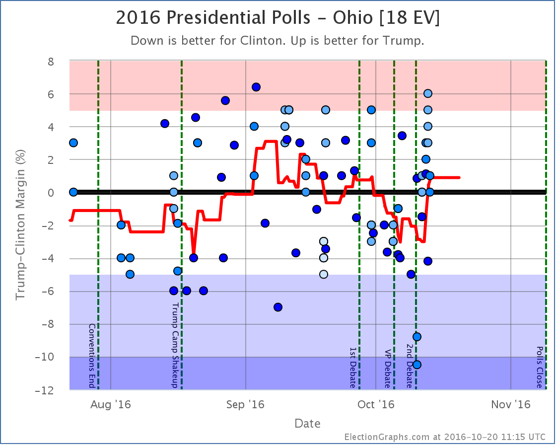
Trump now leads Ohio by 0.9%, but Ohio has been bouncing up and down right around the center line for months. It had been trending toward Clinton until a recent batch of polls that were better for Trump. Really could go either way.
Weak Trump to Weak Clinton
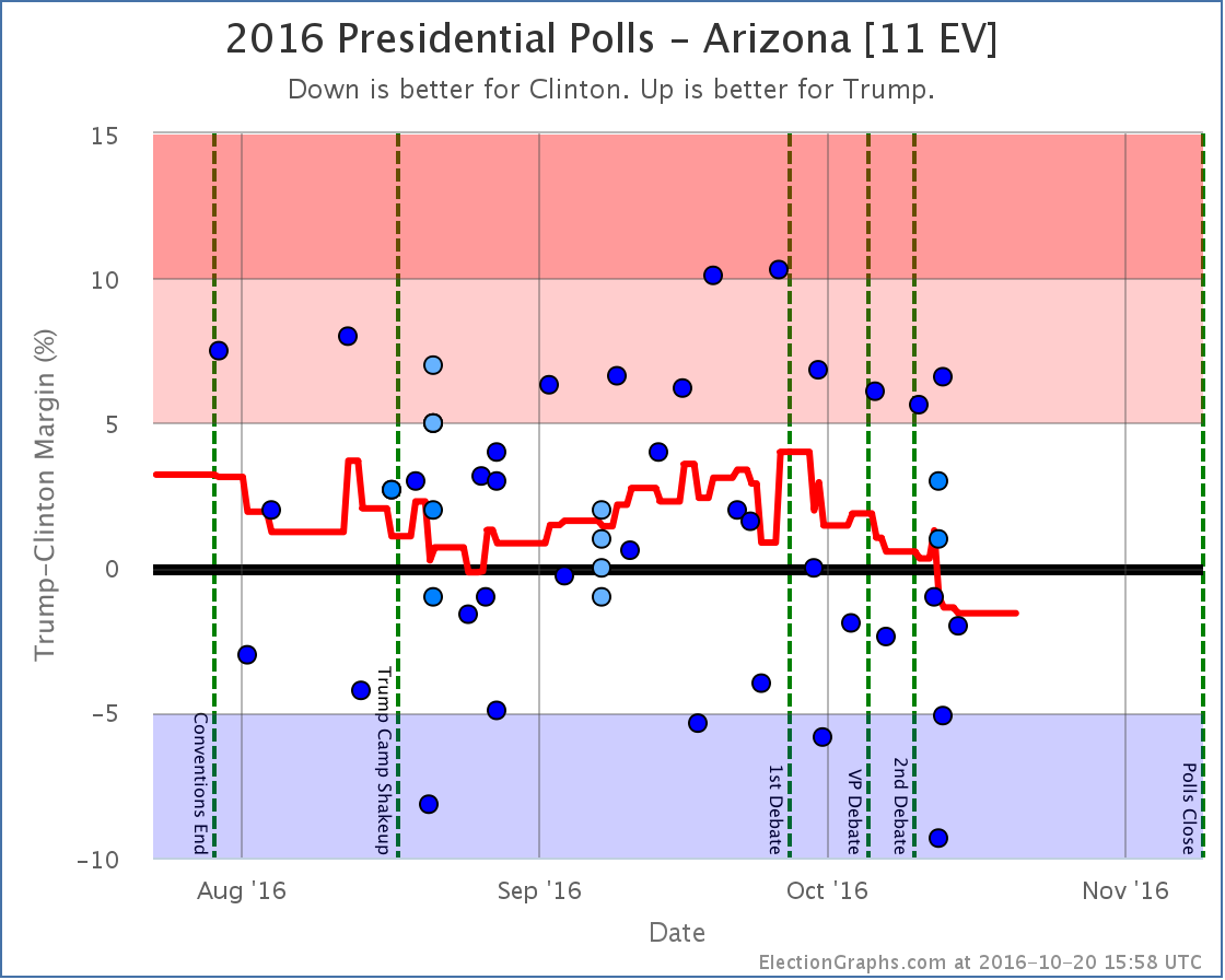
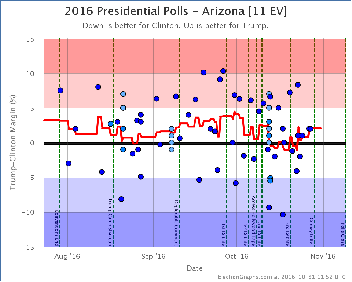
Clinton is now at +1.6% in Arizona. The state has been trending in her direction since the 1st debate. It is still close though, and this could be reversed. There is a reason we call the “weak” states weak.
Into reach for Trump
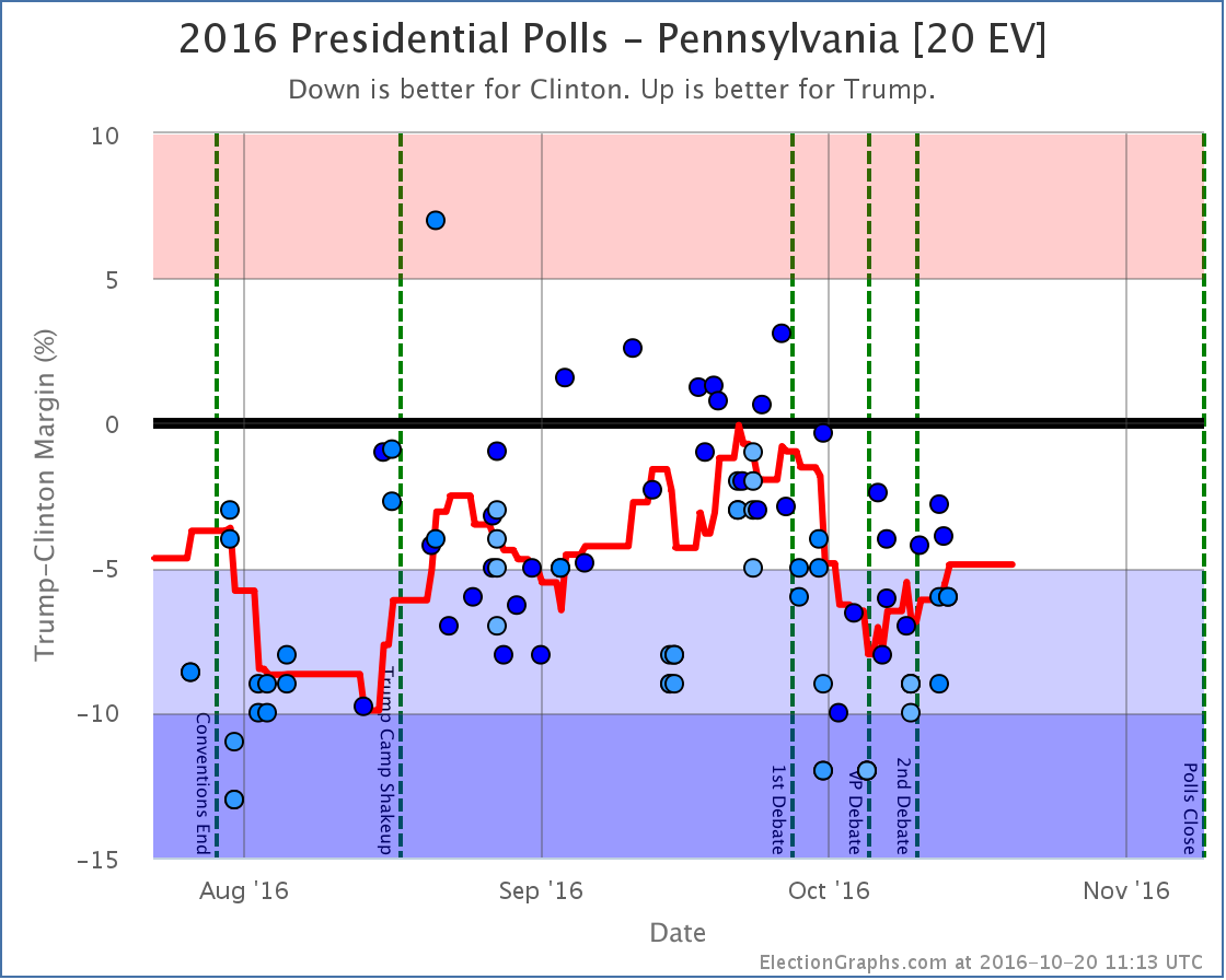
Clinton’s lead in Pennsylvania grew considerably after the 1st debate, but has been shrinking again since the VP debate. It now stands at only 4.9%, which means we once again consider it within reach for Trump. If Trump managed to stretch out and win Pennsylvania, his overall shot of winning the White House is significantly greater. But he has never led in the Pennsylvania poll average. So that will still take a significant move from where we are now…
Into reach for Clinton
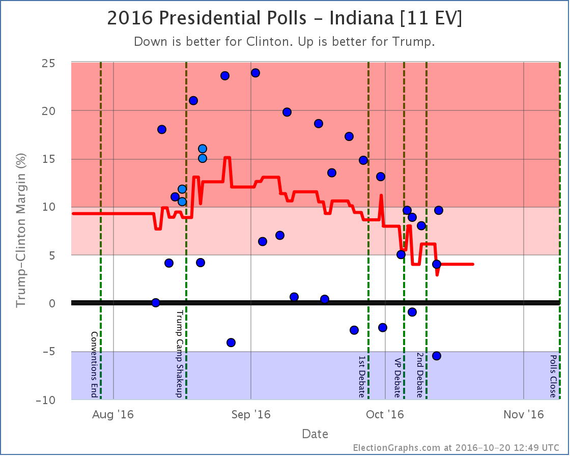
The Election Graphs average now has Trump’s lead in Indiana down to only 4.0%. This puts it in the “Weak Trump” category. I’m not sure I really believe this though. This is pulled downward by two Google polls showing Clinton actually leading in Indiana, which are outliers compared to the rest of the Indiana results. Without Google, the average would be Trump leading by 8.0%. Indiana is closer than it was a few months ago. It HAS been trending slowly away from Trump. But take Indiana as a swing state with a dose of salt until non-Google polls show it there too.
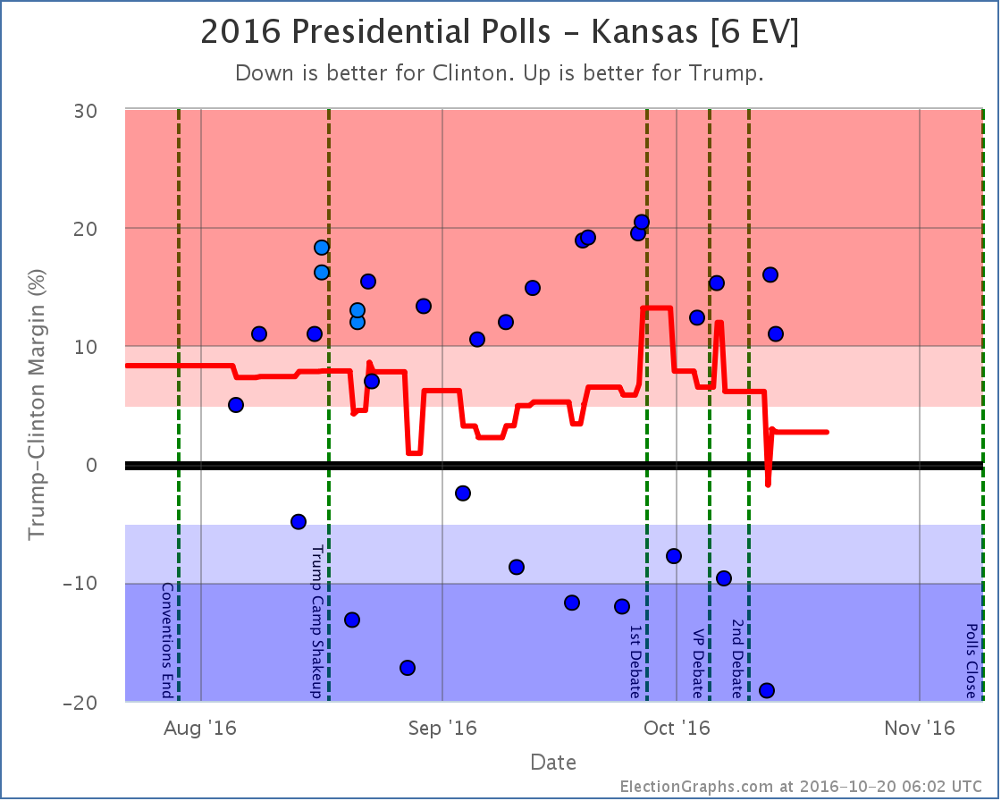
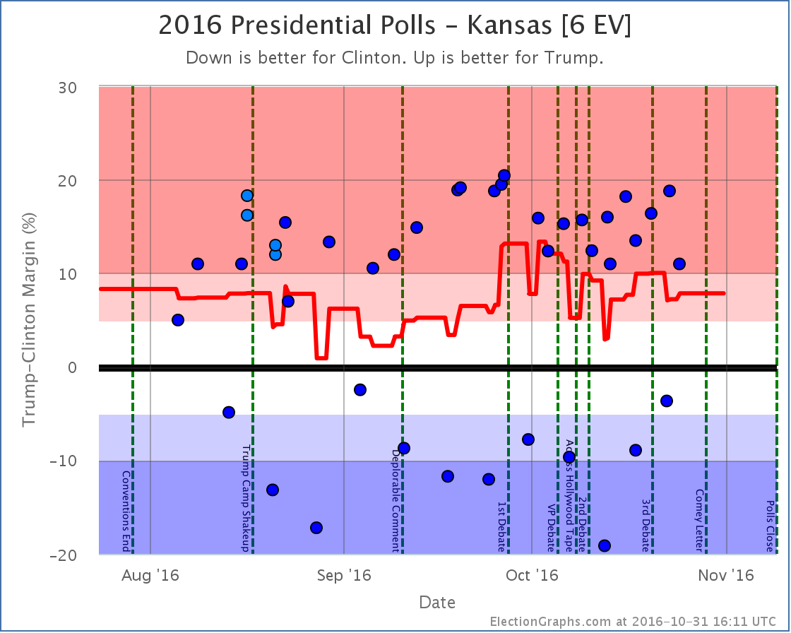
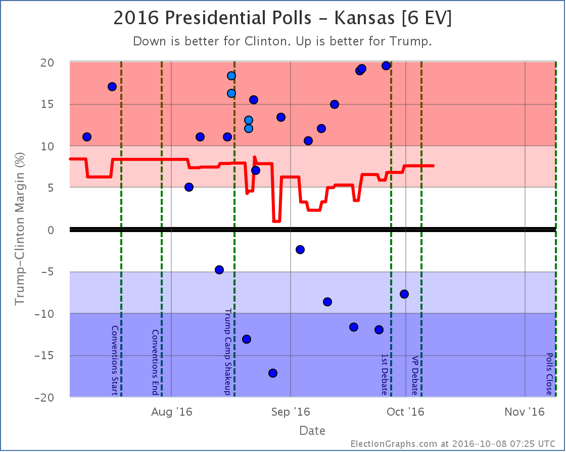
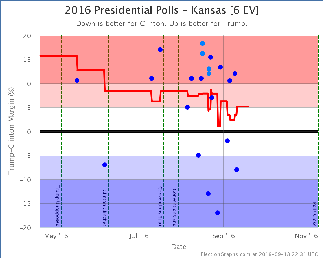
Use the rest of your salt for Kansas, and for the same reason. Google. Without the Google polls, the average in Kansas would not be Trump by 2.7%, it would be Trump by 15.0%. Kansas is lightly polled, so Google has an outsized influence. And the Google results are WAY off from what any other pollster has seen.
Also impacted the tipping point
A note about McMullin
In the last week or two McMullin has spiked in Utah. Some individual polls now even show him leading in Utah. All of the current Election Graphs metrics and charts operate under the assumption that no third party has a realistic shot at winning electoral votes. I have had the outline of a contingency plan on how to modify the site to accommodate 3rd parties that might win electoral votes for months, but activating it would take quite a lot of time and effort. If a 3rd candidate had gotten to that position a month or two ago, the site would definitely have been revamped to adjust for that possibility. As it is, there realistically is no longer time to do that before election day.
Right now the Real Clear Politics average in Utah has McMullin 6.4% behind the lead. The 538 average in Utah has him 11.1% behind the lead. If/when McMullin is within 5% according to either of these averages, I will add notes to both the Utah and National pages talking about the possibility of McMullin winning Utah’s 6 electoral votes, but I probably won’t try to revamp the site to change absolutely everything to account for the possibility. I’ll try to have something ready for 2020 just in case though. :-)
For more information…
This post is an update based on the data on ElectionGraphs.com. Election Graphs tracks a state poll based estimate of the Electoral College. All of the charts and graphs seen in this post are from that site. Additional graphs, charts and raw data can be found there. Follow @ElectionGraphs on Twitter or like Election Graphs on Facebook to see announcements of updates or to join the conversation. For those interested in individual general election poll updates, follow @ElecCollPolls on Twitter for all the polls as they are added. If you find the information in these posts interesting or useful, please consider visiting the tip jar.
States with new poll data added since the last update: All of them. Multiple times. There are additional new polls since I had to cut things off for this update as well. Those will be in the next update.
National Summary
The last week of polls has been devastating to Trump’s position. In the last update we were just starting to see the reaction from the first debate. With this batch the post-debate polling continued to roll in, and while there were a couple of minor moves toward Trump, the net change in this update was a dramatic move toward Clinton:
- The expected result moved from Clinton by 6 electoral votes to Clinton by 154 electoral votes
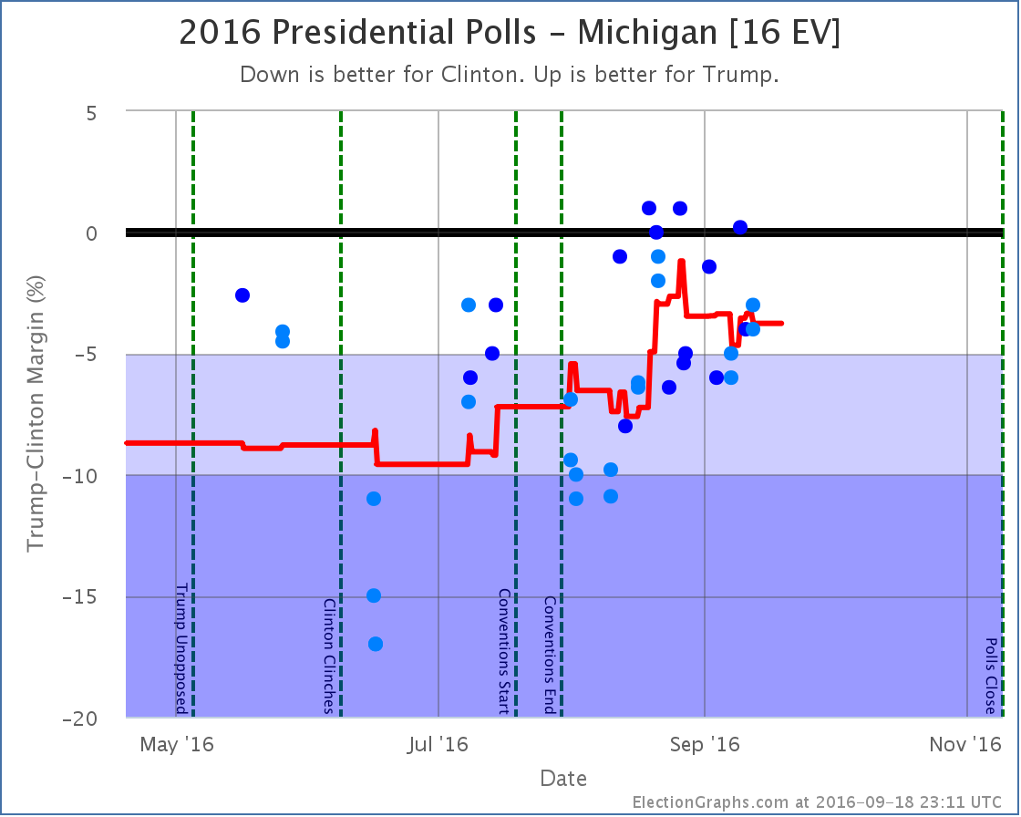
- The tipping point moved from Clinton by 2.1% in CO to Clinton by 4.5% in MI
- Trump’s best case moved from a 60 EV win to a 26 EV win
- Clinton’s best case moved from a 208 EV win to a 196 EV win
Looking at the charts:
The previous update mentioned some Trump losses starting a week or two before the debate. With a lot more polls filling in the time period right before the debate as well as right after, it now looks like those losses were reversed before the debate.
In the time after the debate though, all three indicators on the chart have moved in Clinton’s direction. The race is now essentially back to where it was at the beginning of September. We’re not yet back at Clinton’s high point from August, but it is getting close.
The tipping point chart is even more stark. As with the electoral college view, it looks like Trump’s mid-September declines were reversed by debate time, but after the debate everything falls off a cliff. Most of Trump’s gains from August and September are gone. Right before the debate he topped out with Clinton only ahead in the tipping point metric by 0.4%.
Clinton now leads by 4.5%. The tipping point state is Michigan. Clinton only has to increase her lead slightly there to not just take Michigan out of reach for Trump, but the Presidency.
What we are seeing in the polling results right now at this point probably fully factors in the debate itself. But we are just starting to see the impact from Trump’s “worst week in presidential campaign history ” that started with the debate, continued with his attacks on Alicia Machado, and ended with the leak of some of his tax information. The events of that week are not yet fully baked in.
And of course, the polls do not yet reflect the VP debate, or more importantly, the 2005 Trump video that was leaked on Friday. It is hard to imagine the events of the last few days NOT having an impact on the polls.
And the next debate is coming up. It should be interesting. If you were not planning on tuning in before, change your plans.
31.7 days left until the first actual election results start coming in.
State Details
A lot of states moved in order to produce the summary results above. For those interested in looking at the state by state details, they are below:
Weak Trump to Weak Clinton
Moving out of reach for Trump
Moving out of reach for Clinton
Moving into reach for Trump
States that changed categories but then moved right back again
For more information…
This post is an update based on the data on ElectionGraphs.com. Election Graphs tracks both a poll based estimate of the Electoral College and a numbers based look at the Delegate Races. All of the charts and graphs seen in this post are from that site. Additional graphs, charts and raw data can be found there. Follow @ElectionGraphs on Twitter or like Election Graphs on Facebook to see announcements of updates or to join the conversation. For those interested in individual general election poll updates, follow @ElecCollPolls on Twitter for all the polls as they are added. If you find the information in these posts interesting or useful, please consider visiting the tip jar.
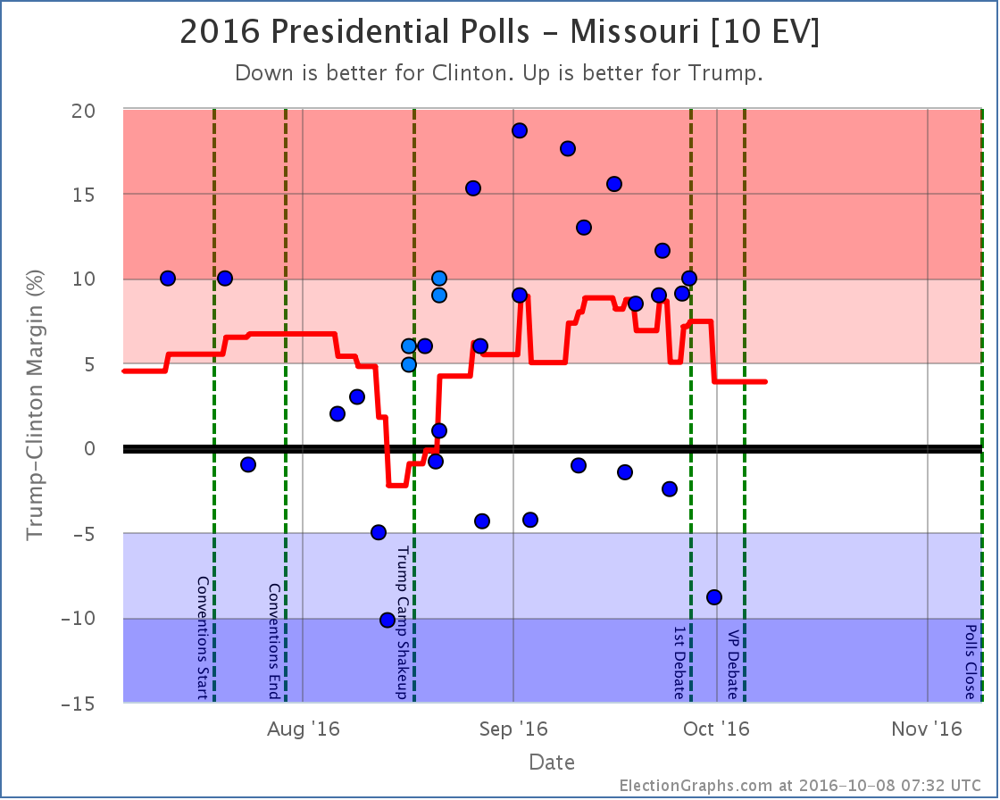
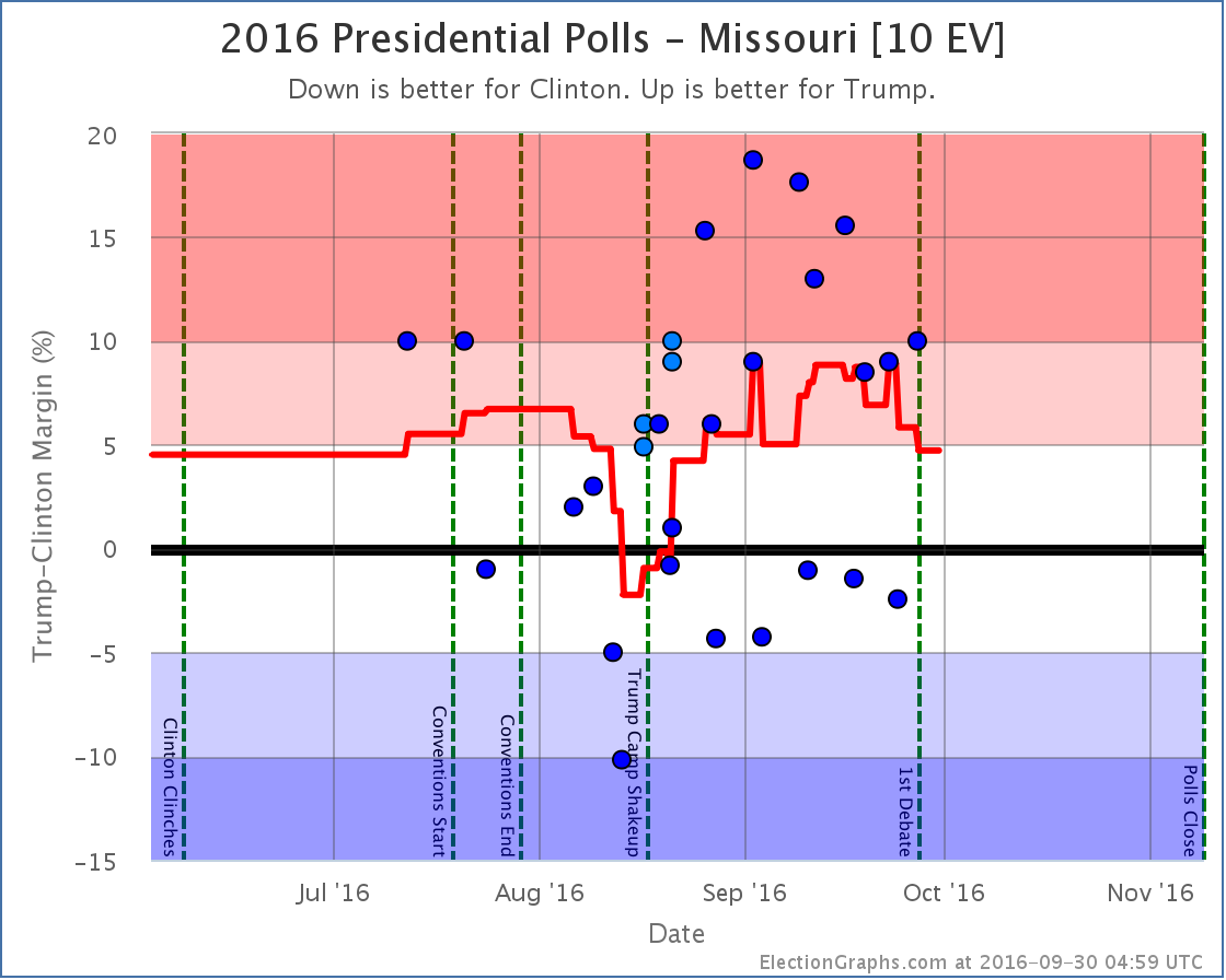
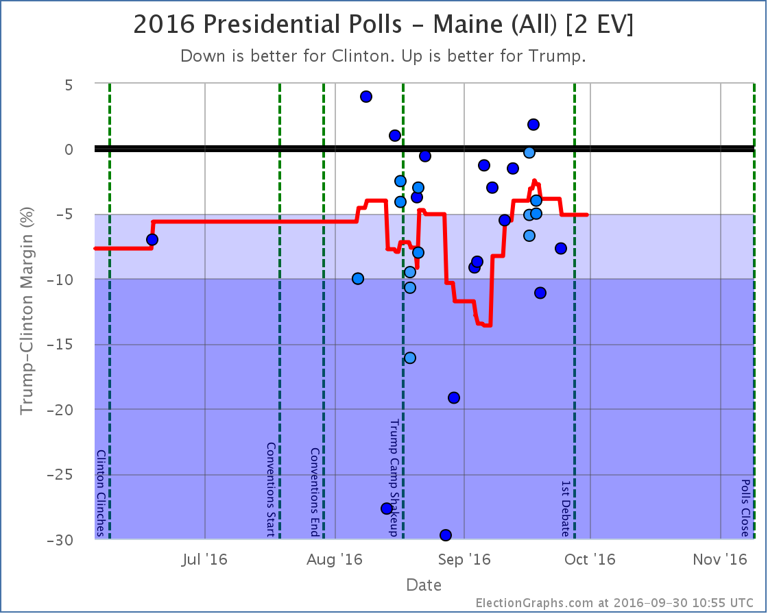
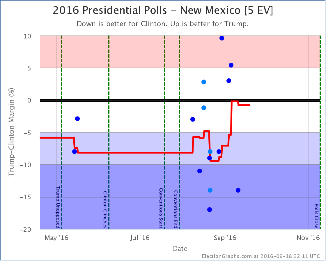
States with new poll data added since the last update: All 50 states, and DC. Notable changes in the tipping point plus New Mexico, Maine (at large), Kansas, and Missouri.
National Summary
With the latest batch of updates, there was a lot of churn that caused some big movements if you look at the charts. For a while as I entered polls it looked like Trump’s peak was definite and a clear downward trend was in place, even before the debate. But then as I continued to enter polls, most of those Clinton gains were reversed.
The primary reason for this? Florida [29 EV], Ohio [18 EV], and North Carolina [15 EV] are all currently very close in my averages. Close enough that single polls can move them back and forth across the center line. As I worked through this round of poll updates, all three of these states moved from Weak Trump to Weak Clinton and back again. Now, the actual changes in the averages in these three states were not much. They just happened to pass the zero line, and have large numbers of electoral votes.
So if you look at the “Expected Case” chart for the electoral college, you see a big move toward Clinton, then a big reversal a few days later. Because of the nature of the electoral college, you should expect (and be careful interpreting) large electoral college moves like this so long as there are big states that are close. In these cases looking at the tipping point provides a different view with a bit less volatility.
In any case, looking only at the final net change from this round of polls, we see these changes in the national picture:
- The expected case moves from Clinton by 8 EV to Clinton by 6 EV
- Clinton’s best case improves from Clinton by 188 EV to Clinton by 208 EV
- Trump’s best case declines from Trump by 106 EV to Trump by 92 EV
- The tipping point moves from Clinton by 0.1% in KS to Clinton by 1.3% in NH
Now, this round includes a handful of post-debate polls, but almost all of the movement discussed here comes from before the debate. (The exception is Florida returning to Weak Trump after the debate.)
Looking at the charts…
Notice the clear dip from about September 19th to September 28th when Florida, Ohio, and North Carolina went slightly blue, then moved slightly red again. In the end, the “expected case” remained flat. The movement Clinton saw from winning by 6 electoral votes to 8 electoral votes in the last update was erased by New Mexico and Kansas both returning to their “normal” colors.
Both “best cases” moved toward Clinton though, with New Mexico and Maine at large both moving out of Trump’s reach, while Missouri moved into Clinton’s reach.
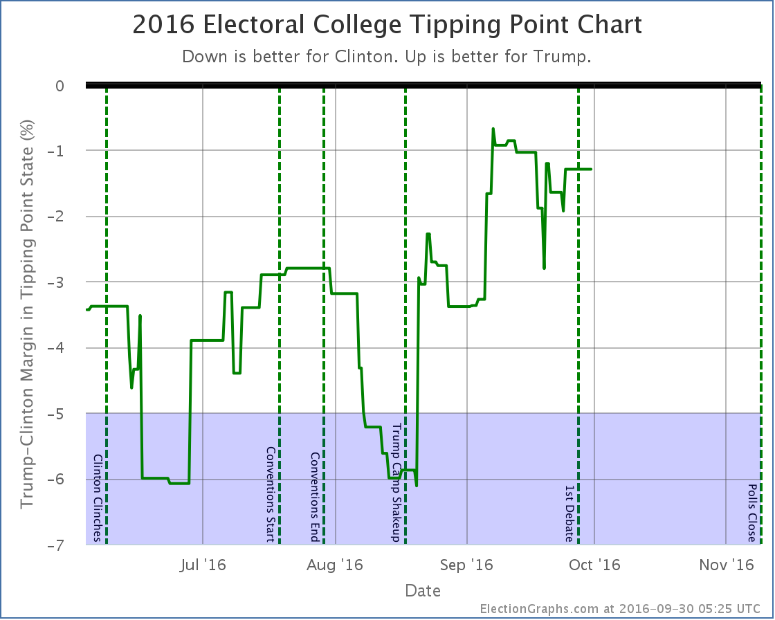
The tipping point chart doesn’t end up with huge moves when big states cross the center line, so it might be a better chart to look at right now to see how the race is moving. What we see is that after big gains starting with Trump’s campaign shakeup on August 17th, Trump seems to have peaked around September 7th… way up from where he had been, but never actually taking the lead… and he has been on a slow decline ever since… but we haven’t yet seen a BIG move back toward Clinton.
By most reports, Trump did badly in the debate, and has been doing things counter-productive to his campaign since the debate. But this does not mean large numbers of people have changed sides. Maybe this will happen, maybe it won’t, but the small number of post-debate polls already included here don’t yet show it. (In fact, as I mentioned, the single state category change post-debate so far is a move toward Trump.)
Additional post-debate polls are coming in quickly now, but I had to cut off the round poll updates somewhere to get this blog post out. There will be another update soon enough, and we’ll start to see a bit better what (if any) lasting change comes out of the first debate. Of course just about as soon as there has been enough time to see that in the polls, it will be time for the next debates…
39.4 days left until polls start to close.
State Details
For those digging into the details, here are the charts for all the states influencing the analysis above:
The big close states:
Weak Clinton to Weak Trump
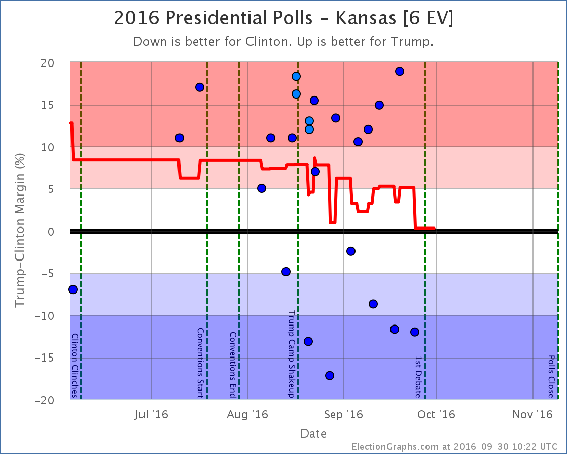
Strong Trump numbers from Ipsos and CVoter balance out the strong Clinton numbers from Google and leave us with an essentially tied Kansas and erase the short blue period for the state I noted last time. (The Ipsos and CVoter results came out later, but covered an earlier time period, so they moved the lines in the past, not just the current number.)
As I stated last time I am incredulous about the Google numbers, and wish there was more additional polling in Kansas to clear up what is really going on there.
Weak Trump to Strong Clinton
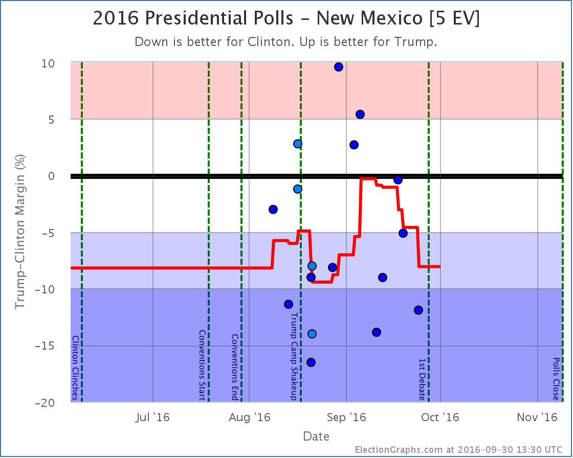
New polls in New Mexico erased the short foray into red territory for New Mexico. As with Kansas, since some of the “new” polls covered older date ranges, the shape of the curve in the past changed as well as the current number.
Strong Trump to Weak Trump
Weak Clinton to Strong Clinton
Other states that influenced the Tipping Point
Note on placing polls on the timeline
I somehow forgot to mention this in my recent interview about this site, but it seems relevant to the discussion above… Many other election tracking sites place polls based on the END of the poll’s time in the field. I place polls on the timeline based on the mid-date of their time in the field. I think this does a better job at trying to identify when directional changes happen, because if an event and a mid-date are aligned, you know that the poll was half before and half after the event. When you place polls by the end of their field time, you can’t make any sort of statements like that about how the poll results match up with the event without referring to the specific start and end dates.
For more information…
This post is an update based on the data on ElectionGraphs.com. Election Graphs tracks both a poll based estimate of the Electoral College and a numbers based look at the Delegate Races. All of the charts and graphs seen in this post are from that site. Additional graphs, charts and raw data can be found there. Follow @ElectionGraphs on Twitter or like Election Graphs on Facebook to see announcements of updates or to join the conversation. For those interested in individual general election poll updates, follow @ElecCollPolls on Twitter for all the polls as they are added. If you find the information in these posts interesting or useful, please consider visiting the tip jar.
Edit 2016-10-01 00:34 UTC to correct the one state that moved after the debates. I had said it was North Carolina moving back from Weak Clinton to Weak Trump, it was actually Florida.
States with new poll data added since the last update: All 50 states, DC, and the Maine congressional districts. Notable changes in Kansas, New Hampshire, New Mexico, and Maine’s 2nd Congressional District.
National Picture
The update today is a strange one. Some indicators move toward Clinton, others move toward Trump. Some of the moves seem to be prompted by outlier data as well, so some skepticism is probably in order. But with the directional mix, one possible conclusion is that we are at or near the top of the recent move toward Trump. As I write this though, we are hours away from the first debate, which may well scramble things again.
The summary changes:
- The expected case moves from Clinton by 6 EV to Clinton by 8 EV
- Clinton’s best case improves from Clinton by 178 EV to Clinton by 188 EV
- Trump’s best case improves from Trump by 98 EV to Trump by 106 EV
- The tipping point moves from Clinton by 0.8% in NM to Clinton by 0.1% in KS
So two moves in Clinton’s direction (Expected and Clinton Best), and two moves in Trump’s direction (Trump Best and Tipping Point.)
The charts look like this:
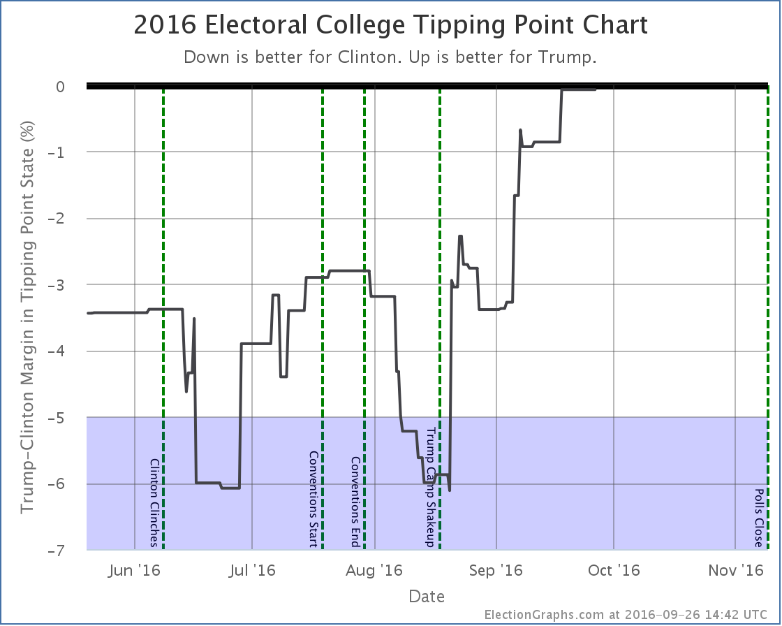
I’ve added a new vertical line marking the moment when Trump shook up his campaign by bringing in Steve Bannon and Kellyanne Conway. Looking back, we can now see this very closely aligns to the moment Trump stopped dropping and started closing the gap with Clinton.
Trump has still not led in my model, but this is about as close as you can get without crossing that line.
The fact that we are now seeing simultaneous moves in both directions might indicate we are near the top of this particular trend toward Trump. But events have the potential to change things quickly… in either direction.
43.4 days until polls start to close on election day…
State Details
For those who are interested in the individual state moves that combine for the national changes above, here they are. I will only add individual commentary when there is something specific worth noting.
Flipping to Clinton
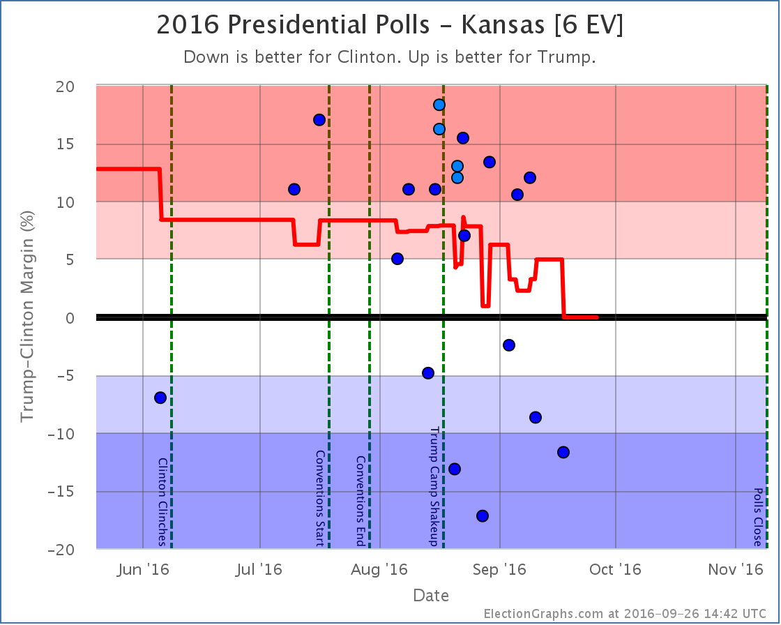
I’m putting this one first, because it is one I honestly don’t believe. Every single one of the results showing Clinton ahead since August is from one pollster… Google Consumer Surveys. This pollster has some unorthodox methods, and has produced strings of outliers in a wide variety of states… some favoring Trump, others favoring Clinton. In this case, other than a single Zogby poll in June, every other pollster shows Kansas not only favoring Trump, but favoring Trump by a substantial margin.
Because I am inclusive and try not to exclude polls, three of the five polls in my average in Kansas are from Google at the moment. This leads to a 0.1% Clinton lead in Kansas. If you excluded the Google polls, my average would show Trump leading by 11.6%. I am very very dubious that Kansas is even a close state, let alone that Clinton is ahead. We need more non-Google polls in Kansas to clear up this situation.
Now, astute observers will note that if you flip Kansas back to red, Trump would actually now be leading in the “expected” result. But not so fast. Google causes changes in other states too. To pick out one prominent example, Google has been giving Trump much bigger leads than other pollsters in Florida. My average in Florida currently shows Trump up by 1.1%, but if you removed Google, the average moves to Clinton by 1.3%. So removing Google might flip Kansas, but it would also flip Florida. You’d still have a Clinton lead overall, just in a different way.
The philosophy of this site is to just include everything unless is it obviously fake or fraudulent. The Google polls may be bad… they are just all over the place compared to more traditional pollsters… but they are not an obvious fake or fraud. So I will continue to include them. I don’t pick and choose polls based on if I “believe” them. Google is in the average. So you end up with a very slight Clinton lead… in Kansas.
But Google is clearly adding noise to the model at the moment… which I’m not particularly thrilled about.
Note that Kansas moved all the way from Strong Trump to Weak Clinton in one jump, so it improved both Clinton’s expected case and her best case.
Flipping to Trump
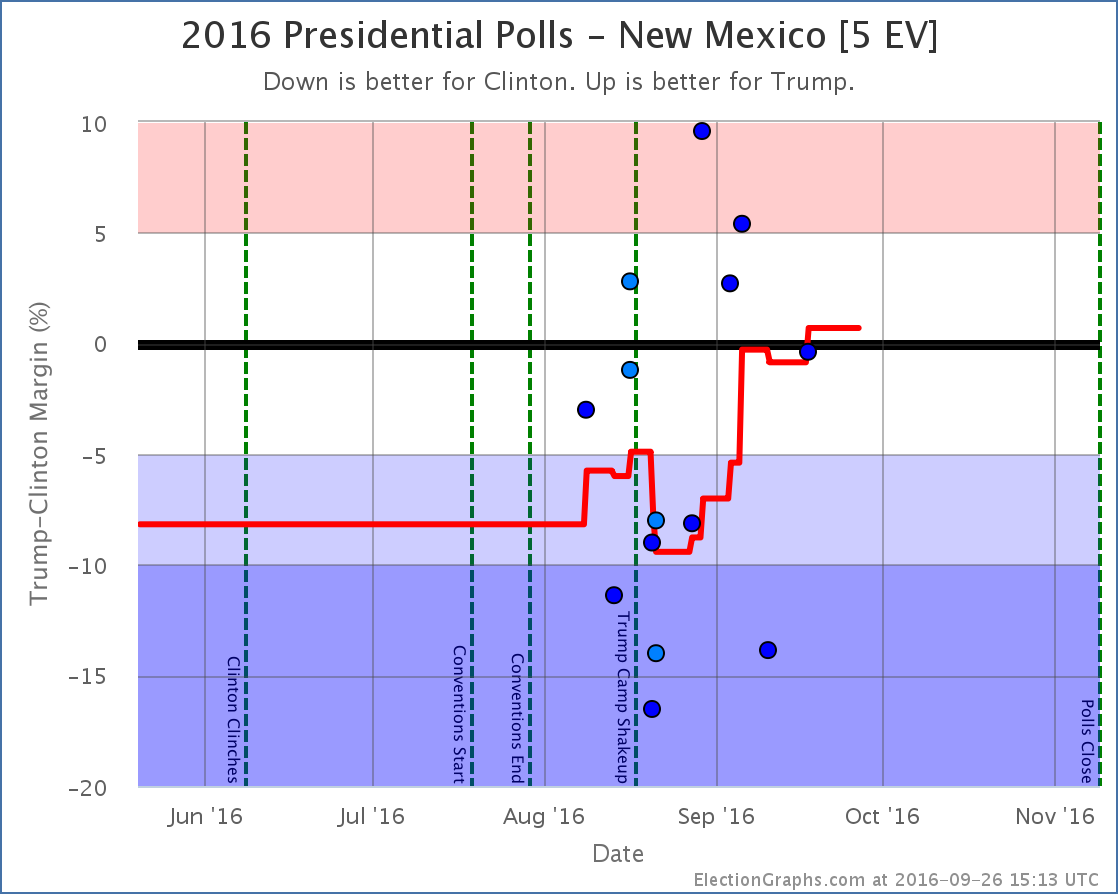
This is another state where three of five data points in my average are from Google, and this time the other two are from Reuters/Ipsos, another “50 state” pollster where the numbers can sometimes be way out of line with other polls. In this case Google and Ipsos seem to trend in opposite directions, but it would be really nice to have some other big name pollsters check out New Mexico again before too long, because when all you have are these polls looking at the whole country and then breaking out subsamples by state, you really have a lot of uncertainty on the results. So like Kansas, treat New Mexico with a substantial pile of salt.
Now in reach for Trump
No longer in reach for Clinton
Interview
The latest Curmudgeon’s Corner podcast presented interviews with three people who do independent electoral college projections based on state polls… Luis Mendez from projectiondesk.com, Darryl Holman from horsesass.org, and me… Sam Minter from electiongraphs.com. We each talked about how we got into this sort of analysis, what makes our sites different, the challenges we face, and more. Take a listen!
For more information…
This post is an update based on the data on ElectionGraphs.com. Election Graphs tracks both a poll based estimate of the Electoral College and a numbers based look at the Delegate Races. All of the charts and graphs seen in this post are from that site. Additional graphs, charts and raw data can be found there. Follow @ElectionGraphs on Twitter or like Election Graphs on Facebook to see announcements of updates or to join the conversation. For those interested in individual general election poll updates, follow @ElecCollPolls on Twitter for all the polls as they are added. If you find the information in these posts interesting or useful, please consider visiting the tip jar.
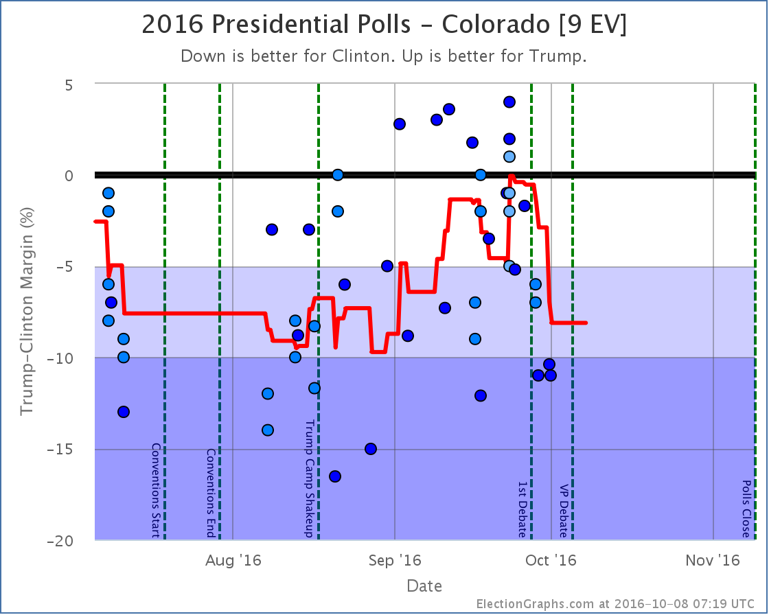
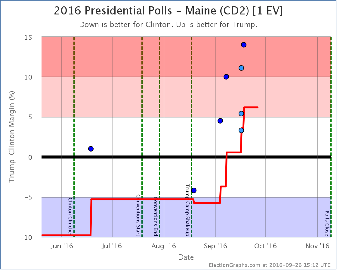
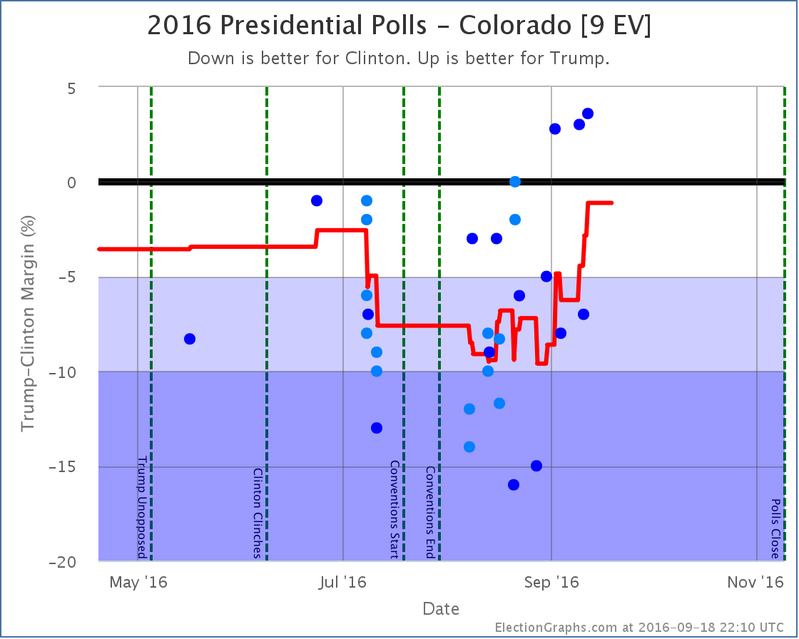
States with new poll data added since the last update: All 50 states, DC, and the Maine congressional districts. Notable changes in Colorado, New Mexico, Iowa, Nevada, Maine (CD2), Kansas, and the tipping point.
National Picture
Trump continues on the upswing, and at this point Clinton only leads by the very narrowest of margins. One more round of polls in his favor could easily put Trump in the lead for the first time this cycle.
With this update, we have the following changes:
- The expected case moves from Clinton by 32 EV to Clinton by only 6 EV
- The tipping point moves from Clinton by 3.4% in MI to Clinton by 0.8% in NM
- Trump’s best case improves from winning by 66 EV to winning by 94 EV
- Clinton’s best case drops from a 190 EV win to a 178 EV win
The full current summary:
There is no denying this is now a razor thin race. This is close. If the election was held today, it could go either way.
Looking at the trends:
In both measures, Trump bottomed in mid-August and has been on a strong upswing ever since. Or is it that Clinton has been collapsing? In the end, the result is the same.
Trump is now far outside the “McCain to Romney” zone where he had been stuck. The question is if he is establishing a new normal, with many people permanently converted to his cause, or if this is an unsustainable high that will soon undergo reversion to the mean.
The race is not today. There are 51.0 days until we start getting the first real election results. A lot will happen between now and then. The first debate is now less than eight days away. Will it change anything? We shall see…
Individual States
I won’t provide individual commentary on all of these, but for those wanting to see the details on the states that changed the national summary this time around, here they are. Click through on any chart for the full detail page with individual polls listed.
Moving from Clinton to Trump:
Now close enough to be in play for Trump:
No longer close enough to be in play for Clinton
Another state whose movement influenced the tipping point
Note on “50 State” polls
Since Election Graphs tries to be as inclusive as possible with polls, we are including some “50 state” polls that some other folks have decided to exclude because of various methodological concerns. Others, like 538, include these polls, but give them very low weights in their models. Because Election Graphs tries to “keep it simple” we don’t do that kind of weighting. Everything just counts and we do a straight average.
Two of these “50 state” polls are now producing weekly results, Google Consumer Surveys and Reuters/Ipsos.
Honestly there are some crazy things in there. For instance:
- Google thinks Clinton is leading in Kansas, some weeks by a very large margin. No other pollster has seen this. Everybody else shows a significant Trump lead.
- Google thinks Trump is only 7% behind in DC. In DC? Really? In DC Obama beat Romney by 83.6% and McCain by 85.9%. The idea that Clinton is only 7% ahead of Trump in DC is pretty much ludicrous.
- The last few Ipsos polls have shown a Trump lead between 13% and 23% in Texas. The most favorable poll to Trump other than Ipsos has a 11% Trump lead, and most show it significantly narrower than that.
- In general it seems to be very common for these two polls to produce results which are outliers compared to other pollsters… Sometimes they show a result far more favorable to Clinton than anyone else, sometimes far more favorable to Trump than anyone else. The direction isn’t uniform, they just sometimes seem way off the mark.
- In many states the sample sizes are very low, and you see wide swings. For instance in West Virginia the Google poll moved from Trump +29% to Clinton +1% in one week! Yes, when you average them you get a 14% Trump lead, which is probably reasonable for West Virginia… but still!
- There are more examples, but you get the idea. In most states, these polls give roughly the results you would expect, in line with other recent polling, but occasionally, especially in smaller states, they seem to be clear outliers.
The craziness of some of these polls leads me to sometimes question my tenets of including everything and keeping it as close to a straight average as possible. But we’re sticking with that and we will see how it does.
And even with this the general notion of this site, that even with very simple assumptions you end up with similar results to what folks with complex models get seems to be holding up. Although the exact state by state results may differ slightly, every analysis I have read has the same general conclusion right now. The race is now much much closer than it was, although Clinton retains a narrow lead.
While these polls are a bit crazy, in the competitive states there are enough other polls so the average seems to be at least somewhat resilient when outliers like these pop up. And in the non-competitive states, well, these 50 state polls may be the only data in the average, so they may screw up the margins a bit, but in the end it doesn’t change the status of the state.
For more information…
This post is an update based on the data on ElectionGraphs.com. Election Graphs tracks both a poll based estimate of the Electoral College and a numbers based look at the Delegate Races. All of the charts and graphs seen in this post are from that site. Additional graphs, charts and raw data can be found there. Follow @ElectionGraphs on Twitter or like Election Graphs on Facebook to see announcements of updates or to join the conversation. For those interested in individual general election poll updates, follow @ElecCollPolls on Twitter for all the polls as they are added. If you find the information in these posts interesting or useful, please consider visiting the tip jar.
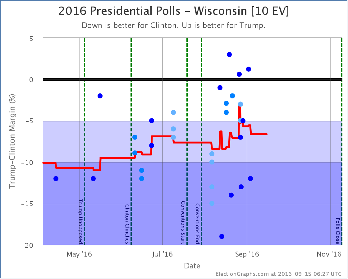
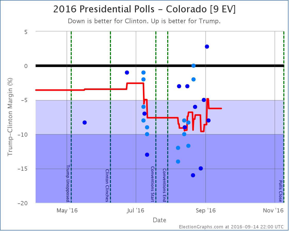
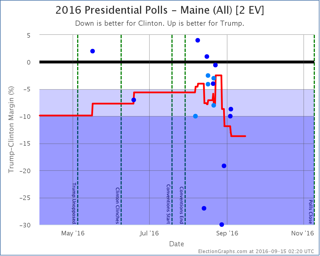
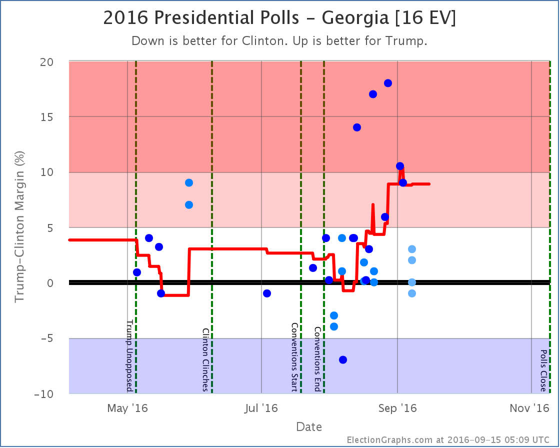
States with new poll data added since the last update: All 50 states and DC. Multiple times each. Notable changes in Florida, North Carolina, Ohio, Iowa, Pennsylvania, Kansas, Colorado, Wisconsin, Maine (All), and Georgia.
There have been tons of polls, including “50 state” polls from three different sources, one of which had weekly data going back four weeks that needed to be added. There were many shifts caused by this batch of polls. We’ll look at all the charts, but lets start with the headline:
The Romney Barrier
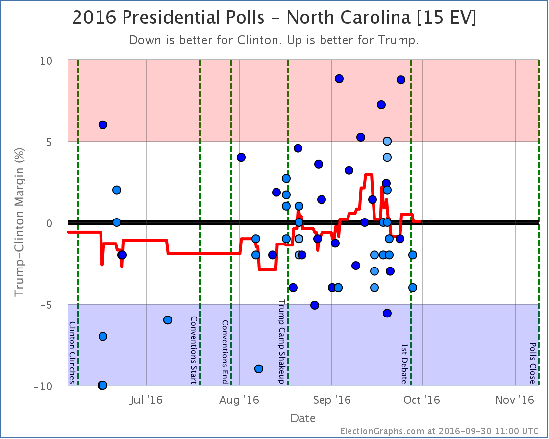
The averages in Florida, Ohio, and North Carolina all moved from Clinton to Trump. Iowa did move in the opposite direction, but it is much smaller, so the net change was dramatically toward Trump.
Before this batch of changes, the “expected” result if everybody won the states they lead was Clinton 341 to Trump 197… a 144 electoral vote win for Clinton.
With this batch of polls, the expected result is now Clinton 285 to Trump 253. This is still a Clinton win, but now by only 32 electoral votes.
From February onward this race had been stuck in the zone with Trump losing by margins between McCain’s loss (192 electoral votes) and Romney’s loss (126 electoral votes).
For the first time since February, Trump is now looking like he would do better than Romney did. Trump now matches Romney’s map, but adds Florida and Ohio. It isn’t quite enough to win, but Trump is now closer than he has ever been… and doing better than the last two Republican candidates.
Some folks were looking at Clinton’s lead in mid-August and were trumpeting the possibility of a Clinton landslide in early August. It was just looking like a solid win for Clinton back then, not a landslide, but things have actually moved in the opposite direction. A 32 electoral college win is more like a squeaker. It would only take Michigan flipping to get us to a 269 to 269 electoral college tie.
(There were also changes in the “best cases” from a lot of states moving in both directions. Trump’s best case went from winning by 68 electoral votes to winning by 66 electoral votes. Clinton’s best case went from winning by 210 electoral votes to winning by 190. So the overall range of possible outcomes reduced.)
Tipping Point
Now, despite the expected case moving in Trump’s direction, changes in Florida, Michigan, Wisconsin and Pennsylvania had the net effect of… zero. Well, to be precise the tipping point changed from a 3.4% Clinton lead in Florida to a 3.4% Clinton lead in Michigan. So the state that holds the balance shifted, but the actual percentage did not.
Looking at the trends though, rather than just the change in this update, while the expected case has clearly been moving in Trumps direction the last few weeks, the tipping point has been trending toward Clinton.
What does this mean?
At a basic level it means that while Trump has made the race closer, pulling over the next few states he needs to win is getting harder.
3.4% is still close, but if Trump is at or near his ceiling, it may be a tough last 3.4% to move.
To be absolutely clear, with all of the above Clinton is still a strong favorite. Trump has made it a lot closer than it was, but he still has a lot of work to do to pull the remaining states he would need past the line to secure an electoral college victory. It isn’t impossible. It is just very hard.
Individual States
OK, with the two national summaries out of the way, time for a run down of all the states that shifted in ways that caused changes to the expected or best cases. I’ll just do a run down of all the graphs without commentary on each one. For the most part they speak for themselves. Keep an eye out for the polls that look like outliers. In some cases if new polls don’t back those up, the changes described here may reverse themselves quickly as new polls come in.
States moving from Clinton to Trump:
States moving from Trump to Clinton:
States now in play for Trump:
States now in play for Clinton:
States no longer in play for Trump:
States no longer in play for Clinton:
What’s Next
This batch of polls was huge, so in the time it took me to complete it, there have already been a bunch of new polls which I will be adding as soon as I can. Even if those polls don’t change anything, there will be polls soon enough that do. This is a dynamic race, and as I post this we have 54.7 days left until we start getting the actual results. Hang on tight, we’re in for a nice ride before we are done.
Note: This post is an update based on the data on ElectionGraphs.com. Election Graphs tracks both a poll based estimate of the Electoral College and a numbers based look at the Delegate Races. All of the charts and graphs seen in this post are from that site. Additional graphs, charts and raw data can be found there. Follow @ElectionGraphs on Twitter or like Election Graphs on Facebook to see announcements of updates or to join the conversation. For those interested in individual general election poll updates, follow @ElecCollPolls on Twitter for all the polls as they are added. If you find the information in these posts interesting or useful, please consider visiting the tip jar.
[Update 07:16 UTC to add comment about outliers.]
[Updated 07:27 UTC to fix some awkward wording.]
Absent something really surprising happening… which you never know… could happen… the posts on the Democratic side at this point are essentially just going to be documenting Clinton’s slow but sure march to the Democratic nomination.
On March 5th if you go by states, you would see Sanders winning Kansas and Nebraska, while Clinton only won Louisiana.
Of course, states don’t matter. Delegates do. For the night, Clinton got 59 delegates and Sanders got 50.
In addition, since the post about Super Tuesday there were adjustments for finalized Super Tuesday results and new superdelegate counts. The net result was that Clinton gained an additional 22 delegates while Sanders added 13.
So total since then… Clinton +81, Sanders +63.
At the time of that last post, Clinton needed 40.52% of the remaining delegates to be on track to win. Sanders needed 59.54%.
Actual percentages since then? Clinton 56.25%, Sanders 43.75%. Clearly Clinton easily exceeded her targets, while Sanders… did not.
Actual delegate counts right now: Clinton 1127, Sanders 482, O’Malley 1.
You need 2382 delegates to win. 1610 have already been counted. There are 3153 left to be determined.
Where does that put things now?
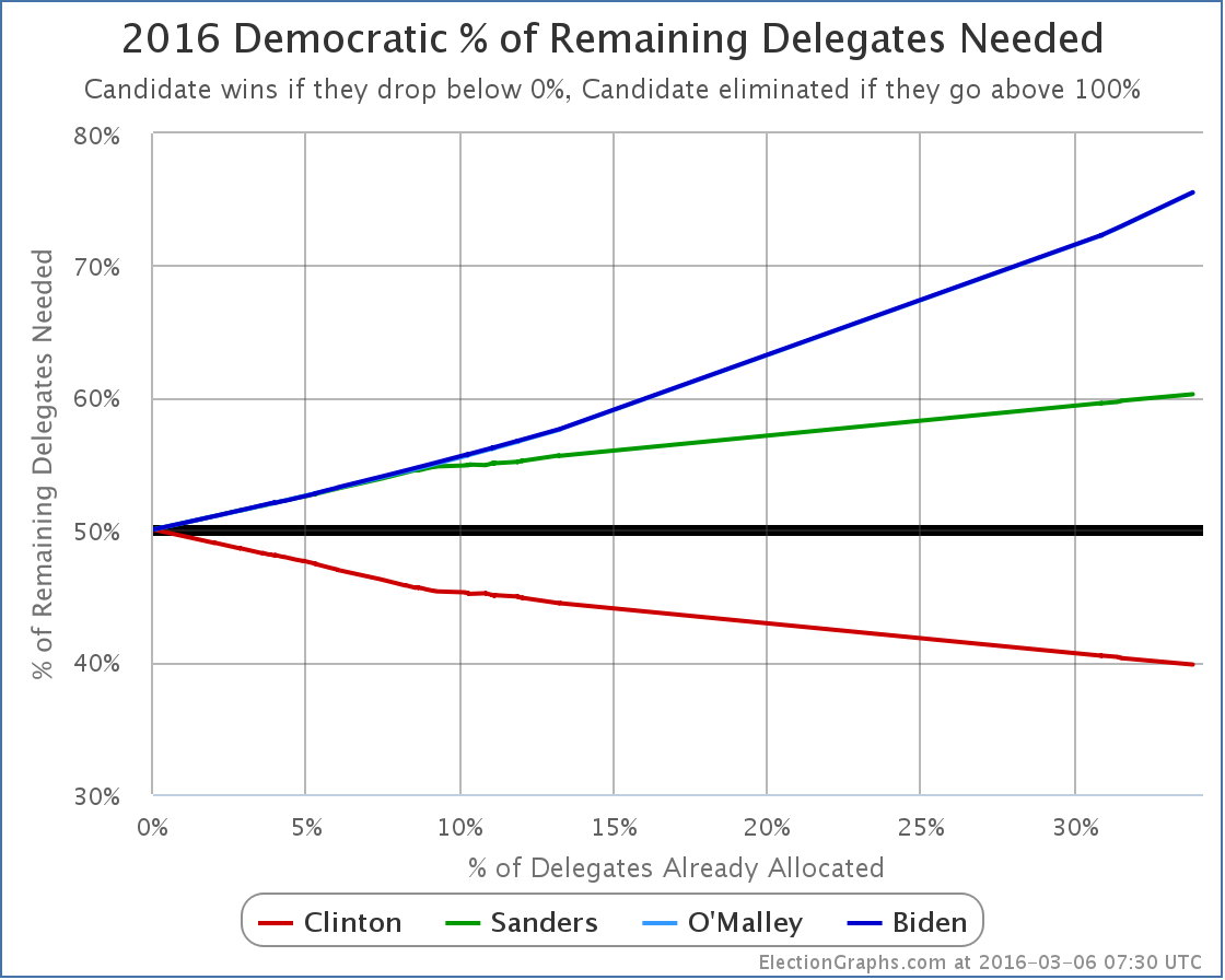
Clinton now needs only 39.80% of the remaining delegates to win.
To catch up and win, Sanders would need 60.26% of the remaining delegates.
Next up is Maine. I haven’t found any polling on Maine. It seems like it might be a good state for Sanders. But is it 60.26% good? In delegate terms that would be 16 of the 25 pledged delegates. Guess we’ll find out.
[Update 15:56 UTC: Overnight updates gave Sanders 1 additional delegate in Louisiana and Clinton 1 less. So if I’d waited until morning to post this the title would have said Clinton won 58 to 51 rather than 59 to 50. But the substance of the post remains the same.]
[Update 2016-03-07 03:07 UTC: Another update gives Sanders yet another delegate in Louisiana and Clinton yet another less. So Louisiana now Clinton 37 to Sanders 14, and March 5th contests overall Clinton 57 to Sanders 52.]
Note: This post is an update based on the data on ElectionGraphs.com. Election Graphs tracks both a poll based estimate of the Electoral College and a numbers based look at the Delegate Races. All of the charts and graphs seen in this post are from that site. Additional graphs, charts and raw data can be found there. All charts above are clickable to go to the current version of the detail page the chart is from, which may contain more up to date information than the snapshots on this page, which were current as of the time of this post. Follow @ElectionGraphs on Twitter or like Election Graphs on Facebook to see announcements of updates or to join the conversation. For those interested in individual general election poll updates, follow @ElecCollPolls on Twitter for all the polls as they are added.
Update 08:40 to add actual delegate counts, how many are left, etc.


|
Romney |
Obama |
| Romney Best Case |
294 |
244 |
| Current Status |
206 |
332 |
| Obama Best Case |
190 |
348 |
No states were called between 01:45 UTC and 02:00 UTC, but a ton were called between 02:00 UTC and 02:15 UTC:
- Romney: KS, LA, NE-All, NE-1, ND, SD, TX, WY, MS
- Obama: MI, NY, NJ
All of these were no brainer expected states, except for Michigan. Michigan is the first state of the night to be called where the margin was less than 5% in the polls, so winning this state made a difference between the “best cases” that I present. Obama was ahead here by 4.5%, so a win here was predicted, but it was a close state and one that Romney really needed.
As of the final update I made on election day, Michigan was the tipping point state. That means Romney had to win all the states he was doing better in than Michigan PLUS Michigan in order to win. He just lost Michigan, which means he now needs a state he was further behind in that Michigan in order to win.
This is very bad news to Romney. His path to victory is now not quite impossible, but very close. Let’s look:
With all the states he has already won, plus the uncalled states where Romney was ahead by more than 5%, he had 190 electoral votes. Then the areas he was ahead in:
- Nebraska 2nd (1): 3.8% Romney lead
- North Carolina (15): 1.4% Romney lead
That gets Romney to 206. He needs 63 more electoral votes. Looking at the remaining states that haven’t yet been called:
- Iowa (6): 2.0% Obama lead
- Florida (29): 2.3% Obama lead
- Colorado (9): 2.4% Obama lead
- New Hampshire (4): 2.8% Obama lead
- Maine 2nd (1): 2.8% Obama lead
- Virginia (13): 3.6% Obama lead
- Pennsylvania (20): 4.8% Obama lead
- Nevada (6): 4.8% Obama lead
If Romney wins all of those through Pennsylvania, it gets him to 288 electoral votes, which wins him the Presidency. If he doesn’t win Pennsylvania to win, he needs every other one of those states, including Nevada, which would get him to 274. If he does win Pennsylvania, then he could afford to lose Virginia, New Hampshire and Maine’s 2nd (and Nevada).
But that is a very tall order! And there will be another update coming soon…
| In the latest Curmudgeon’s Corner…
Sam and Ivan talk about:
- Daylight Savings Time / Election 2012
- New iPad / Apple Competition / HD Downloads
Just click to listen now:
[wpaudio url=”http://www.abulsme.com/CurmudgeonsCorner/cc20120311.mp3″ text=”Recorded 11 Mar 2012″]
or
 1-Click Subscribe in iTunes 1-Click Subscribe in iTunes
 View Podcast in iTunes View Podcast in iTunes
 View XML Feed View XML Feed
|
 |
|
|

