- 05:49:32 Retweeted @AmyNotAmy 05:49:04 I suggested to my family that I may have sensory issues, to which my dad responded, "you are a sensory issue." Love you too… @abulsme
- 16:53:33 Retweeted @NicestHippo 2015-10-13 21:51:16 We're doing it backwards. How about if you're gravely sick, we chip in & pay for you, but if you want a war, you start an online fundraiser
- 18:08:39 Watching – Back To The Future In ACTUAL 2015 (CollegeHumor) http://t.co/QeJt7Nk3RW
- 19:37:42 Reading – Iris' CVS Birthday Party (Sarah Fortune) http://t.co/cHzZdpskj4
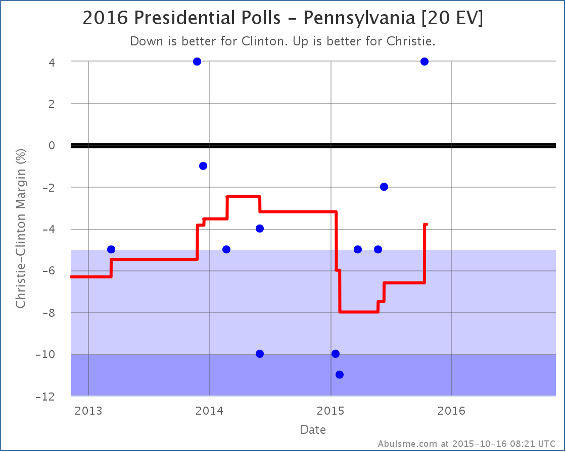
As I mentioned yesterday, Christie is seemingly still in the Republican race. There hadn’t been any state level polls that included him since August, but then yesterday there was one in Virginia that improved his position against Clinton. And now in today’s update we have another poll that included him, this time PPP in Pennsylvania, and once again the result is an improvement in Christie’s position vs Clinton.
This makes Pennsylvania a possible pickup for Christie and thus improves his “best case” scenario even further.
I snarked yesterday about how Christie’s best case was to lose by 70 electoral votes. Well, now his best case is to lose by 30 electoral votes. So he actually is getting a lot closer to being in reach. Of course I also made fun of his 1.9% in the RCP average of national Republican polls… oops, it is 1.7% now. Clinton vs Christie is still the 5th “best polled” candidate combination according to the metric I use, but I expect that will probably change before too long as we continue to get more and more polls including Trump, Carson, Fiorina and Cruz, with fewer including Christie. Not to mention more with Sanders and Biden. They all seem to have gotten more polling action lately, but not yet enough to bring them into the “top five” I talk about here. There are still significant gaps in close state polling for those candidates, but those are gradually being filled in. To briefly illustrate why I don’t talk about all the candidate combinations here, the new polling in Pennsylvania from PPP yesterday actually resulted in all of these changes:
Those are all tweets from @ElecCollPolls. That account tweets each and every electoral college related change on ElectionGraphs.com, including each individual poll result as it is added. If you are interested in that level of detail, follow @ElecCollPolls on Twitter. But be careful interpreting what you see beyond the five best polled combinations I highlight here. There is often still very sparse polling, certainly when compared with the top five, and the averages still rely quite a lot on previous general election results, so it may or may not yet be giving a good picture of where things really stand for that candidate pair. You can still get some insight of course, you just have to be careful. Here on the blog, I concentrate on the candidate pairs with the most robust polling, and on the changes that impact the range of possible results for those candidates. These “top five” candidate pairs are really where the amount of data available is best and where I can feel the most confident drawing conclusions from the data… and even then you sometimes have to be careful reading too much into things. After all, it is still 389.1 days until polls start to close. Things will change a lot in those days. Which is why tracking this is fun. Keep watching. Note: This post is an update based on the data on ElectionGraphs.com. All of the charts and graphs seen here are from that site. Graphs, charts and raw data can be found there for the race nationally and in each state for every candidate combination that has been polled at the state level. In addition, comparisons of the best polled candidate combinations both nationally and each in each state are available. All charts above are clickable to go to the current version of the detail page the chart is from, which may contain more up to date information than the snapshots on this page, which were current as of the time of this post. Follow @ElecCollPolls on Twitter for specific poll details as I add them. And like Election Graphs on Facebook! On the Curmudgeon’s Corner podcast this week, Ivan struggles to stay awake while he and Sam record their commentary track for the first Democratic debate. Listen to our thoughts on Clinton, Sanders, O’Malley, Webb and Chafee’s performances as they answer questions on the issues of the day. And listen to Ivan doze off and snore! Several times! Ah yes, this debate was obviously the most exciting and engaging yet! Click to listen or subscribe… then let us know your own thoughts!
Length this week – 2:21:53
Show Details:
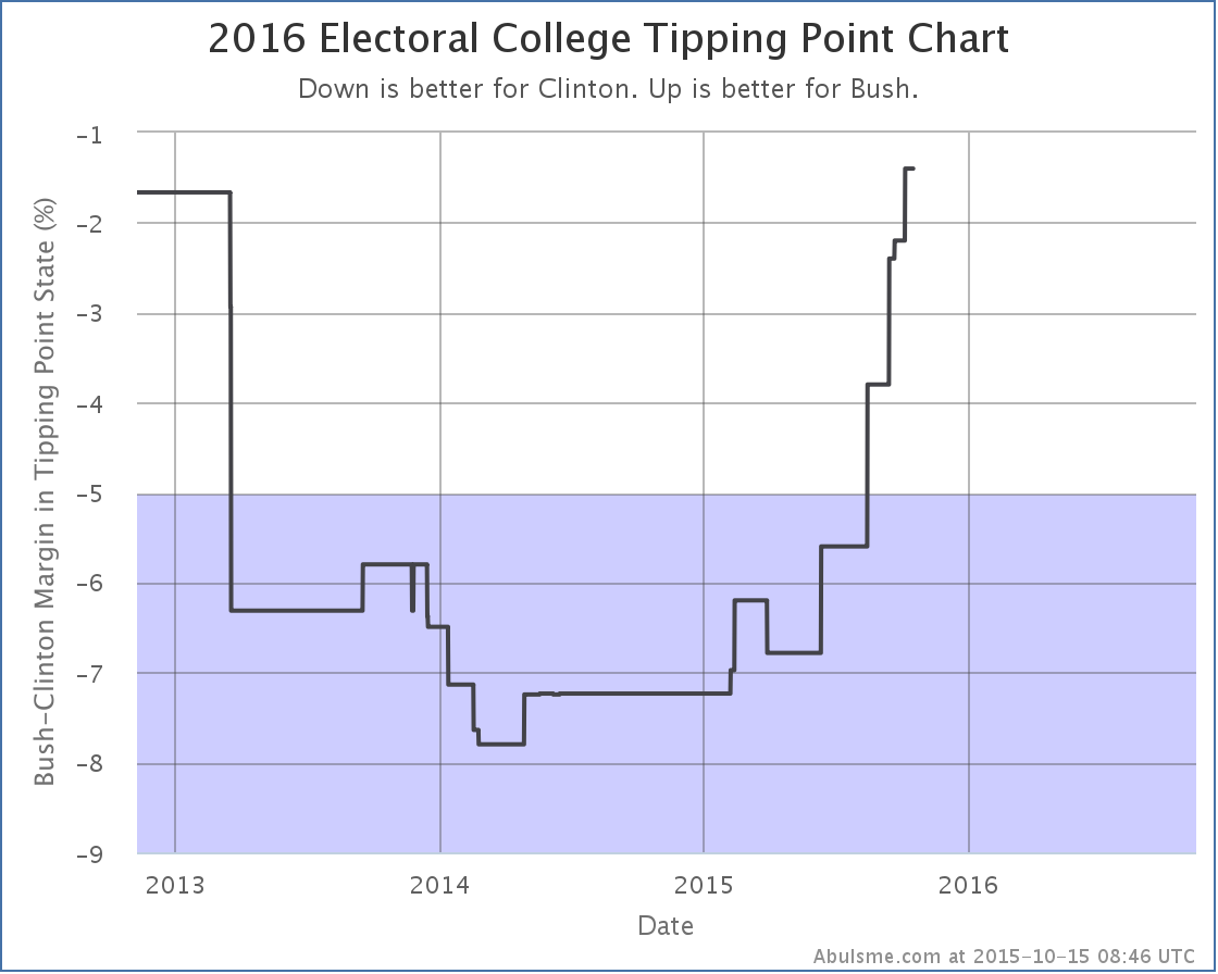
Continuing the trend, in today’s update Clinton just weakens further. Let’s just jump right into the details: Clinton vs Bush
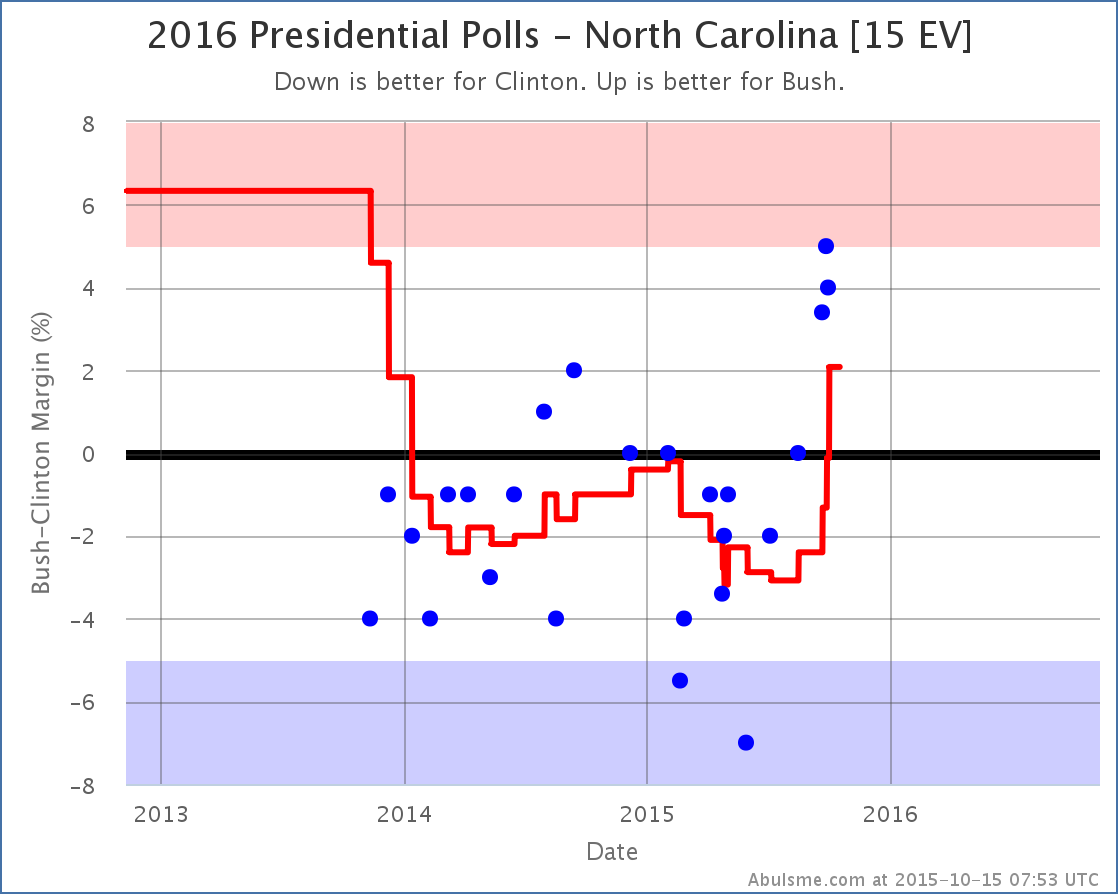
With the latest polls Bush surges to the lead in North Carolina. This has been a pretty quick move. All three polls taken since mid-September have shown a Bush lead. Before that he hadn’t managed better than a tie in North Carolina since September 2014. This of course improves Bush’s “expected case” where he wins all the states where he leads in my poll average:
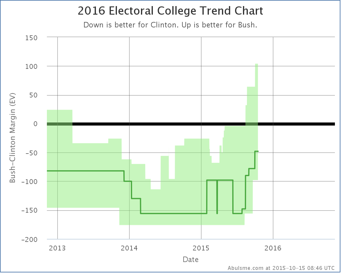
This brings the expected result to Clinton 293 to Bush 245. Still a 48 electoral vote loss for Bush, but that is closer than it has ever been before. Bush also improved against Clinton in Virginia. This did not result in a category change, but it did move the tipping point further in Bush’s direction:
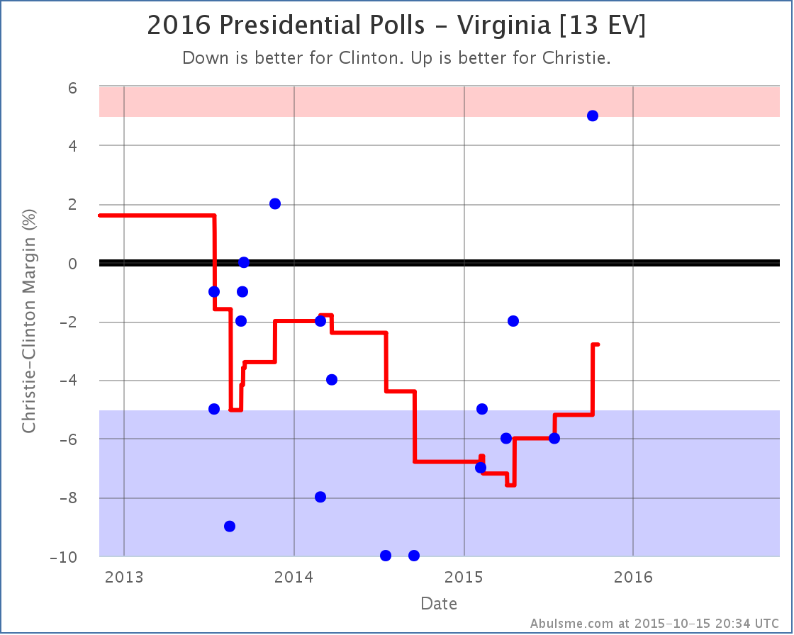
The tipping point is now 1.4% in Michigan in Clinton’s favor. So a national poll move of as little as 0.7% would flip the electoral college to Bush’s side. Bush may not be leading yet like Rubio is, but he is actually very close to that. His best case is to win by 104 electoral votes if he gets all the close states. So Bush is certainly competitive with Clinton at the moment. Bush vs Christie Christie? Is he still running? I thought he was just about gone. Before today’s update, nobody had bothered to include Christie in a state level poll since late August. More than a month. But CNU decided to include him in a new Virginia poll, and it improved his position in Virginia:
This drops Clinton’s lead against Christie in Virginia to only 2.8%, making the state once again a “swing state” that could go either way.
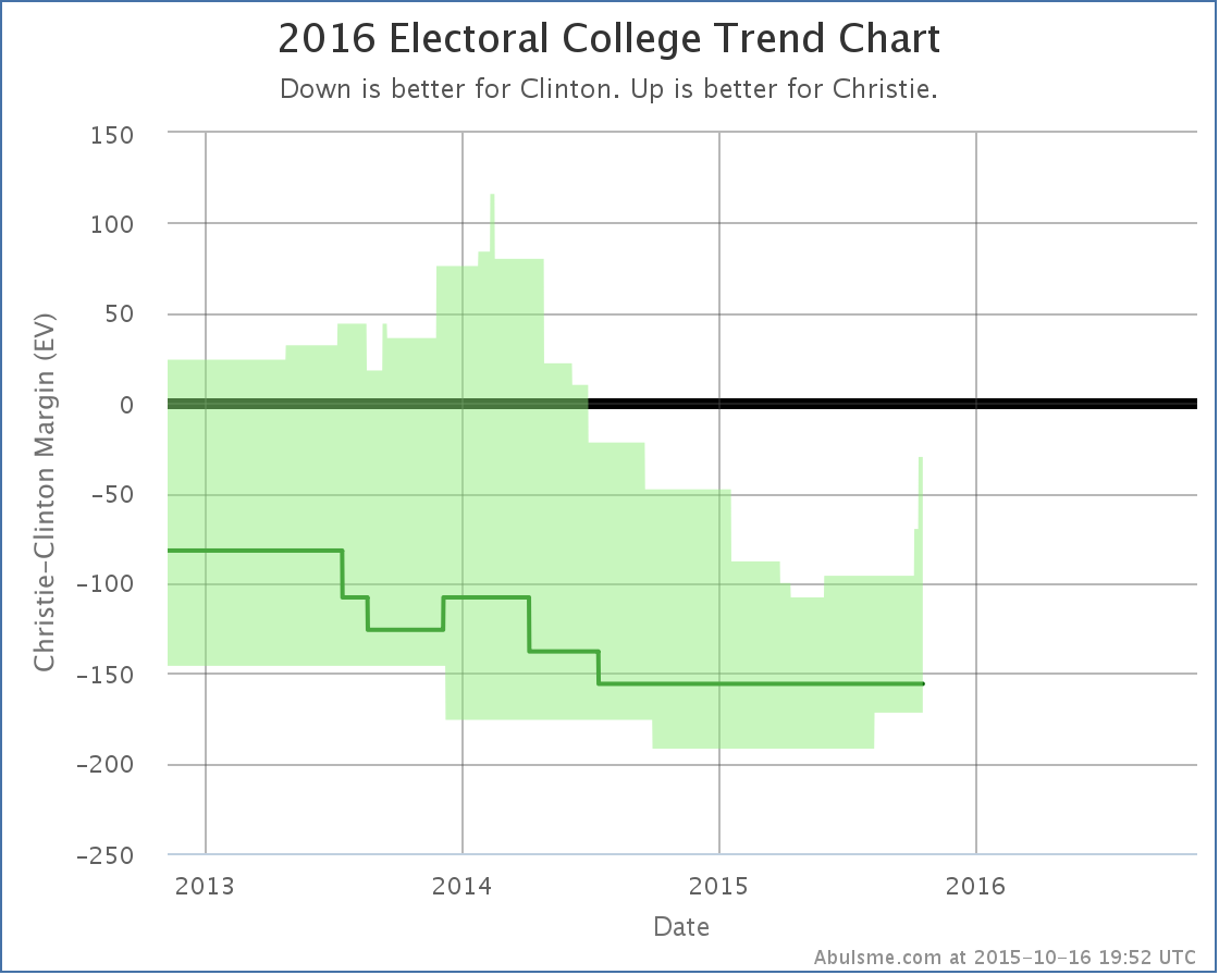
Christie’s best case, if he wins all of the close states, is now to lose by 70 electoral votes. His expected case is still to lose by 156 electoral votes. Unlike Bush, Christie is not competitive with Clinton at the moment. Things can change quickly though, so you never know! But with Christie at 1.9% in the RCP average of national Republican polls, I’m not sure if Christie will have a chance to find out. 390.1 days until the polls start to close! Note: This post is an update based on the data on ElectionGraphs.com. All of the charts and graphs seen here are from that site. Graphs, charts and raw data can be found there for the race nationally and in each state for every candidate combination that has been polled at the state level. In addition, comparisons of the best polled candidate combinations both nationally and each in each state are available. All charts above are clickable to go to the current version of the detail page the chart is from, which may contain more up to date information than the snapshots on this page, which were current as of the time of this post. Follow @ElecCollPolls on Twitter for specific poll details as I add them. And like Election Graphs on Facebook!
|
||