This is the website of Abulsme Noibatno Itramne (also known as Sam Minter).
Posts here are rare these days. For current stuff, follow me on Mastodon
|
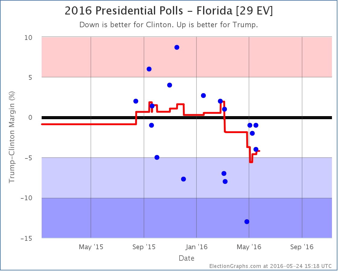
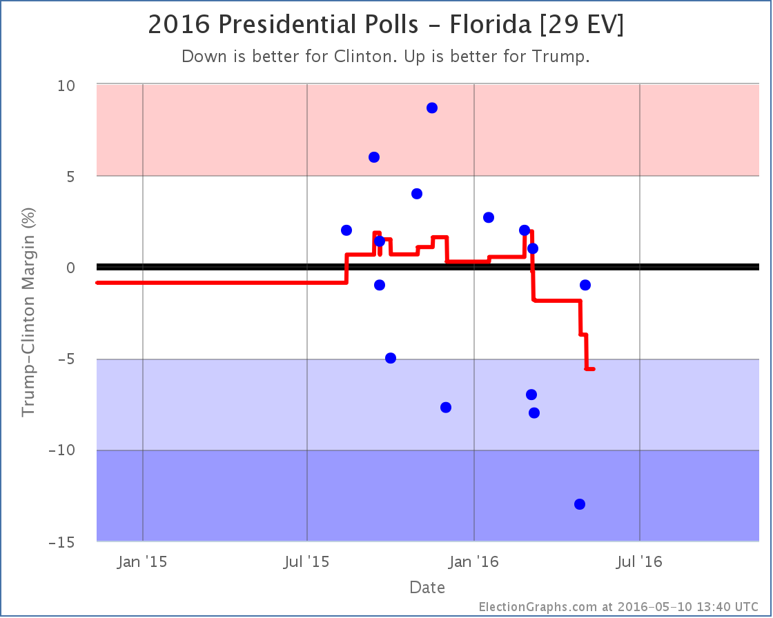
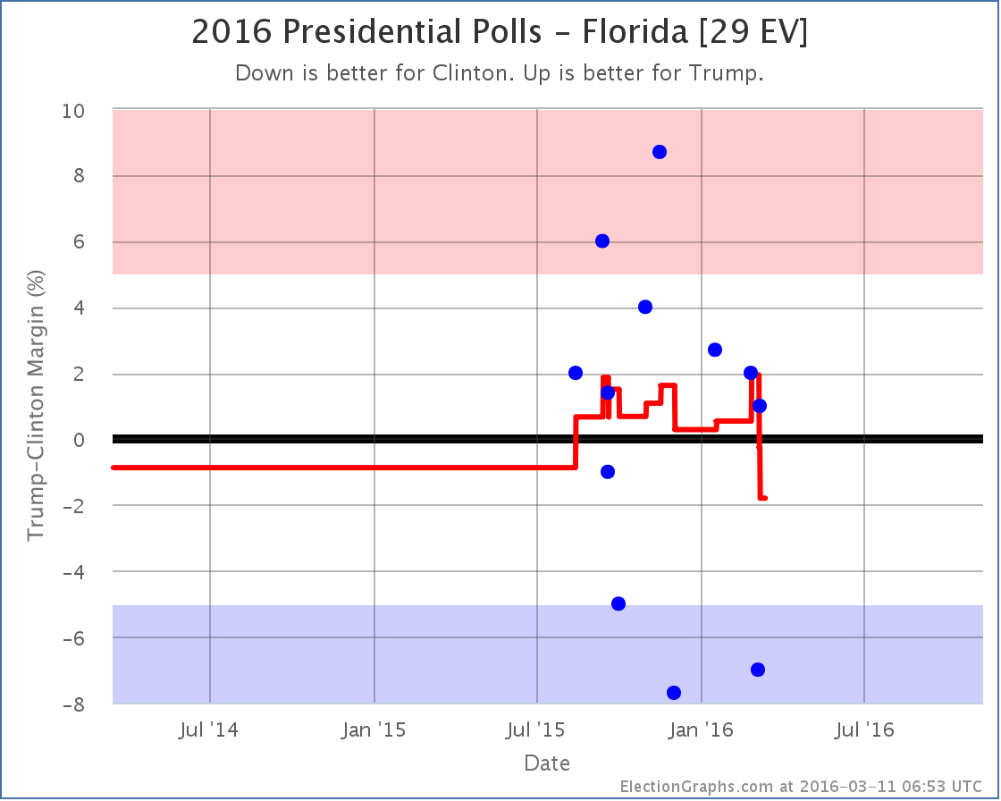
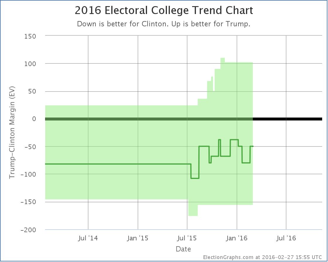
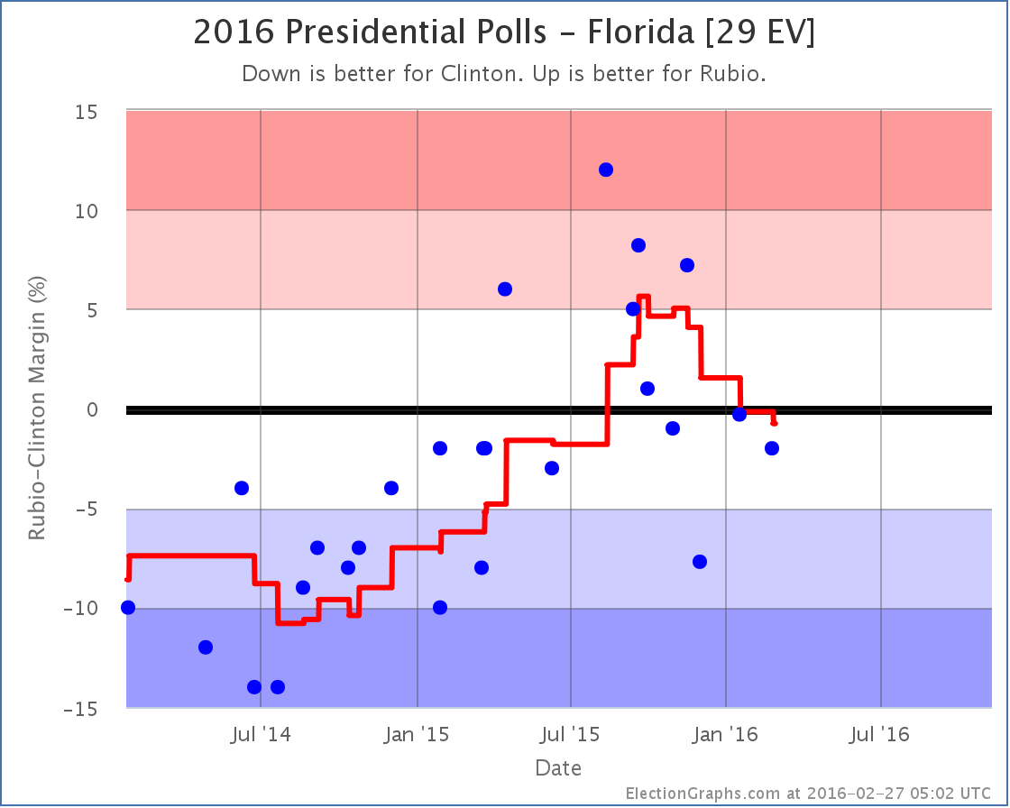
Since the last update, which was only a day ago, new poll data was added for Florida, Colorado, Wisconsin, North Carolina, Maine (at large and each congressional district), and Arkansas. The Colorado poll was much needed as it has been under polled. Arkansas and Maine as well. But only the Florida poll made a difference. Specifically, the polls in question actually covered a timeframe from earlier in the month, so the last couple weeks of the charts are modified.
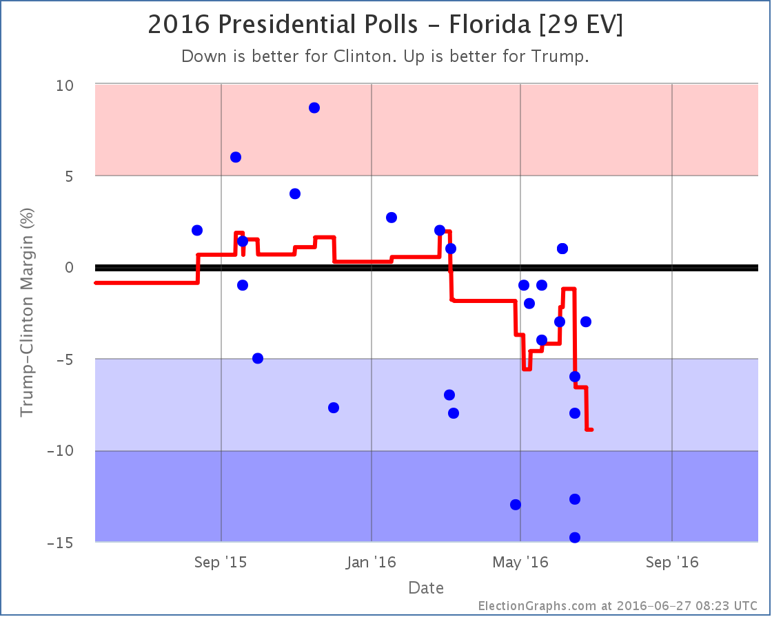
The poll average in Florida now only covers two weeks of polling. We are definitely in the general election season.
The last two weeks of polls have not been kind to Trump in Florida. With this update earlier polls showing Florida close fall off the calculation and so the average drops rapidly. The two worst results for Trump in the current average were the ones added in this update. They are from Saint Leo University (one including Johnson as an option and one without). These are the 1st and 3rd worst numbers Trump has ever had in Florida. They may prove to be outliers. We’ll see what the next polls bring.
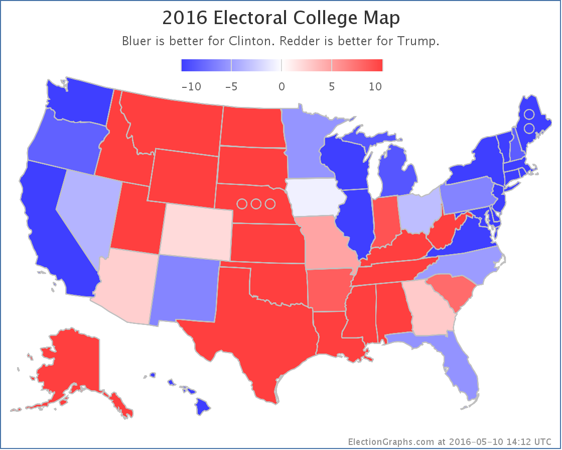
For the moment though, Clinton’s lead in Florida grows to 8.9%. This is a rapid drop and takes Florida from “Weak Clinton” to “Strong Clinton”. So we take Florida out of the list of potential Trump states in his best case.
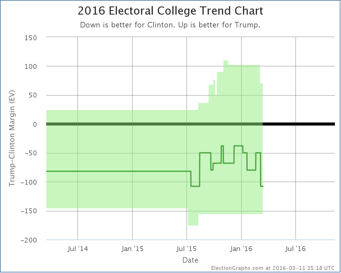
As mentioned, the timeframes covered by the Florida polls that were just added and which caused the change are older… June 10-16.. so the drop in the best case from Florida actually gets inserted before the bump up caused by Trump getting closer in Virginia. So the chart now actually shows a huge drop due to Florida, then a day later the bump up caused by Virginia.
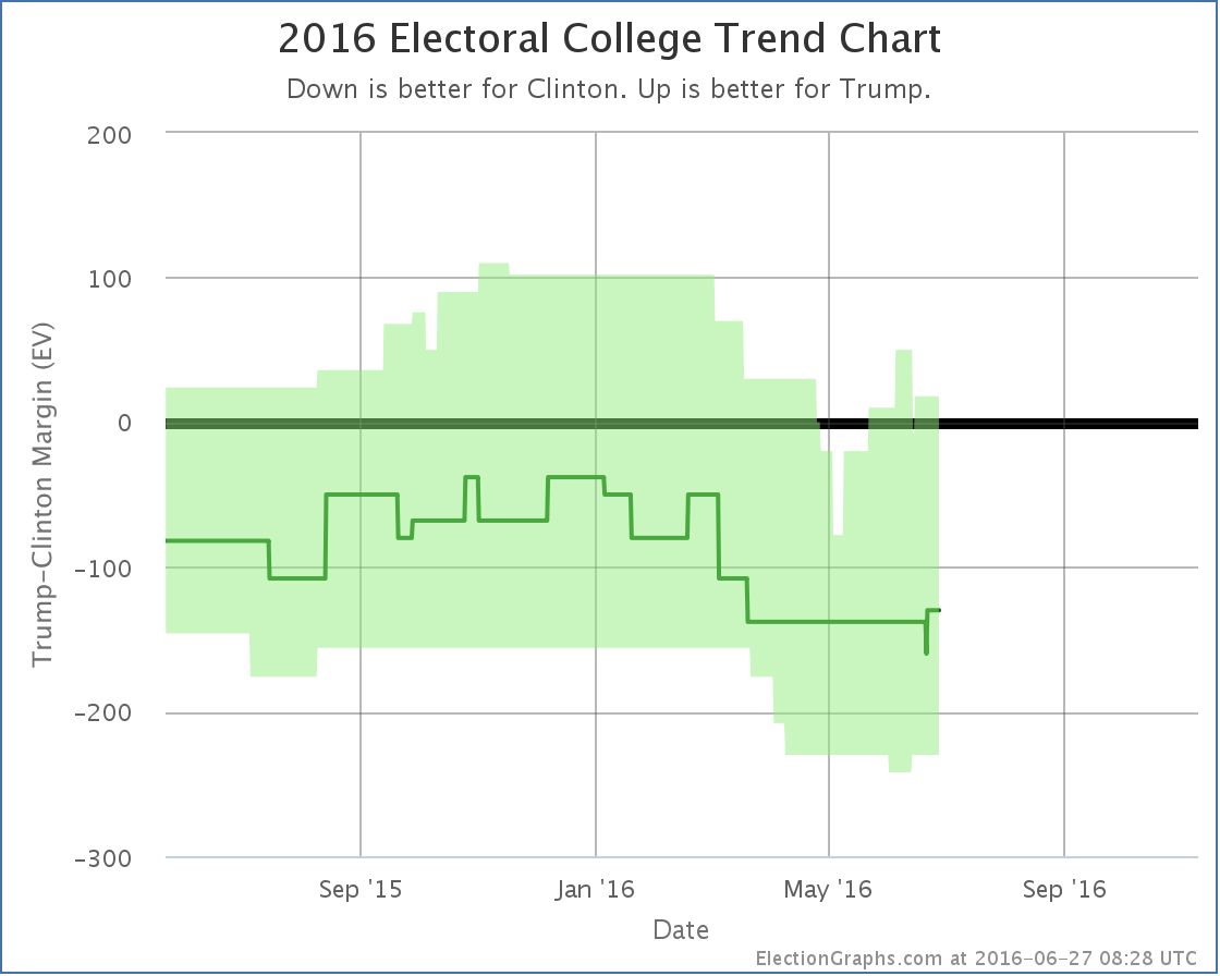
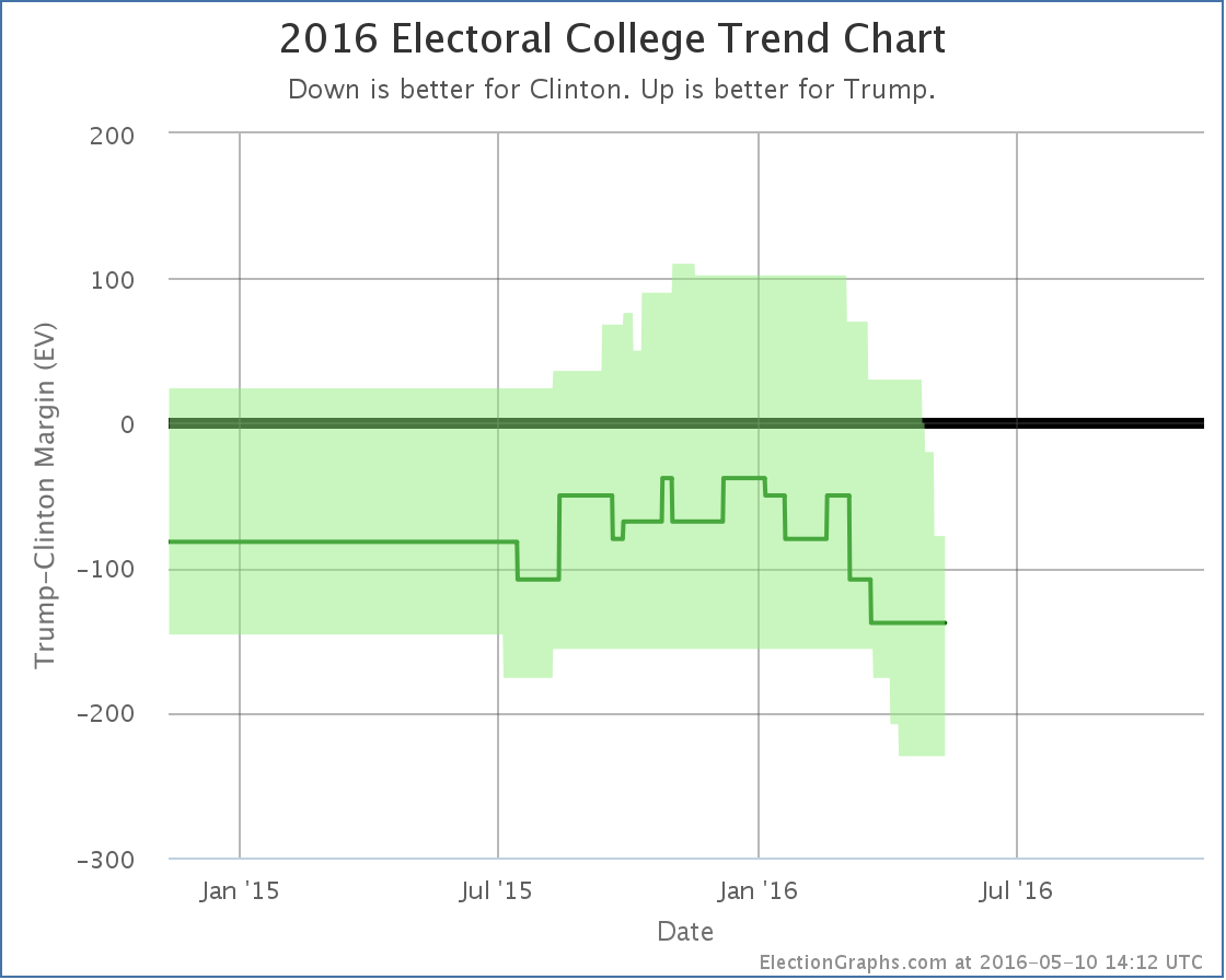
With this update Trump’s best case dropped from a 76 electoral vote win to a 18 electoral vote win, but that 78 vote win is actually wiped off the chart entirely since the Florida change actually happened before the Virginia one.
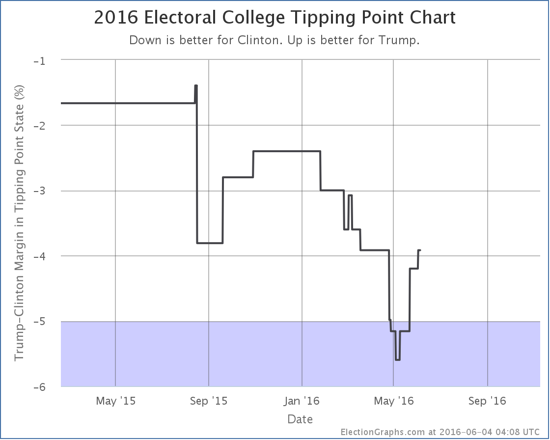
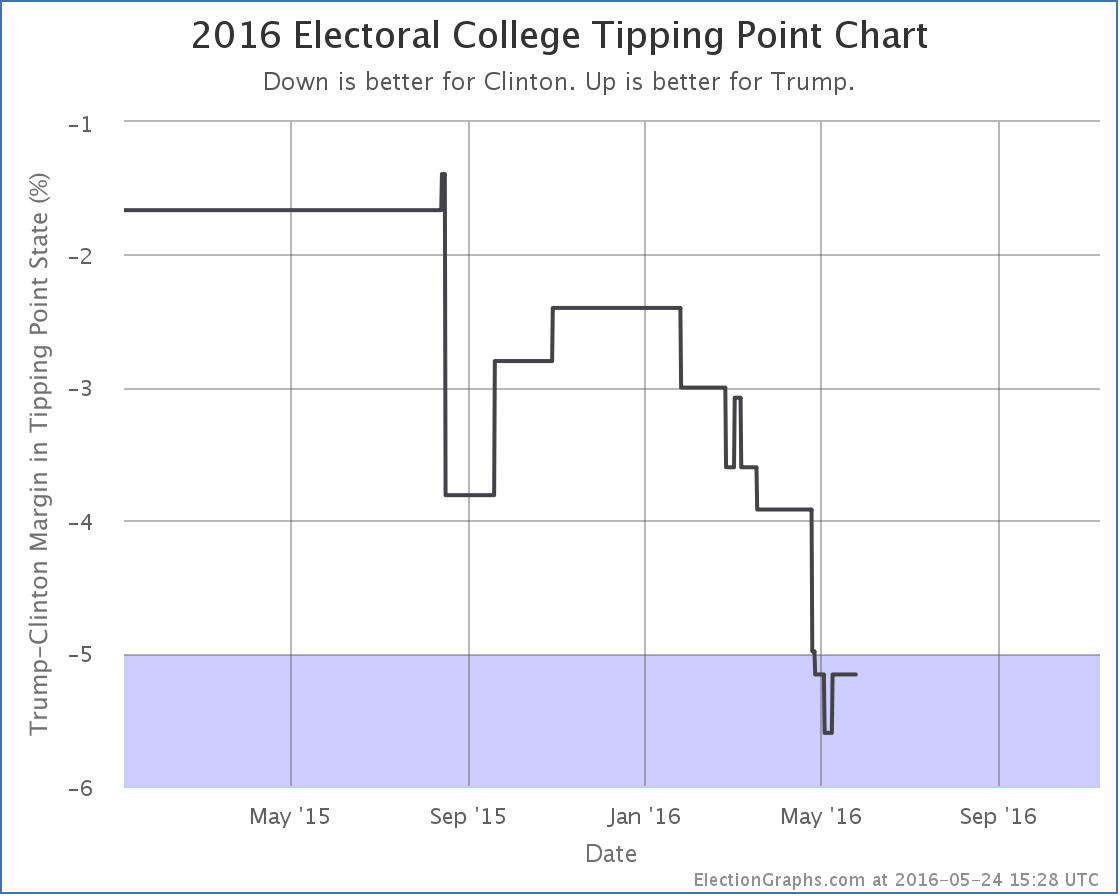
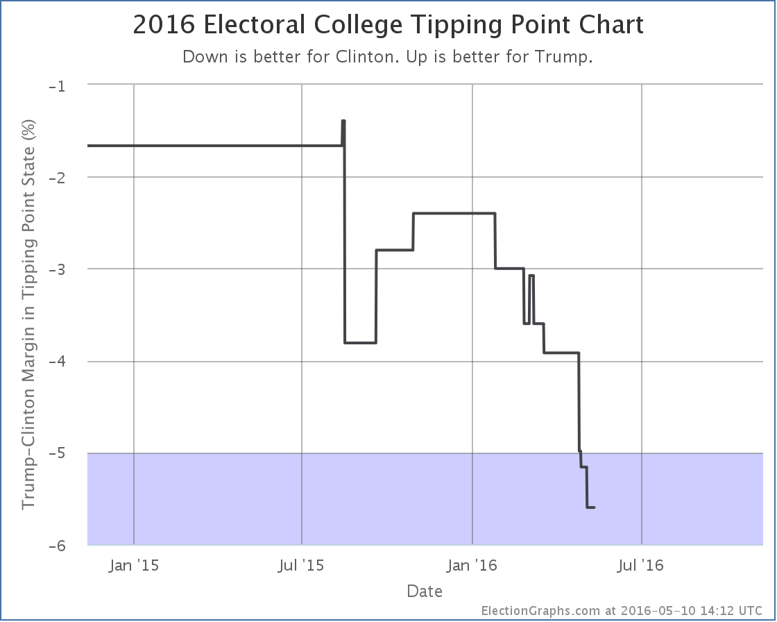
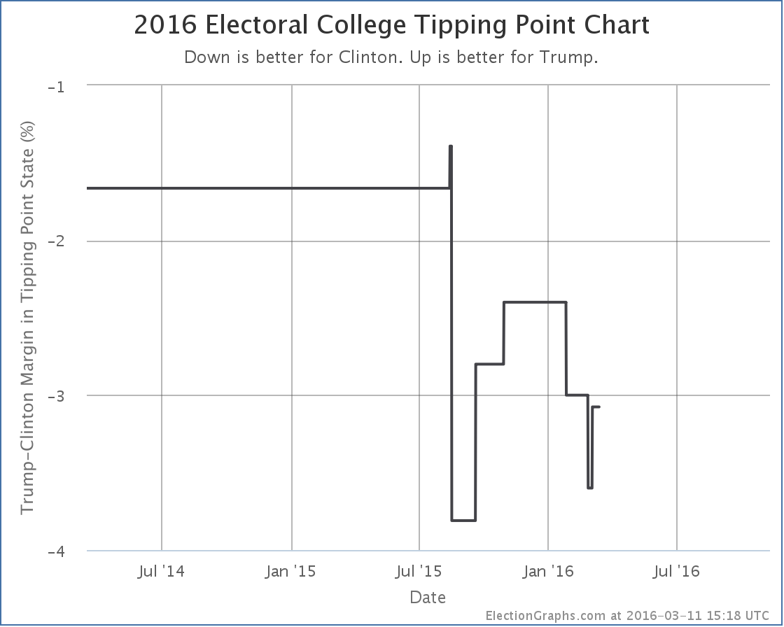
Since Florida was the tipping point state, the tipping point also moves:
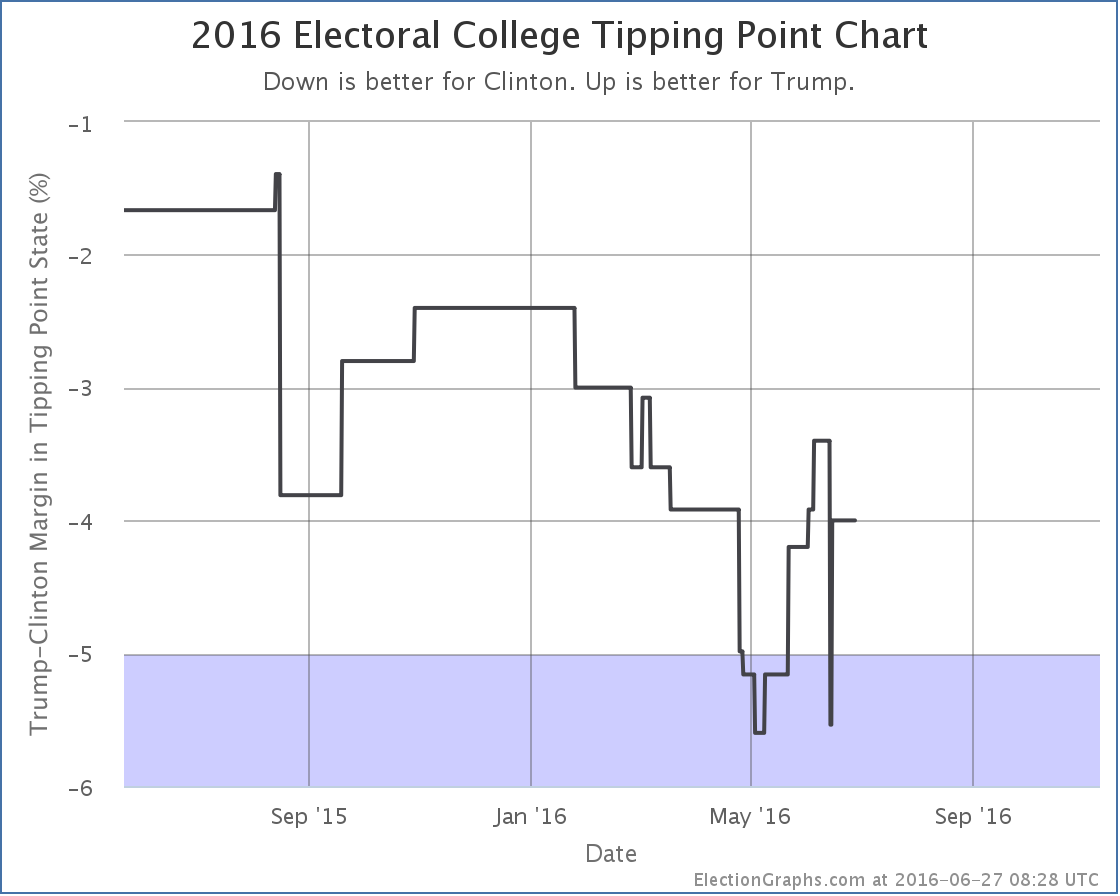
As with Trump’s best case, the tipping point now shows a big drop from Florida, then a gain a day later when Virginia moved in the opposite direction. In the end this update causes the tipping point to move from Clinton by 3.0% in Florida to Clinton by 4.0% in Ohio. And once again that previous peak is just wiped off the chart because the Florida change happened before Virginia.
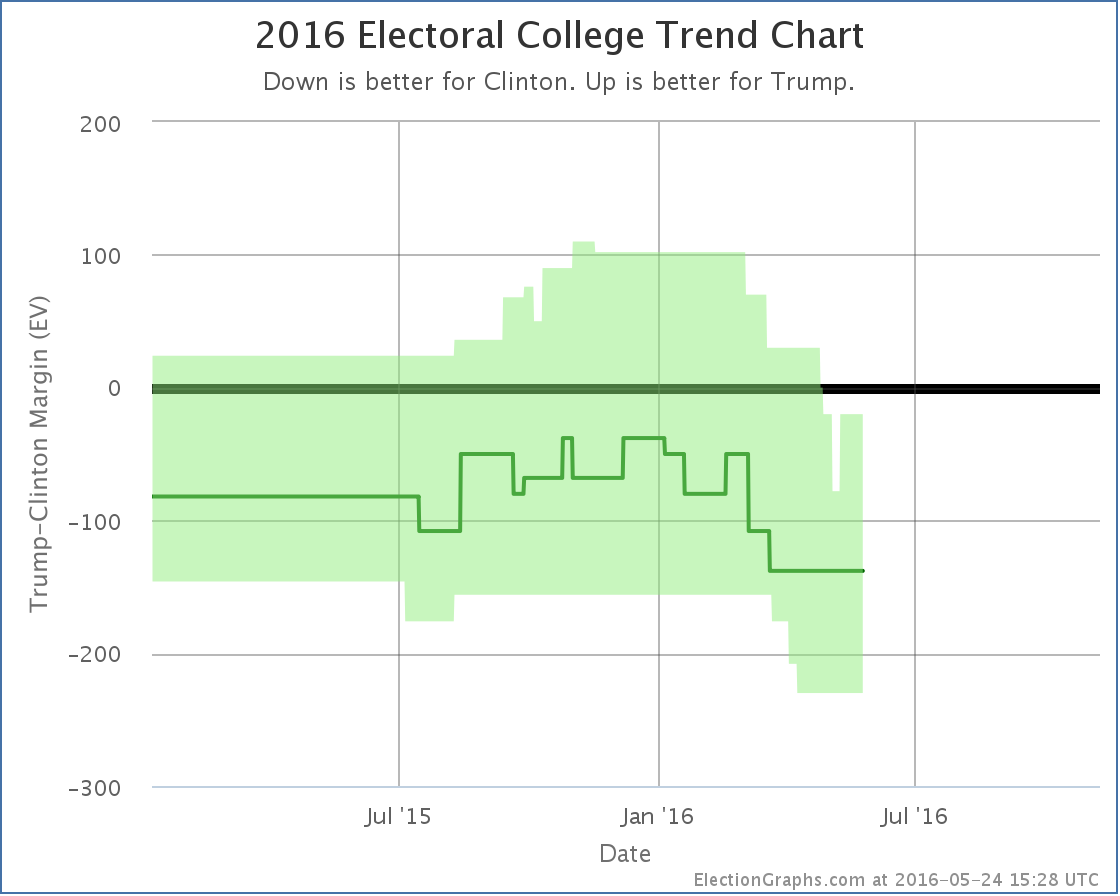
Just yesterday I noted that when looking over a two month time horizon 3 out of the 4 metrics Election Graphs tracks have moved in Trump’s direction, and the fourth was flat. This is still true today, and it is even true if you only look at a one month time horizon, but without Florida those gains are lessened significantly.
With today’s updates however, you can now start to see some movement away from Trump in the last two to three weeks. We will not know for a while yet though if this is the start of a larger trend toward Clinton, or if Trump will bounce back.
Without Florida in play, to win Trump has to almost sweep the states where Clinton leads by less than 5%… Arizona, Pennsylvania, Iowa, Virginia, Nevada and Ohio… he can afford to lose one of the small 6 EV states (Iowa and Nevada)… as well as holding all the states where he has only a narrow lead. That is a tall order given current polling.
134.3 days until polls start to close on Election 2016.
Note: This post is an update based on the data on ElectionGraphs.com. Election Graphs tracks both a poll based estimate of the Electoral College and a numbers based look at the Delegate Races. All of the charts and graphs seen in this post are from that site. Additional graphs, charts and raw data can be found there. Follow @ElectionGraphs on Twitter or like Election Graphs on Facebook to see announcements of updates or to join the conversation. For those interested in individual general election poll updates, follow @ElecCollPolls on Twitter for all the polls as they are added. If you find the information in these posts interesting or useful, please consider visiting the tip jar.
Edit 17:40 UTC to add “Without Florida in play…” paragraph near the end.
Edit 18:55 UTC to acknowledge that Trump could actually afford to lose one of the 6 EV states.
The national polls at this point show that Trump’s “bump” from clinching the nomination is most likely already over, and Clinton has started to gain ground again. You can see this in both the Pollster and RCP charts. Here at Election Graphs though we track the state level polls and model the electoral college.
Since in any given state there are fewer polls than are done at the national level, the state poll averages move more slowly, and therefore the national picture also reacts more slowly to changes in the state of the race. So while the national polls have seen the bounce come or go, we are still seeing improvement in Trump’s situation.
Since the last update about 9 days ago there have been polls added in New Mexico, Virginia, North Carolina, Oregon, Michigan, New York, New Jersey, New Hampshire, Georgia, California (x4), and Florida. The Florida one is the one that resulted in an overall change.
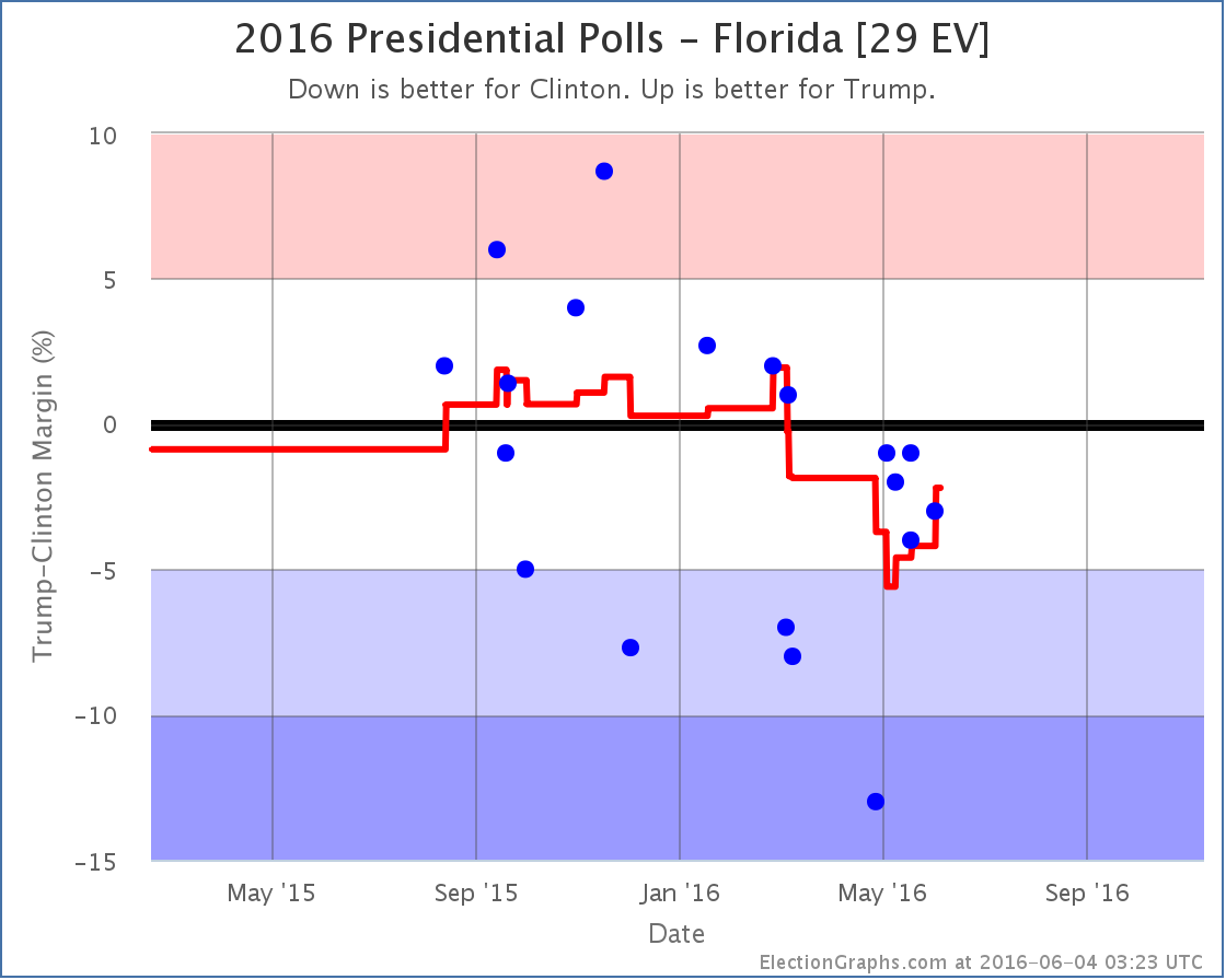
Basically, what now looks like an outlier poll from April showing Clinton with a huge 13% lead rolls off the average and so we have a pop in the Trump direction. Florida doesn’t change categories though. I had it classified as “Weak Clinton” before, and it is still “Weak Clinton” now.
But Florida was the tipping point state, the state that would have put Clinton over the top if you rank the states by how strongly they support one candidate over the other. So when Florida moves, so does the tipping point:
The tipping point moves from a 4.2% Clinton lead in Florida to a 3.9% Clinton lead in Nevada.
This means that while Clinton is clearly ahead, it would only take about 2% of people changing their minds (if those 2% were evenly distributed across the country) to flip the lead to Trump. You could get a similar result from the undecideds breaking disproportionately to Trump.
The national polls indicate Clinton is pulling further ahead again. We will quite possibly see that soon at the state by state level tracked here. But not yet. For now, the analysis here is still showing Trump gaining ground.
157.3 days until polls start to close on election night 2016.
Note: This post is an update based on the data on ElectionGraphs.com. Election Graphs tracks both a poll based estimate of the Electoral College and a numbers based look at the Delegate Races. All of the charts and graphs seen in this post are from that site. Additional graphs, charts and raw data can be found there. All charts above are clickable to go to the current version of the detail page the chart is from, which may contain more up to date information than the snapshots on this page, which were current as of the time of this post. Follow @ElectionGraphs on Twitter or like Election Graphs on Facebook to see announcements of updates or to join the conversation. For those interested in individual general election poll updates, follow @ElecCollPolls on Twitter for all the polls as they are added.
There has been a lot of recent press about new national polls of the Clinton vs Trump race. Nobody should look at individual polls of course, but there have been enough polls now to move the averages. RCP has Trump +0.2%. Pollster has Clinton +1.6%. Pollster includes more polls and has a more sophisticated methodology, but the core result is the same… a close Clinton vs Trump race, and much closer than what looked to be the case a few weeks ago.
So what do we see looking at the electoral college view? Well, first of all, keep in mind that individual states tend to be polled less often than we get national polls, and some states are polled more often than others. So a state by state view like the one here, at least at this stage in the cycle, will react more slowly to rapid changes than the national numbers. If there is a big national change, you simply have to wait long enough to there to be enough new polls in enough states to move the state averages and then the national summary.
Since the last time I posted about a national model change on May 11th, there have been new general election polls in Oregon, Louisiana, Georgia (x2), Utah, New Hampshire, Arizona, New Jersey, Tennessee, Indiana, Florida (x3), Virginia, California, and Ohio. Of all of these, only the Florida polls have made a difference in my national summary.
The three new polls, one of which was from early May but was only released a few days ago, all show Clinton ahead, but by less than 5%. This pulls Clinton’s lead back under 5%, specifically to a 4.2% lead.* The oldest poll in the average at the moment, showing a 13% Clinton lead, is now looking very much like an outlier, so it would not be surprising to see this look even closer when the next new poll is released.
This essentially reverses the changes from the May 11th update, and puts Florida back in play as a possible pick up for Trump.
With Florida a possibility again, if Trump wins all the states he leads, plus all the states where Clinton is ahead by less than 5%, we end up at Clinton 279, Trump 259 – A 20 electoral vote win for Clinton.
Since Florida was the tipping point state, this also moves the tipping point:
The new tipping point is North Carolina, where Clinton leads by 5.2%.
Trump’s “best case” is still to lose at the moment. But it is closer than it looked before.
So, the natural question here, especially given the national polls, is if this represents the end of the decline Trump has been suffering since January, and the start of a process where the state by state race starts looking as close as the national race polling averages would indicate.
The only real answer to that is that it is too soon to tell and we need to wait for more state polls to see if we see other states moving. But it would not be surprising if we see exactly that in the next few weeks.
With the results of both primary races essentially settled, but with Trump rapidly consolidating his party while Clinton is still dealing with Sanders, a tightening makes a lot of sense.
As Trump turns his attention to the general election, he will also presumably presumably do the traditional “pivot” to start courting voters that may have been turned off by his performance in the primaries. There have already been a number of moves in this direction.
We may have just seen Trump’s low point and the beginning of his rebound. Or this may be a blip. We shall see soon enough. The pace of new state level general election polls is quickening.
168.2 days until polls start to close on election night. A lot will happen in that time. Stay tuned.
* For anybody watching really carefully, because of the order in which I found these polls, two were added on Sunday and with those the chart showed a move from Strong Clinton to Weak Clinton on the 8th based on the poll that was taken in early May but released just last week, with a return to Strong Clinton on the 18th with a more recent poll. Since there was no net change from the addition of these two polls, even though they created a move back and forward on the charts, I did not do a post on Sunday. With a new poll added today that has the same middate in the field as the later of the two polls I added Sunday, the return movement that had been on the 18th was erased and there was now an overall change prompting this post. It looks odd that the movement on the chart is from the 8th, but I am not posting about it until the 24th, but the above is why.
Note: This post is an update based on the data on ElectionGraphs.com. Election Graphs tracks both a poll based estimate of the Electoral College and a numbers based look at the Delegate Races. All of the charts and graphs seen in this post are from that site. Additional graphs, charts and raw data can be found there. All charts above are clickable to go to the current version of the detail page the chart is from, which may contain more up to date information than the snapshots on this page, which were current as of the time of this post. Follow @ElectionGraphs on Twitter or like Election Graphs on Facebook to see announcements of updates or to join the conversation. For those interested in individual general election poll updates, follow @ElecCollPolls on Twitter for all the polls as they are added.
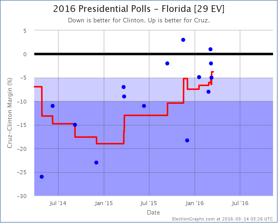
Since the last electoral college update there have been polls in West Virginia, New York, Georgia, Massachusetts, Florida, Ohio, Pennsylvania, and New Hampshire. Of all of these, only the one in Florida made a notable change to the overall picture of the election.
This was one of three Quinnipiac Swing State polls that were released on May 10th covering Florida, Ohio and Pennsylvania.
These polls got lots of press for showing a close Clinton vs Trump race in the three key states. But in both Ohio and Pennsylvania when you include the new polls in the average of the other recent polls, there was no change to the status of the states in the Election Graphs model. Ohio was and remains a “Weak Clinton” state… Clinton now leads by 3.4%. Pennsylvania was and remains a “Strong Clinton” state… Clinton now leads by 6.4%.
In Florida there was a category change, but despite the hype, the change doesn’t make the state look closer, instead it shows Clinton increasing her lead. Let’s look at this more closely.
The new poll shows Clinton leading by only 1%, which is better for Trump than the previous average, which showed Clinton leading by 3.7%. So why did the average move toward Clinton instead of toward Trump? Well, to understand this, you need to look not at where the average was before, but instead at the polls being replaced in the average.
In this case the new Clinton by 1% poll replaced two polls*, one where Trump led by 2.7% in January, and the other where Trump led by 2.0% in February. So the average moves toward Clinton because even though the new poll was better than the recent average and the next most recent poll (which had Clinton +13%), it was worse than the older polls falling out of the average.
Looking at the dots for the individual polls, as well as the trend line, you can see that while the new poll does indeed show a close race, it now means that only one out of the last five polls in Florida show a Trump lead, while up until March you saw Trump leading many of the polls in Florida. He led in the average. The fact that people are now pushing “Trump is only 1% behind Clinton in Florida” as a good poll for Trump is actually an indication of the fact that he has fallen so much that this result is now unusually good for Trump. Back in early March it would have been completely unremarkable.
Looking at the average again, the line has been moving toward Clinton since March. With the Quinnipiac poll replacing the older polls where Trump was leading, Clinton’s lead in the state is up to 5.6%, which moves the state to “Strong Clinton” and takes Florida out of the list of states we give him in the “best case”.
So nationwide, the new situation looks like this:
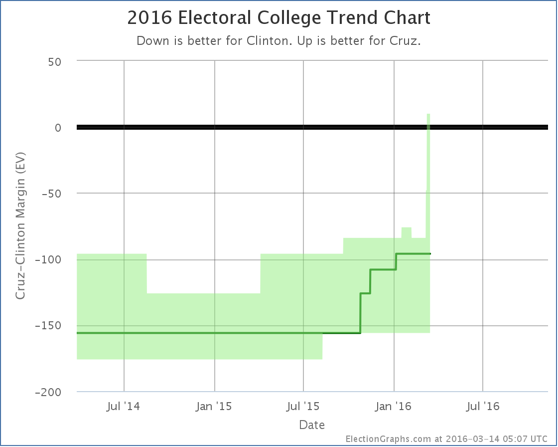
Without Florida, if Trump wins all the states he is ahead in, plus all the states Clinton is ahead by less than 5%, Trump loses by 78 electoral votes. This is a new low for Trump’s best case. The Trump deterioration that started in January continues.
Having said that, while this looks like an easy Clinton win, when people start talking about a Democratic win of historic proportions, the evidence doesn’t yet support that. Looking now at the expected case rather than Trump’s best case… so each candidate just wins all the states where they lead in the poll average… you get Clinton 338, Trump 200… a 138 electoral vote win.
By comparison, Romney lost by 126 electoral votes and McCain lost by 192 electoral votes. So right now Trump is doing worse than Romney, but still better than McCain. This is a solid loss of course, but we are nowhere near the comparisons some people are making to a possible Mondale style loss. (Mondale lost by 512 electoral votes to Reagan).
Even Trump’s worst case right now (losing by 230 electoral votes) is only in the neighborhood of Dole’s loss to Bill Clinton (217 electoral votes) and not even in Dukakis territory (losing by 315 electoral votes to GHW Bush). And of course Trump’s best case, while still a loss, would be better than either Romney or McCain did. We are a long way from Mondale.
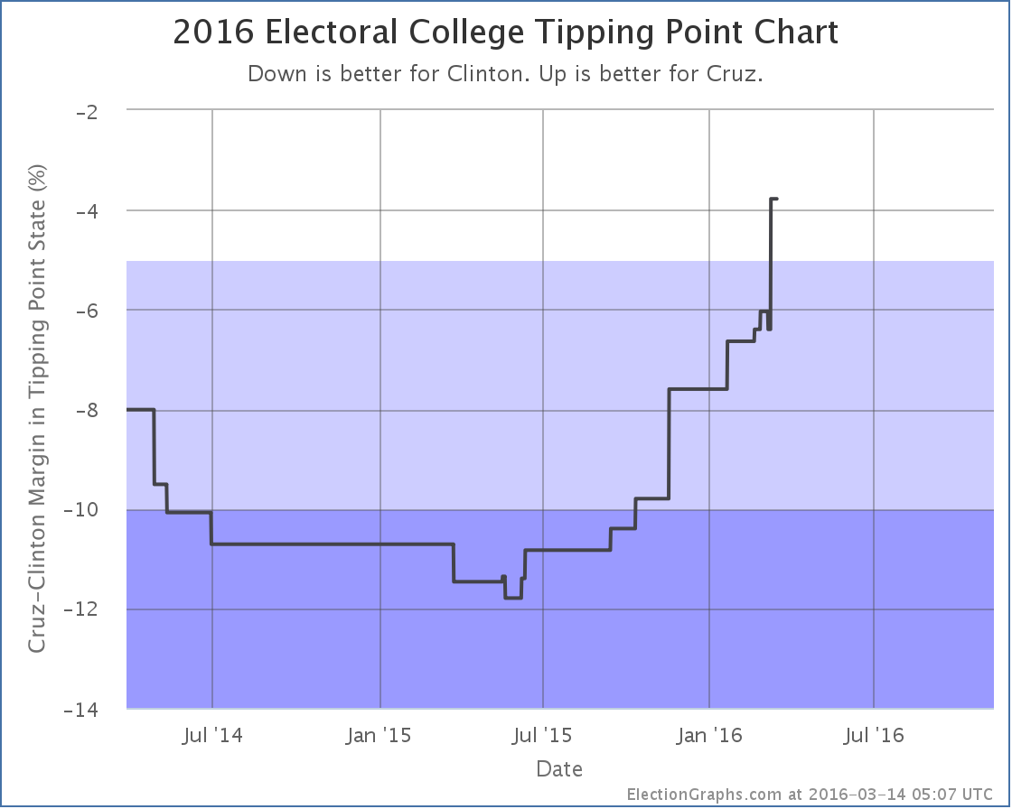
With the Florida change, the tipping point also moved, which gives a different view:
The tipping point is the margin in the state that would put the winner over the top. Right now it is Clinton’s 5.6% lead in Florida. What this means though is that you only need 2.8% of people to change their minds nationwide, and enough states flip that Trump would be winning. Given how divided the electorate is, that might actually be pretty difficult, but it doesn’t sound anywhere near as dire as the electoral college view. Changing the minds of 3% of Americans seems quite possible.
We have 181.8 days left until polls start to close on election day. Trump may be down right now, but there is still lots of time left. That may change. Do not be surprised if things tighten before election day… or if Clinton widens her lead further. There is still plenty of room for movement.
* The previous Clinton by 3.7% average was one of the cases where the Election Graphs poll average is based on six polls instead of the normal five. This happened because the five poll average resulted in a Clinton lead of exactly 5%. The primary purpose of the poll average on Election Graphs is not the average itself, but rather to categorize each state into one of the six categories… weak, strong, or solid for each candidate. 5% is the boundary between weak and strong, so additional older polls are pulled in as needed to get the average off the fence and put the average solidly in one category. In this case the one additional poll pulled the average back toward Trump and resulted in the 3.7% Clinton lead.
Note: This post is an update based on the data on ElectionGraphs.com. Election Graphs tracks both a poll based estimate of the Electoral College and a numbers based look at the Delegate Races. All of the charts and graphs seen in this post are from that site. Additional graphs, charts and raw data can be found there. All charts above are clickable to go to the current version of the detail page the chart is from, which may contain more up to date information than the snapshots on this page, which were current as of the time of this post. Follow @ElectionGraphs on Twitter or like Election Graphs on Facebook to see announcements of updates or to join the conversation. For those interested in individual general election poll updates, follow @ElecCollPolls on Twitter for all the polls as they are added.
It has only been a few days since the last Electoral College update but there have already been polls added for Ohio, Indiana, California, Florida and Minnesota. A couple of these made differences to the ElectionGraphs.com models, so lets take a look…
Clinton vs Trump
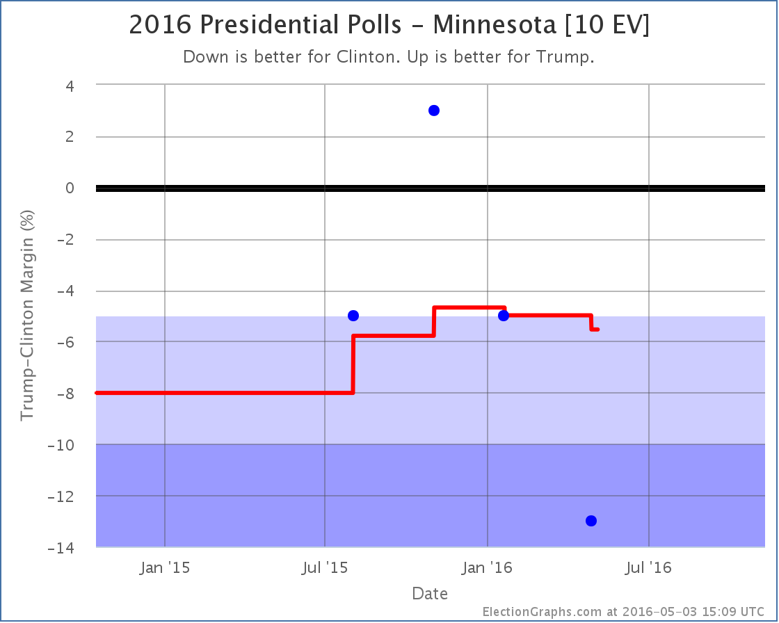
Minnesota has been lightly polled. The average still is padded with the 2012 election results. But with this addition, Clinton’s lead is now 5.5%, which puts the state out of the “Weak Clinton” category and into “Strong Clinton”. For the ElectionGraphs.com model that means for now we now assume that even in a very favorable case, Trump will not win Minnesota.
In the last update Trump’s best case was already an electoral college tie. So, with Minnesota out of the picture…
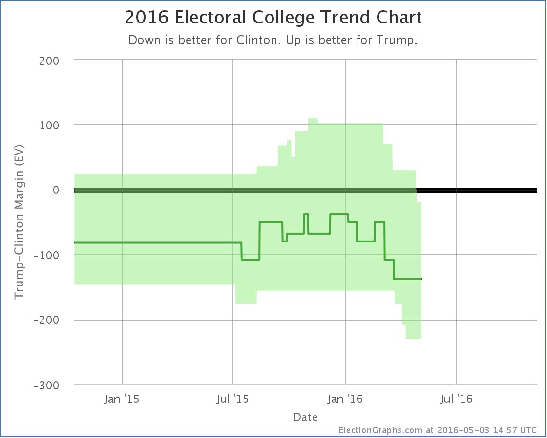

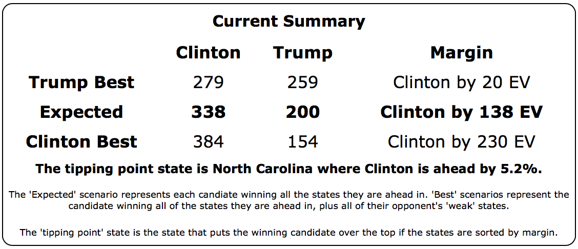
So yes. Trump’s best case… winning all the states where he leads in the polls, plus all the states where Clinton leads by less than 5%, is now to lose to Clinton by 20 electoral votes.
Now, it is important to mention that even though I call this Trump’s “best case”, it is the best case as of right now, with the polls we have today. It is May. We have months to go before the general election. A lot can change. So this doesn’t mean Trump can’t win. It just means that if today’s polling averages held, he couldn’t win.
The tipping point (the percentage you would have to move all the state polls to flip the winner) also moved toward Clinton:
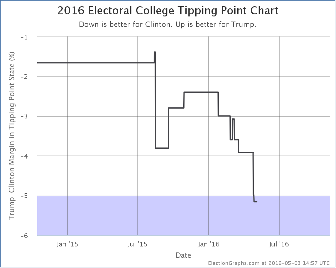
All this together means that Trump is now very far behind Clinton. She has the clear advantage. A big advantage. Trump has a lot of work to do if he wants to catch up and be in a winning position by November. It is not impossible, but it will require changing a lot of minds.
Clinton vs Cruz
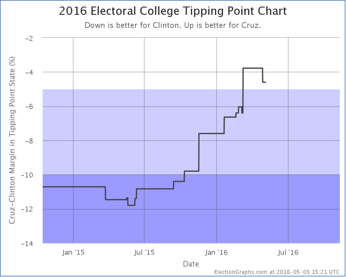
Oh yeah, Cruz is still in it too Cruz was still in it when this last batch of polls was taken, and he did badly as well. The latest poll in Florida didn’t change the categorization of Florida, but since Florida was the tipping point state it moved the tipping point:
Given the state of the nomination races though any combination other than Clinton vs Trump appears to be completely academic now, absent some catastrophic unexpected event.
188.8 days until polls close on election day 2016.
Note: This post is an update based on the data on ElectionGraphs.com. Election Graphs tracks both a poll based estimate of the Electoral College and a numbers based look at the Delegate Races. All of the charts and graphs seen in this post are from that site. Additional graphs, charts and raw data can be found there. All charts above are clickable to go to the current version of the detail page the chart is from, which may contain more up to date information than the snapshots on this page, which were current as of the time of this post. Follow @ElectionGraphs on Twitter or like Election Graphs on Facebook to see announcements of updates or to join the conversation. For those interested in individual general election poll updates, follow @ElecCollPolls on Twitter for all the polls as they are added.
Since the last Electoral College Update there have been general election polls in Florida, Ohio and Illinois. There was no notable change to the front-running Clinton vs Trump pair, but there was significant movement in Clinton vs Cruz.
After more than a year on an upward trend, Cruz finally closes to within 5% of Clinton in Florida. Clinton now leads by only 3.8%. This makes Florida a “Weak Clinton” state and makes it a possible pickup for Cruz. Add this to Ohio from a few days ago and you have a breakthrough moment for Cruz:
For the first time, Cruz’s best case is actually to win. If Cruz won every state he leads, plus Nevada, Ohio, and Florida where he is close… then he wins by 10 electoral votes.
Without those three close states, he still loses by 96 electoral votes. But those three states ARE close, and for the very first time the possibility of Cruz pulling ahead and winning seems plausible.
The Florida move, plus yet another bump in Cruz’s direction in Ohio, also moved the tipping point:
Before the latest batch of updates, the tipping point had been New Hampshire, where Clinton is ahead by 6.4%. Now it is Florida, where Clinton is ahead by only 3.8%.
Florida and Ohio make a big difference, and Cruz is now making them both close.
Cruz had been the one Republican candidate that looked sure to lose in the general. But things change during a campaign, and he now has a shot. If he were to win the Republican nomination of course. Looking at the delegate race that still looks unlikely. But if we end up at a contested convention, anything could happen…
Note: This post is an update based on the data on ElectionGraphs.com. Election Graphs tracks both a poll based estimate of the Electoral College and a numbers based look at the Delegate Races. All of the charts and graphs seen in this post are from that site. Additional graphs, charts and raw data can be found there. All charts above are clickable to go to the current version of the detail page the chart is from, which may contain more up to date information than the snapshots on this page, which were current as of the time of this post. Follow @ElectionGraphs on Twitter or like Election Graphs on Facebook to see announcements of updates or to join the conversation. For those interested in individual general election poll updates, follow @ElecCollPolls on Twitter for all the polls as they are added.
Since my last Electoral College blog post there have been new polls in New York, Florida, New Jersey, Ohio and Pennsylvania. There were notable changes for two candidate pairs. But for both of them, the news was mixed. Lets take a look:
Clinton vs Trump
With some strong polls from last fall rolling off the average, Florida flips from “Weak Trump” to “Weak Clinton” with the state now sitting at a 1.8% Clinton lead. This is still a very “close could go either way” result, but it puts Florida on Clinton’s side of the fence so she gets Florida’s 29 electoral votes in her “Expected” case:
Florida is a big state and makes a big difference. The expected result is now a 108 electoral vote win by Clinton. But it is important to remember that given all the close states that could easily move, anything from Clinton by 156 to Trump by 70 is very easy to imagine given the current polling.
But there was movement for Trump in the other direction too. He improved in Pennsylvania, and while it didn’t change the status of Pennsylvania (Weak Clinton) it did move Trump’s tipping point:
After a very brief dip lower, Trump’s tipping point pops back up to being behind Clinton by only 3.1%. Remember, the tipping point essentially represents how far ahead or behind a candidate is nationally, but adjusted for the effects of the electoral college.
So Trump’s “expected” result gets a little bit worse, but the amount he has to move polls to flip that result to a win gets a little smaller.
Clinton vs Cruz
While Trump was weakening in Florida, Cruz’s poll average was improving in Ohio. He is now behind Clinton by only 4.0%. She still leads, but this is close enough for me to consider Ohio a swing state and a possible pick up for Cruz, which improves his “best case”…
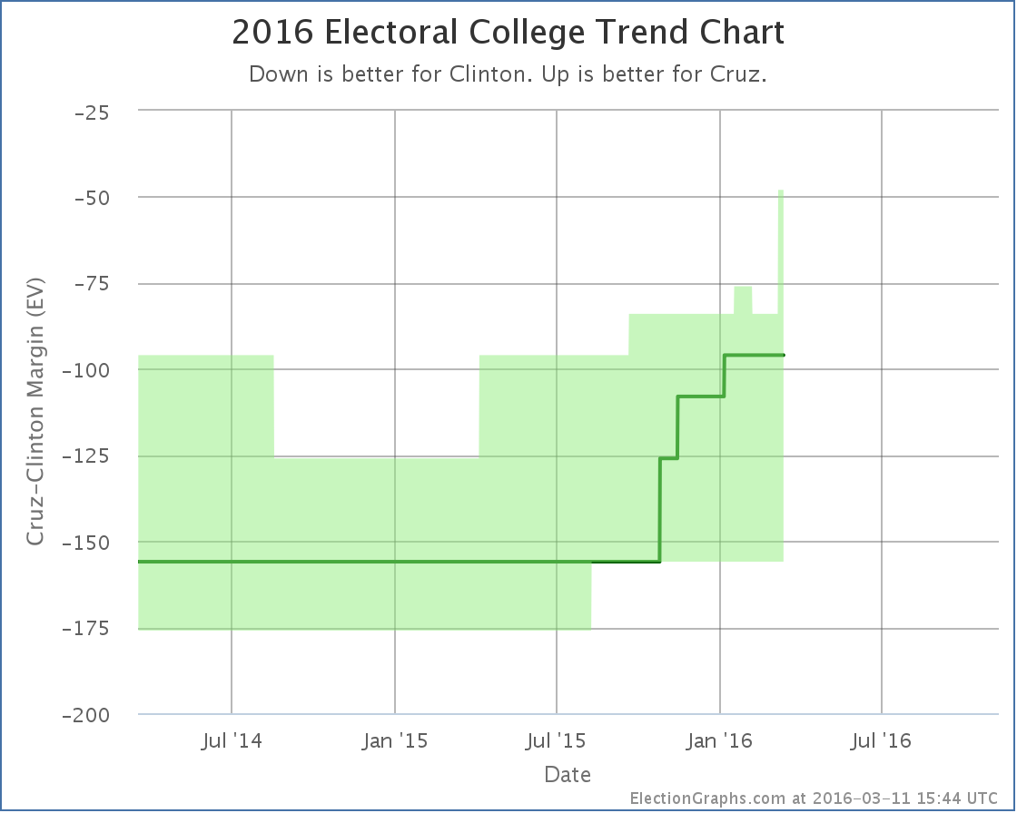
Now if Cruz wins all the states he is ahead in, plus flips Nevada and Ohio where he is close… he loses by only 48 electoral votes.
But still, it is an improvement. And Cruz has been on an improving trend for about a year now. If it continues, he might eventually be competitive.
On this metric anyway. As with Trump above, his tipping point also moves, but in the opposite direction:
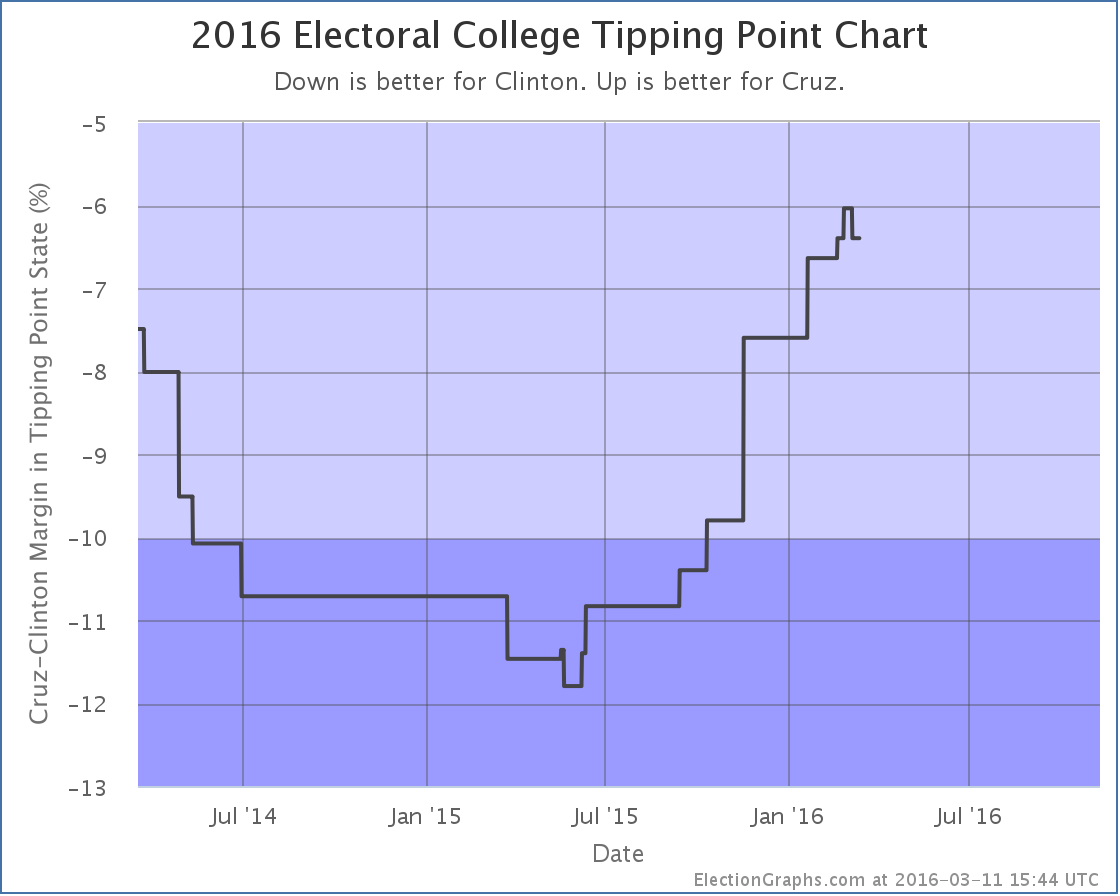
Cruz’s poll average in Florida dropped a bit. The category didn’t change (Strong Clinton) but the movement did cause Cruz’s tipping point to go from 6.0% behind Clinton to being 6.4% behind Clinton.
Either way, Cruz continues to be far behind Clinton when you look at things based on state level polls. As I have discussed here before, looking at national polls makes this matchup look much closer. It is unclear at this point if this is exposing an actual divergence between the popular vote and electoral college due to the regional distribution of candidate support, or if it is simply that there haven’t been enough state level polls of this matchup to catch up with recent changes to support levels. If Cruz becomes the Republican nominee, this would eventually become clear.
Of course, looking at the delegate race that doesn’t look too likely right now, so we may never know.
241.8 days until polls start to close.
Note: This post is an update based on the data on ElectionGraphs.com. Election Graphs tracks both a poll based estimate of the Electoral College and a numbers based look at the Delegate Races. All of the charts and graphs seen in this post are from that site. Additional graphs, charts and raw data can be found there. All charts above are clickable to go to the current version of the detail page the chart is from, which may contain more up to date information than the snapshots on this page, which were current as of the time of this post. Follow @ElectionGraphs on Twitter or like Election Graphs on Facebook to see announcements of updates or to join the conversation. For those interested in individual general election poll updates, follow @ElecCollPolls on Twitter for all the polls as they are added.
Yes, all the attention is on South Carolina and Super Tuesday, but time for a quick electoral college update from recent poll updates. In the last batch of polls were new matchup results in Florida, Georgia, Wisconsin and West Virginia. These resulted in a few notable changes.
Clinton vs Trump
Well, actually, once again there was no significant update in the Clinton vs Trump race, but in this transitional phase where we are still getting polling for folks other than the frontrunners, I’ll mention the frontrunner status when there is a post highlighting changes with other candidate pairs. Trump’s lead in the average in Georgia actually dropped from 10.1% to 9.5% changing Georgia from “Solid Trump” to “Strong Trump” in my categorization, but this really doesn’t make any difference. Georgia isn’t in play at the moment. The situation remains that anything from Clinton winning by 156 to Trump winning by 102 is within the realm of the possible, and Clinton winning by 50 is the “expected” result if all the states go where their averages are currently pointing.
Clinton vs Cruz
Cruz improves a bit in Florida against Clinton, but not enough to change categories. Florida was however the tipping point state, so this also moves:
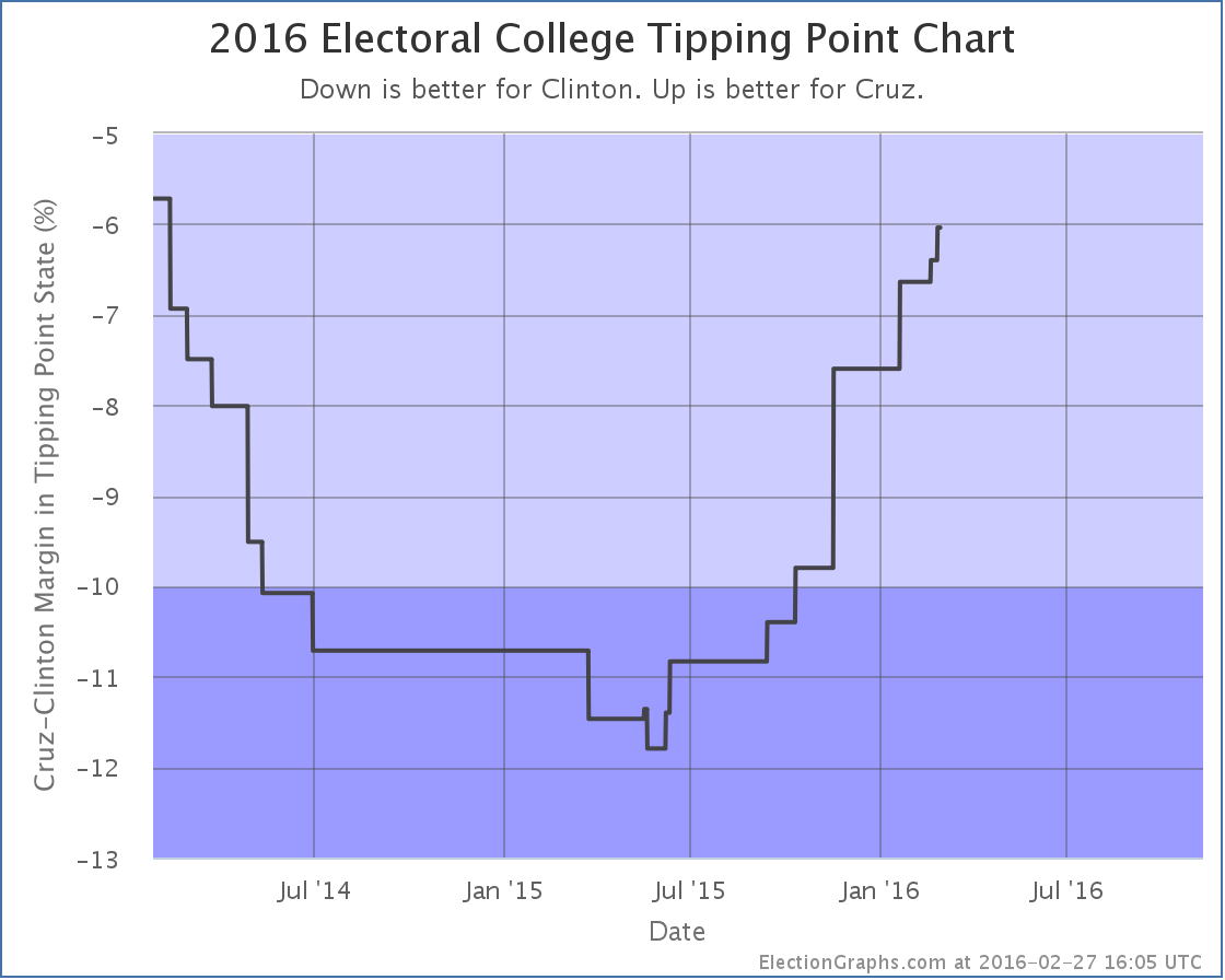
Cruz’s upward tipping point trend continues. Just a little bit further, and the Clinton vs Cruz race might actually look competitive!
(Reminder, the tipping point represents the margin in the state that would put the winner “over the top” if you ranked the states by their candidate preference. It is a good measure of how much the candidate who is behind would have to change national public opinion to flip the result and win.)
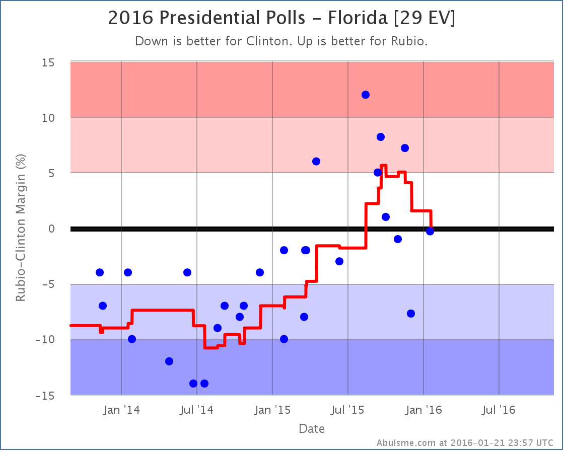
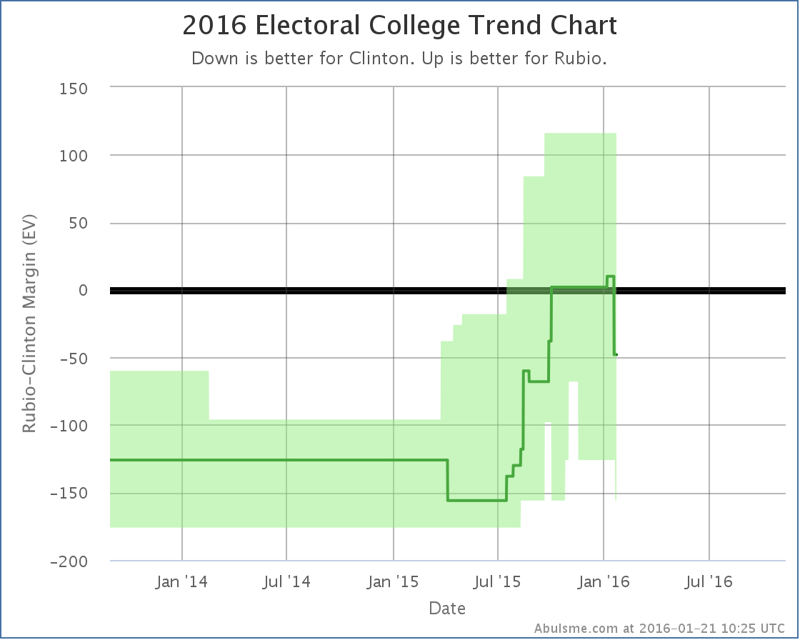
Clinton vs Rubio
This matchup had notable changes caused by the polls in two different states. First up, Florida:
The state didn’t change status. It was “Weak Clinton” before, and remains “Weak Clinton”. But as with Cruz, Florida was the tipping point state, and so the tipping point changes as well.
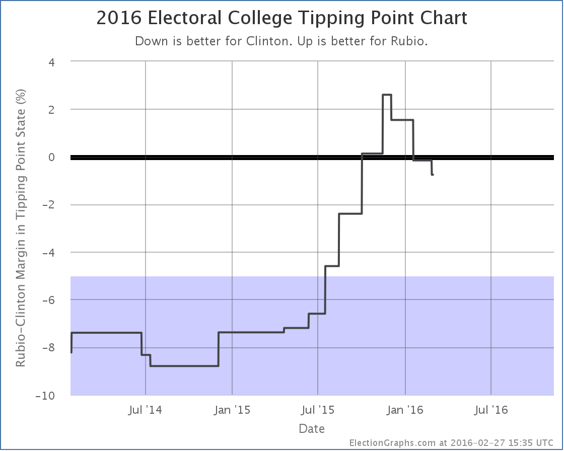
By this metric Rubio peaked in November and has been declining ever since. A Clinton vs Rubio matchup still looks incredibly close though. Clinton is only ahead here by 0.8%.
So this was good for Clinton. But there was also a change in Wisconsin that was good for Rubio:
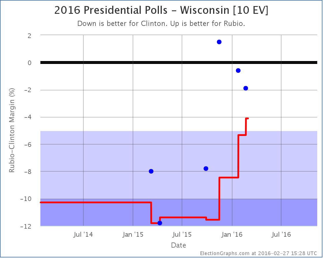
All the recent polls have shown Wisconsin as a close state, whereas older polls had it Strong or Solid Clinton, and therefore the average has been moving up toward Rubio. With today’s update, it moves from “Strong Clinton” to “Weak Clinton”. This puts it in play for Rubio and improves his best case:
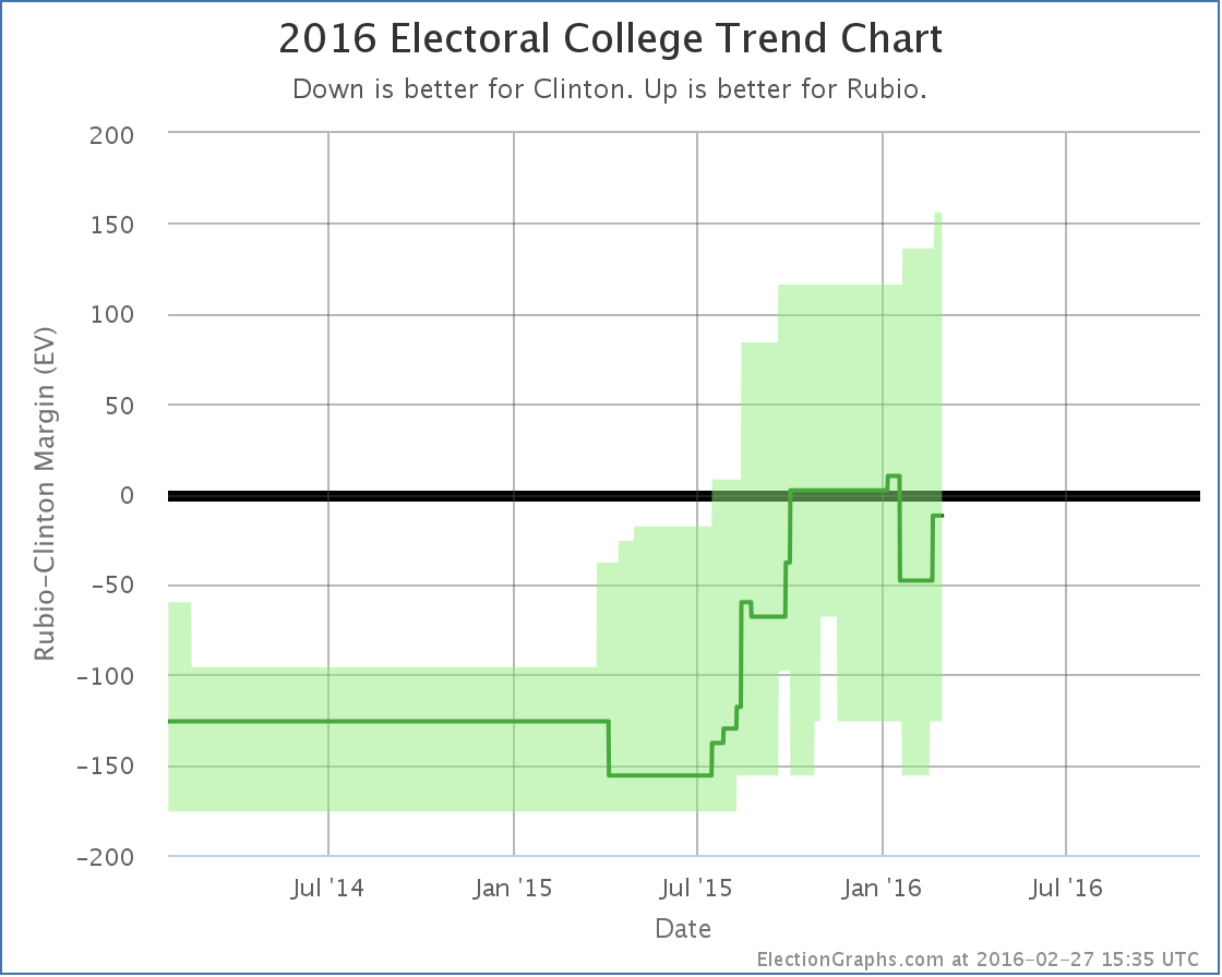
There are now ELEVEN close states in the Clinton vs Rubio contest, accounting for 141 electoral votes, which is quite a swing! Everything from Clinton by 126 to Rubio by 156 is now “in the bubble”. Clinton remains a slight favorite, winning by 12 electoral votes if all the states ended up following current poll results. But this is a tiny margin. Clinton vs Rubio remains essentially a tied race, with Florida’s 29 electoral votes at the tipping point.
And that is where things stand at the end of February.
254.9 days left until general election polls start to close.
Note: This post is an update based on the data on ElectionGraphs.com. Election Graphs tracks both a poll based estimate of the Electoral College and a numbers based look at the Delegate Races. All of the charts and graphs seen in this post are from that site. Additional graphs, charts and raw data can be found there. All charts above are clickable to go to the current version of the detail page the chart is from, which may contain more up to date information than the snapshots on this page, which were current as of the time of this post. Follow @ElectionGraphs on Twitter or like Election Graphs on Facebook to see announcements of updates or to join the conversation. For those interested in individual general election poll updates, follow @ElecCollPolls on Twitter for all the polls as they are added.
My primary race delegate tracking for both parties will be out very soon… promise. In the mean time, rather than just looking at the delegate leaders on each side against each other, we continue to concentrate on the five best polled candidate combinations.
With a batch of new polls added in North Carolina, Florida, and New Hampshire, it starts to look like the long trend of Clinton getting weaker and weaker against a wide variety of Republican rivals may have ended. Maybe. For now. A little bit. Things will change before we are done. Polls like these aren’t predictive of the general election until after the conventions. Caveat caveat caveat.
Lets look at each category change by state:
Florida (29 EV)
Of the best five polled candidate combinations, two Republicans have their positions deteriorate against Clinton in this update, Bush and Rubio:
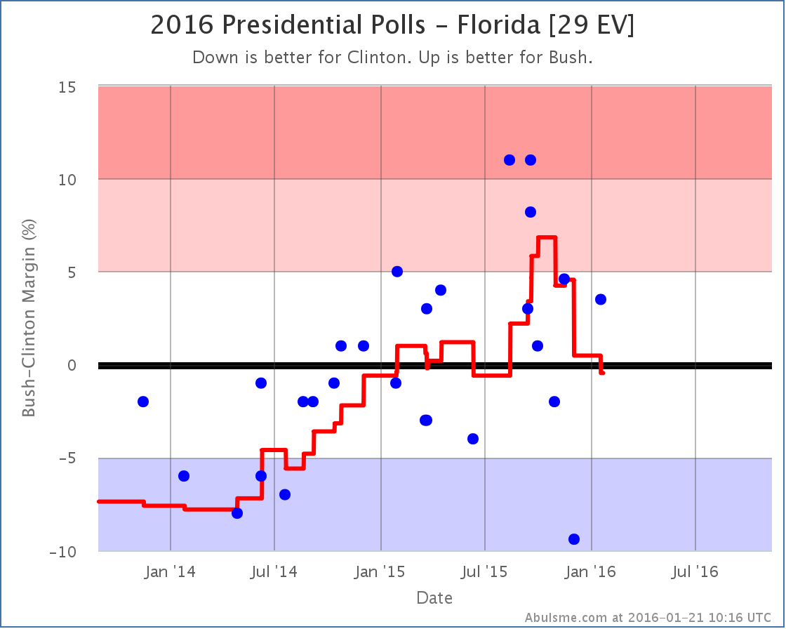
Both candidates seemed to peak in late September or early October, and since then have been weakening. With the latest set of poll updates, both states move from being weakly on the Republican side of the line, to being Weak Clinton. The “weak” here should be emphasized. Clinton’s lead over Bush in the average is only 0.5%, and over Rubio it is only 0.2%. This is about as close as you can get. Since for the analysis here any lead under 5% is considered as one that could easily disappear overnight, at these even smaller margins, this is essentially a tie. But for the last few months, the movement has been in Clinton’s direction.
North Carolina (15 EV)
In North Carolina, once again Bush and Rubio lose ground to Clinton. Although technically with the current update Clinton vs Trump dropped to the 6th best polled candidate combination, I know the Trumpets will want to hear about how he is doing, so I’ll mention that Trump also weakens in North Carolina. Yes, yes, I know that any such indications are just propaganda from the vast establishment conspiracy of which I am a part. But anyway… looking at the charts:
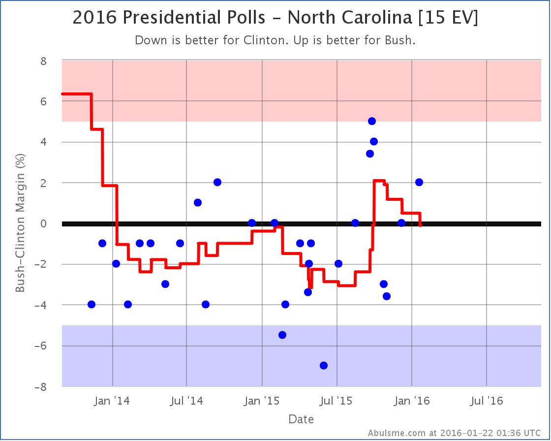
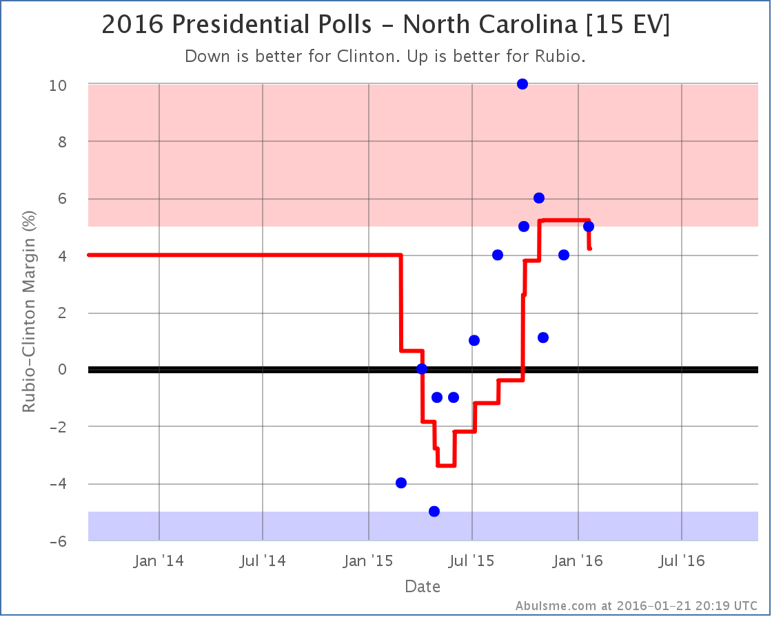
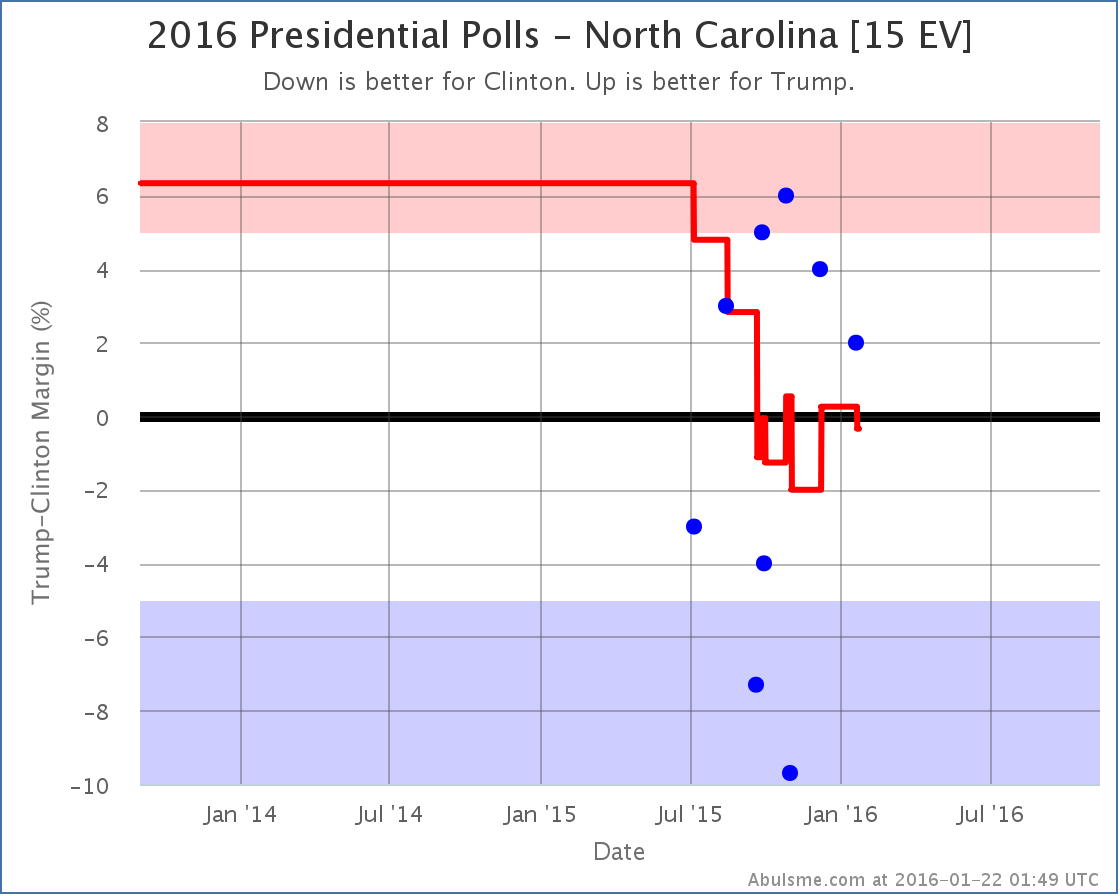
In this case the averages for Bush and Trump against Clinton move from Weak Republican to Weak Clinton, but once again the “weak” is the key here. Clinton leads Bush by 0.1% and Trump by 0.3%. So again, super close. A move from just barely on one side of the line to just barely on the other side of the line isn’t really too meaningful except if it seems part of a larger movement. In the case of Bush, the average seems to have been moving toward Clinton for several months. In the case of Trump, it is more bouncing around in a range over the past few months.
Rubio does a bit better here. North Carolina had actually been in the “Strong Rubio” category for a few months, with the poll average showing a Rubio lead of over 5%. With the latest update, Rubio’s lead slips under 5% to 4.2%, which means I once again consider North Carolina a state that could go either way in this matchup, but Rubio still has a lead.
New Hampshire [4 EV]
New Hampshire is the one state that has good news for the Republicans in this update. No category changes for Bush, Rubio, or Trump… but this time Cruz jumps into a new category.
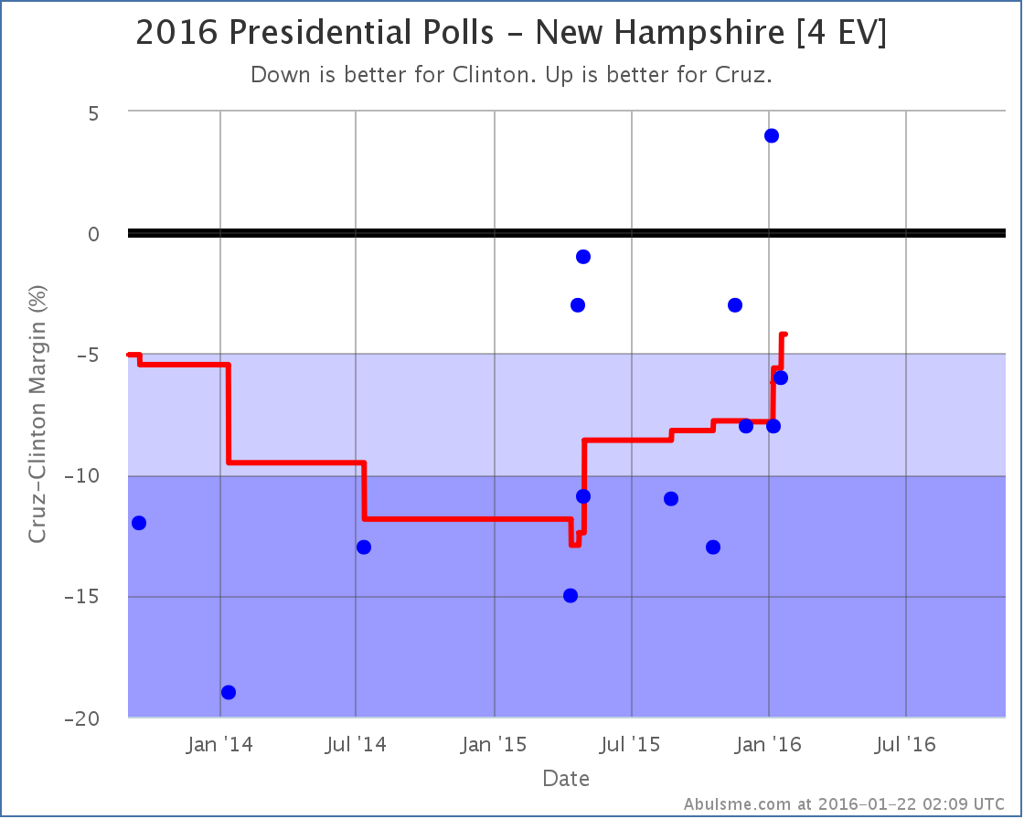
Cruz’s recent movement in New Hampshire is the opposite of the trends we were looking at for the other candidates in the other states. Cruz is gaining on Clinton in New Hampshire. For the first time, the state starts to look competitive in this match up. Clinton is still up 4.2% in the average, but now it is conceivably within reach for Cruz.
National Ranges
So with all these various changes, what do things look like nationally for all these candidate pairs? Here we go:
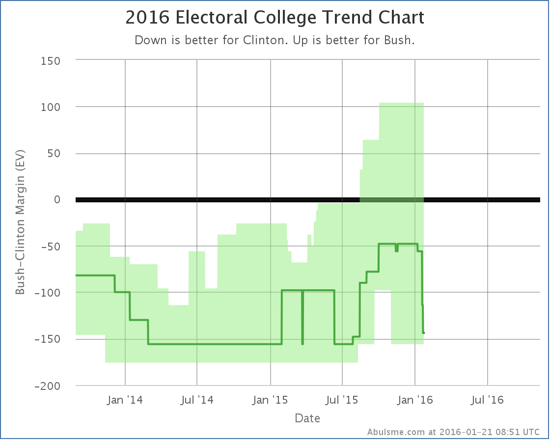
With Florida and North Carolina back out of his column, the result if everybody just wins the states they are ahead in now sits at Bush losing by 144 electoral votes. If he manages to flip the states where Clinton is ahead by less than 5% he could still win by up to 104 electoral votes though, so while Bush is behind, this is still a race.
Before this update, Clinton vs Rubio was actually expected to be a narrow 10 electoral vote Rubio win. But if you take Florida away, that changes into a 48 electoral vote loss. With North Carolina also now considered a possibility for Clinton, Clinton’s “best case” improves to a 156 electoral vote win. Rubio’s best case is still a 116 electoral vote win though, so this matchup is also a real race that could go either way.
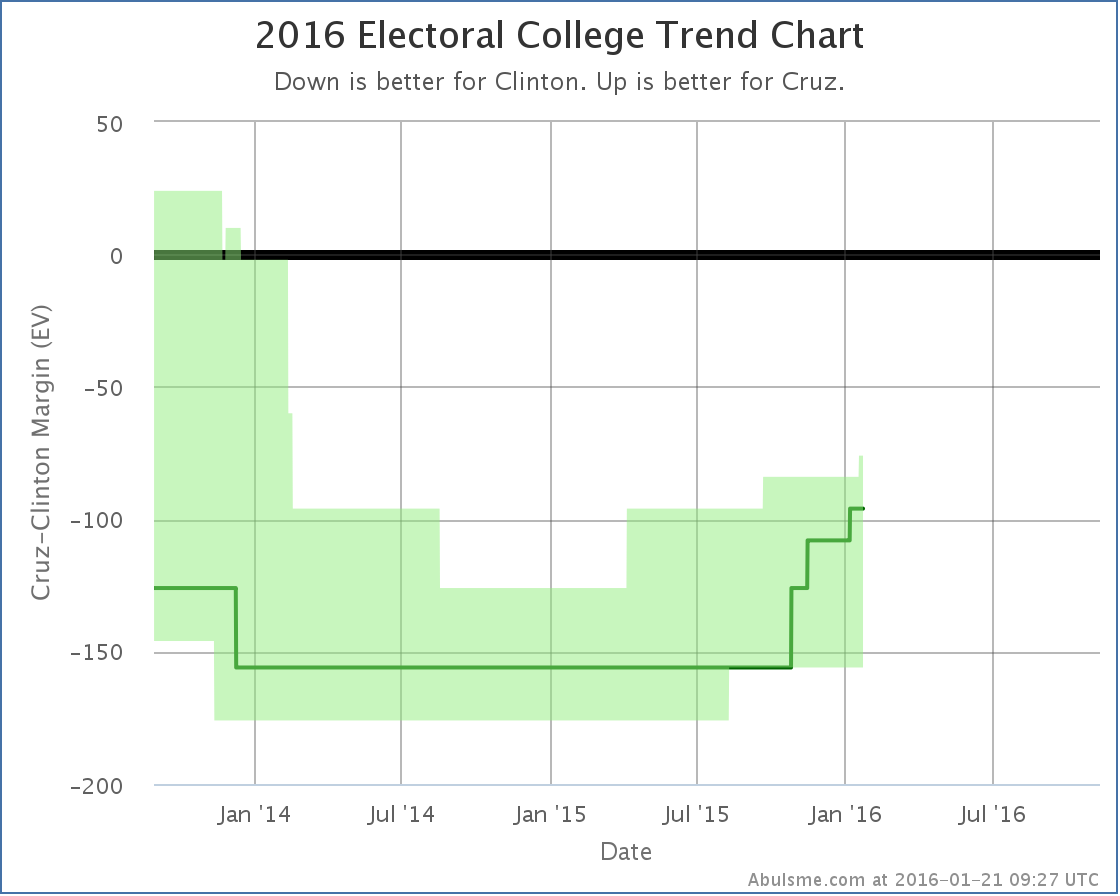
On the other hand… making New Hampshire possible brings Cruz’s best case… where he wins every state he is ahead in, plus all the states where Clinton’s lead is less than 5%… to Cruz losing by 76 electoral votes. This is better than it was. Cruz has been improving since last spring. But he is still not yet in a place that would make a Clinton vs Cruz race even competitive. Right now that matchup looks like an easy Clinton win.
Now, the Real Clear Politics average for Clinton vs Cruz actually shows Cruz ahead of Clinton right now. (Rubio too.) How does this mesh? First thing to note is that the state level polling that the estimates on this site are based on are still not happening quickly enough to show national movement that happens on timeframes less than a few months. So it is quite possible there has been a recent move just isn’t reflected in the state numbers yet. If so, if Cruz ends up the nominee, there will be a lot more polling, and we’ll see the state level analysis move toward the national numbers as more data becomes available. It is of course also possible that Cruz’s support is distributed between states in such a way that gives him a popular vote advantage while still leaving him behind in the electoral college. To be frank though, that is less likely.
Given that, it is reasonable to think that perhaps the gains Cruz showed in the New Hampshire update today are quite likely happening in other states as well, there just isn’t the polling available yet to show it on a state by state basis. So Cruz may be stronger than he appears on this chart.
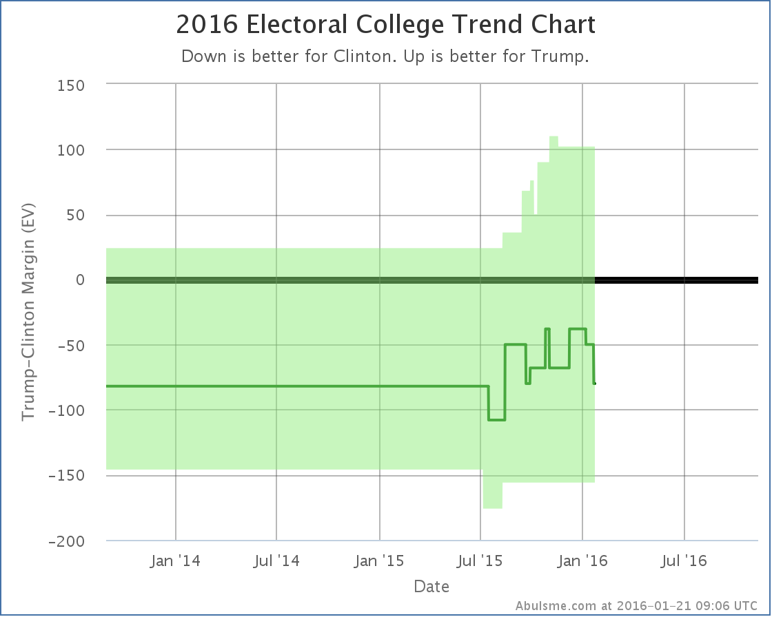
There really wasn’t polling on Trump before this summer, so most if not all of the movement seen here is not real movement, but just the process of getting enough polls to have a reasonable picture of how Trump is doing. The “expected” case doesn’t show a real trend, it has just bounced around a bit. Trump’s best case kept improving as more polls became available. At the moment, the state poll averages show a Clinton vs Trump race could reasonably be anywhere from a 156 electoral vote Clinton win to a 102 electoral vote Trump win, with the “expected case” being an 80 electoral vote win by Clinton. But this matchup DOES look like a real race, not a Clinton rout. Trump does better against Clinton than either Cruz or Bush. Of these four, only Rubio does better.
Or course, I should repeat all the usual caveats again. See the top of this post. There is still lots of time. Everything can and will change over the next few months.
291.9 days until the polls start to close. 11 days until the Iowa caucuses.
This whole thing is going to start moving very quickly very soon.
PS for Sanders fans: Although no match up vs Sanders has been polled enough to talk about in detail here, with today’s updates Sanders strengthened vs Rubio in North Carolina, while weakening against both Rubio and Cruz in Florida.
Note: This post is an update based on the data on ElectionGraphs.com. All of the charts and graphs seen here are from that site. Graphs, charts and raw data can be found there for the race nationally and in each state for every candidate combination that has been polled at the state level. In addition, comparisons of the best polled candidate combinations both nationally and each in each state are available. All charts above are clickable to go to the current version of the detail page the chart is from, which may contain more up to date information than the snapshots on this page, which were current as of the time of this post. Follow @ElecCollPolls on Twitter for specific poll details as I add them. And like Election Graphs on Facebook!
For once this is an update with good news for Clinton! Specifically, the latest Florida poll brings the state back into reach…

Well, into reach against Bush. Bush hasn’t been having the best time of things lately. But Bush now leads Clinton by only 4.2% in our average, so we consider Florida one of those states that could go either way.
Meanwhile though, against Rubio…
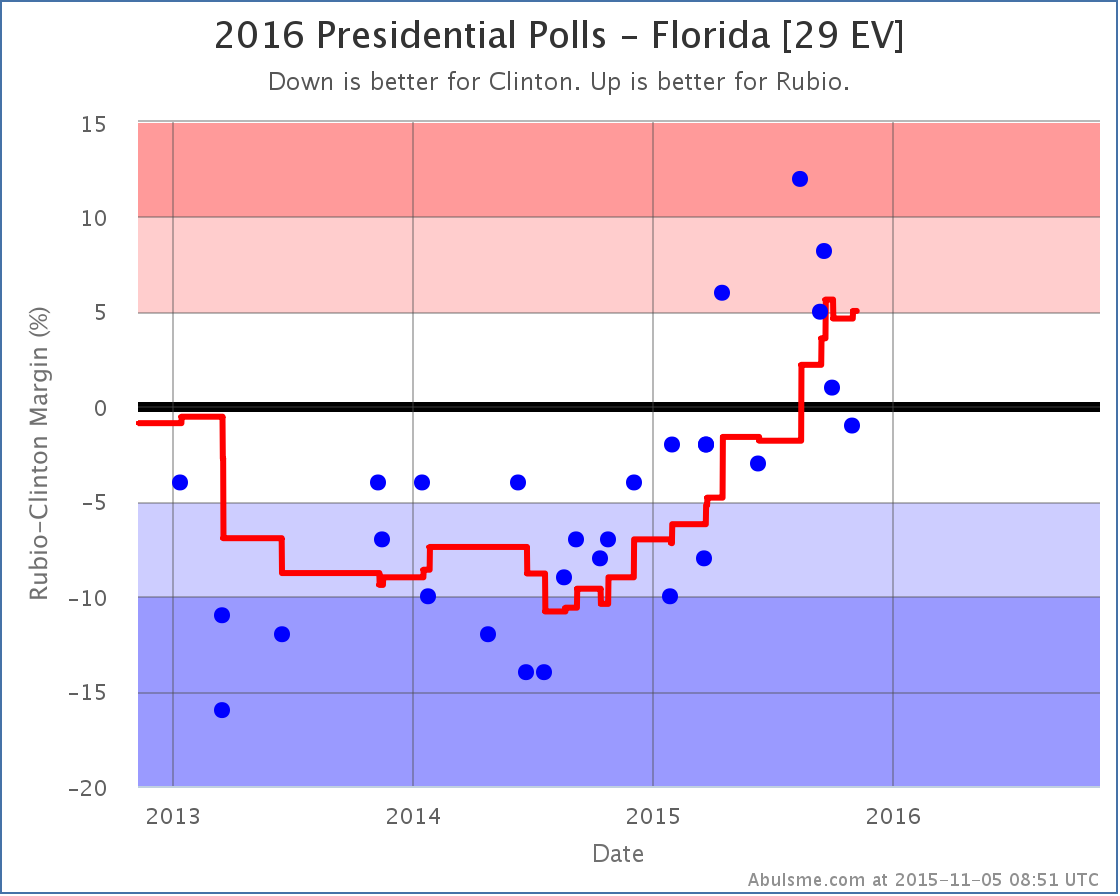
With this latest poll Rubio’s lead grows to just barely over 5%, so once again we take it out of the “possible” list for Clinton.
So Clinton gains Florida as a possible pickup against Bush, but loses it agains Rubio. Is that a wash over all? Probably.
It is also worth noting though that in both of these cases the averages are very close to the 5% boundary between the actually pretty arbitrary “Weak” and “Strong” categories. It should not be surprising if the next polls just reverse today’s changes.
For the moment though:
- Clinton’s best case vs Bush improves from winning by 98 electoral votes to winning by 156 electoral votes.
- Clinton’s best case vs Rubio drops from winning by 126 electoral votes to only winning by 68 electoral votes.
The “expected” cases, where each candidate just wins the states they lead in the average, remain Clinton winning by 48 electoral votes against Bush, and losing by 2 electoral votes against Rubio.
369.1 days until the first polls start to close.
Note: This post is an update based on the data on ElectionGraphs.com. All of the charts and graphs seen here are from that site. Graphs, charts and raw data can be found there for the race nationally and in each state for every candidate combination that has been polled at the state level. In addition, comparisons of the best polled candidate combinations both nationally and each in each state are available. All charts above are clickable to go to the current version of the detail page the chart is from, which may contain more up to date information than the snapshots on this page, which were current as of the time of this post. Follow @ElecCollPolls on Twitter for specific poll details as I add them. And like Election Graphs on Facebook!
|
|