This is the website of Abulsme Noibatno Itramne (also known as Sam Minter).
Posts here are rare these days. For current stuff, follow me on Mastodon
|
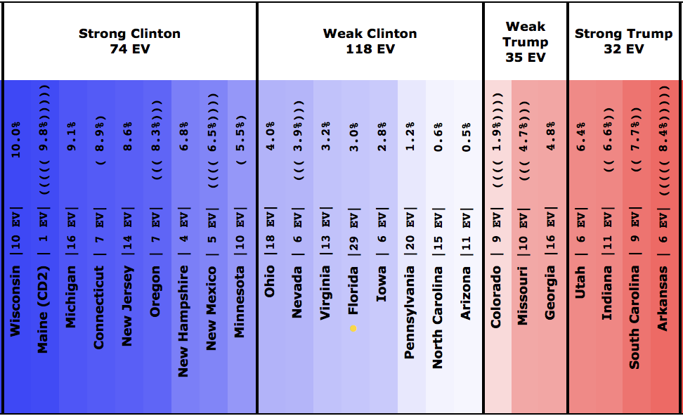
States with new poll data since the last update: Iowa, Colorado, Michigan, Ohio, Pennsylvania, Virginia, Wisconsin, Florida
In advance of the conventions there has been a large volume of recent polling. For the first time with this update the polling average in some states is based fully on polls with their middates within the last seven days. Right now there is no shortage of state level polling and we are seeing lots of movement. Some of this may be random movement depending on which polls are most recent at any given time, but it is likely we are also detecting actual changes on the ground as well.
With the current batch of polls there are notable changes in four states. Pennsylvania, Ohio, and Iowa move toward Trump, while Colorado moves toward Clinton. Lets look at all four of these changes individually, then we’ll review the national picture.
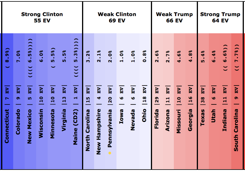
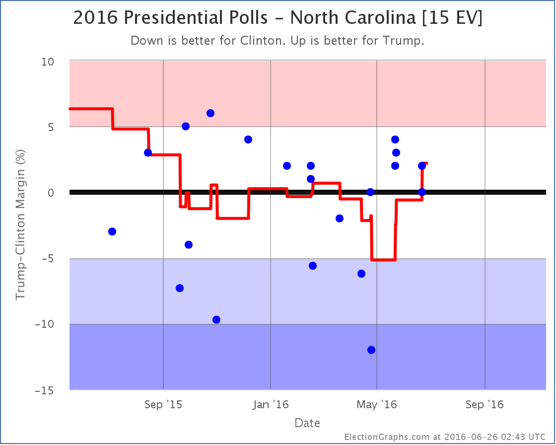
Pennsylvania [20 EV]
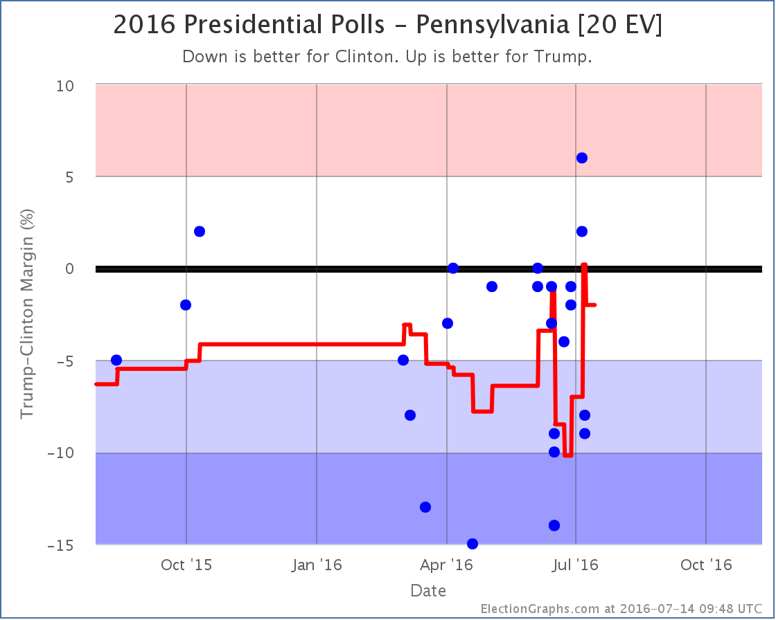
Polls for both Quinnipiac and Marist were added with this update. These were released and added on the same day. You can see above though that the Quinnipiac poll (which covers a slightly earlier date range) actually briefly spiked Pennsylvania into Weak Trump before the Marist poll pushed things back to the Clinton side.
Net result together though, Pennsylvania tightens, but Clinton is still ahead… by a narrow 2.0% margin.
With Pennsylvania in play again, Trump’s best case improves. In addition, this change contributed to moving the tipping point toward Trump.
Ohio [18 EV]
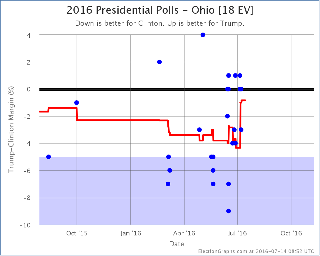
With the newest polls Trump sees a bump as some polls very favorable to Clinton from mid-June roll off the average. Clinton now leads Ohio by only 0.8%. There is no change in categories here. Weak Clinton before, Weak Clinton after. But the movement in Ohio combines with the movement in Pennsylvania above to impact the tipping point.
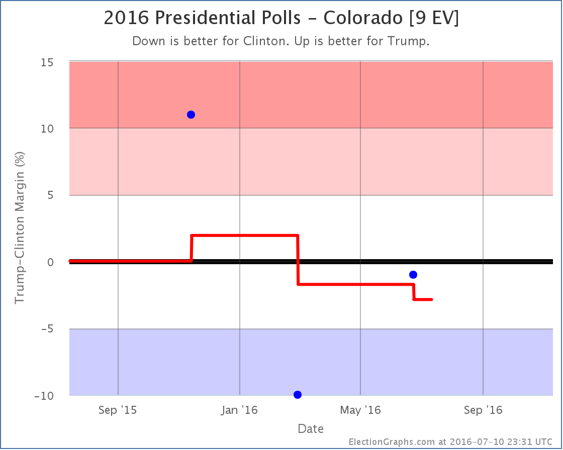
Colorado [9 EV]
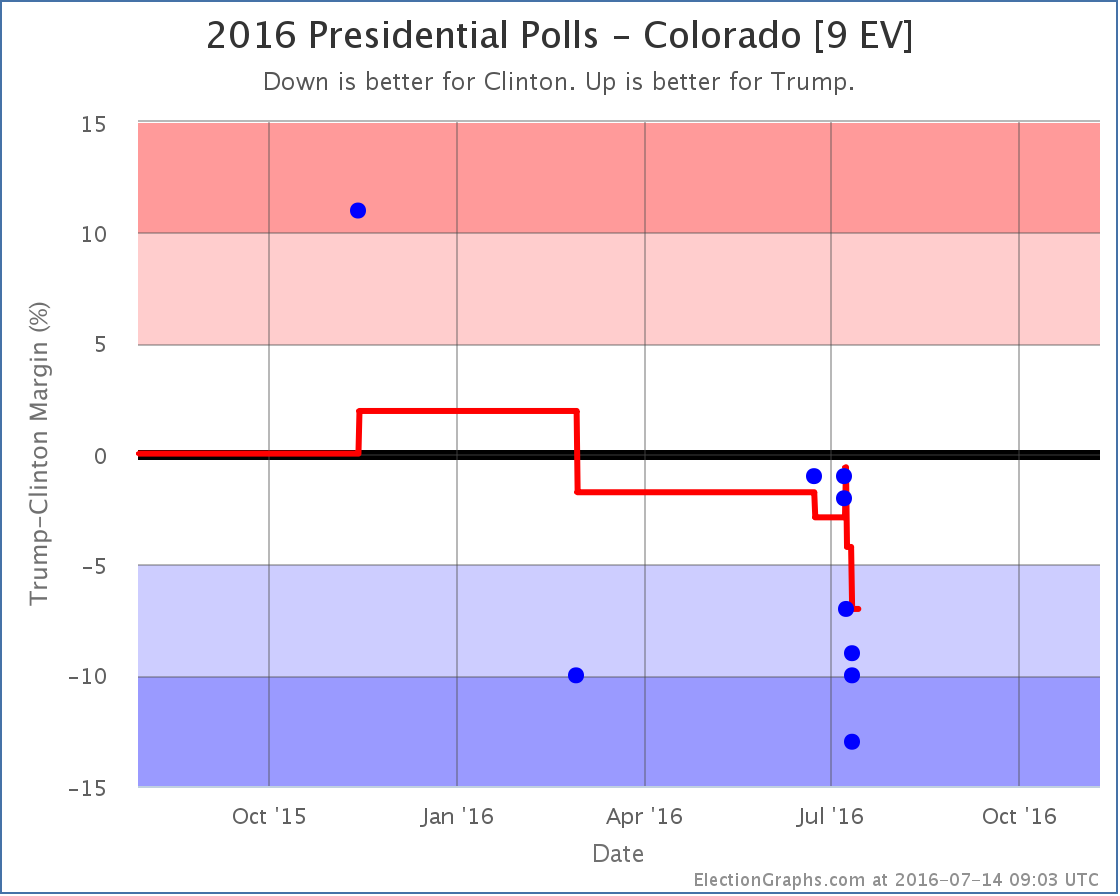
After spending what seemed like forever as the least polled “close state”, we all of a sudden have lots and lots of polls in Colorado. The end result? Colorado had looked like a very close state based on the average results of the last few elections. But now that we finally have a decent volume of Clinton vs Trump polls, Clinton has a clear lead. She is now ahead by a healthy 7.0%.
So in the only one of today’s moves that is in Clinton’s direction, Colorado moves out of reach for Trump. At least for now. This reduces Trump’s best case.
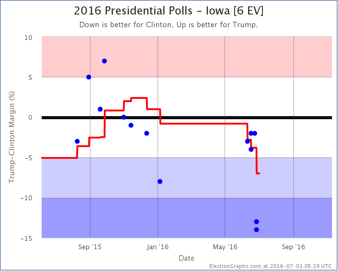
Iowa [6 EV]
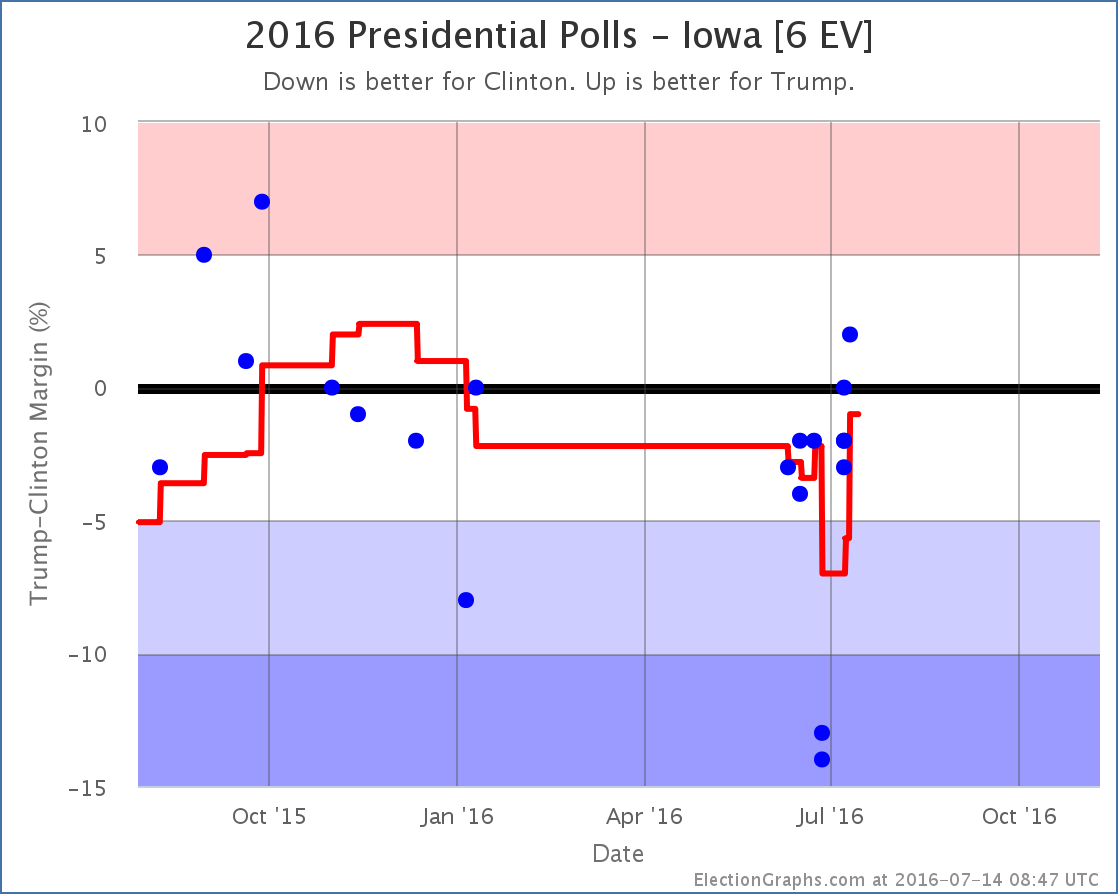
New Gravis and Marist polls push Loras polls from the end of June off the average… polls which now look like clear outliers… and so the average moves in Trump’s direction. Iowa now looks very close, sitting at a 1.0% Clinton lead.
With Iowa close again, it is once again included as a possible Trump pick up, improving his best case.
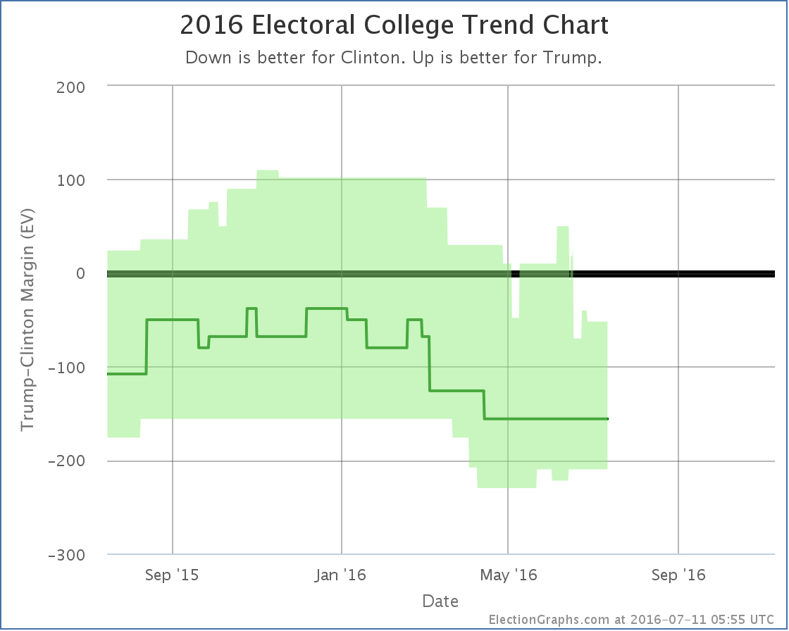
National View
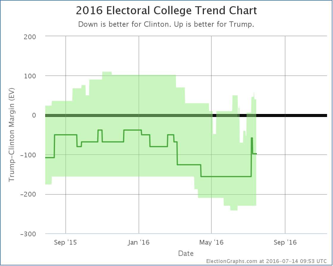
Once you factor in the two states moving toward Trump and the one state moving forward Clinton, Trump’s best case moves from winning by 6 electoral votes to winning by 40 electoral votes. No net change for the expected case despite the temporary spike.
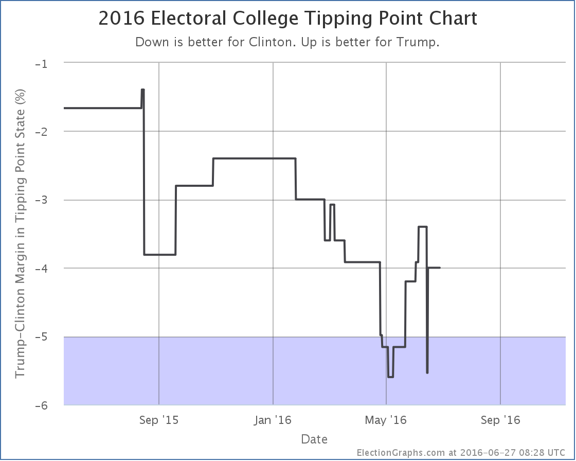
The more impressive change though is actually with the tipping point:
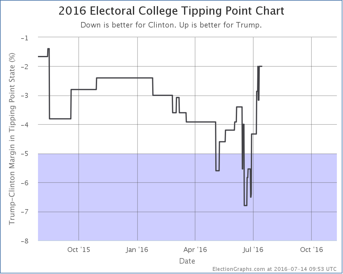
With two states moving in ways that impact the tipping point, it moves from Clinton by 4.3% in Ohio to Clinton by 2.0% in Pennsylvania. This is the best position Trump has had in this metric since last August.
Trump is of course still behind. But a 2.0% tipping point means you only would need 1% of people flipping from Clinton to Trump to push Trump into the lead, or undecideds breaking in his direction. For the first time in a long time, this is looking like a close race again.
Looking at the center of the spectrum, Trump’s shortest path to being in the lead goes through Ohio, Nevada, Iowa, and Pennsylvania. All of those states have Clinton in the lead, but by less than 2.0%, a margin that could easily evaporate overnight.
With the Republican convention starting in less than 4 days, if we see Trump get the traditional “bump” we may well see him actually in the lead for the first time this cycle sometime in the next couple weeks. This assumes of course the convention ends up coming off smoothly. If the convention becomes chaotic, the bump may evaporate.
Also acting against the bump, the Democratic convention starts only a few days after the Republican convention ends. There is no significant gap between the two conventions. Which may make any bump too transitory to measure in an electoral college based view.
If we see even a minor bump though, at this point it would be enough to put Trump in the lead.
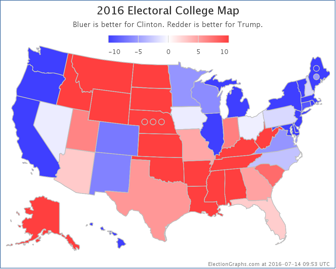
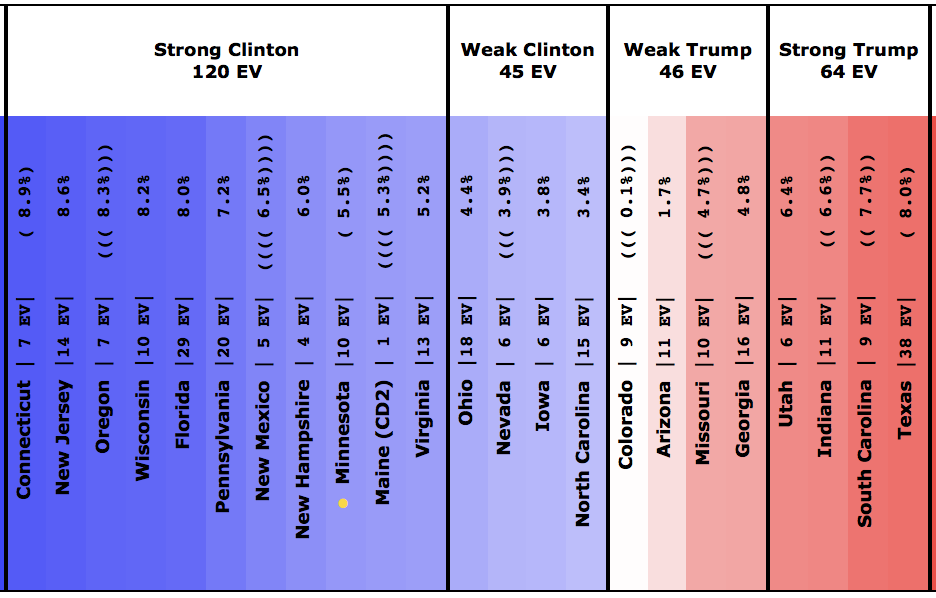
To close up today, a quick look at the current map:
117.2 days until polls start closing on Election night 2016. The conventions are upon us. Things will be nuts from here until November. Hold on tight! :-)
Note: This post is an update based on the data on ElectionGraphs.com. Election Graphs tracks both a poll based estimate of the Electoral College and a numbers based look at the Delegate Races. All of the charts and graphs seen in this post are from that site. Additional graphs, charts and raw data can be found there. Follow @ElectionGraphs on Twitter or like Election Graphs on Facebook to see announcements of updates or to join the conversation. For those interested in individual general election poll updates, follow @ElecCollPolls on Twitter for all the polls as they are added. If you find the information in these posts interesting or useful, please consider visiting the tip jar.
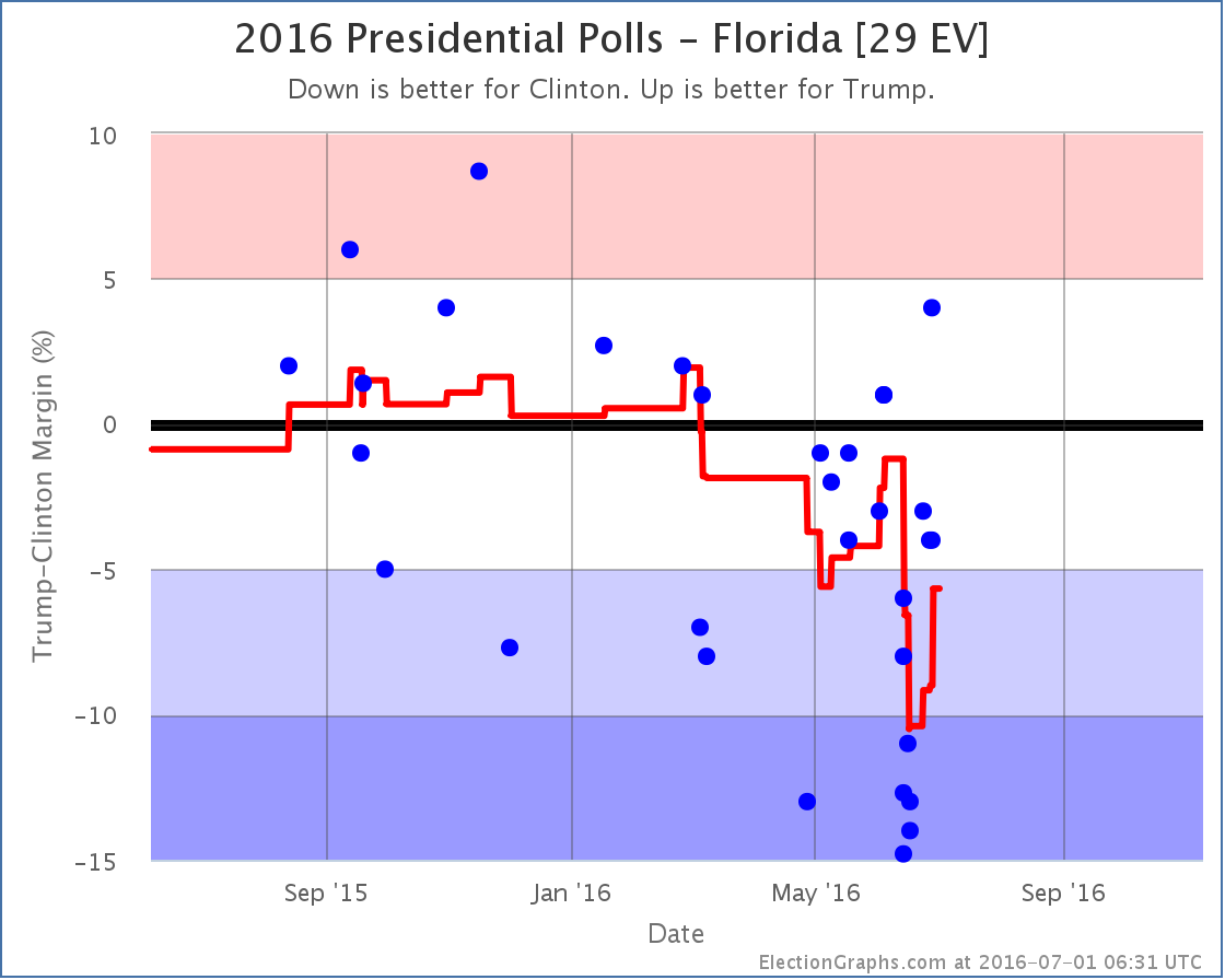
States updated with new poll data since last update: Nevada, Florida, Kentucky, New Hampshire
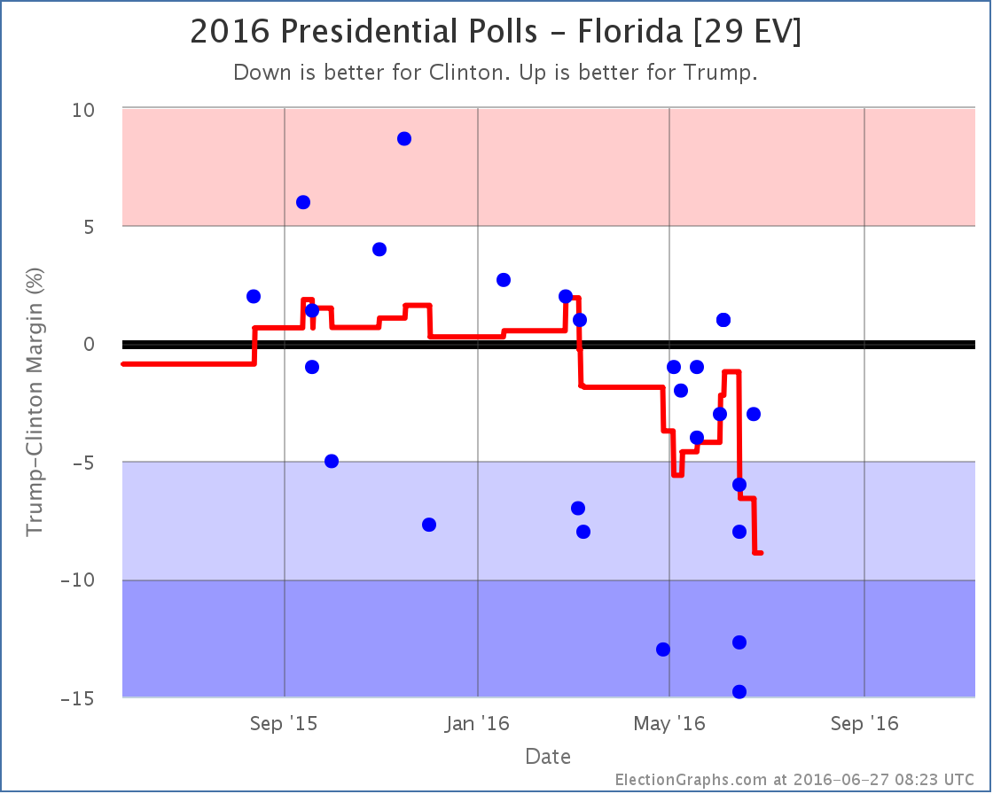
Just a couple weeks ago we were talking about how Clinton’s lead in Florida had gotten quite large, and it moved out of the possible pickups for Trump. This was on the strength of a number of polls that covered mid-June that were very positive toward Clinton, showing leads as high as 15% in the state. The worst mid-June poll for Clinton still showed her ahead by 6%. Those polls have now rolled off the average, replaced by new polls much more favorable to Trump. With the two new Florida polls added in this update, things move very rapidly in Trump’s direction:
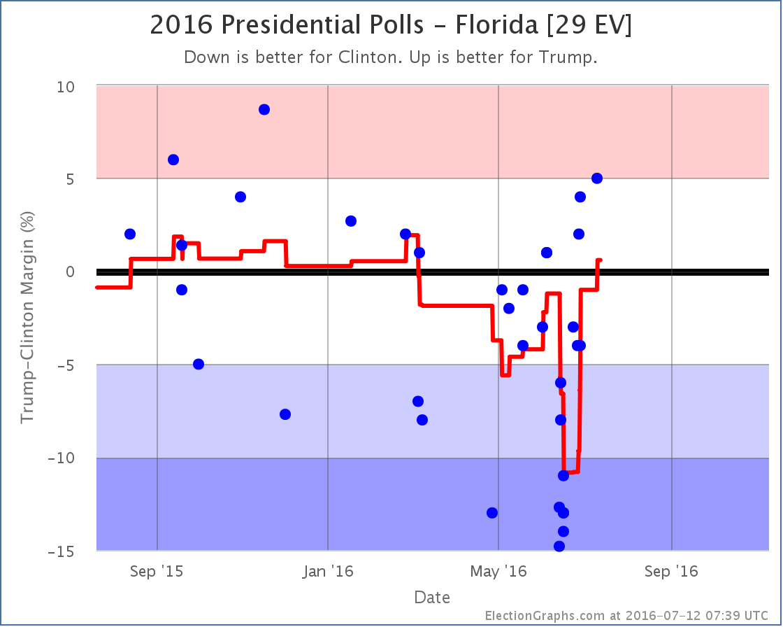
With the two new polls in the mix, the average moved from Strong Clinton to Weak Clinton on June 28th. But things kept getting better for Trump. On July 10th the average moved from Weak Clinton to Weak Trump.* Trump takes the lead in Florida for the first time since March. At 29 electoral votes Florida makes a huge difference.
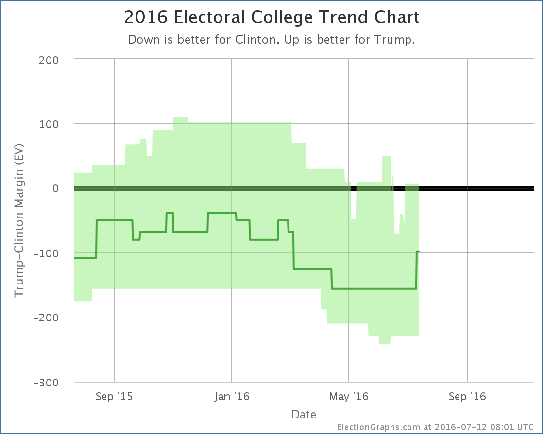
You can now see an upward movement on Trump’s best case a couple weeks ago, followed by the bump upward in the expected case more recently.
The electoral college view can move very quickly, especially when a big state like Florida swings its weight around. So after a few weeks of bad news for Trump and the trend looking like it was heading relentlessly against him, we now have the chart showing movement back toward Trump.
Trump is still behind, but once again he has a “best case” that includes him winning. With Florida not just in play, but actually on his side for the moment, if Trump wins all the states he is ahead in, plus all the states where Clinton leads by less than 5%, he squeaks out a narrow 6 electoral vote win.
In the “expected case” were each candidate wins the states they are ahead in, Trump now only loses by 98 electoral votes. This is now better than Romney’s 126 electoral vote loss as well as McCain’s 192 electoral vote loss. So while Trump is still losing, with current polling he is actually improving on the performance of the last two Republican candidates.
With Florida moving, the “tipping point” also moves:
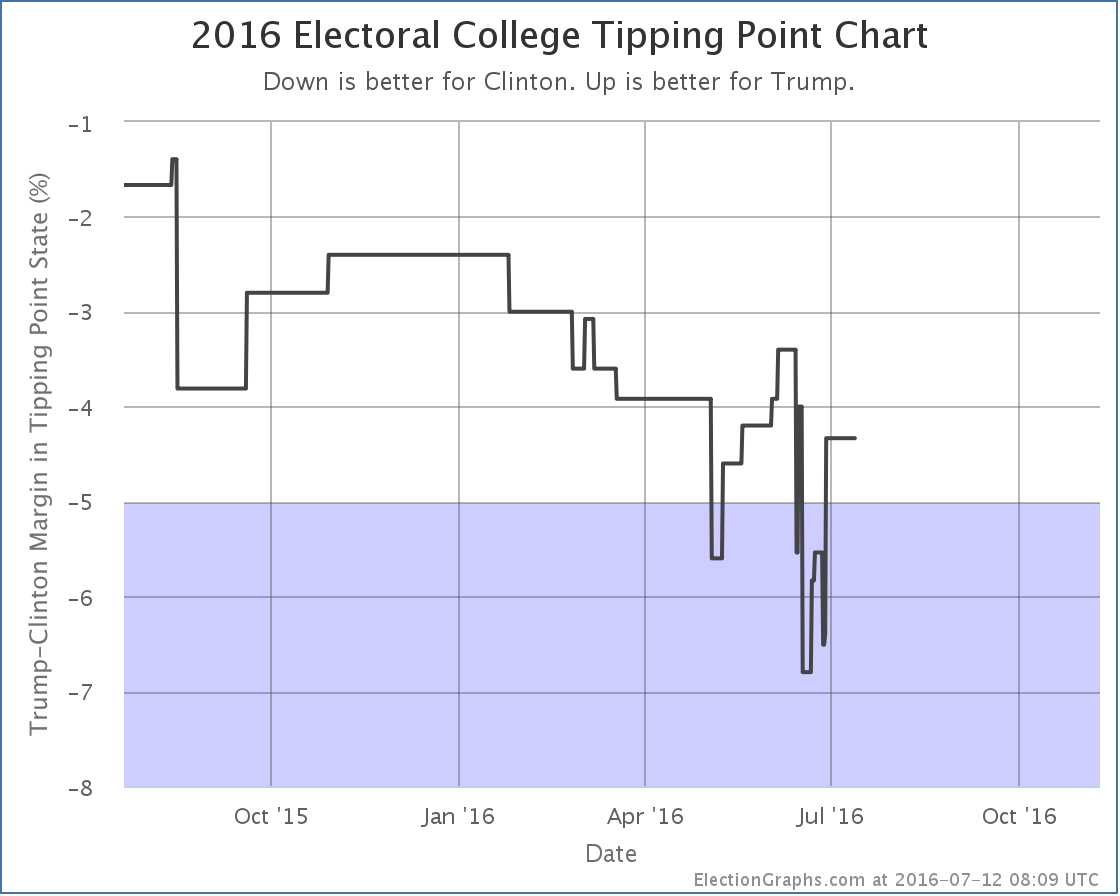
Before this update the tipping point was a 5.7% Clinton lead in Florida. Now it is a 4.3% Clinton lead in Ohio.
One thing to point out in both of the graphs above is that we see a lot of volatility in the “Trump best case” and “tipping point” lines in the last couple of months. This is the natural result of general election polling ramping up once the nominations were settled. States that are near the tipping point or near category boundaries will “twinkle” as new polls cause the averages to bounce around. This will only increase as we get closer and closer to November. Although I post updates each time states move around in this way, it is important to watch the longer term trends, while remembering that things can sometimes shift quickly.
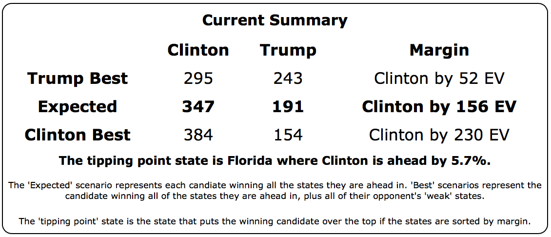
For now though, the current summary looks like this:
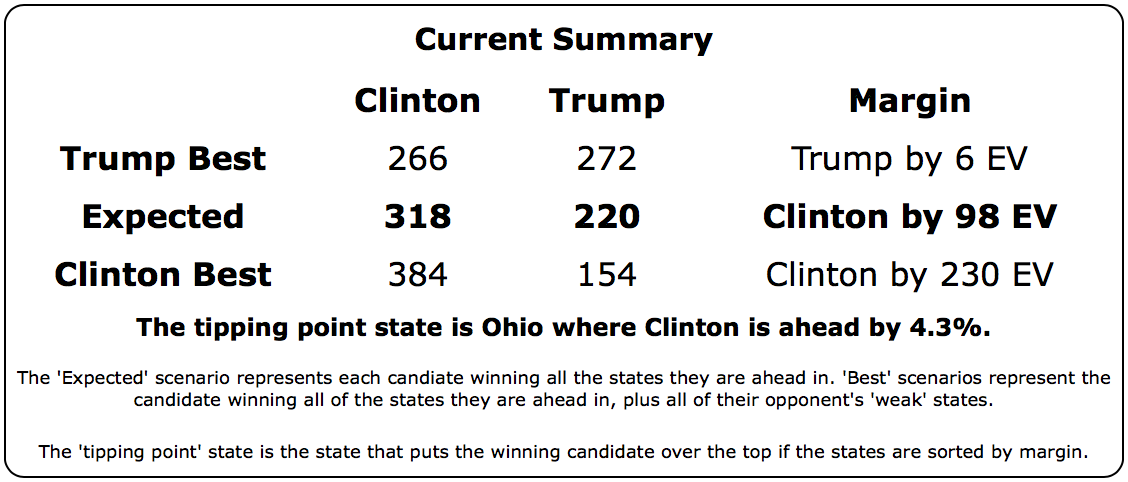
It is hard to overstate the importance of Florida here. With Florida out of reach, Trump’s best case was to lose. With Florida on his side, a win is once again in reach, although he still needs to flip every single one of Nevada, New Hampshire, Colorado, North Carolina, and Ohio to do it.
119.7 days until polls close on election day. Less than 6 days until the gavel drops on the Republican convention.
* For those wondering why in this single update we start referencing changes that happened in the average on June 28th and July 10th rather than a change that happens as of this update, this is because the graphs reflect changes due to polls at the mid-dates of the time they were in the field, not at the time the poll is announced, or the time I enter the poll into my data. So today two polls were added, the first covered June 26 to 28 and the second covered July 9 to 10. These became the most recent and 4th most recent polls I know about in Florida, and the line showing the average adjusts to reflect changes at the midpoint of those date ranges.
Note: This post is an update based on the data on ElectionGraphs.com. Election Graphs tracks both a poll based estimate of the Electoral College and a numbers based look at the Delegate Races. All of the charts and graphs seen in this post are from that site. Additional graphs, charts and raw data can be found there. Follow @ElectionGraphs on Twitter or like Election Graphs on Facebook to see announcements of updates or to join the conversation. For those interested in individual general election poll updates, follow @ElecCollPolls on Twitter for all the polls as they are added. If you find the information in these posts interesting or useful, please consider visiting the tip jar.
Polls added since last update: Ohio, Pennsylvania, California, Arizona, Florida, Michigan, North Carolina, New Hampshire, Nevada, Wisconsin, Oregon, Vermont, Alaska, Colorado, Idaho, Iowa, Maine (All), Missouri, Oklahoma, Texas, Utah.
In addition to a number of actual new polls, I recently got a helpful batch of data from Darryl, another election modeler who posts at horsesass.org. His latest update is here. His analysis uses state polling averages, but then runs a Monte Carlo simulation to generate a distribution of possible outcomes and win odds, rather than simply the electoral result range based on the close states going one way or another like I do here. Good stuff, you should check it out.
In any case, Darryl sent me a batch of polls he had in his database that I had apparently missed. Most of these were older polls and though they jiggled the lines in the past a bit, did not change the current analysis. Except in one state: Colorado.
Colorado has been very lightly polled given how it is one of the states that has actually gone both ways in the last five elections. The poll Darryl had found which I had missed was a Keating poll back in February, that showed Clinton with a significant lead. With only three Clinton vs Trump polls total so far, and old elections filling out the polling average, that one poll makes a difference.
With that poll now in place, the average moves from “Weak Trump” to “Weak Clinton”. In fact, since it was an older poll that was responsible for the change, Colorado has actually been “Weak Clinton” for months now, we just didn’t know it. This change is now reflected in all the graphs.
Everything on the center “expected result” line since late February moves down 18 as Colorado’s 9 electoral votes flip from red to blue. Colorado still looks close though. Clinton’s lead is only 2.9% and the three polls we do have range from Clinton up 10%, to Trump up 11%. We still don’t have a really great picture of Colorado. More polls are needed there.
In the mean time, the new national summary looks like this:
We still have a picture of Clinton dominating Trump. Even if Trump wins all the close states, he still loses. In the expected case, Trump’s result is still better than McCain but worse than Romney. A loss to be sure, but a loss comparable to the Republican losses in the last two elections, not an unusually bad loss.
We are now only a week away from the Republican convention. There is usually a bit of a bounce after a convention (although it usually doesn’t last too long). But this year is unusual. Who knows what we will see.
120.3 days until polls start to close on Election 2016.
Note: This post is an update based on the data on ElectionGraphs.com. Election Graphs tracks both a poll based estimate of the Electoral College and a numbers based look at the Delegate Races. All of the charts and graphs seen in this post are from that site. Additional graphs, charts and raw data can be found there. Follow @ElectionGraphs on Twitter or like Election Graphs on Facebook to see announcements of updates or to join the conversation. For those interested in individual general election poll updates, follow @ElecCollPolls on Twitter for all the polls as they are added. If you find the information in these posts interesting or useful, please consider visiting the tip jar.
New polls since last update: Iowa, Florida, New York, North Carolina, Nevada, Arizona, Ohio, New Hampshire, Pennsylvania, Wisconsin, Michigan.
This is now the sixth day in a row that there has been movement in the Election Graphs models. I didn’t expect this kind of pace until September or October. Hopefully it won’t be this way the entire time until November, or your faithful commentator will be a burned out cinder by then.
In any case, in today’s update two changes contribute to the changes:
Iowa [6 EV]
The new Iowa polls by Loras (one with Johnson and Stein, one without) initially look like outliers. But there has been a wave of these polls showing bigger Clinton leads than we had seen previously this week. Are they all outliers? There will be no way to tell for sure until there is more polling. But do not be surprised if this “movement” reverses once these particular polls roll off of the average.
In the mean time though, we include all the polls in the average, and Iowa moves from Weak Clinton to Strong Clinton, which means it is no longer included in Trump’s best case.

With Iowa not in play, Trump’s best case moves from losing by 40 electoral votes to losing by 52 electoral votes. This is still better than the picture was at the beginning of May, which Trump’s best case was to lose by 78 electoral votes, but even so, this isn’t a pretty picture for Trump.
After weeks of saying here that a Trump collapse was not yet visible in the state polls, you can now clearly see a Trump bump, followed by a collapse. Notable though is the fact that this is only visible in Trump’s “best case”, not the “expected case”. Trump made a number of states look close, but aside from some transitory short term changes that were erased as more polls were added, Trump has not moved any states over to his side of the line.
The expected electoral college result has been static at Clinton 338, Trump 200 since March.
Florida [29 EV]
Florida does not change categories this time, but along with Iowa moves the tipping point.
Iowa moved toward Clinton. The Iowa poll covered a slightly earlier timeframe than the Florida poll. Iowa moved the tipping point from Clinton by 5.5% in Minnesota to Clinton by 6.5% in New Mexico.
But then Florida moved a bit toward Trump and almost immediately moved the tipping point back to Clinton by 5.7% in Florida.

You can see the spike down to 6.5% then immediate movement back to 5.7% on the chart. Net change is still a 0.2% movement toward Clinton.
The Trump bump followed by a collapse is now clearly visible on the tipping point chart as well. Note that the “bump” only moved Trump to the zone he was in back in March. It never completely reversed the negative trend of the primary months. And this entire graph is on the blue side of the center line. Trump has never had a lead.
On this metric, with the recent collapse just hit his worst level ever (then bounced back a bit).
The way to read this trend along with the flatness in the expected electoral college result is that while Trump hasn’t fallen further behind in the electoral college, the states he would need to flip in order to win are moving further away from him, making the task of catching up with Clinton look harder and harder.
The picture has changed dramatically in just the last two to three weeks though, so it is important to keep in mind how volatile these numbers can be. Especially since a number of the polls that caused these changes initially look like they might be outliers.
It would not be surprising at all to see some movement back in the trump direction in the two weeks prior to the Republican convention. And of course the “usual” pattern is a bump after the Convention.
So keep watching. 130.3 days until polls start to close on election day.
Note: This post is an update based on the data on ElectionGraphs.com. Election Graphs tracks both a poll based estimate of the Electoral College and a numbers based look at the Delegate Races. All of the charts and graphs seen in this post are from that site. Additional graphs, charts and raw data can be found there. Follow @ElectionGraphs on Twitter or like Election Graphs on Facebook to see announcements of updates or to join the conversation. For those interested in individual general election poll updates, follow @ElecCollPolls on Twitter for all the polls as they are added. If you find the information in these posts interesting or useful, please consider visiting the tip jar.
New polls since last update: North Carolina, New Hampshire, New Jersey, Washington
After yesterday’s mass of bad polls for Trump, today’s update brings a positive change for Trump in New Hampshire:
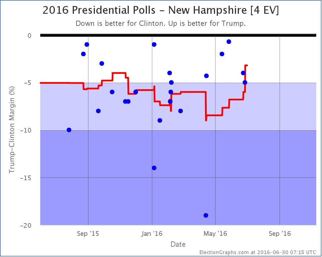
To be honest, this looks less like real moment, than the April poll by WMUR showing Clinton ahead by 19% being a fairly clear outlier and now rolling off the polling average. With that poll gone, the average moves to a 3.2% Clinton lead.
Without the outlier poll New Hampshire would have still been in the “Strong Clinton” category earlier this year. The presence of the outlier delayed the move to “Weak Clinton”, but New Hampshire is there now. There has yet to be a poll showing Trump actually ahead in New Hampshire, but there are plenty showing that it is close. So it is now considered as a possible Trump pick up, which improves Trump’s “best case”.

See the little bump at the top of the very right hand side of the “bubble”? That’s new Hampshire. Trump’s best case improves from losing by 48 electoral votes to only losing by 40 electoral votes.
New Hampshire aside, for the moment Trump remains pretty far behind. He has said that the “real campaign” won’t begin until after the convention. We’ll see soon enough.
17.9 days until the Republican Convention, 24.9 days until the Democratic Convention, 131.2 days until polls start to close on Election Day 2016.
Note: This post is an update based on the data on ElectionGraphs.com. Election Graphs tracks both a poll based estimate of the Electoral College and a numbers based look at the Delegate Races. All of the charts and graphs seen in this post are from that site. Additional graphs, charts and raw data can be found there. Follow @ElectionGraphs on Twitter or like Election Graphs on Facebook to see announcements of updates or to join the conversation. For those interested in individual general election poll updates, follow @ElecCollPolls on Twitter for all the polls as they are added. If you find the information in these posts interesting or useful, please consider visiting the tip jar.
New polls since last update: Florida, Iowa, Michigan, North Carolina, Ohio, Pennsylvania, Virginia.
This is the fourth day in a row where there have been changes to the Election Graphs model based on new polling. That is quite a bit! The pace of polling is accelerating as we approach the conventions.
The new additions today that caused changes were all from a series of swing state polls released by Ballotpedia. The Ballotpedia results look very bad for Trump. In terms of the Election Graph model, Pennsylvania, North Carolina and Virginia all jumped into categories more favorable to Clinton, and the movements in Ohio and Pennsylvania contributed to a move in the tipping point toward Clinton.
All in all, the net result is that once again even if Trump were to win all the states he is ahead in, plus all the states where he is less than 5% behind, he would still lose. As recently as yesterday I said that Trump was up or flat from one and two months ago on all four metrics tracked here. Today’s results flip that overnight. Trump is now DOWN or flat on all four metrics when compared to either one or two months ago. Perhaps these polls will turn out to be outliers, but for the moment, Trump’s position looks much weaker than it did… and it was pretty weak to start with.
Lets go over each of states that shifted the model. Although just released, these polls covered June 10 to June 22, so the changes show up on the charts on the midpoint, June 16th. So the shape of the charts over the last couple weeks is modified, not just the very end of the charts.
Pennsylvania
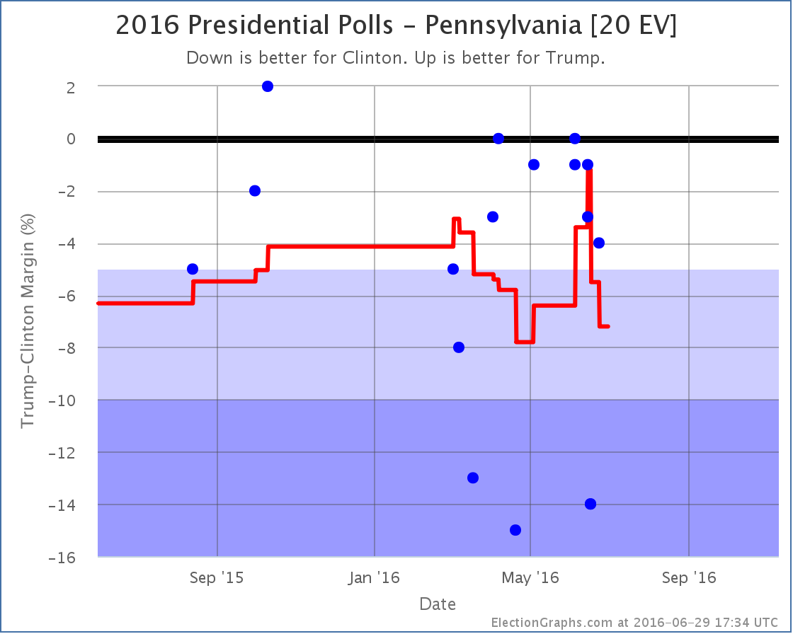
A series of relatively good polls for Trump that showed Pennsylvania close had resulted in a nice spike toward Trump. But with the new polls from Ballotpedia (one including Johnson, one with just Clinton and Trump, both showing a 14% Clinton lead) the average again moves dramatically toward Clinton, now showing a 7.2% Clinton lead.
Now, it is clear that the new polls are dramatically different than the other recent polls, so the possibility that they are not really representative can’t be thrown out. On the other hand, they are still within the very wide range we have seen polls over the past few months. Election Graphs includes all polls in the average and lets the average wash it out. If Ballotpedia is not representative of the “real” trend, new polls should show that before very long.
For the moment though, Pennsylvania moves to “Strong Clinton” and is no longer included in Trump’s best case.
North Carolina
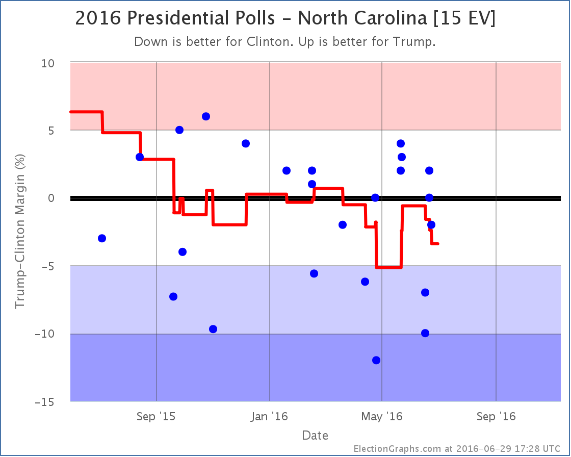
In North Carolina the two Ballotpedia polls (Clinton leading by 7% and 10%) not only pull North Carolina from Weak Trump to Weak Clinton, but because these polls covered a time period before the recent upward movement by Trump it actually completely erases that brief period in the red zone for North Carolina. Clinton now leads by 3.4% and North Carolina is back on the blue side of the ledger.
Virginia
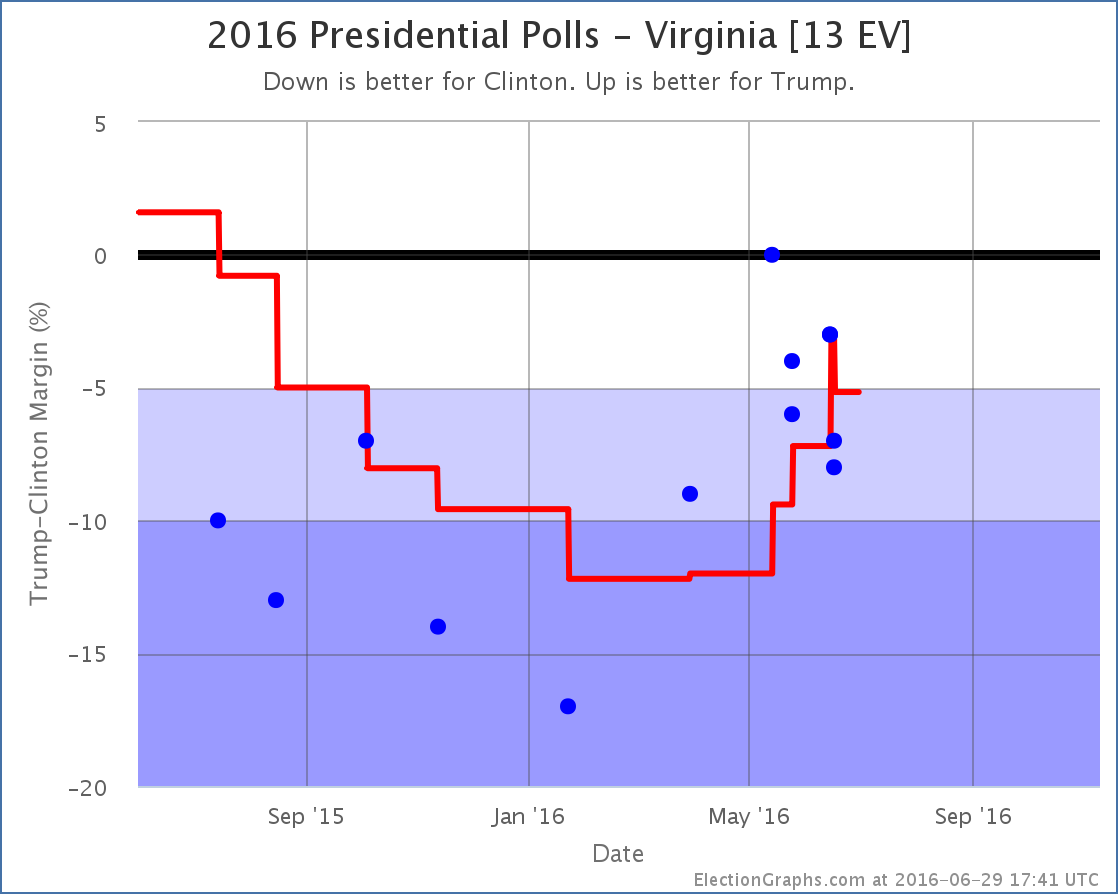
Virginia is also a state where Trump had made the state close, but the new polls wipe that out. Here the new Ballotpedia polls show Clinton ahead by 7% and 8%, and the new average is Clinton by 5.2%. This takes Virginia back out of Trump’s list of potential pickups and further damages his “best case”.
Ohio
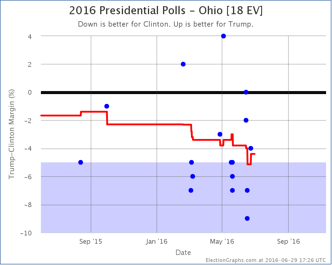
The new Ballotpedia polls (Clinton by 7% and 9%) actually briefly moved Ohio into the “Strong Clinton” category, but since there was already a later PPP poll (Clinton by 4%) there is no net category change in today’s update. The movement in Ohio, along with the movement in Pennsylvania, both contributed to the change in the tipping point though.
National Picture
So where do all these changes put the national picture?
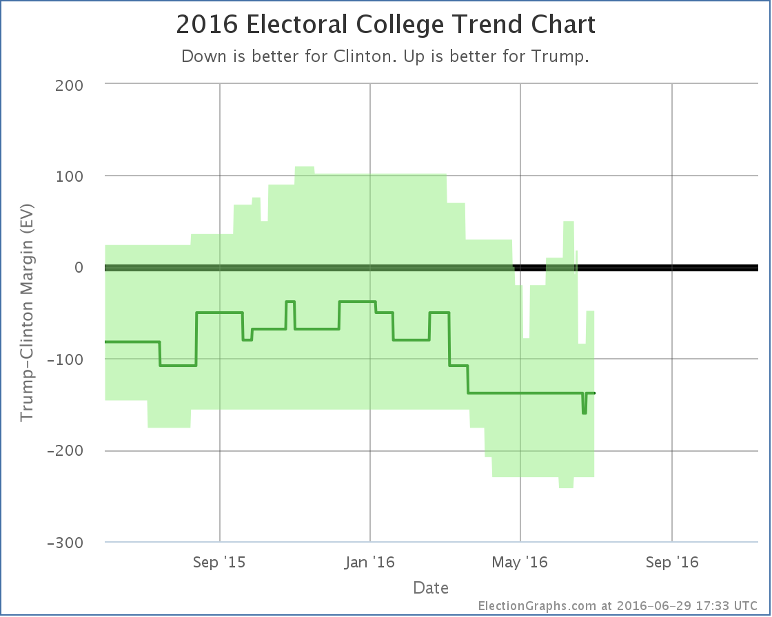
The most recent move on this chart is actually an upward movement toward Trump. This is Ohio moving back to “Weak Clinton” after the brief period as “Strong Clinton” described in the Ohio section. But the major move in todays updates is overall movement away from Trump.
Trump’s “expected case” moved from a 108 electoral vote loss (which is now wiped from the chart) to a 138 electoral vote loss, which is where the expected case has now been all but a few days since March.
Meanwhile Trump’s “best case” moved from an 18 electoral vote win, to a 48 electoral vote loss.
And the tipping point also moves:
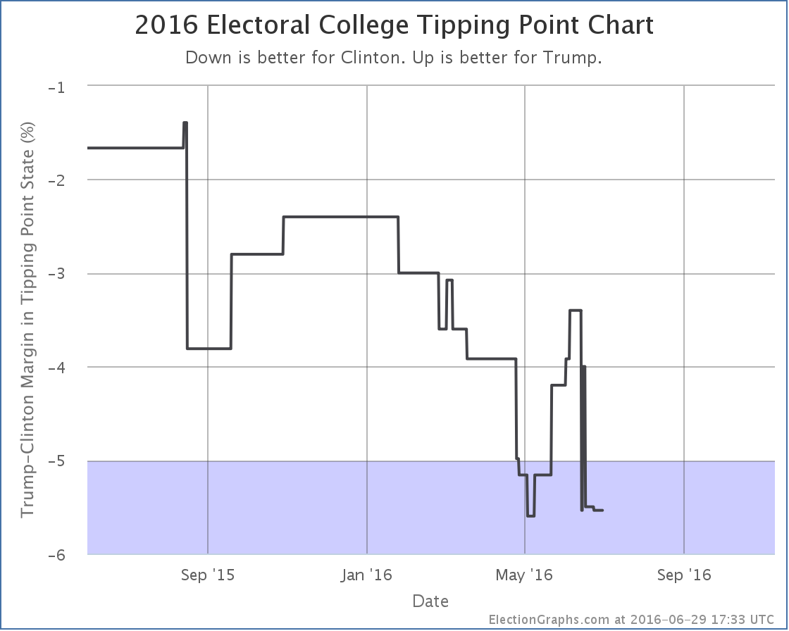
The tipping point moved from a 4.0% Clinton lead in Ohio, to a 5.5% Clinton lead in Minnesota.
The center of the spectrum of the states now looks like this:
To be clear: Ohio, Nevada, Iowa and North Carolina currently look like “close states” that Trump could possibly pick up. Clinton doesn’t need any of them. She could give all four of them to Trump on a silver platter and he would still lose. She could throw in Virginia as well, and even give him the 2nd district of Maine… and she would still win.
Now, if these Ballotpedia results turn out to just be bad polling, the averages will pop back a bit more toward Trump once we get a few more polls in these states. But for the moment, Trump’s averages just took a serious dive. He isn’t in the worst shape against Clinton ever… that happened at the beginning of May… but he is close.
132.0 days until the polls start to close. Much more fun to come…
Note: This post is an update based on the data on ElectionGraphs.com. Election Graphs tracks both a poll based estimate of the Electoral College and a numbers based look at the Delegate Races. All of the charts and graphs seen in this post are from that site. Additional graphs, charts and raw data can be found there. Follow @ElectionGraphs on Twitter or like Election Graphs on Facebook to see announcements of updates or to join the conversation. For those interested in individual general election poll updates, follow @ElecCollPolls on Twitter for all the polls as they are added. If you find the information in these posts interesting or useful, please consider visiting the tip jar.
New polls since last update: Texas (x2), Arizona, Iowa, New Hampshire, Ohio, Pennsylvania, Wisconsin.
Well, that didn’t last long. Less than a week ago the polling average in Arizona moved to the blue side of the center line. With today’s update, Arizona is once again tinted the more familiar red color.
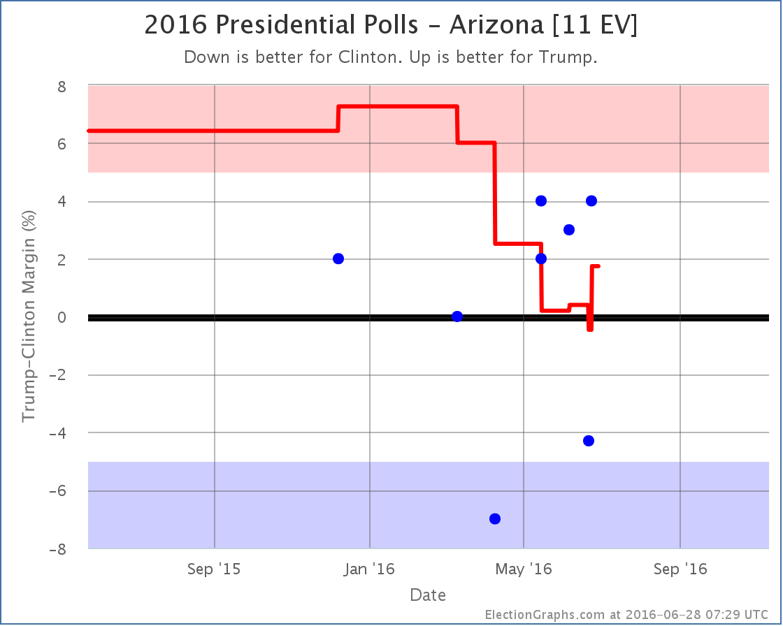
One of the two polls showing Clinton leading in Arizona falls off the average, and so it rises to a 1.7% Trump lead. Arizona is still looking close, which is itself remarkable given the electoral history there, but once again it is on the Trump side of the line.
The “expected case” where each candidate wins all the states where they lead in the poll average, no more, no less, now sits at Clinton 323, Trump 215. This is a 108 electoral vote win for Clinton. We are back where we were in mid-March.
With this scenario, Trump is still losing, but not by as much as either Romney (126 EV loss) or McCain (192 EV loss).
So to repeat a theme I have touched on a number of times before, yes, Trump is behind here. Clinton is winning. But we are NOT seeing a historically bad Republican candidate. Trump is actually doing better than his immediate predecessors at the moment.
And compared to both two months ago and one month ago, he is still up or flat on all four metrics tracked here at Election Graphs, not in the midst of and epic collapse. Or, at least, there isn’t one in evidence yet at the state level. If anything, it looks like he is still in the process of recovering from the collapse in support he did indeed see during the months the primaries were in full swing.
133.2 days until the polls start to close.
Note: This post is an update based on the data on ElectionGraphs.com. Election Graphs tracks both a poll based estimate of the Electoral College and a numbers based look at the Delegate Races. All of the charts and graphs seen in this post are from that site. Additional graphs, charts and raw data can be found there. Follow @ElectionGraphs on Twitter or like Election Graphs on Facebook to see announcements of updates or to join the conversation. For those interested in individual general election poll updates, follow @ElecCollPolls on Twitter for all the polls as they are added. If you find the information in these posts interesting or useful, please consider visiting the tip jar.
Since the last update, which was only a day ago, new poll data was added for Florida, Colorado, Wisconsin, North Carolina, Maine (at large and each congressional district), and Arkansas. The Colorado poll was much needed as it has been under polled. Arkansas and Maine as well. But only the Florida poll made a difference. Specifically, the polls in question actually covered a timeframe from earlier in the month, so the last couple weeks of the charts are modified.
The poll average in Florida now only covers two weeks of polling. We are definitely in the general election season.
The last two weeks of polls have not been kind to Trump in Florida. With this update earlier polls showing Florida close fall off the calculation and so the average drops rapidly. The two worst results for Trump in the current average were the ones added in this update. They are from Saint Leo University (one including Johnson as an option and one without). These are the 1st and 3rd worst numbers Trump has ever had in Florida. They may prove to be outliers. We’ll see what the next polls bring.
For the moment though, Clinton’s lead in Florida grows to 8.9%. This is a rapid drop and takes Florida from “Weak Clinton” to “Strong Clinton”. So we take Florida out of the list of potential Trump states in his best case.

As mentioned, the timeframes covered by the Florida polls that were just added and which caused the change are older… June 10-16.. so the drop in the best case from Florida actually gets inserted before the bump up caused by Trump getting closer in Virginia. So the chart now actually shows a huge drop due to Florida, then a day later the bump up caused by Virginia.
With this update Trump’s best case dropped from a 76 electoral vote win to a 18 electoral vote win, but that 78 vote win is actually wiped off the chart entirely since the Florida change actually happened before the Virginia one.
Since Florida was the tipping point state, the tipping point also moves:
As with Trump’s best case, the tipping point now shows a big drop from Florida, then a gain a day later when Virginia moved in the opposite direction. In the end this update causes the tipping point to move from Clinton by 3.0% in Florida to Clinton by 4.0% in Ohio. And once again that previous peak is just wiped off the chart because the Florida change happened before Virginia.
Just yesterday I noted that when looking over a two month time horizon 3 out of the 4 metrics Election Graphs tracks have moved in Trump’s direction, and the fourth was flat. This is still true today, and it is even true if you only look at a one month time horizon, but without Florida those gains are lessened significantly.
With today’s updates however, you can now start to see some movement away from Trump in the last two to three weeks. We will not know for a while yet though if this is the start of a larger trend toward Clinton, or if Trump will bounce back.
Without Florida in play, to win Trump has to almost sweep the states where Clinton leads by less than 5%… Arizona, Pennsylvania, Iowa, Virginia, Nevada and Ohio… he can afford to lose one of the small 6 EV states (Iowa and Nevada)… as well as holding all the states where he has only a narrow lead. That is a tall order given current polling.
134.3 days until polls start to close on Election 2016.
Note: This post is an update based on the data on ElectionGraphs.com. Election Graphs tracks both a poll based estimate of the Electoral College and a numbers based look at the Delegate Races. All of the charts and graphs seen in this post are from that site. Additional graphs, charts and raw data can be found there. Follow @ElectionGraphs on Twitter or like Election Graphs on Facebook to see announcements of updates or to join the conversation. For those interested in individual general election poll updates, follow @ElecCollPolls on Twitter for all the polls as they are added. If you find the information in these posts interesting or useful, please consider visiting the tip jar.
Edit 17:40 UTC to add “Without Florida in play…” paragraph near the end.
Edit 18:55 UTC to acknowledge that Trump could actually afford to lose one of the 6 EV states.
Since the last update there have only been polls in North Carolina and Texas, but North Carolina makes a difference:
A particularly good poll for Clinton from April rolls off the average and now all the recent polls have Trump ahead or tied in North Carolina. The average is now a 2.2% Trump lead. North Carolina has been back and forth between Clinton and Trump several times over the last year, but Trump’s position at the moment is now better than it has been since last September.
Only a month ago, Clinton was at her best position in the last year. Is this an actual dramatic swing toward Trump in North Carolina? Maybe. It is also possible that there is just highly volatile polling, and Clinton had a good run, and now Trump is having a good run. The bottom line is that North Carolina has spent all but a handful of weeks in the last year with neither candidate having a lead of more than 5%. In other words, it is a close state that could go either way.
But for now, Trump is once again in the lead, so North Carolina goes into his column for the expected results:

Since North Carolina has more electoral votes than Arizona, this more than reverses the movement of the expected result from a few days ago when Arizona flipped (just barely) to the blue side.
Looking back and comparing now with exactly two months ago, we see that Trump’s best case has improved from a Clinton 20 EV win to a Trump 76 EV win. The “expected” case has improved from a 138 EV loss to a 130 EV loss. Clinton’s best case has stayed the same. The tipping point has also moved from Clinton by 5.2% to Clinton by 3.0%.
So in 3 out of 4 measures, Trump has improved. In the other there has been no change.
In the Pollster national poll average over the same time period Trump has gone from being behind by 7.4% to being behind by 6.6%. Wait… what was that last one?
Hasn’t everybody been talking about how Trump has been collapsing in the national polls? But he has actually gained ground in the past two months! What is going on here?
Here is the national chart from Pollster:
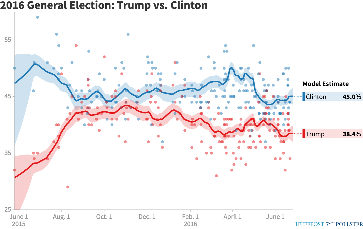
How much and in what direction the gap has changed of course all depends on what timeframes you are comparing.
Trump had narrowed the national gap with Clinton to only about 3.2% in mid May. (The RCP average actually had him very slightly ahead at the peak.) Since then, he has fallen back.
But he is still better off than he was in late April. And he has improved even more dramatically if you compare to late March. So the longer term national trend is the gap between Trump and Clinton narrowing, despite the opposite movement in the last month.
With the high resolution polling on the national picture, you could see the “Trump Bump” when after securing the nomination Trump closed the gap and then fell back again. With the slower state by state picture, that essentially may have happened too quickly for it to be visible.
Overall Clinton is clearly in a dominant position over Trump.
But Trump has indeed been catching up in a number of states. He hadn’t actually pulled a state over to his side since February though. Just as it is now, it was also North Carolina back then… and that time it only lasted a month or so before the state went blue again.
We will see soon enough if North Carolina stays red longer this time, and if Trump can pull more “Weak Clinton” states to his side. Pulling back Arizona would be the obvious first target, followed by Pennsylvania, Iowa and Florida. With those four states, Trump would take an overall lead for the first time.
That is all it would take. Four states. Of these Trump is furthest behind in Florida, but he is only behind by 3.0% there. With all the talk of how dire Trump’s situation is, he really isn’t that far back.
If Trump has a few good weeks and Clinton has a few bad weeks, that can change quickly.
Keep watching. 135.8 days until the polls start closing on election day.
Note: This post is an update based on the data on ElectionGraphs.com. Election Graphs tracks both a poll based estimate of the Electoral College and a numbers based look at the Delegate Races. All of the charts and graphs seen in this post are from that site. Additional graphs, charts and raw data can be found there. Follow @ElectionGraphs on Twitter or like Election Graphs on Facebook to see announcements of updates or to join the conversation. For those interested in individual general election poll updates, follow @ElecCollPolls on Twitter for all the polls as they are added. If you find the information in these posts interesting or useful, please consider visiting the tip jar.
Since the last update there have been new polls in Arizona, Washington, Illinois, Iowa, Florida, Ohio, Pennsylvania, and Utah. The latest ones in Pennsylvania, Arizona and Utah made differences to the Electoral Graphs model. Two of these moves favored Trump, but one favored Clinton.
We’ll cover them in order of how many electoral votes each state has.
Pennsylvania (20 EV)
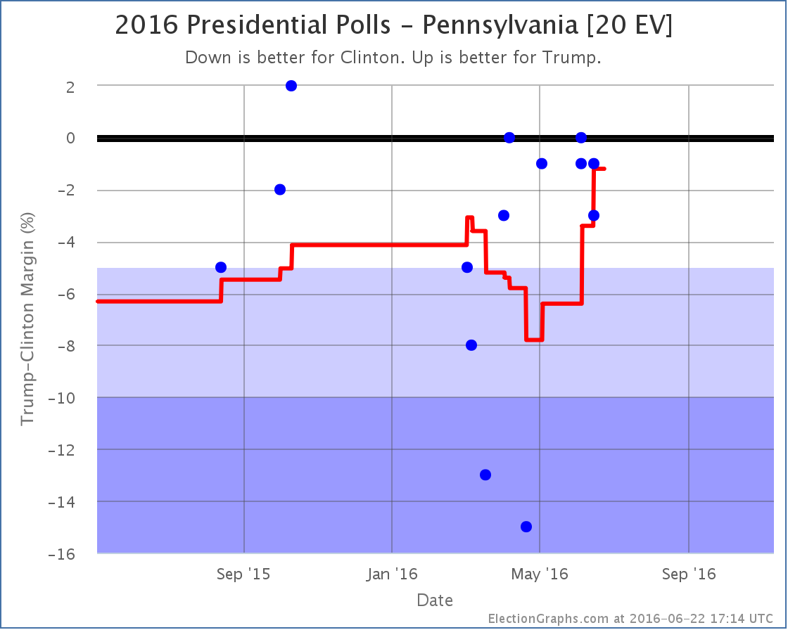
The polling average moves from Clinton by 3.4% to Clinton by 1.2% as a really good poll for Clinton (15% lead) from April rolls off the average, replaced by polls showing a close race. The state doesn’t change categories, it is still a “Weak Clinton” state, but this continues the Trumpward movement in Pennsylvania, and since Pennsylvania was the tipping point state, it moves the tipping point in Trump’s direction:
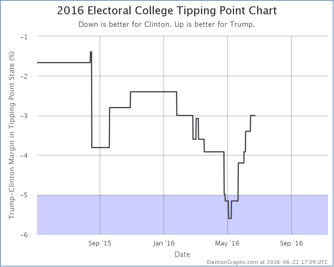
On the tipping point metric, Trump has been improving consistently since the beginning of May. This despite the continued downward trend in the national numbers. As I discussed last time, this has happened in enough states at this point that it seems like it may be a real thing. Trump is getting closer in some states, while simultaneously falling further behind nationally.
Arizona (11 EV)
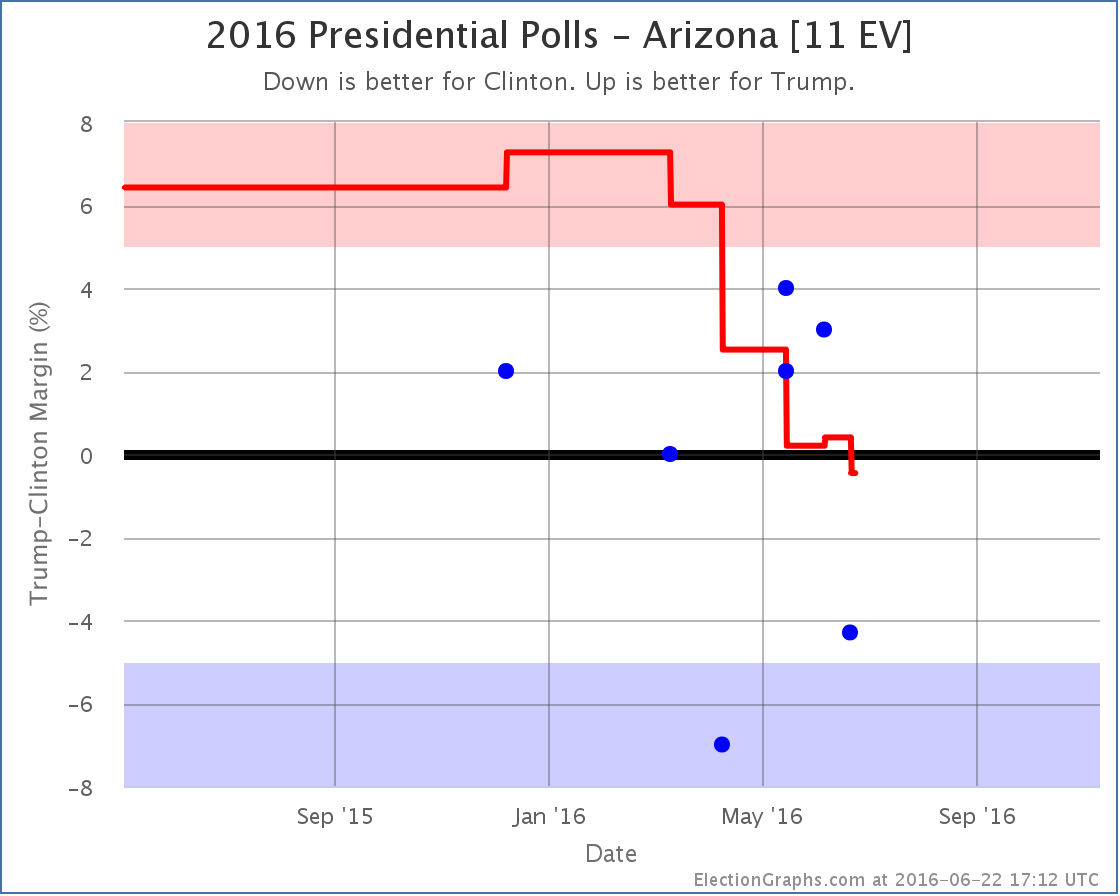
While the tipping point was moving toward Trump, Arizona has been moving toward Clinton. With the latest updates, Arizona moves from an 0.4% Trump lead to a 0.5% Clinton lead. Either way, Arizona is currently looking like a state that could go either way. But for the first time this cycle, Arizona is now on the blue side of the line. Arizona hasn’t gone Democratic in a presidential election since 1996. That isn’t as long as a state like Utah, but it is still quite some time, and it is remarkable that the poll average is showing Democrats with a lead, no matter how small.
Utah (6 EV)
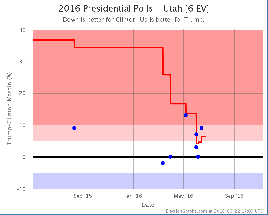
Meanwhile, as Arizona dips into the blue, Utah, which had briefly dropped into the competitive zone, once again looks a little stronger for Trump, and thus moves out of the category that could go either way. Having said that, we’re still looking at the smallest Republican margin in Utah in many decades. Just not quite as narrow as it looked.
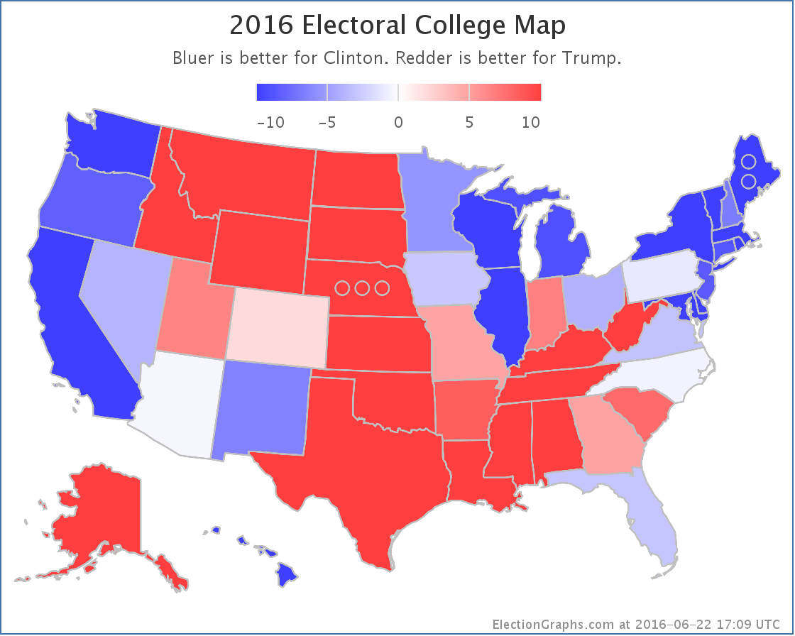
National Summary
With Arizona flipping to the blue, improving the expected case for Clinton, and Utah pulling back out of the competitive zone, reducing Clinton’s best case, the national map now looks like this:
The center of the spectrum of the states (excluding the solid states where one candidate leads by more than 10%) looks like this:
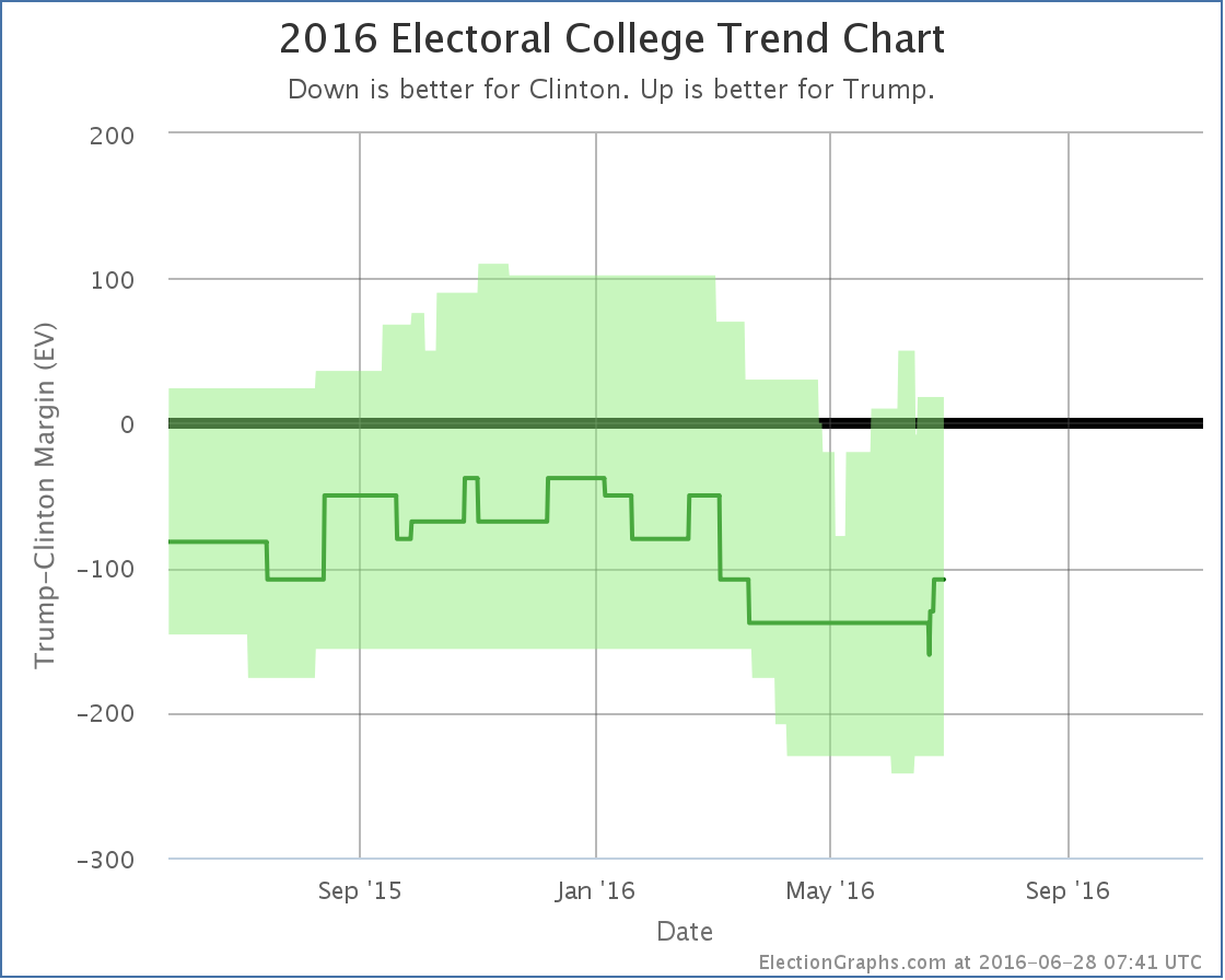
And the trend bubble…

It is hard to call a trend on this.
Look at the center line (the expected case) and every move since February has been toward Clinton.
Look at the top of the bubble (Trump’s best case) or the tipping point (see chart earlier in this post) and every move since early May has been toward Trump.
Look at the bottom of the bubble (Clinton’s best case) and things were moving toward Clinton until June, then started moving back toward Trump.
And of course the national polls have been moving toward Clinton for awhile now.
So what is really the trend? Well, all of them. They measure different things. Clinton’s absolute electoral college and popular vote leads are growing. But Trump is making more states close, which means his best case is improving, and the tipping point is getting closer. While meanwhile, for the moment anyway, Clinton’s best case may have hit a ceiling and be bouncing off it.
It is more complex than just looking at which direction a single number is going.
But in the end, if you have to look at only one number, it is probably the “expected” line. To win, Trump has to make that line move upward. It hasn’t been going that way for months, and it has never shown a Trump win.
Trump has 138.7 days to change that.
Note: This post is an update based on the data on ElectionGraphs.com. Election Graphs tracks both a poll based estimate of the Electoral College and a numbers based look at the Delegate Races. All of the charts and graphs seen in this post are from that site. Additional graphs, charts and raw data can be found there. Follow @ElectionGraphs on Twitter or like Election Graphs on Facebook to see announcements of updates or to join the conversation. For those interested in individual general election poll updates, follow @ElecCollPolls on Twitter for all the polls as they are added. If you find the information in these posts interesting or useful, please consider visiting the tip jar.
|
|