Since the last update there have been new polls in Arizona, Washington, Illinois, Iowa, Florida, Ohio, Pennsylvania, and Utah. The latest ones in Pennsylvania, Arizona and Utah made differences to the Electoral Graphs model. Two of these moves favored Trump, but one favored Clinton.
We’ll cover them in order of how many electoral votes each state has.
Pennsylvania (20 EV)
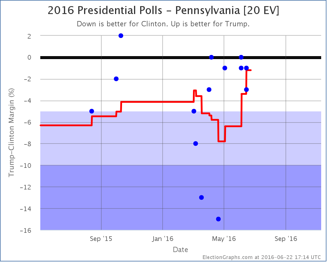
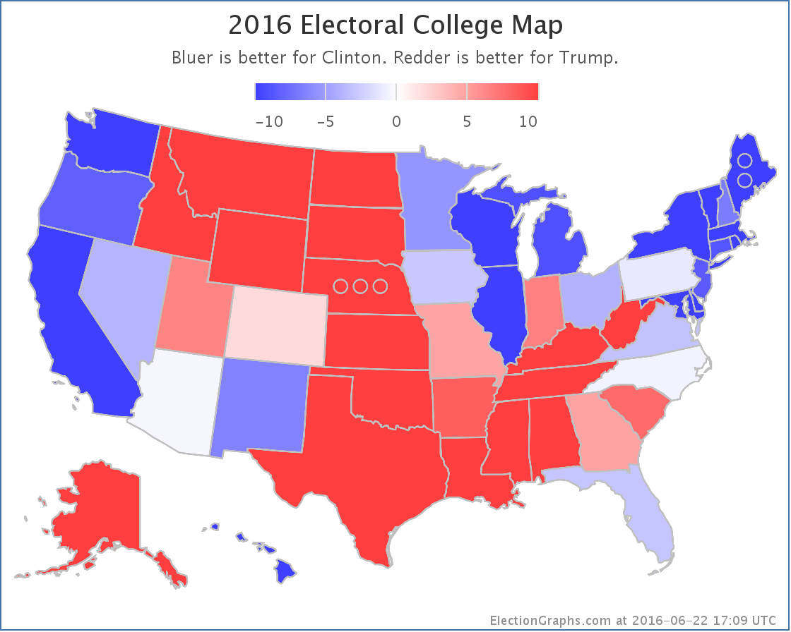
The polling average moves from Clinton by 3.4% to Clinton by 1.2% as a really good poll for Clinton (15% lead) from April rolls off the average, replaced by polls showing a close race. The state doesn’t change categories, it is still a “Weak Clinton” state, but this continues the Trumpward movement in Pennsylvania, and since Pennsylvania was the tipping point state, it moves the tipping point in Trump’s direction:
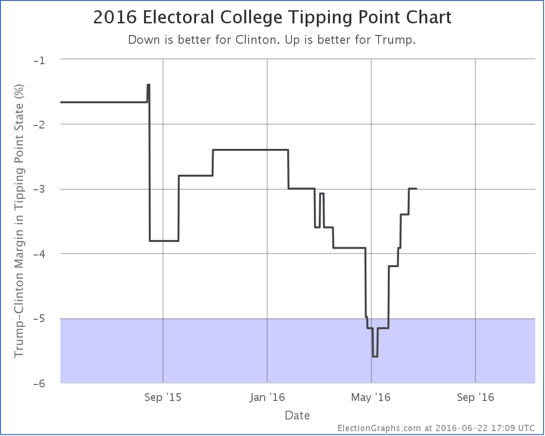
On the tipping point metric, Trump has been improving consistently since the beginning of May. This despite the continued downward trend in the national numbers. As I discussed last time, this has happened in enough states at this point that it seems like it may be a real thing. Trump is getting closer in some states, while simultaneously falling further behind nationally.
Arizona (11 EV)
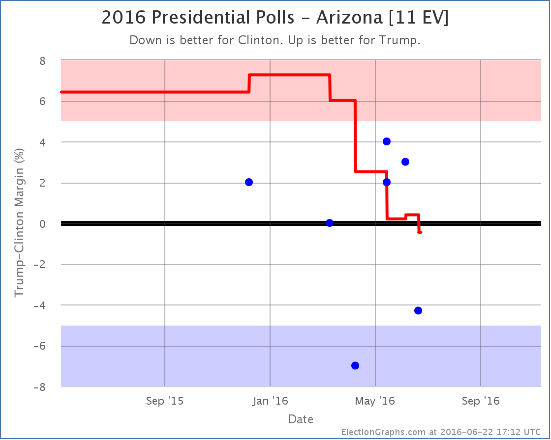
While the tipping point was moving toward Trump, Arizona has been moving toward Clinton. With the latest updates, Arizona moves from an 0.4% Trump lead to a 0.5% Clinton lead. Either way, Arizona is currently looking like a state that could go either way. But for the first time this cycle, Arizona is now on the blue side of the line. Arizona hasn’t gone Democratic in a presidential election since 1996. That isn’t as long as a state like Utah, but it is still quite some time, and it is remarkable that the poll average is showing Democrats with a lead, no matter how small.
Utah (6 EV)
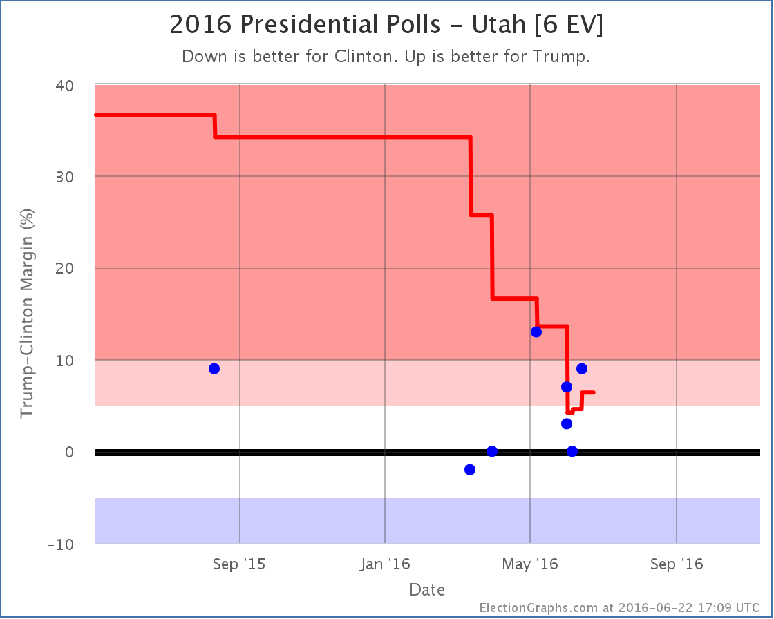
Meanwhile, as Arizona dips into the blue, Utah, which had briefly dropped into the competitive zone, once again looks a little stronger for Trump, and thus moves out of the category that could go either way. Having said that, we’re still looking at the smallest Republican margin in Utah in many decades. Just not quite as narrow as it looked.
National Summary
With Arizona flipping to the blue, improving the expected case for Clinton, and Utah pulling back out of the competitive zone, reducing Clinton’s best case, the national map now looks like this:
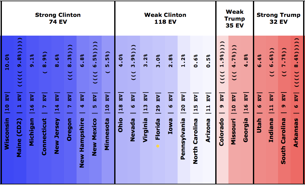
The center of the spectrum of the states (excluding the solid states where one candidate leads by more than 10%) looks like this:
And the trend bubble…
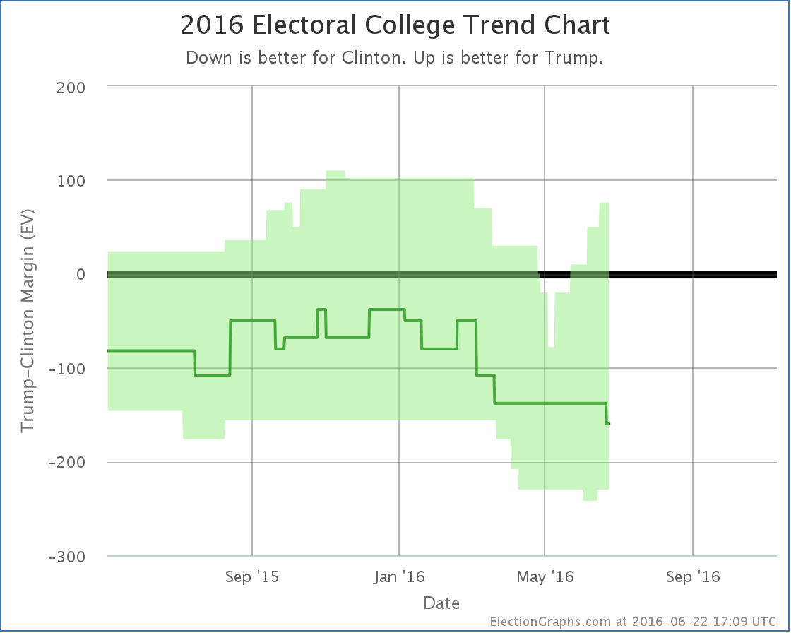
It is hard to call a trend on this.
Look at the center line (the expected case) and every move since February has been toward Clinton.
Look at the top of the bubble (Trump’s best case) or the tipping point (see chart earlier in this post) and every move since early May has been toward Trump.
Look at the bottom of the bubble (Clinton’s best case) and things were moving toward Clinton until June, then started moving back toward Trump.
And of course the national polls have been moving toward Clinton for awhile now.
So what is really the trend? Well, all of them. They measure different things. Clinton’s absolute electoral college and popular vote leads are growing. But Trump is making more states close, which means his best case is improving, and the tipping point is getting closer. While meanwhile, for the moment anyway, Clinton’s best case may have hit a ceiling and be bouncing off it.
It is more complex than just looking at which direction a single number is going.
But in the end, if you have to look at only one number, it is probably the “expected” line. To win, Trump has to make that line move upward. It hasn’t been going that way for months, and it has never shown a Trump win.
Trump has 138.7 days to change that.
Note: This post is an update based on the data on ElectionGraphs.com. Election Graphs tracks both a poll based estimate of the Electoral College and a numbers based look at the Delegate Races. All of the charts and graphs seen in this post are from that site. Additional graphs, charts and raw data can be found there. Follow @ElectionGraphs on Twitter or like Election Graphs on Facebook to see announcements of updates or to join the conversation. For those interested in individual general election poll updates, follow @ElecCollPolls on Twitter for all the polls as they are added. If you find the information in these posts interesting or useful, please consider visiting the tip jar.
Leave a Reply
You must be logged in to post a comment.