This post gives an overview of the Election Graphs Delegate Race site for 2016, highlighting the major charts, graphs and features of the site, and how to interpret some of that is there. Or just ignore this and go to the site and explore. But if you want an item by item explanation of what you will see there, then read on.
New Overview Page
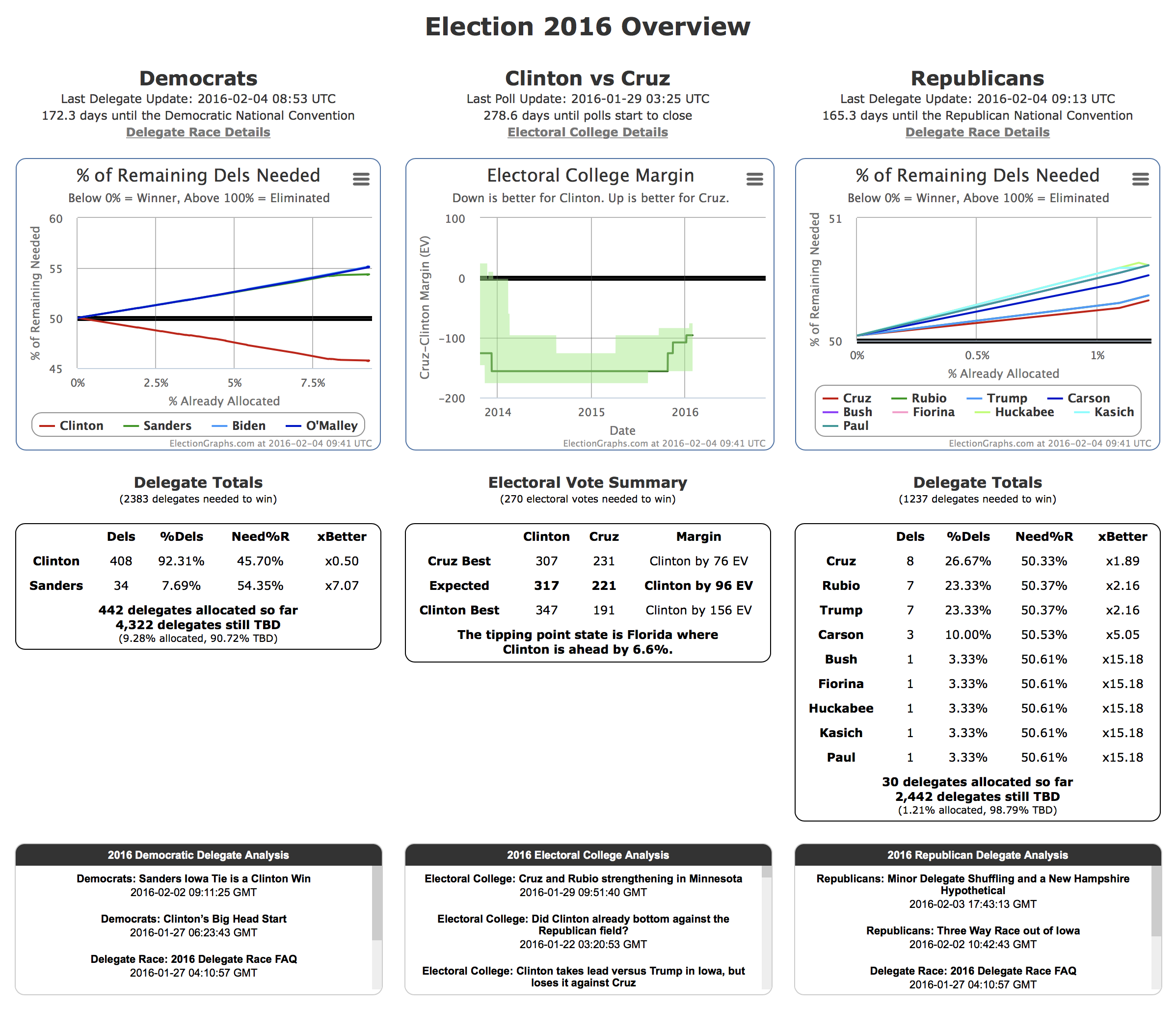
First of all, while not technically part of the Delegate Race coverage pages, I should mention that with the launch of the Delegate Race, the home page of electiongraphs.com has been changed so that rather than just concentrating on the Electoral College race, it gives thumbnail versions of the most important information on both Delegate Races and the Electoral College for the general election. I won’t go over all the specific elements on this page because everything is covered either here or in the Tour of the Electoral College part of the site published back in 2014. From this starting point you can of course easily get to all of the details on both the Electoral College and Delegate Race sides of the site.
The candidate combination in the center will be the delegate leaders in both parties as soon as both parties actually have delegate leaders. Until then, it shows the best polled candidate combination.
Two Columns
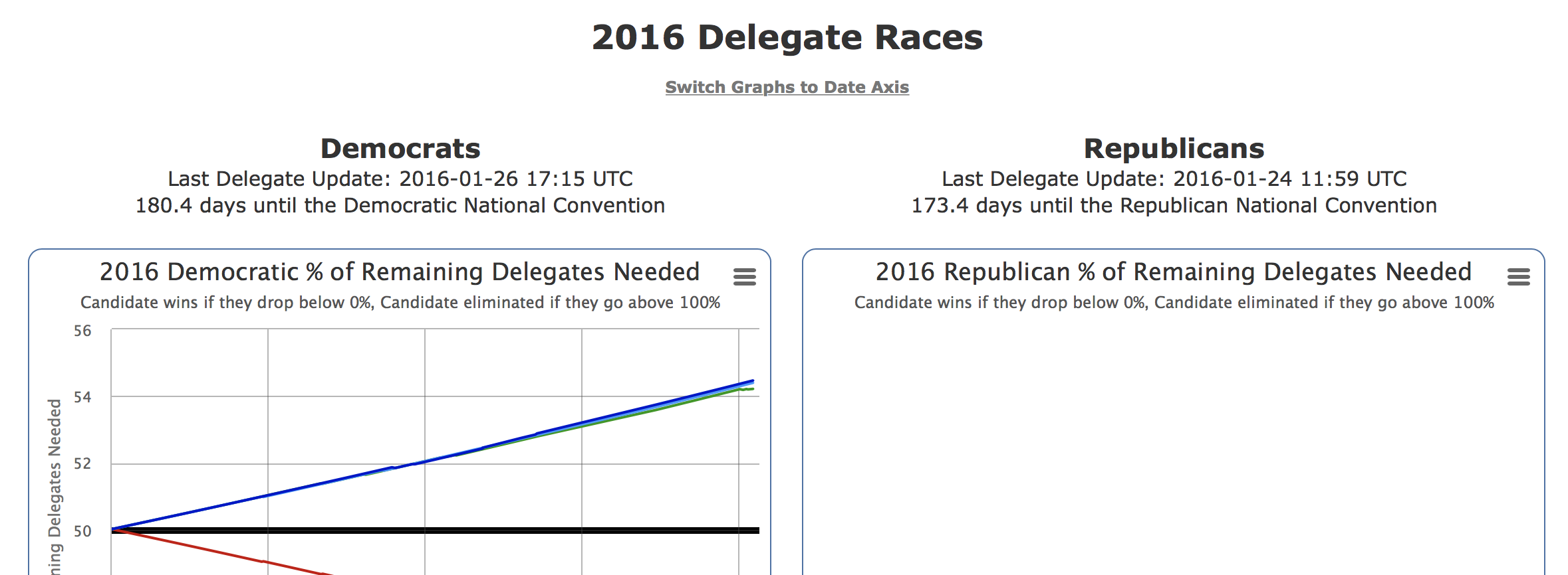
The main structure of the 2016 Delegate Races page is two columns. Democrats on the left, Republicans on the right. (Would you arrange them differently? :-) )
Everything on the page runs in parallel for the two parties, showing the same type of data for each. I will use the Democrats as the examples for the rest of this tour, simply because as of a little over a week before Iowa as this is written, there is actual data for the Democrats because of the super delegates who have already expressed a preference, while there won’t be real delegate data for the Republicans until the Iowa caucus results are known.
Updates and Countdown
The heading should be self-explanatory. :-) A timestamp for the last data update and a count down to the start of the convention.
% of Remaining
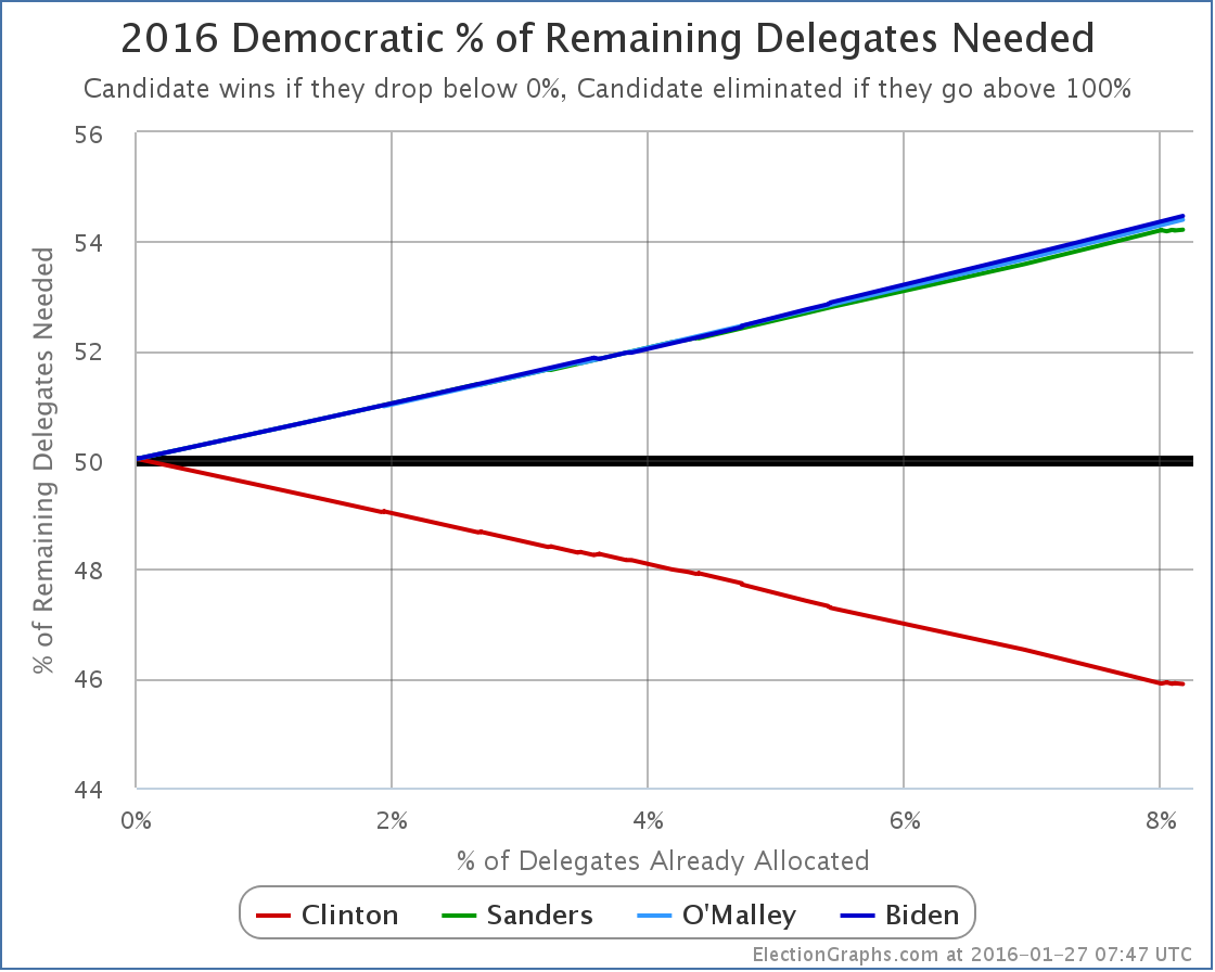
This is one of the critical charts I alluded to in the last post.This shows the percentage of the remaining delegates that each candidate needs to get in order to win the nomination on the first ballot at the convention. On this kind of chart, going DOWN is good. It means you are so far ahead that you only need a small percentage of the delegates that are left to win.
Once this number goes to 0%, it means you don’t need any more delegates, you have already won.
The flip side of this is that if it goes to 100%, you have been eliminated. You could get every outstanding delegate and it still wouldn’t be enough.
And specifically during the contest, at any given time, this number is the level you need to get on each new delegate contest as it comes up to be “on pace” to win. So, for example, with the state of the chart above, you can see that Sanders would need to get a little over 54% of the delegates in the next context (the Iowa caucuses) to be on track to win the nomination. If he got 52% of the delegates, he might well have “won Iowa”, but not by enough. He would actually be in a worse position going into New Hampshire in terms of the delegate race, needing an even higher percentage to be on pace the next time around.
Now, that is of course in terms of the pure delegate race. Given the psychology involved, if getting 52% in Iowa was perceived as such a huge win that it boosts his likely delegate haul in New Hampshire from 53% to 60% or some such, then even though the Iowa result put him in a worse position short term, it might boost long term prospects. This is the kind of calculus that occurs during the race, but boosts like that only go so far, in the end watch the math and where this chart goes.
Note a situation where ALL candidates go up to 100% rather than one of them heading down to 0%, is exactly the situation that would lead to a so-called “contested convention” where there is no clear winner going into the convention.
Delegate Totals
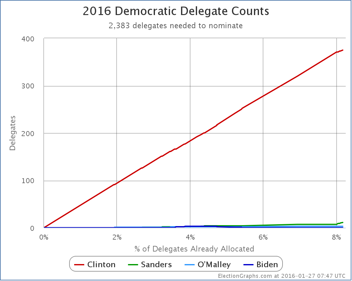
The raw estimate of the number of delegates supporting the candidate. This is a “soft count” meaning it includes not just delegates who are formally bound to a candidate, but also unbound delegates who have expressed a preference, and in cases of multi-stage processes, estimates of the final numbers based on the results of the earlier stage. As estimates, these numbers can change, going both up and down as the estimates are refined. Delegate numbers can of course also go down when a candidate drops out and releases their delegates.
% of Delegates
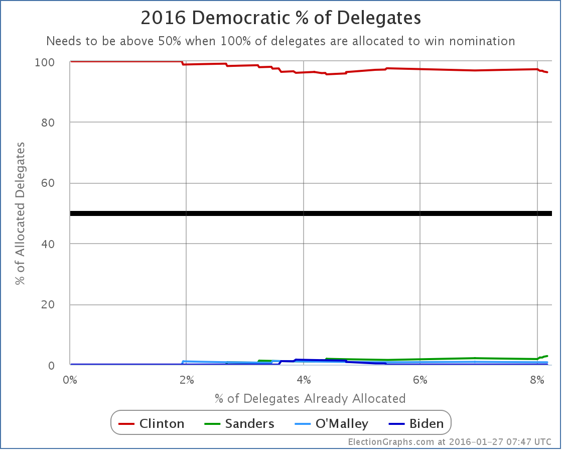
This is the percentage of the delegates allocated so far that have supported each candidate. This shows how well the candidate is doing so far. It may or may not be directly reflective of how well they will do in the rest of the race. That can be influenced by many factors, but it is reasonable to think that for there to be a dramatic change in performance, there would have to be dramatic events or dramatic differences in the landscape causing the change.
Now, as an example, the change from the pre-Iowa world where all the delegates are Democratic insiders to post-Iowa where delegates are actually determined by real people voting is an example of a pretty dramatic change. So for instance, a change from Clinton getting 95%+ of the delegates to something lower would not only not be unexpected, but it would be surprising if such a shift did not happen.
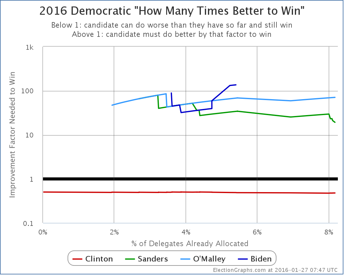
This is a second way of looking at how much work a candidate needs to do to win. The percentage of the remaining delegates tells you a lot, but this divides that by how well they have been doing so far, to give a representation of just how much better a candidate has to do in order to catch up and win if they are behind, or how much leeway to do worse a candidate who is on a winning pace has. So, for instance, if so far a candidate has been getting 30% of delegates, but they need 60% of delegates in order to win, then they would need to do 2x better than they have been to win.
This chart it shown with an logarithmic scale due to the large range of values seen.
Summary Table
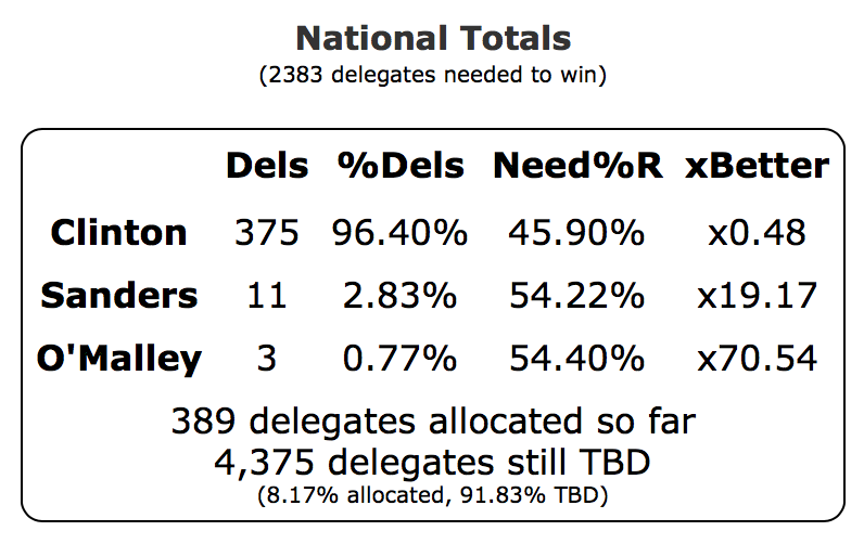
The site is Election Graphs, and the most important graph is the % remaining graph, so that came first, and I even talked about all the charts lower on the page before mentioning this, but this is the table with all the detailed numbers behind the data, plus some basic numbers around how many delegates have been allocated, how many are left, how many are needed to win, etc.
This covers only a snapshot of the numbers at the current time. Historical data is only available in the charts. (Or in the raw data I provide if someone wants to parse it to recreate the time series data.)
State Delegate Counts
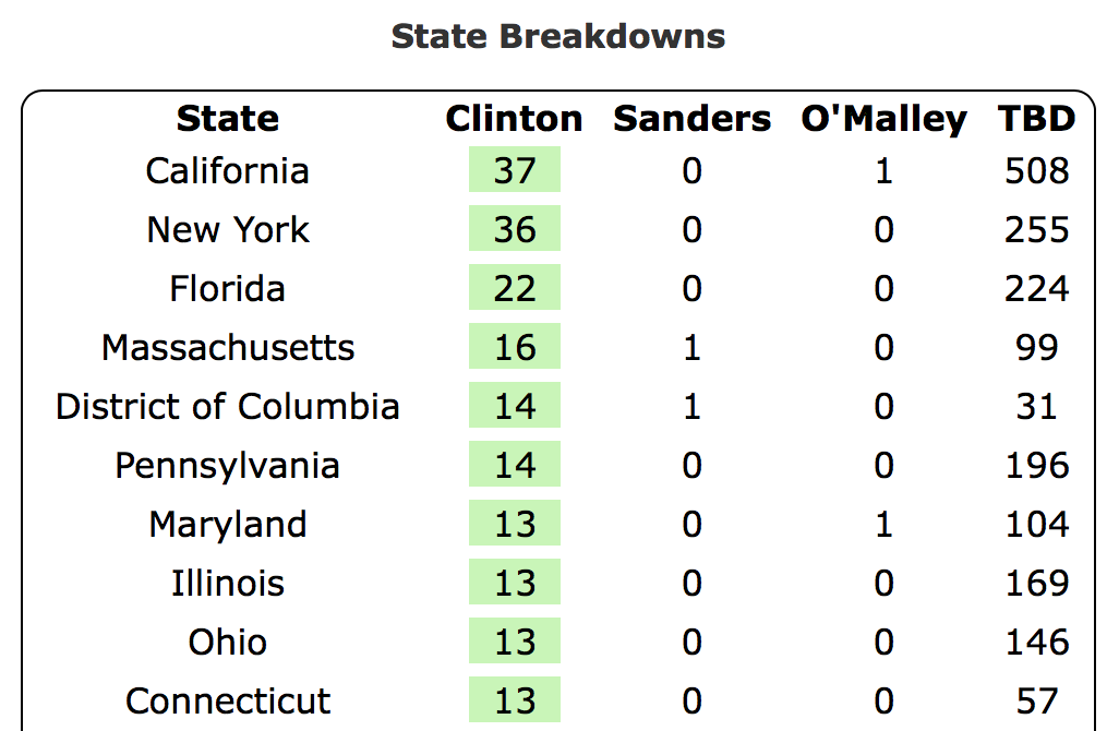
At the bottom of the page is a state by state breakdown of the delegate estimates. The states are listed in order of how many delegates have been allocated so far. The candidate(s) currently leading in each state are highlighted in green. Because of the ways in which delegate allocation works, including the presence of unbound delegates, the delegate leader does not necessarily have to match the winner in the voting reported in primaries and caucuses. And indeed, as seen above, there can be many delegates allocated before any voting takes place at all.
Graphs with a Date Axis
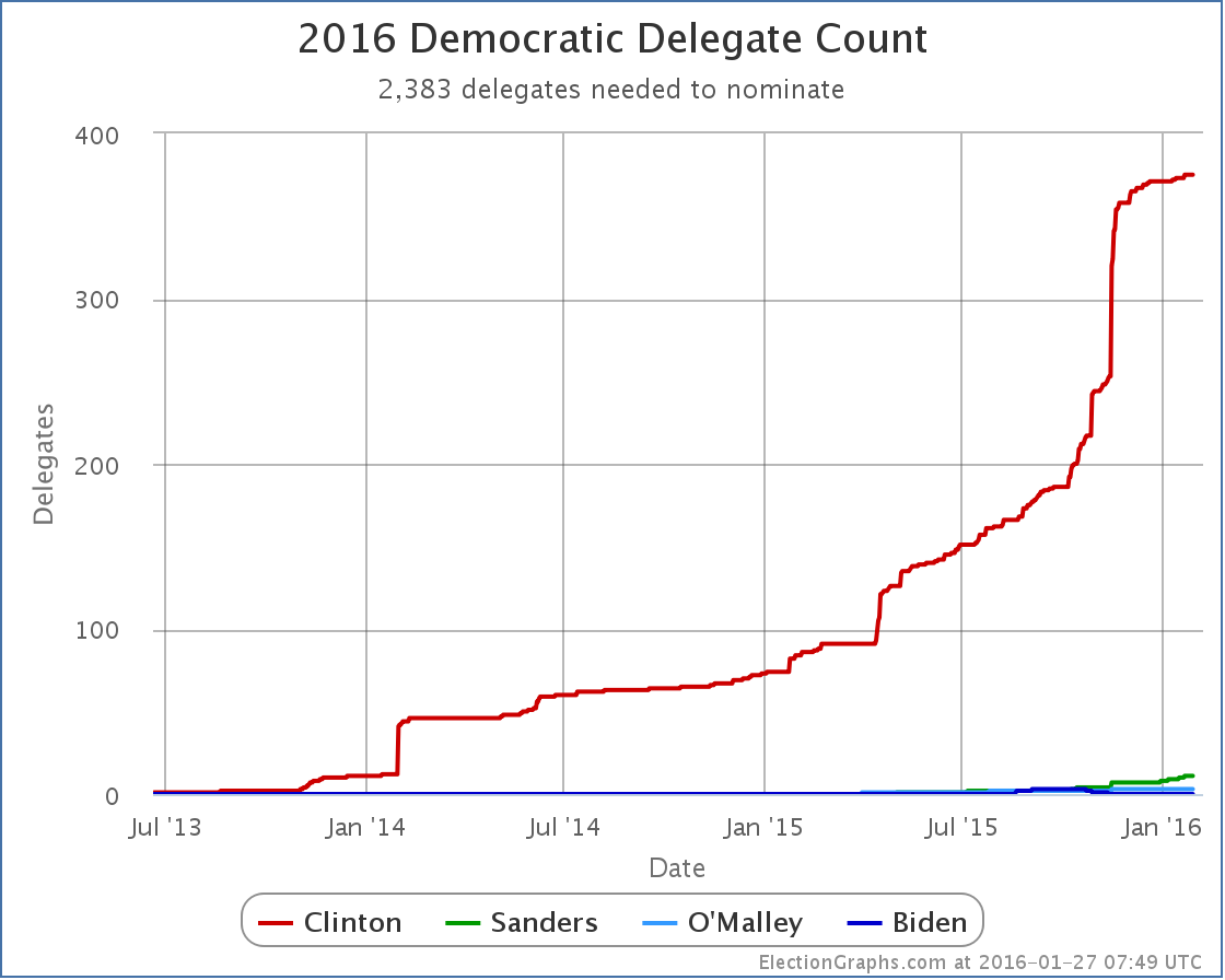
Looking at the delegate race based on % of delegates allocated does give a better real sense of how far along in the process it really is, but sometimes you just want to see things as they look on a more familiar date axis. At the very top of the page there is a “Switch Graphs to Date Axis” link that shifts all the graphs to be date based instead of percent of delegates based.
Once in that mode, you can of course toggle back to the % of delegates view, but you can also toggle between starting the charts whenever the first delegates were logged (so in the case of the Democrats in the 2016 cycle, way back in June 2013) or starting the charts only on the date of the Iowa caucuses (Feb 1st 2016).
Links to Blog Posts
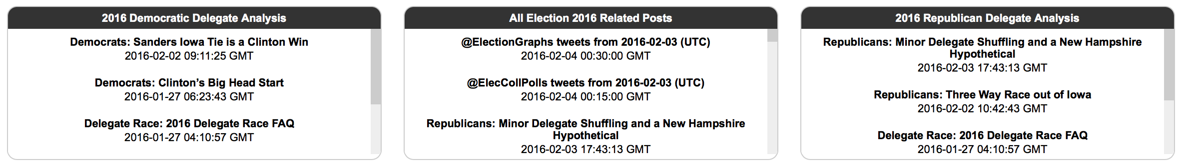
Oh yeah, and in the middle somewhere there, there are three blocks with links to relevant blog posts. The left and right blocks contain only blog posts with analysis of the delegate race for the parties in that column. The middle block also includes articles on the Electoral College race, episodes of the Curmudgeon’s Corner podcast that talk about the election, and digests of posts made by the @ElectionGraphs and @ElecCollPolls twitter accounts.
Notes
Finally, at the very bottom of the page are places to follow Election Graphs, some notes about sources, links to raw data, etc. If you are into those things, enjoy.
Note: This post is an update based on the data on ElectionGraphs.com. Election graphs tracks both a poll based estimate of the Electoral College and a numbers based look at the Delegate Races. All of the charts and graphs seen in this post are from that site. Additional graphs, charts and raw data can be found there. All charts above are clickable to go to the current version of the detail page the chart is from, which may contain more up to date information than the snapshots on this page, which were current as of the time of this post. Follow @ElectionGraphs on Twitter or like Election Graphs on Facebook to see announcements of updates or to join the conversation. For those interested in individual general election poll updates, follow @ElecCollPolls on Twitter for all the polls as they are added.
[Edit 2016-01-27 03:19 UTC to add final note]
[Edit 2016-01-27 06:59 UTC to update screenshots to retina resolution]
[Edit 2016-01-27 08:06 UTC to update graphs]
[Edit 2016-02-02 11:30 UTC to update section on blog post links to reflect split of Democratic and Republican blocks]
[Edit 2016-02-04 09:45 UTC to update screenshots for overview page and RSS feeds to reflect current structure]