This is the website of Abulsme Noibatno Itramne (also known as Sam Minter). Posts here are rare these days. For current stuff, follow me on Mastodon

Categories

Calendar

January 2016
S M T W T F S
 12
3456789
10111213141516
17181920212223
24252627282930
31  

Democrats: Clinton’s Big Head Start

The Election Graphs delegate tracker is live! In the last few hours I have posted an intro to this effort, a tour of the new features, and a FAQ. But now it is time to get into the meat of things and start talking about results and what they mean.

While the Republican Party does have unbound delegates that will be able to make up their own minds independently, most of those people won’t be officially chosen until the primary/caucus season is well underway, and regardless, I haven’t yet found a good source of information tracking which of these folks is publicly supporting which Republican candidate. So the flow of delegate information for the Republicans won’t start until we get the results of the Iowa caucuses next week.

But on the Democratic side… most of the “superdelegates” are already known (although some may change before the convention). The superdelegates are Governors, Senators, Representatives, members of the Democratic National Committee, and “Distinguished Party Leaders”. As Democratic activists, these people very often are quite public about who they support. And they show up in news reports when they do that. And there are places tracking it.

Since this is the first analysis post of the primary season, I’m going to walk through the charts I use on my site, building up to the main one I believe is the one worth concentrating on going forward. If you just want to get straight to the punchline of how this race is going, skip to the last chart in the post and read from there.

Since June of 2013, slowly but surely, the superdelegates have been publicly choosing sides…

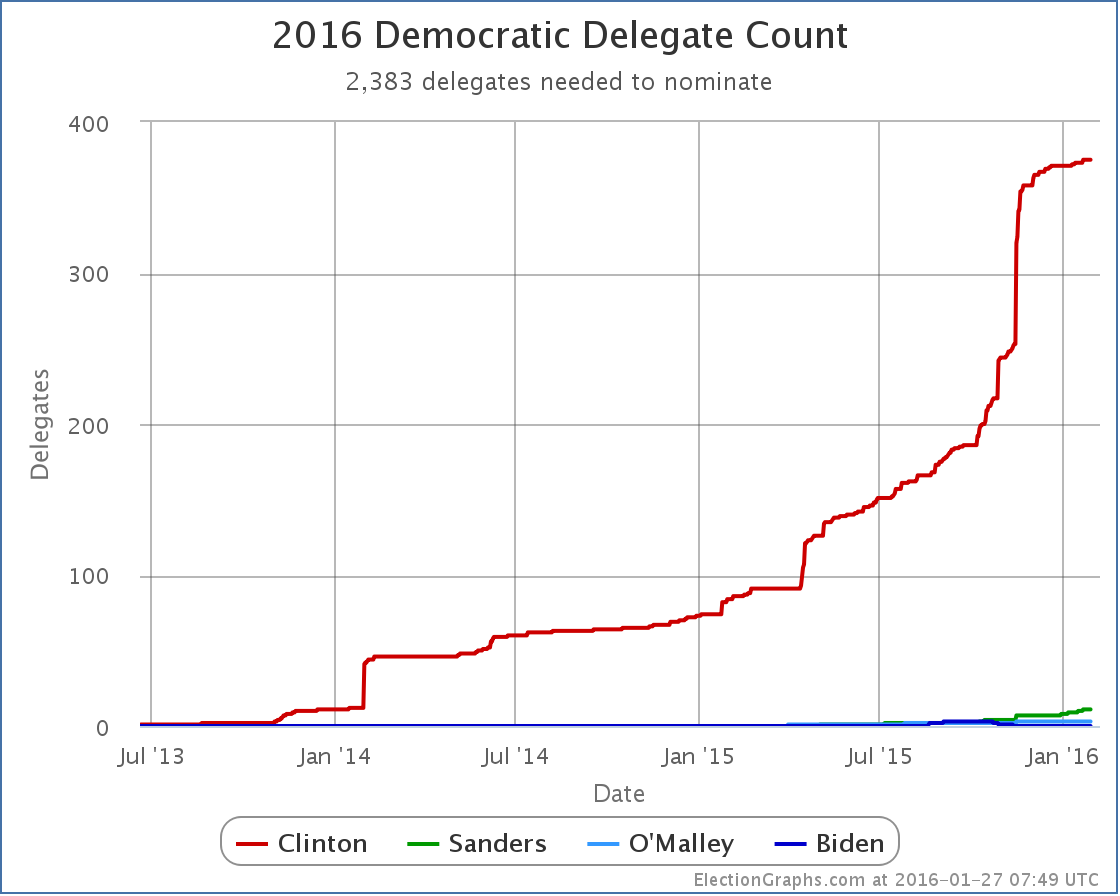
See the red line? That is Clinton. See the Green line? That is Sanders. Clinton is absolutely dominant here.

By my best count, 389 of the 713 superdelegates have expressed a preference, and 375 of those have come out for Clinton. Sanders has 11. O’Malley 3.

Now, the chart above is by date. It looks all jumpy because the delegates revealed their preferences at various random times, with a few big jumps when things happened, like Clinton officially announcing, or when AP did a survey of all the superdelegates. That can be interesting, but actually distorts the picture of how the race is coming along. Time to do a quick switch and show how this looks when we look at the % of delegates allocated instead of the date:

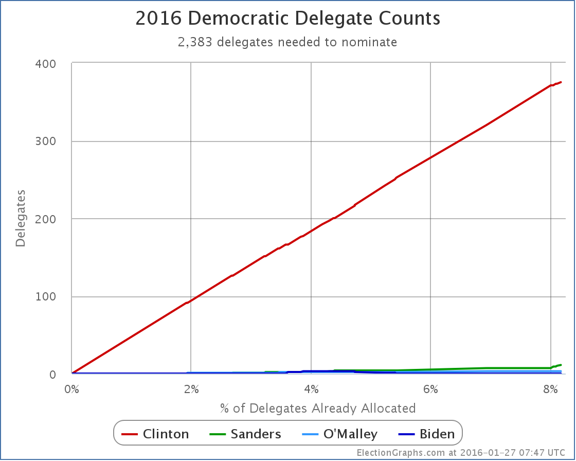
Suddenly, we have nearly a straight line. The lumpiness caused by the uneven distribution of delegate preference announcements over time is gone and we get a much clearer look at what is happening. We see that over 8% of the delegates to the convention have already expressed a preference. Clinton has been consistently racking these up as they come in. She is dominating in this race. But by how much? Lets switch to looking at the % of delegates each candidate has…

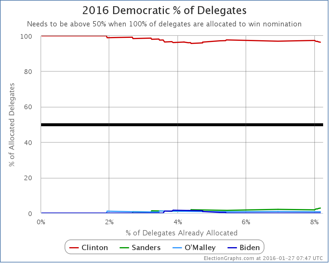
Once again we see that Clinton is dominant, but a few more details start to be seen. For instance we see that so far at least, Clinton’s weakest point was between the 4% and 5% marks when Biden, Sanders and O’Malley all had a few delegates in their columns and Clinton had about half the delegates she has today. But Biden dropped out, and Clinton kept on getting delegates at a pace not matched proportionately by Sanders or O’Malley, so Clinton’s dominant percentage increased again for awhile.

Very recently though, at the tail end of this chart, you can see that Sanders has been collecting delegates at a fast enough pace that his percentage has actually been going up, while Clinton’s has been decreasing. The Sanders percentage is still small, but it is going up. So where does that put Sanders? How about his surge? Can he win?

Time to look at the chart I consider to be the most important one to look at for understanding the race. Instead of looking at the percentage of delegates each candidate already has, we shift to looking at the percentage of the remaining delegates that the candidate would need to get in order to win the nomination:

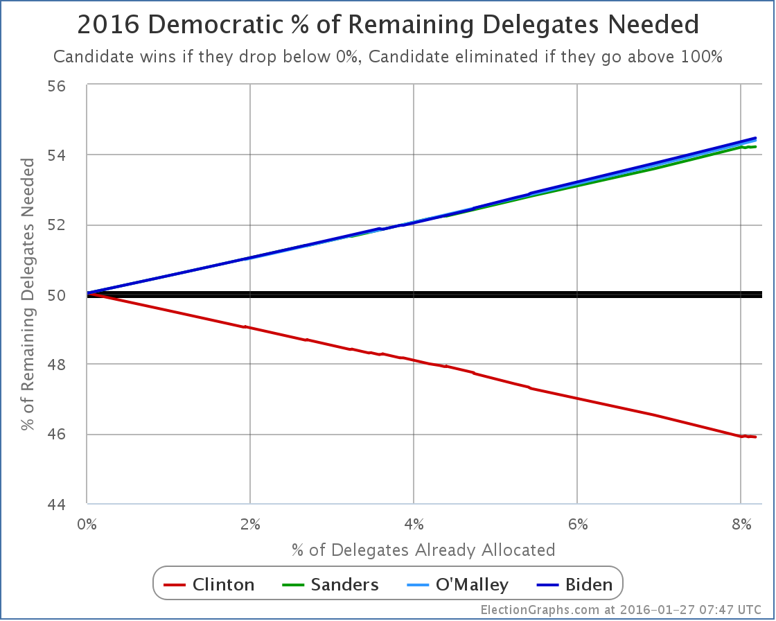
As Clinton racks up delegates, it becomes harder and harder to catch up. With the lead she already has based on superdelegates, in order to win, Sanders doesn’t need to get 50% of the remaining delegates, he needs to get 54.22% of the remaining delegates.

Specifically looking at Iowa, 44 delegates are at stake.

To be clear, no Democratic delegates will actually be earned on the night of the Iowa caucus. It is the first step of a multi-stage process that won’t end until June. But after the precinct caucus results next week, we’ll be able to make estimates based on the initial vote results and what we know about the specific delegate allocation rules in Iowa.

With 44 delegates up for grabs, given the 54.22% number we calculated, for Sanders to actually put himself in a better position after Iowa than before, Sanders doesn’t need 22 or 23 delegates, he needs 24.

Now, if Sanders gets more delegates than Clinton, the media and press coverage about the Sanders surge and the risk to Clinton will be overwhelmingly loud. Nobody other than this site will be talking about how he won, but didn’t get to 24, so he is actually worse off. Everything will be about the Sanders win and his “momentum”.

And there is some fairness to this. If Sanders wins Iowa’s popular vote, no matter what the delegate estimates turn out to be, he will get a lot of positive attention. And people will talk about how Clinton is a lot weaker than she had seemed. That talk may improve Sanders’ position in New Hampshire or in other states further down the road. Perhaps it would boost him enough to compensate for the increase in the “% of remaining needed to win” that would result from falling short of 54.22% in Iowa. Getting a narrow win that doesn’t get enough delegates to actually improve the overall position in the short term may actually still have a positive impact in the medium to long run. Spin matters.

The polls are close in Iowa, either Clinton or Sanders could easily take the state. But the numbers to watch are not the popular vote totals. You shouldn’t even be looking simply at who is estimated to get the most delegates. The question is if the person who gets the most delegates gets enough to be on pace to win.

For someone other than Clinton to win, they have to start by catching up. This already means that they have to get more than 54% of delegates as we go forward. If they fail to reach that number, with each subsequent contest they will have to do even better to catch up.

If they do reach that bar though, each subsequent contest becomes easier. That’s the way it works. But the target is not getting the most delegates in each contest. It is getting more than the number you need to be on pace to win. Right now Sanders needs 54.22% of the delegates. Clinton only needs 45.90% of the delegates. She doesn’t even need to get a majority since she has already banked so many delegates before voting even starts.

So far, in the “invisible primary”, Clinton has scored an incredible 96.4% of the delegates. This will not continue. The Democratic leaders that make up the superdelegates have a very different perspective and background than Iowa caucus goers, or New Hampshire primary voters. Sanders will do better than the 2.8% of delegates he has managed so far. The question is how much better and if it puts him on track to actually catch up and win, or if it quickly becomes apparent that he is just playing the role of the protest candidate almost everyone originally expected him to be.

If Sanders doesn’t get to that 54.22% mark in Iowa, we may know pretty quickly that he is falling short, although if he wins in the popular vote, there will still be a crazy media circus for weeks.

If he exceeds that mark though, then the media howling might actually be warranted. At least until South Carolina. South Carolina is a very different state than either Iowa and New Hampshire, and the picture might change dramatically again after that.

But the next few weeks will be exciting almost any way the results go. And we haven’t even talked about the Republicans this time since there aren’t any delegates to look at quite yet. There will certainly be quite a bit of excitement on that side as well.

Tune in here for all the twists and turns as this race shifts into high gear!

Just under a week until Iowa. Hold on tight.

Note: This post is an update based on the data on ElectionGraphs.com. Election Graphs tracks both a poll based estimate of the Electoral College and a numbers based look at the Delegate Races. All of the charts and graphs seen in this post are from that site. Additional graphs, charts and raw data can be found there. All charts above are clickable to go to the current version of the detail page the chart is from, which may contain more up to date information than the snapshots on this page, which were current as of the time of this post. Follow @ElectionGraphs on Twitter or like Election Graphs on Facebook to see announcements of updates or to join the conversation. For those interested in individual general election poll updates, follow @ElecCollPolls on Twitter for all the polls as they are added.

[Edit 06:45 UTC to fix wording]

[Edit 08:09 UTC to update graphs]

[Edit 08:15 UTC to fix typo]

[Edit 2016-02-02 06:03 UTC to change “Delegate Race” in title to “Democrats” in preparation for separating posts on the two races]

Delegate Race: 2016 Delegate Race FAQ

This is a FAQ for the 2016 Delegate Race portion of ElectionGraphs.com. The FAQ for the Electoral College portion is here.

Why are you doing this?

Fundamentally, because I have fun with it. But in addition I think I’ve added a couple things beyond the usual delegate tracking you find everywhere in the primary season that are useful and interesting.

OK, what are those things?

First up is tracking the percentage of remaining delegates needed to win. I think this gives a better measure of how the race is going than just looking at the delegate totals alone, because it captures how much harder it is to change the outcome as the race progresses and the frontrunners accumulate delegates.

Second is tracking the various metrics against the percentage of delegates allocated so far, rather than against the date. This gives a better understanding of just how far along the process it is than the date does, since the distribution of delegate allocation “events” is very clumpy, not evenly distributed through the primary season. This is also influenced by when delegates not bound by primary and caucus results make their decisions, which doesn’t happen on any particular pre-set timetable.

Third, rather than concentrating completely on the current delegate counts, I also show the progression of these metrics over time, giving a sense of how things are developing. Now, the past is not necessarily directly predictive of the future, there is always the possibility that campaign events occur that dramatically change the direction of the race, but looking at how things have been going so far, more often than not, gives you an idea of the most probable way things are going to continue.

Why are your delegate counts different than those at my favorite media outlet?

Until delegates actually do the roll call vote at the convention, delegate counting has a lot of uncertainty involved.

While some delegates are directly bound and known based on primary and caucus night results, many others are determined in a variety of ways that make them hard to count. In some cases there is a multi stage delegate selection process. Some outlets choose not to count delegates in these multi-stage processes until the final delegates are known at the last stage of that process. Others, like this site, attempt to determine an estimate of what the final outcome of the process will be based on the results of the earlier stages. These are estimates, and will almost certainly change and shift as the process continues.

In addition, other delegates are actually complete free agents and can vote for whoever they feel like, and can change their minds repeatedly until they cast their actual vote at the convention. Often delegates for candidates that drop out end up in this category as well if they are “released”. Where these delegates publicly express their support for a candidate, this can be used to predict how they will vote, but even in these cases the delegate can still change their mind.

All of the above means that different outlets will make different choices of how to estimate the delegate count, and will have slightly different numbers. The general trends should be similar though.

So are you some kind of expert in the delegate selection process to make these estimates?

No. Not at all. Many years ago I was a physics major. These days I work at a Seattle tech company. I have no particular expertise in this other than being an interested amateur. My estimates though are for the most part not made by me trying to directly estimate numbers from my own reporting. I consult a number of different sources of information on delegate outcomes and try to come up with numbers that use the best available information from those sources.

OK, so what are those sources?

As I launch the delegate tracker a little less than a week before Iowa, my primary sources so far have been Green Papers, FiveThirtyEight, Wikipedia, and the sites they link as references. Some other sources have also been consulted though, and as the actual contests get underway, I expect I will find information in a variety of other places. If you really want to dig into the details, I include reference notes in my raw delegate data files for the Democrats and Republicans as updates are added.

Doesn’t the fact some delegates can change their minds invalidate the “% of remaining delegates” metric?

Well, it does mean that it is really “% of remaining delegates if none of the already allocated delegates change their mind or were estimated incorrectly”, but in practice in recent contests, this hasn’t made a huge difference. But yes, it is always the case that there can indeed be changes of this sort, and you can imagine situations where this would end up being quite significant. For instance, if the front runner were to have an unexpected health issue, dropping out of the race and releasing all of their delegates half way through the primary season, then of course everything gets scrambled. But even events like this would be nicely represented in the graphs, with the % of delegates allocated moving backwards, and the “% of remaining needed to win” changing appropriately. Absent a dramatic event of that sort though, delegates changing their minds is a minor secondary effect, and the estimates in multi-stage processes are often “close enough”, so these factors are unlikely to have a huge effect on the charts.

Do you come at this with some sort of political bias?

Well, of course. Everybody has some sort of opinion and I do have feelings on the presidential race, both in the primaries and in the general election. When it comes to Election Graphs and the commentaries I post when I make updates to either the Delegate Race numbers or the Electoral College estimates, I try my best to be objective and talk mostly about the numbers, and the implications of the numbers on the results. If you want to hear my less objective and more opinionated thoughts on what is going on, and what should be going on, listen to the podcast I cohost: Curmudgeon’s Corner. I often talk about the objective analysis there too course, but my cohost Ivan and I are not constrained by that. In my actual charts and graphs though, and on the update commentary blog posts, I try to stick to what the numbers are saying.

How often is the data updated?

I have a day job and a family, so my time is often somewhat constrained, but I will try to at the very least do an update within 24 hours of the results being released after each major primary or caucus. In the 2008 and 2012 cycles I did a daily scan for new delegate updates even when there wasn’t a major contest, and would do a post if any numbers changed. (Often they wouldn’t, but I checked every day.) I can’t commit in advance to that daily cycle. It will be a goal, but if life gets in the way, I may miss some days. But certainly when there are new primary and caucus results, I will try to get them included as quickly as possible. I generally won’t do more than one update per day though. So when results are still in flux on election nights, I may choose to wait a bit to post the update, so as to get the best numbers possible.

You’ve done this before?

I started doing electoral vote and delegate tracking online in 2008. You can check out the results from both 2008 and 2012 here.

This is awesome, I’d like to share this or mention it in my own online space, can I?

All of the Election Graphs pages, as well as my blog post commentaries, are released with a Creative Commons Attribution-NonCommercial-ShareAlike 4.0 International license. Feel free to reuse this material within those constraints, although I would appreciate a heads up that you are planning to do so.

For other possible uses or to discuss anything else about this site, please contact Election Graphs via Twitter. That is probably the best way to get my attention quickly rather than having an email lost in my inbox or spam folders.

In terms of sharing on social media (or other media)… of course! That would be great! You may also want to follow @ElectionGraphs on Twitter, or like the Election Graphs Facebook Page. In fact, please do!

This sucks, what a waste of time, you are obviously just a shill for <insert candidate you don’t like>… How can I tell you how awful you are?

I welcome and would love to hear from people who have constrictive criticism about the site, want to discuss methodology, or just want to chat civilly about the implications of the numbers shown on the site. But if you just want to yell at me… do you really have to? It just wastes everybody’s time. If you don’t like the site, don’t visit. But if you do need to make comments like the above, there are places to do that. The links to Facebook and Twitter are above, and comments are open on abulsme.com as well.

Note: This post is an update based on the data on ElectionGraphs.com. Election graphs tracks both a poll based estimate of the Electoral College and a numbers based look at the Delegate Races. All of the charts and graphs seen in this post are from that site. Additional graphs, charts and raw data can be found there. All charts above are clickable to go to the current version of the detail page the chart is from, which may contain more up to date information than the snapshots on this page, which were current as of the time of this post. Follow @ElectionGraphs on Twitter or like Election Graphs on Facebook to see announcements of updates or to join the conversation. For those interested in individual general election poll updates, follow @ElecCollPolls on Twitter for all the polls as they are added.

@ElectionGraphs tweets from 2016-01-26 (UTC)

@ElecCollPolls tweets from 2016-01-26 (UTC)

@abulsme tweets from 2016-01-26 (UTC)