- 03:51:22 Reading – Trump, FOX News, and Megyn Kelly Explained (Scott Adams) https://t.co/6z9fCynYJ3
- 04:08:00 [Abulpost] Delegate Race: 2016 Delegate Race FAQ https://t.co/zVfbNcsd8D
- 06:24:21 [Abulpost] Delegate Race: Clinton's Big Head Start https://t.co/4FJfMY1jAU
- 07:08:27 Retweeted @ianbremmer 2016-01-25 14:16:32 Make $32,400 a year or more? Congratulations. You're in the world's top 1%.
- 22:59:50 Retweeted @HawkinsUSA 22:27:37 If Trump started shooting people in the street, 40% of Trumpkins would still back him. 30% not sure. https://t.co/3vzJ1eCMSA
|
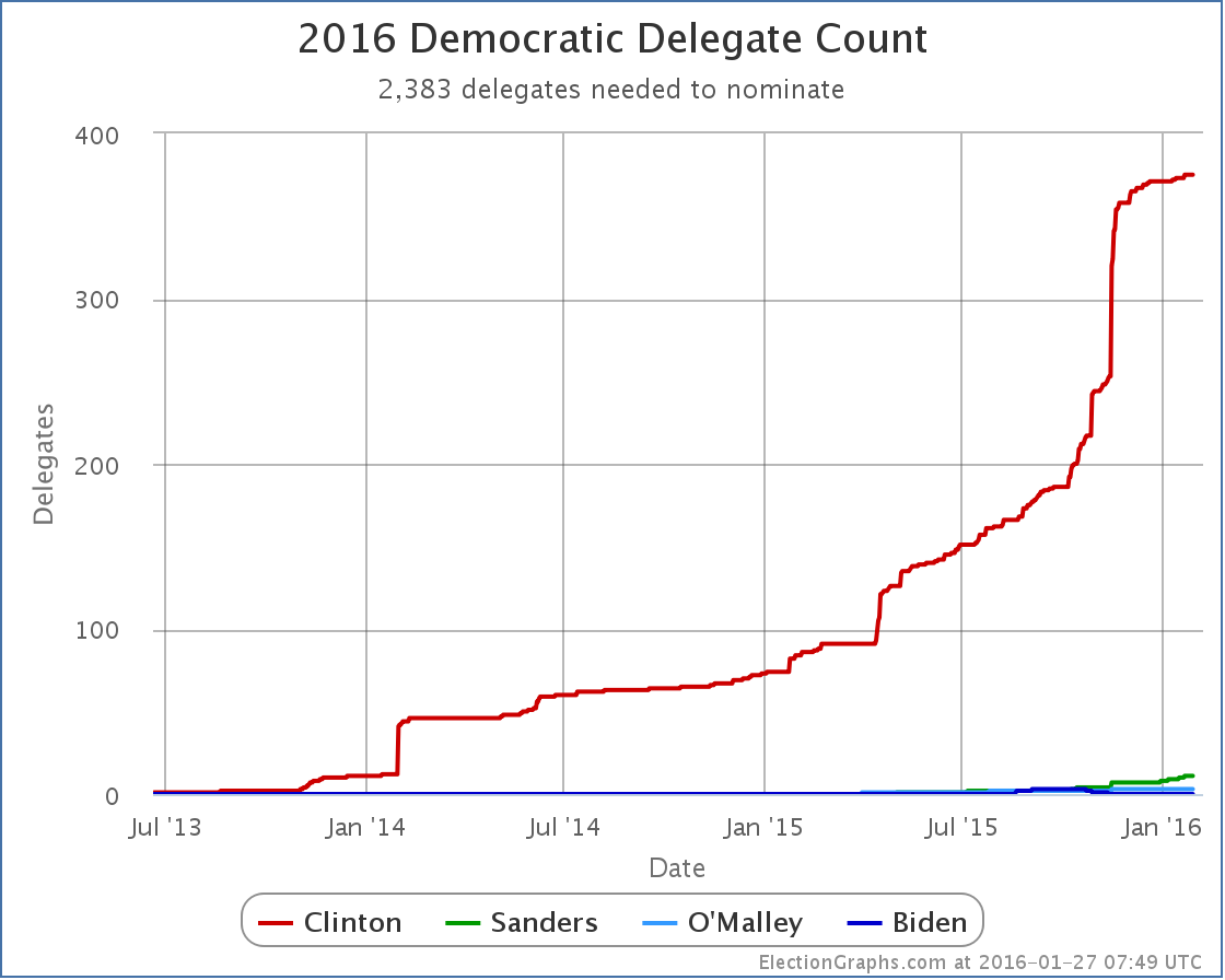
The Election Graphs delegate tracker is live! In the last few hours I have posted an intro to this effort, a tour of the new features, and a FAQ. But now it is time to get into the meat of things and start talking about results and what they mean. While the Republican Party does have unbound delegates that will be able to make up their own minds independently, most of those people won’t be officially chosen until the primary/caucus season is well underway, and regardless, I haven’t yet found a good source of information tracking which of these folks is publicly supporting which Republican candidate. So the flow of delegate information for the Republicans won’t start until we get the results of the Iowa caucuses next week. But on the Democratic side… most of the “superdelegates” are already known (although some may change before the convention). The superdelegates are Governors, Senators, Representatives, members of the Democratic National Committee, and “Distinguished Party Leaders”. As Democratic activists, these people very often are quite public about who they support. And they show up in news reports when they do that. And there are places tracking it. Since this is the first analysis post of the primary season, I’m going to walk through the charts I use on my site, building up to the main one I believe is the one worth concentrating on going forward. If you just want to get straight to the punchline of how this race is going, skip to the last chart in the post and read from there. Since June of 2013, slowly but surely, the superdelegates have been publicly choosing sides…
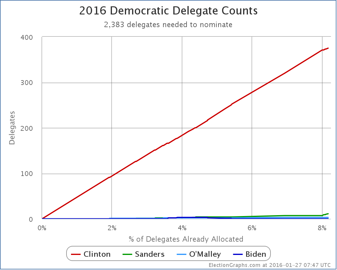
See the red line? That is Clinton. See the Green line? That is Sanders. Clinton is absolutely dominant here. By my best count, 389 of the 713 superdelegates have expressed a preference, and 375 of those have come out for Clinton. Sanders has 11. O’Malley 3. Now, the chart above is by date. It looks all jumpy because the delegates revealed their preferences at various random times, with a few big jumps when things happened, like Clinton officially announcing, or when AP did a survey of all the superdelegates. That can be interesting, but actually distorts the picture of how the race is coming along. Time to do a quick switch and show how this looks when we look at the % of delegates allocated instead of the date:
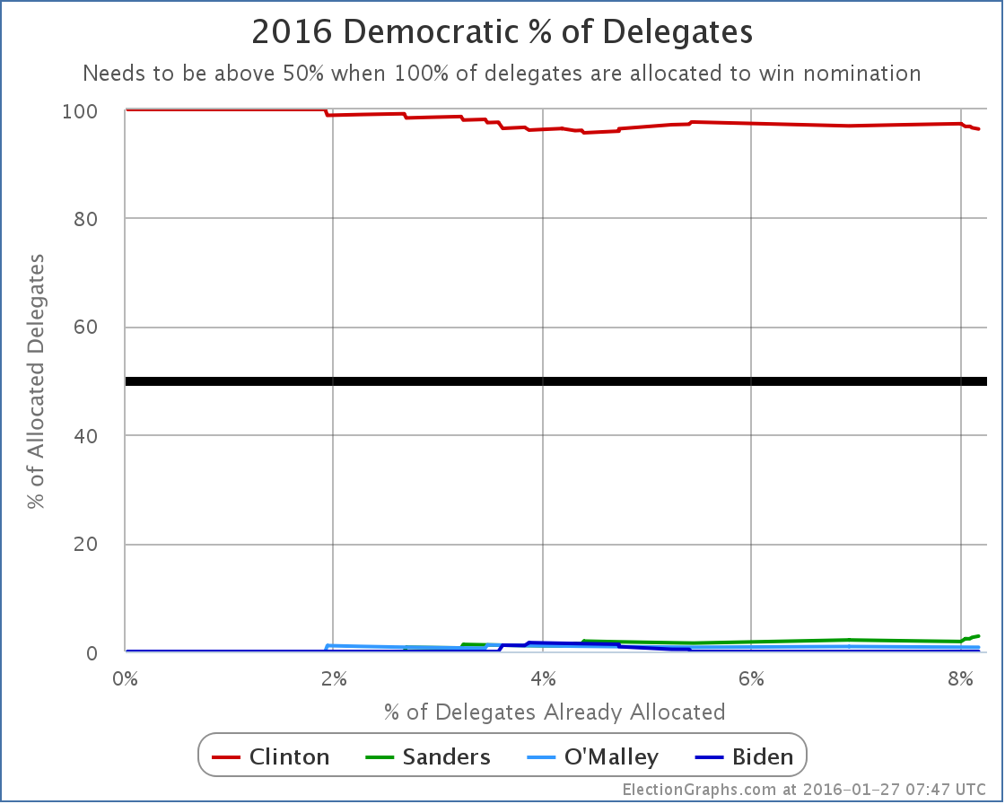
Suddenly, we have nearly a straight line. The lumpiness caused by the uneven distribution of delegate preference announcements over time is gone and we get a much clearer look at what is happening. We see that over 8% of the delegates to the convention have already expressed a preference. Clinton has been consistently racking these up as they come in. She is dominating in this race. But by how much? Lets switch to looking at the % of delegates each candidate has…
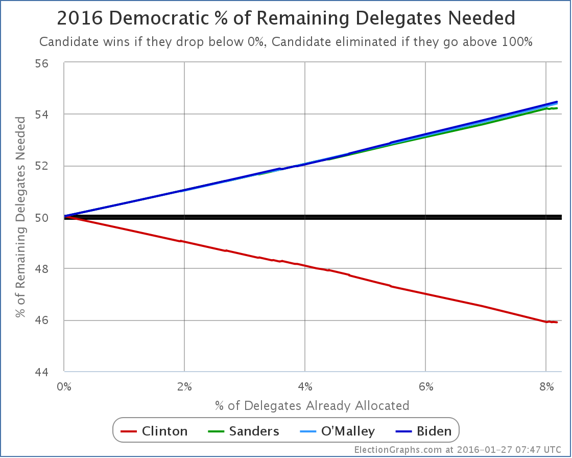
Once again we see that Clinton is dominant, but a few more details start to be seen. For instance we see that so far at least, Clinton’s weakest point was between the 4% and 5% marks when Biden, Sanders and O’Malley all had a few delegates in their columns and Clinton had about half the delegates she has today. But Biden dropped out, and Clinton kept on getting delegates at a pace not matched proportionately by Sanders or O’Malley, so Clinton’s dominant percentage increased again for awhile. Very recently though, at the tail end of this chart, you can see that Sanders has been collecting delegates at a fast enough pace that his percentage has actually been going up, while Clinton’s has been decreasing. The Sanders percentage is still small, but it is going up. So where does that put Sanders? How about his surge? Can he win? Time to look at the chart I consider to be the most important one to look at for understanding the race. Instead of looking at the percentage of delegates each candidate already has, we shift to looking at the percentage of the remaining delegates that the candidate would need to get in order to win the nomination:
As Clinton racks up delegates, it becomes harder and harder to catch up. With the lead she already has based on superdelegates, in order to win, Sanders doesn’t need to get 50% of the remaining delegates, he needs to get 54.22% of the remaining delegates. Specifically looking at Iowa, 44 delegates are at stake. To be clear, no Democratic delegates will actually be earned on the night of the Iowa caucus. It is the first step of a multi-stage process that won’t end until June. But after the precinct caucus results next week, we’ll be able to make estimates based on the initial vote results and what we know about the specific delegate allocation rules in Iowa. With 44 delegates up for grabs, given the 54.22% number we calculated, for Sanders to actually put himself in a better position after Iowa than before, Sanders doesn’t need 22 or 23 delegates, he needs 24. Now, if Sanders gets more delegates than Clinton, the media and press coverage about the Sanders surge and the risk to Clinton will be overwhelmingly loud. Nobody other than this site will be talking about how he won, but didn’t get to 24, so he is actually worse off. Everything will be about the Sanders win and his “momentum”. And there is some fairness to this. If Sanders wins Iowa’s popular vote, no matter what the delegate estimates turn out to be, he will get a lot of positive attention. And people will talk about how Clinton is a lot weaker than she had seemed. That talk may improve Sanders’ position in New Hampshire or in other states further down the road. Perhaps it would boost him enough to compensate for the increase in the “% of remaining needed to win” that would result from falling short of 54.22% in Iowa. Getting a narrow win that doesn’t get enough delegates to actually improve the overall position in the short term may actually still have a positive impact in the medium to long run. Spin matters. The polls are close in Iowa, either Clinton or Sanders could easily take the state. But the numbers to watch are not the popular vote totals. You shouldn’t even be looking simply at who is estimated to get the most delegates. The question is if the person who gets the most delegates gets enough to be on pace to win. For someone other than Clinton to win, they have to start by catching up. This already means that they have to get more than 54% of delegates as we go forward. If they fail to reach that number, with each subsequent contest they will have to do even better to catch up. If they do reach that bar though, each subsequent contest becomes easier. That’s the way it works. But the target is not getting the most delegates in each contest. It is getting more than the number you need to be on pace to win. Right now Sanders needs 54.22% of the delegates. Clinton only needs 45.90% of the delegates. She doesn’t even need to get a majority since she has already banked so many delegates before voting even starts. So far, in the “invisible primary”, Clinton has scored an incredible 96.4% of the delegates. This will not continue. The Democratic leaders that make up the superdelegates have a very different perspective and background than Iowa caucus goers, or New Hampshire primary voters. Sanders will do better than the 2.8% of delegates he has managed so far. The question is how much better and if it puts him on track to actually catch up and win, or if it quickly becomes apparent that he is just playing the role of the protest candidate almost everyone originally expected him to be. If Sanders doesn’t get to that 54.22% mark in Iowa, we may know pretty quickly that he is falling short, although if he wins in the popular vote, there will still be a crazy media circus for weeks. If he exceeds that mark though, then the media howling might actually be warranted. At least until South Carolina. South Carolina is a very different state than either Iowa and New Hampshire, and the picture might change dramatically again after that. But the next few weeks will be exciting almost any way the results go. And we haven’t even talked about the Republicans this time since there aren’t any delegates to look at quite yet. There will certainly be quite a bit of excitement on that side as well. Tune in here for all the twists and turns as this race shifts into high gear! Just under a week until Iowa. Hold on tight. Note: This post is an update based on the data on ElectionGraphs.com. Election Graphs tracks both a poll based estimate of the Electoral College and a numbers based look at the Delegate Races. All of the charts and graphs seen in this post are from that site. Additional graphs, charts and raw data can be found there. All charts above are clickable to go to the current version of the detail page the chart is from, which may contain more up to date information than the snapshots on this page, which were current as of the time of this post. Follow @ElectionGraphs on Twitter or like Election Graphs on Facebook to see announcements of updates or to join the conversation. For those interested in individual general election poll updates, follow @ElecCollPolls on Twitter for all the polls as they are added. [Edit 06:45 UTC to fix wording] [Edit 08:09 UTC to update graphs] [Edit 08:15 UTC to fix typo] [Edit 2016-02-02 06:03 UTC to change “Delegate Race” in title to “Democrats” in preparation for separating posts on the two races] This is a FAQ for the 2016 Delegate Race portion of ElectionGraphs.com. The FAQ for the Electoral College portion is here. Why are you doing this?
OK, what are those things?
Why are your delegate counts different than those at my favorite media outlet?
So are you some kind of expert in the delegate selection process to make these estimates?
OK, so what are those sources?
Doesn’t the fact some delegates can change their minds invalidate the “% of remaining delegates” metric?
Do you come at this with some sort of political bias?
How often is the data updated?
You’ve done this before?
This is awesome, I’d like to share this or mention it in my own online space, can I?
This sucks, what a waste of time, you are obviously just a shill for <insert candidate you don’t like>… How can I tell you how awful you are?
Note: This post is an update based on the data on ElectionGraphs.com. Election graphs tracks both a poll based estimate of the Electoral College and a numbers based look at the Delegate Races. All of the charts and graphs seen in this post are from that site. Additional graphs, charts and raw data can be found there. All charts above are clickable to go to the current version of the detail page the chart is from, which may contain more up to date information than the snapshots on this page, which were current as of the time of this post. Follow @ElectionGraphs on Twitter or like Election Graphs on Facebook to see announcements of updates or to join the conversation. For those interested in individual general election poll updates, follow @ElecCollPolls on Twitter for all the polls as they are added.
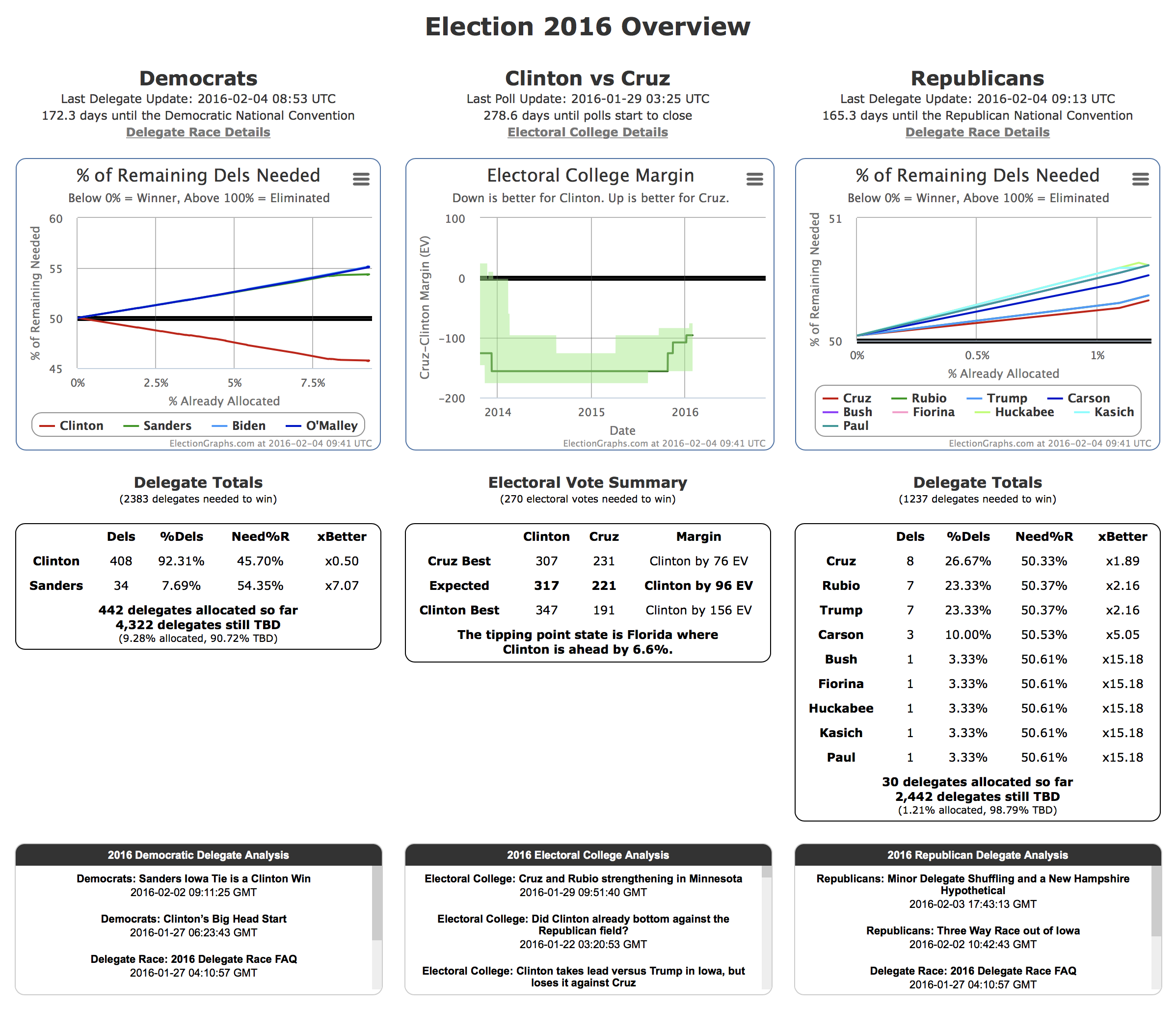
This post gives an overview of the Election Graphs Delegate Race site for 2016, highlighting the major charts, graphs and features of the site, and how to interpret some of that is there. Or just ignore this and go to the site and explore. But if you want an item by item explanation of what you will see there, then read on. New Overview Page
First of all, while not technically part of the Delegate Race coverage pages, I should mention that with the launch of the Delegate Race, the home page of electiongraphs.com has been changed so that rather than just concentrating on the Electoral College race, it gives thumbnail versions of the most important information on both Delegate Races and the Electoral College for the general election. I won’t go over all the specific elements on this page because everything is covered either here or in the Tour of the Electoral College part of the site published back in 2014. From this starting point you can of course easily get to all of the details on both the Electoral College and Delegate Race sides of the site. The candidate combination in the center will be the delegate leaders in both parties as soon as both parties actually have delegate leaders. Until then, it shows the best polled candidate combination. Two Columns
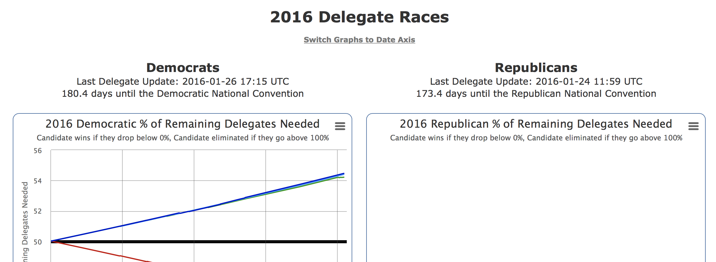
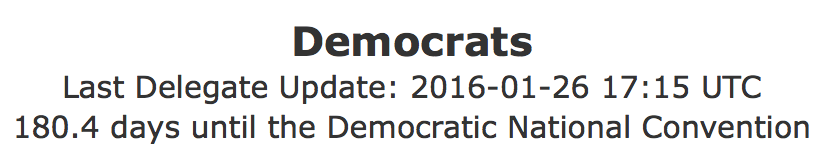
The main structure of the 2016 Delegate Races page is two columns. Democrats on the left, Republicans on the right. (Would you arrange them differently? :-) ) Everything on the page runs in parallel for the two parties, showing the same type of data for each. I will use the Democrats as the examples for the rest of this tour, simply because as of a little over a week before Iowa as this is written, there is actual data for the Democrats because of the super delegates who have already expressed a preference, while there won’t be real delegate data for the Republicans until the Iowa caucus results are known. Updates and Countdown
The heading should be self-explanatory. :-) A timestamp for the last data update and a count down to the start of the convention. % of Remaining
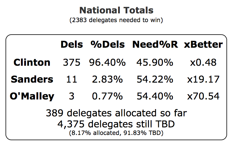
This is one of the critical charts I alluded to in the last post.This shows the percentage of the remaining delegates that each candidate needs to get in order to win the nomination on the first ballot at the convention. On this kind of chart, going DOWN is good. It means you are so far ahead that you only need a small percentage of the delegates that are left to win. Once this number goes to 0%, it means you don’t need any more delegates, you have already won. The flip side of this is that if it goes to 100%, you have been eliminated. You could get every outstanding delegate and it still wouldn’t be enough. And specifically during the contest, at any given time, this number is the level you need to get on each new delegate contest as it comes up to be “on pace” to win. So, for example, with the state of the chart above, you can see that Sanders would need to get a little over 54% of the delegates in the next context (the Iowa caucuses) to be on track to win the nomination. If he got 52% of the delegates, he might well have “won Iowa”, but not by enough. He would actually be in a worse position going into New Hampshire in terms of the delegate race, needing an even higher percentage to be on pace the next time around. Now, that is of course in terms of the pure delegate race. Given the psychology involved, if getting 52% in Iowa was perceived as such a huge win that it boosts his likely delegate haul in New Hampshire from 53% to 60% or some such, then even though the Iowa result put him in a worse position short term, it might boost long term prospects. This is the kind of calculus that occurs during the race, but boosts like that only go so far, in the end watch the math and where this chart goes. Note a situation where ALL candidates go up to 100% rather than one of them heading down to 0%, is exactly the situation that would lead to a so-called “contested convention” where there is no clear winner going into the convention. Delegate Totals
The raw estimate of the number of delegates supporting the candidate. This is a “soft count” meaning it includes not just delegates who are formally bound to a candidate, but also unbound delegates who have expressed a preference, and in cases of multi-stage processes, estimates of the final numbers based on the results of the earlier stage. As estimates, these numbers can change, going both up and down as the estimates are refined. Delegate numbers can of course also go down when a candidate drops out and releases their delegates. % of Delegates
This is the percentage of the delegates allocated so far that have supported each candidate. This shows how well the candidate is doing so far. It may or may not be directly reflective of how well they will do in the rest of the race. That can be influenced by many factors, but it is reasonable to think that for there to be a dramatic change in performance, there would have to be dramatic events or dramatic differences in the landscape causing the change. Now, as an example, the change from the pre-Iowa world where all the delegates are Democratic insiders to post-Iowa where delegates are actually determined by real people voting is an example of a pretty dramatic change. So for instance, a change from Clinton getting 95%+ of the delegates to something lower would not only not be unexpected, but it would be surprising if such a shift did not happen.
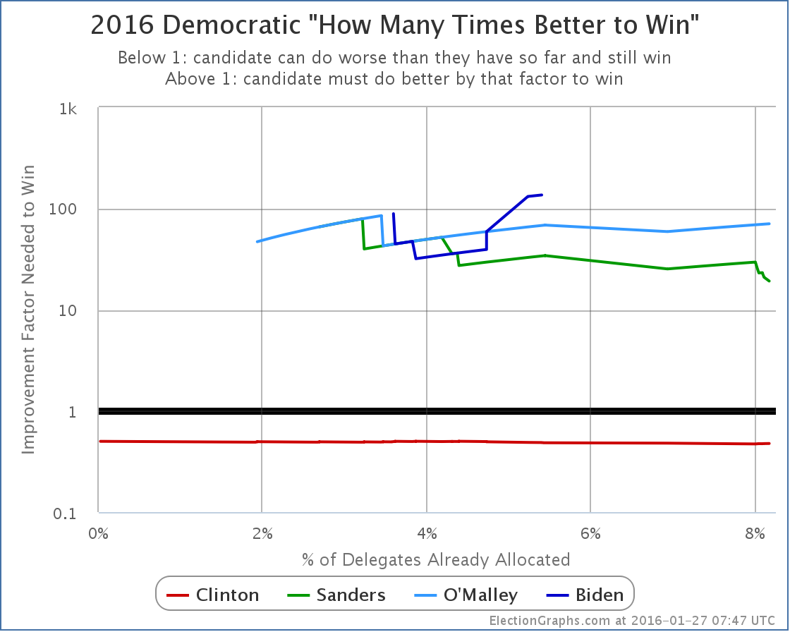
This is a second way of looking at how much work a candidate needs to do to win. The percentage of the remaining delegates tells you a lot, but this divides that by how well they have been doing so far, to give a representation of just how much better a candidate has to do in order to catch up and win if they are behind, or how much leeway to do worse a candidate who is on a winning pace has. So, for instance, if so far a candidate has been getting 30% of delegates, but they need 60% of delegates in order to win, then they would need to do 2x better than they have been to win. This chart it shown with an logarithmic scale due to the large range of values seen. Summary Table
The site is Election Graphs, and the most important graph is the % remaining graph, so that came first, and I even talked about all the charts lower on the page before mentioning this, but this is the table with all the detailed numbers behind the data, plus some basic numbers around how many delegates have been allocated, how many are left, how many are needed to win, etc. This covers only a snapshot of the numbers at the current time. Historical data is only available in the charts. (Or in the raw data I provide if someone wants to parse it to recreate the time series data.) State Delegate Counts
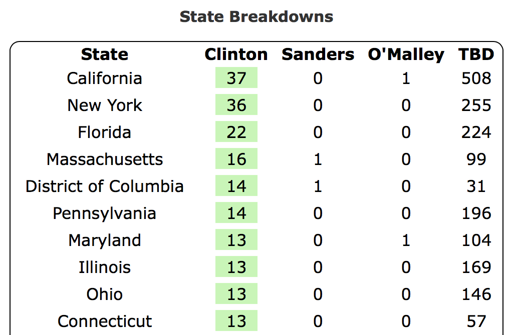
At the bottom of the page is a state by state breakdown of the delegate estimates. The states are listed in order of how many delegates have been allocated so far. The candidate(s) currently leading in each state are highlighted in green. Because of the ways in which delegate allocation works, including the presence of unbound delegates, the delegate leader does not necessarily have to match the winner in the voting reported in primaries and caucuses. And indeed, as seen above, there can be many delegates allocated before any voting takes place at all. Graphs with a Date Axis
Looking at the delegate race based on % of delegates allocated does give a better real sense of how far along in the process it really is, but sometimes you just want to see things as they look on a more familiar date axis. At the very top of the page there is a “Switch Graphs to Date Axis” link that shifts all the graphs to be date based instead of percent of delegates based. Once in that mode, you can of course toggle back to the % of delegates view, but you can also toggle between starting the charts whenever the first delegates were logged (so in the case of the Democrats in the 2016 cycle, way back in June 2013) or starting the charts only on the date of the Iowa caucuses (Feb 1st 2016). Links to Blog Posts
Oh yeah, and in the middle somewhere there, there are three blocks with links to relevant blog posts. The left and right blocks contain only blog posts with analysis of the delegate race for the parties in that column. The middle block also includes articles on the Electoral College race, episodes of the Curmudgeon’s Corner podcast that talk about the election, and digests of posts made by the @ElectionGraphs and @ElecCollPolls twitter accounts. Notes Finally, at the very bottom of the page are places to follow Election Graphs, some notes about sources, links to raw data, etc. If you are into those things, enjoy. Note: This post is an update based on the data on ElectionGraphs.com. Election graphs tracks both a poll based estimate of the Electoral College and a numbers based look at the Delegate Races. All of the charts and graphs seen in this post are from that site. Additional graphs, charts and raw data can be found there. All charts above are clickable to go to the current version of the detail page the chart is from, which may contain more up to date information than the snapshots on this page, which were current as of the time of this post. Follow @ElectionGraphs on Twitter or like Election Graphs on Facebook to see announcements of updates or to join the conversation. For those interested in individual general election poll updates, follow @ElecCollPolls on Twitter for all the polls as they are added. [Edit 2016-01-27 03:19 UTC to add final note] [Edit 2016-01-27 06:59 UTC to update screenshots to retina resolution] [Edit 2016-01-27 08:06 UTC to update graphs] [Edit 2016-02-02 11:30 UTC to update section on blog post links to reflect split of Democratic and Republican blocks] [Edit 2016-02-04 09:45 UTC to update screenshots for overview page and RSS feeds to reflect current structure]
It is just over 7 days until the doors open on the Iowa caucuses for 2016. So it is time to open the Election Graphs delegate tracker. electiongraphs.com/2016delsLong past time actually. At least on the Democratic side, the delegate race actually started long before Iowa. We’ll get into that a bit in a separate post later, but for now, just a quick introduction to what this delegate tracker will and won’t be. The Election Graphs delegate tracker will be based on “soft counts”. While many delegates do get determined directly based on voting results in primaries or caucuses, many do not. There are “superdelegates” who are free agents and can change their minds at any point. There are also processes where the direct voting just elects delegates to a “second stage” who in turn later vote for “a third stage”, etc, until eventually weeks or months later, the actual convention delegates are elected. The degree to which any of this is deterministic varies by state. Here at election graphs we’ll be using a variety of sources to try to understand the preferences of known superdelegates and officially uncommitted delegates, while trying to estimate what the delegate allocation will eventually be at the end of multi-stage processes. This all means that estimates are subject to change and revision. Things are not locked in stone when a winner is declared on a primary election night. In practice though, at least in the last couple of election cycles, tracking these “soft counts” is actually pretty stable. The estimates do adjust a bit as time goes on, but you generally have a pretty good picture of what is going on, and it gives you a better picture than looking only at a “hard count” of delegates who are completely bound to a candidate with no ability to change their vote. Looking narrowly at only that part of the delegate count leaves out a big part of the picture. Lots of places will have delegate counts starting the evening of the Iowa caucuses though, why should you pay attention to the one at Election Graphs? First and most importantly, I track a couple of statistics I have not seen anywhere else. Namely, the percentage of the remaining delegates each candidate needs to capture in order to win, and how much better (or worse) that is than how they have been doing so far. These tell you much more than a raw delegate count, because they also take into account the dwindling number of remaining delegates as things proceed. So, for instance, looking at the famous 2008 Clinton vs Obama race with these metrics it was clear by early March that it was very very unlikely that Clinton would be able to catch up with Obama. Not impossible, but very unlikely, requiring Clinton to do better than she ever had before by a large margin to catch up… a margin that got bigger with every passing contest. Meanwhile the frenzy around the 2008 race continued on and on and on… long after it was clear to anyone really watching the math that it was over. So watch these numbers for an early sense of when the picture is really becoming clear. Second, I also track all of these against the percent of delegates already allocated, not just against the date, which gives you a much better sense of how far along in the process things are, since the delegates available aren’t even remotely close to evenly distributed over time. Third, while lots of places show current delegate counts, very few show you charts of how the delegate race proceeds over time. As they say “past performance does not guarantee future results”, but at the same time, it does give you an idea of the range of what is likely. Sure, something cataclysmic could happen to cause someone who has been routinely getting 60% of the delegates to suddenly only get 10% for the rest of the race, but it is unlikely. It would have to be a result of a massively disruptive change in the race, not the normal ups and downs of a campaign. So watch the time series charts. There are a bunch of other little details here and there that politics and numbers geeks might like too. And of course, it is a chance to support your local neighborhood amateur who does this for fun in their spare time. :-) This is the first of three posts to introduce the delegate tracker, the next will be a “tour” going over all the new features on the site. Note: This post is an update based on the data on ElectionGraphs.com. Election graphs tracks both a poll based estimate of the Electoral College and a numbers based look at the Delegate Races. All of the charts and graphs seen in this post are from that site. Additional graphs, charts and raw data can be found there. All charts above are clickable to go to the current version of the detail page the chart is from, which may contain more up to date information than the snapshots on this page, which were current as of the time of this post. Follow @ElectionGraphs on Twitter or like Election Graphs on Facebook to see announcements of updates or to join the conversation. For those interested in individual general election poll updates, follow @ElecCollPolls on Twitter for all the polls as they are added. [Edit 2016-01-27 03:18 UTC to add final note] [Edit 2016-01-27 08:00 UTC to update graph]
|
||